
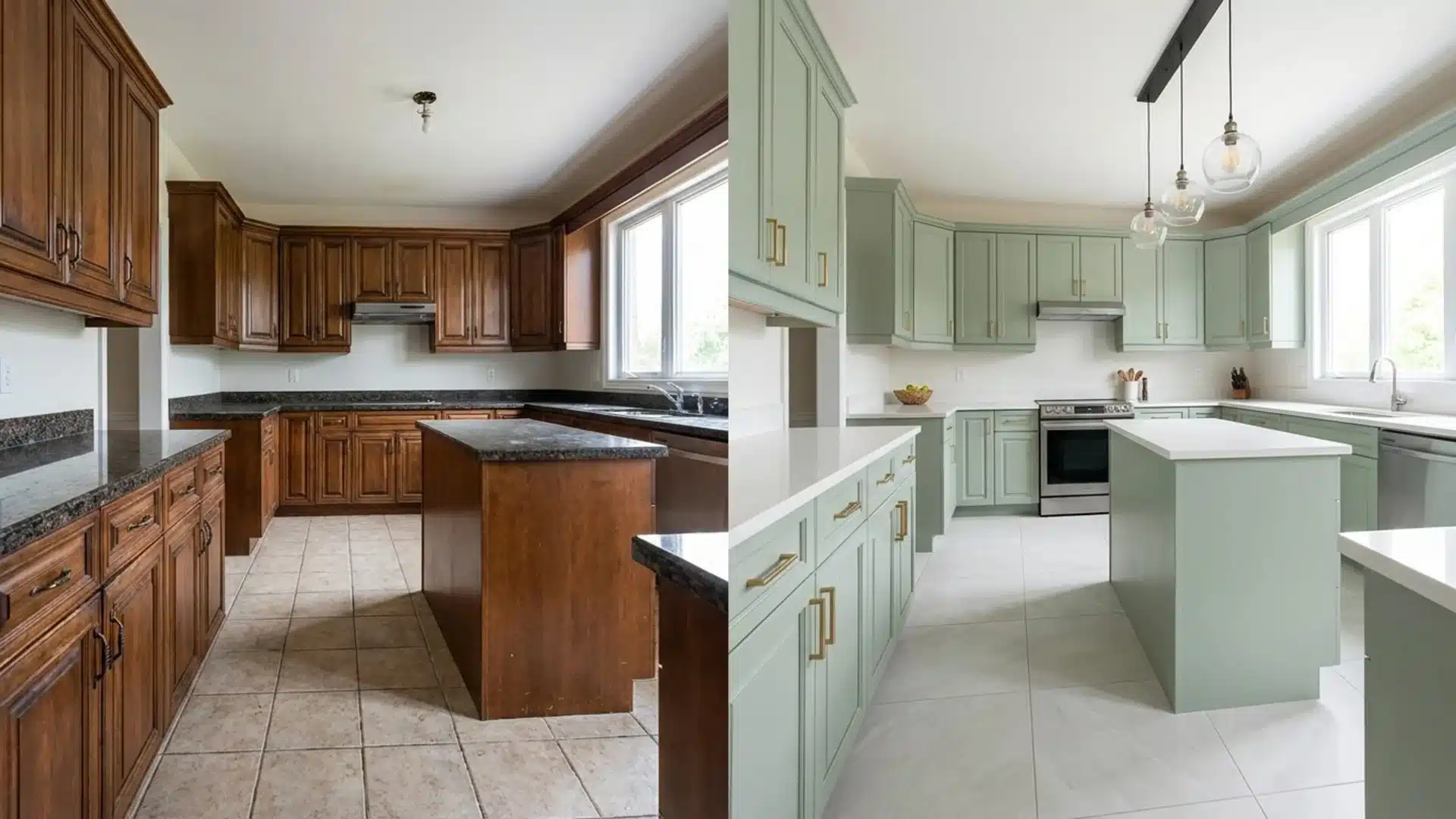
A cabinet finish that no longer matches anything, a countertop stained past what cleaning can fix, corners that quietly stopped working years ago.
These are the small signs a kitchen gives before anyone decides to actually do something about it. None of it usually calls for tearing the whole room down.
Sometimes one well-placed change is enough to shift how the entire space feels.
Here are real before-and-after kitchens covering cabinets, countertops, flooring, lighting, layout, and the occasional full gut renovation, each one showing what was wrong originally and the specific fix that solved it.
Planning a Kitchen Remodel
A kitchen remodel starts with a clear budget.
Divide costs across cabinets, countertops, flooring, appliances, and labor before any work begins.
Identify the functional problems the current kitchen has first.
Low storage, limited counter space, and poor lighting are common issues to address in a remodel. Check load-bearing walls before planning. Confirm appliance and material lead times early, as cabinets and countertops can take 4 to 12 weeks to arrive.
Work in a set sequence: rough work first, then flooring, then cabinets, countertops, backsplash, and fixtures.
This order prevents rework and keeps costs controlled.
Key Materials and Finishes Used in Kitchen Makeovers
Material choices affect the look and durability of cabinets, counters, flooring, and backsplashes.
Coordinating materials creates a unified kitchen, making it feel like a single space rather than a series of updates.
| Material | Common Options | Best Used For | Estimated Cost |
|---|---|---|---|
| Cabinet Finish | Painted wood, shaker, flat front | Largest visual surface | $1,500–$15,000 |
| Countertop | Quartz, granite, butcher block | High-use prep surfaces | $2,000–$8,000 |
| Backsplash Tile | Subway, porcelain, mosaic | Wall protection at range/sink | $300–$2,500 |
| Flooring | Porcelain tile, LVP, hardwood | High-traffic, moisture areas | $1,500–$7,000 |
| Hardware Finish | Matte black, brass, nickel | Knobs, pulls, faucet | $150–$600 |
| Appliance Finish | Stainless, panel-ready, matte black | Range, fridge, dishwasher | $2,500–$12,000 |
| Lighting Fixture | Brass, matte black, chrome | Pendants, recessed, under-cabinet | $300–$3,000 |
| Paint Finish | Matte, eggshell, satin, gloss | Walls, ceilings, cabinet interiors | $100–$500 |
Note: The figures mentioned above are estimated values and may vary based on kitchen size, material grade, and labor rates in your area, as covered in this kitchen remodel cost breakdown.
Before and After Kitchen Remodel Ideas
Every kitchen has a story of where it started. These before-and-after remodels show how small updates and full renovations can completely reshape the way a kitchen looks and feels.
1. Painting Oak Cabinets White
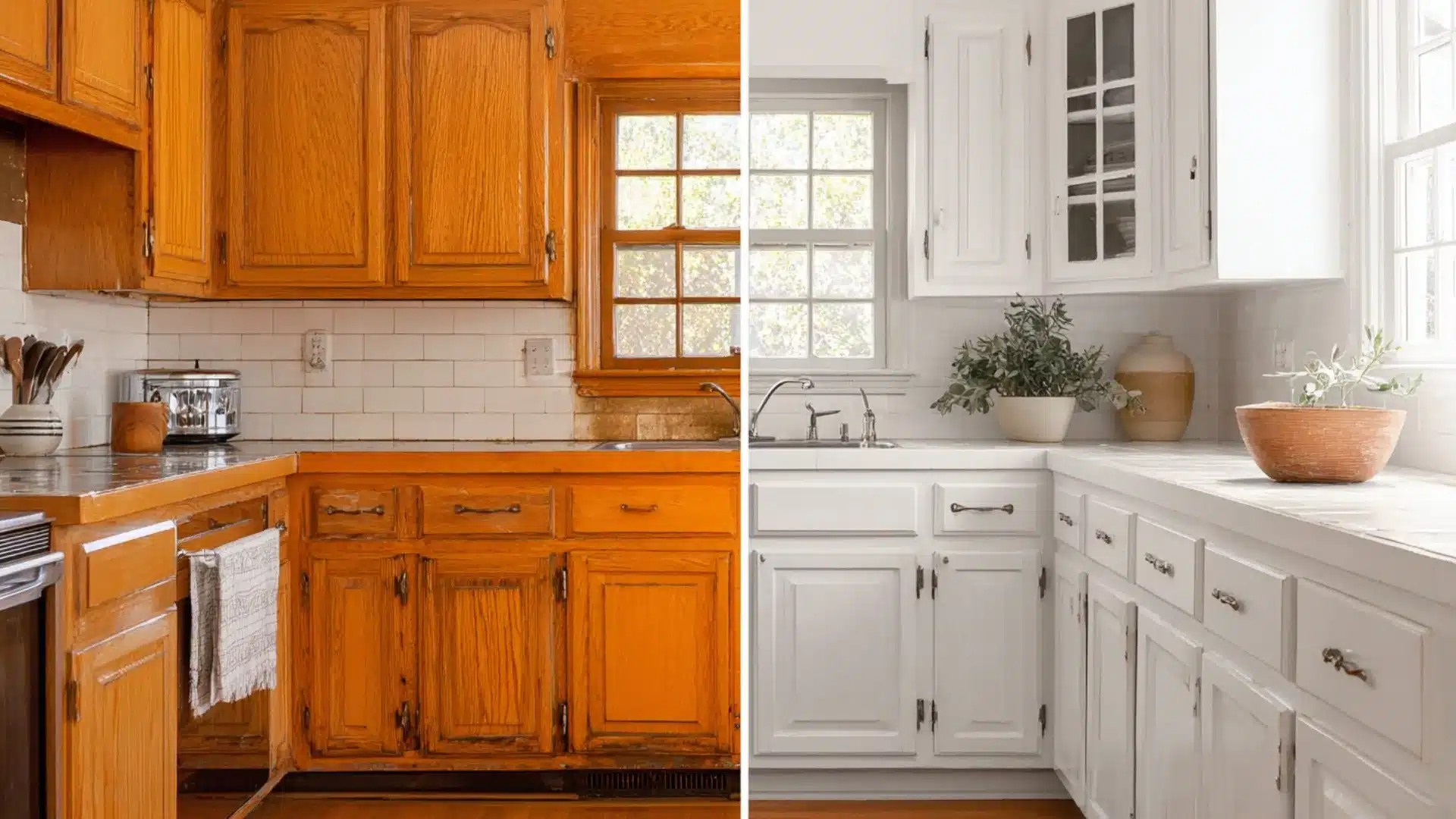
Before:Honey-oak cabinets with orange-toned wood grain and brass knobs made the kitchen feel heavy and visually dated, clashing against stone countertops and pulling the room backward.
After:Crisp white shaker-style fronts were painted on the same boxes, reducing visual weight and reflecting more light throughoutthe kitchen without replacing a single cabinet structure.
A fresh coat of white paint remains one of the highest-impact cabinet changes possible at the lowest structural cost.
2. Open Shelving Conversion
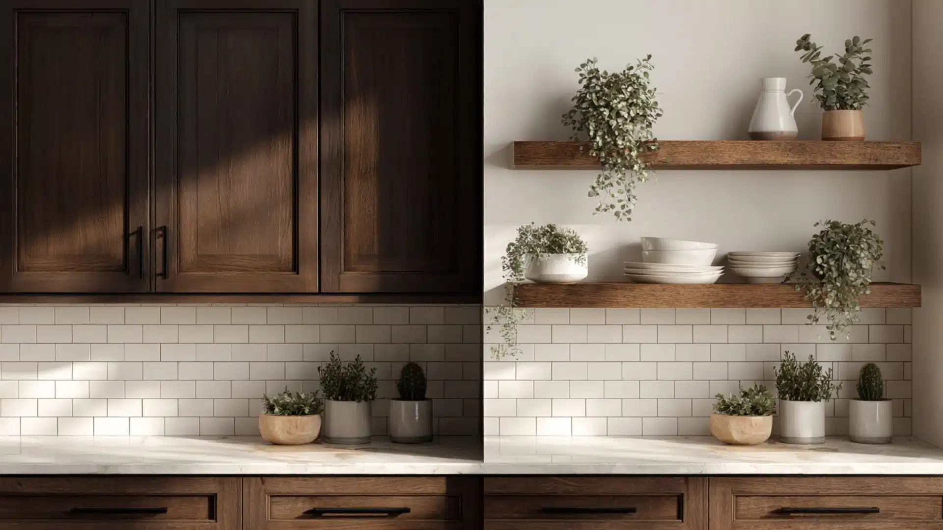
Before:Solid upper cabinet doors blocked light from reaching the upper zone, creating a heavy,enclosed ceiling line that made the kitchen feel smaller than it actually was.
After:Floating wood shelves replaced the removed upper cabinets, opening sightlines, reducing overhead clutter, and giving frequently used dishes a visible and accessible display spot.
Removing the upper cabinet doors costs less than replacing them and delivers a far more dramatic spatial result.
3. Adding Glass Cabinet Inserts
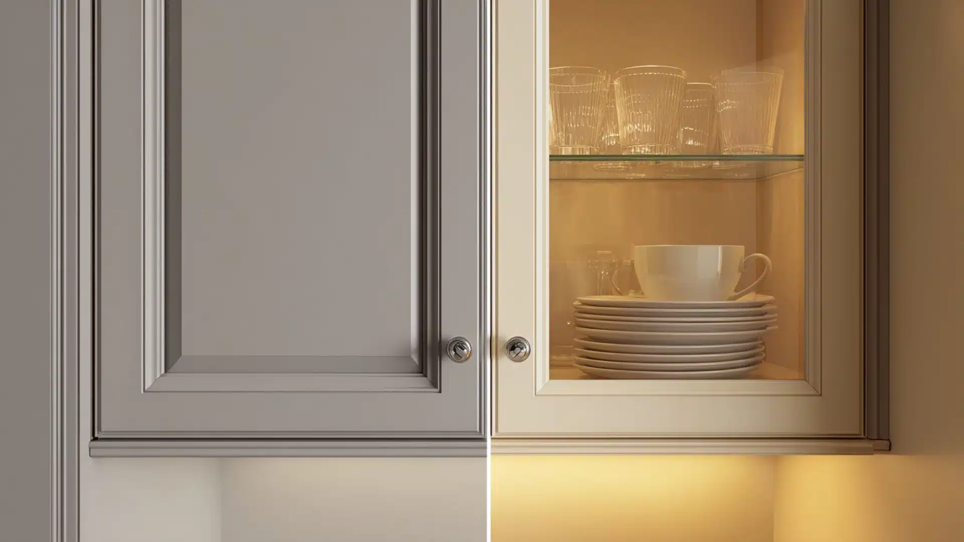
Before:Solid laminate cabinet doors hid everything behind a flat, unbroken wall of panels, making the upper section feel closed off and visually heavy above the counter.
After:Center panels were removed and replaced with clear or seeded glass panes, adding visual depth and showcasing curated dishware without committing to full open shelving.
Glass inserts also make locating items faster during daily use without removing a single cabinet box
4. Dark Cabinet Refresh
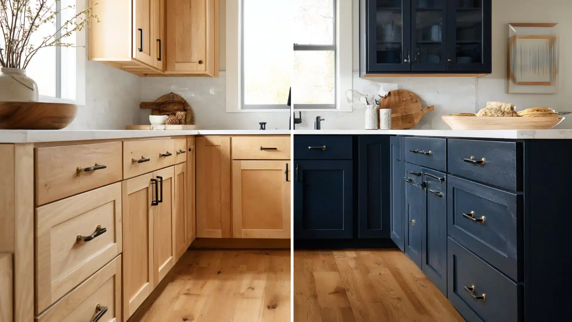
Before:Light-toned wood cabinets showed every scuff, grease smudge, and fingerprint, requiring constant wiping to maintain any semblance of cleanlinessthroughout the day.
After:Deep navy, charcoal, or forest green paint was applied over the same cabinet boxes, grounding the kitchen with a stronger visual anchor while concealing everyday wear far more effectively.
Darker cabinet tones also make hardware choices stand out more clearly against the finished surface.
5. Cabinet Hardware Swap
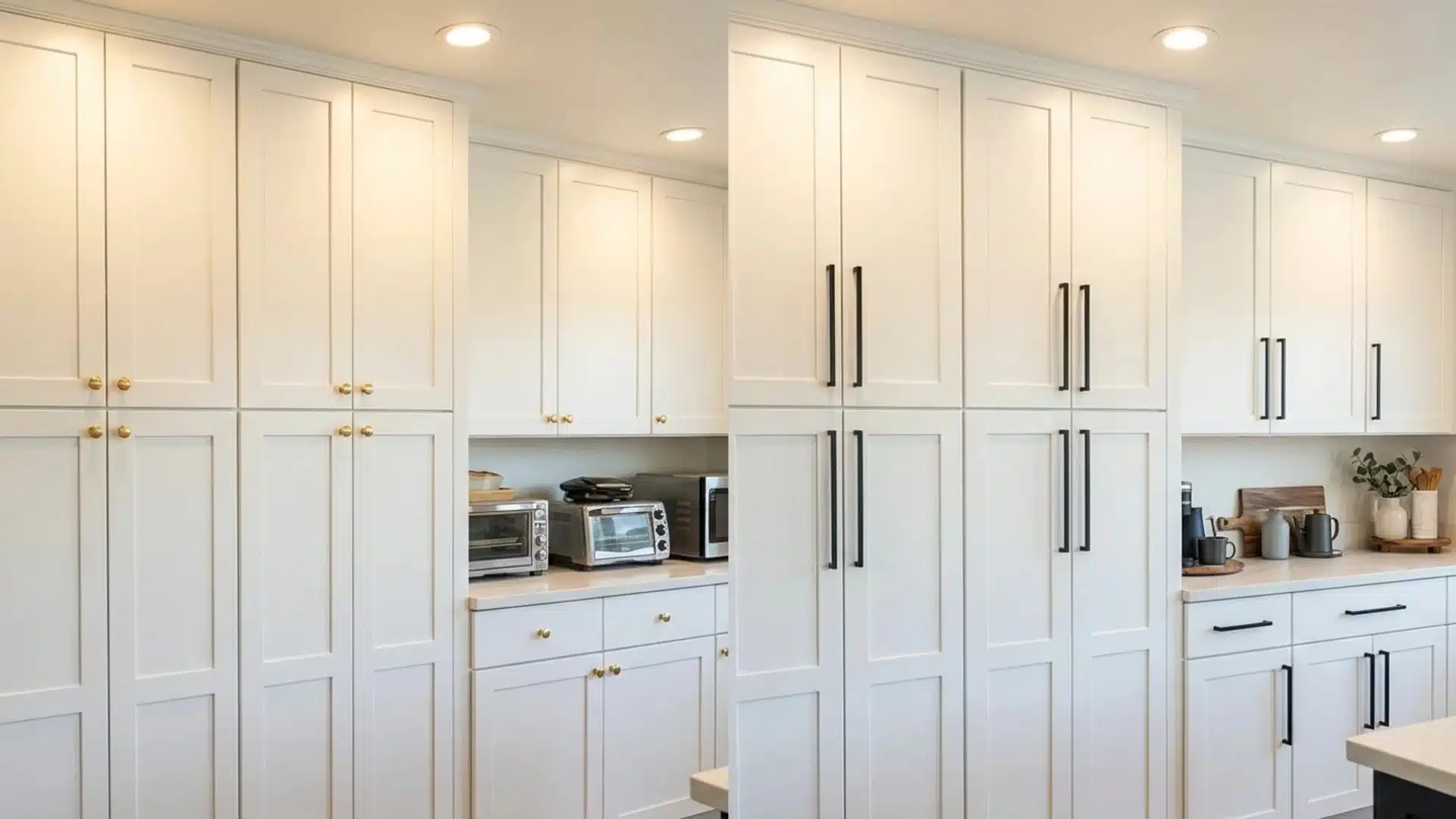
Before:Original brass or chrome knobs had tarnished and yellowed over time, dragging down the appearance of otherwise structurally sound cabinets that needed no replacement.
After:Every pull and knob was swapped for matte-black or brushed-goldhardware, noticeably changing the perceived age and style of the entire space without touching a single cabinet door.
New hardware also improves grip and ease of use on drawers that previously felt stiff or awkward.
6. Ceiling-Height Upper Cabinets
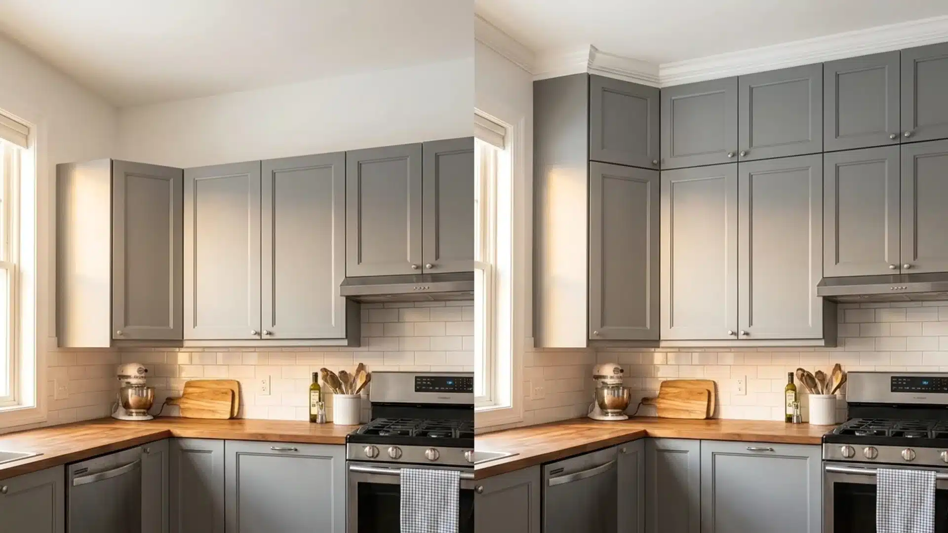
Before:Standard upper cabinets stopped 12 to 18 inches below the ceiling, leaving a gap that collected grease and dust and made decorative items impossible to access or clean regularly.
After:Additional cabinet boxes were added above the originals to reach full ceiling height, eliminating the dust gap and making the ceiling height feel intentional rather than incidental to the build.
The vertical extension makes the entire wall read as one deliberate architectural feature rather than an unfinished run.
7. Two-Tone Cabinet Color Split
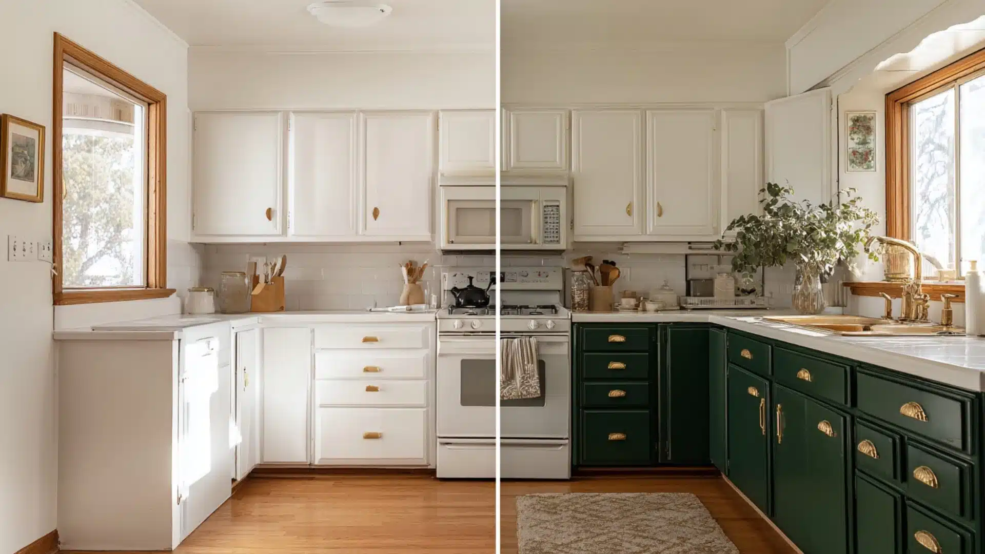
Before:A single cabinet color painted throughout the kitchen left the room reading as flat and visually undivided, with no clear separation between upper and lower zones.
After:Upper cabinets were painted one color and lowers a contrasting shade, adding visual complexity and a layered, considered finish without requiring any new cabinet boxes to be built.
The color break at counter height draws the eye naturally and gives the room a defined design direction.
8. Laminate to Quartz Upgrade
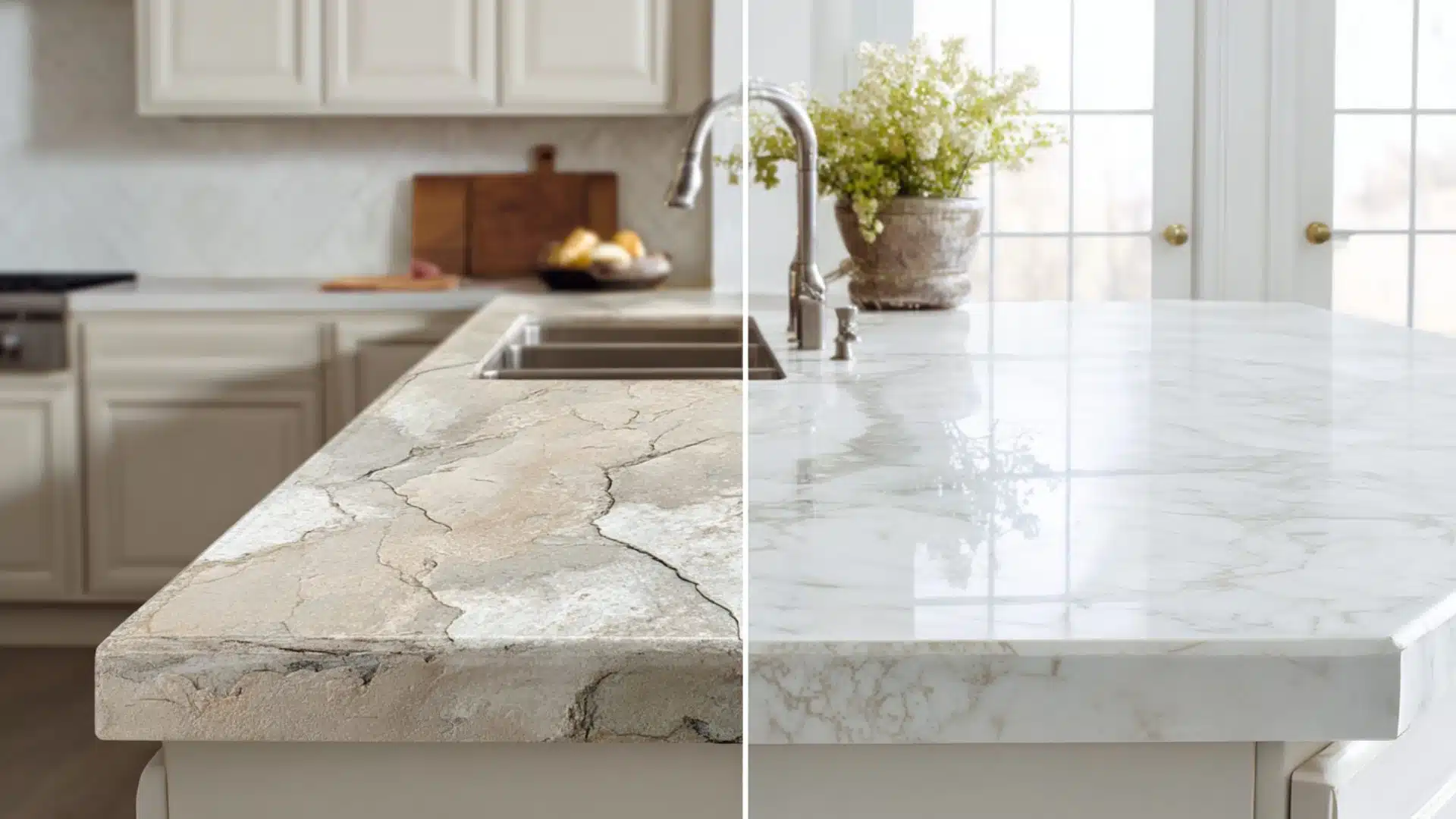
Before:Builder-grade laminate countertops had absorbed stains over years of use that no amount of cleaning could fully remove, leaving the surface looking permanently dull and worn.
After:Solid white quartz slabs replaced the laminate entirely, resisting stains and scratches far better while brightening the kitchen and raising the overall perceived quality of the room.
Quartz also requires no sealing after installation, unlike natural stone alternatives that need ongoing maintenance.
9. Tile Countertop Removal
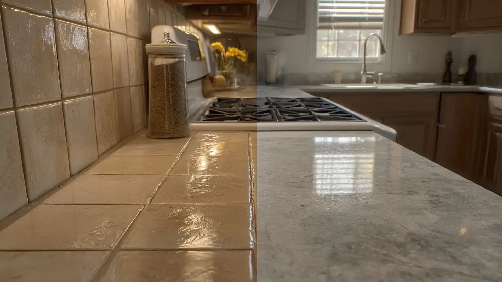
Before:Individual ceramic tiles across the counter surface had darkened grout lines that trapped grease and cooking residue, resisted regular cleaning, and made the surface look aged regardless of effort.
After:A single seamless stone slab replaced the entire tiled run, eliminating every grout line and creating a smooth, continuous work surface far easier to maintain during daily cooking.
A continuous slab also makes rolling dough and precision prep work significantly more practical than tile ever allowed.
10. Granite to Quartzite Switch
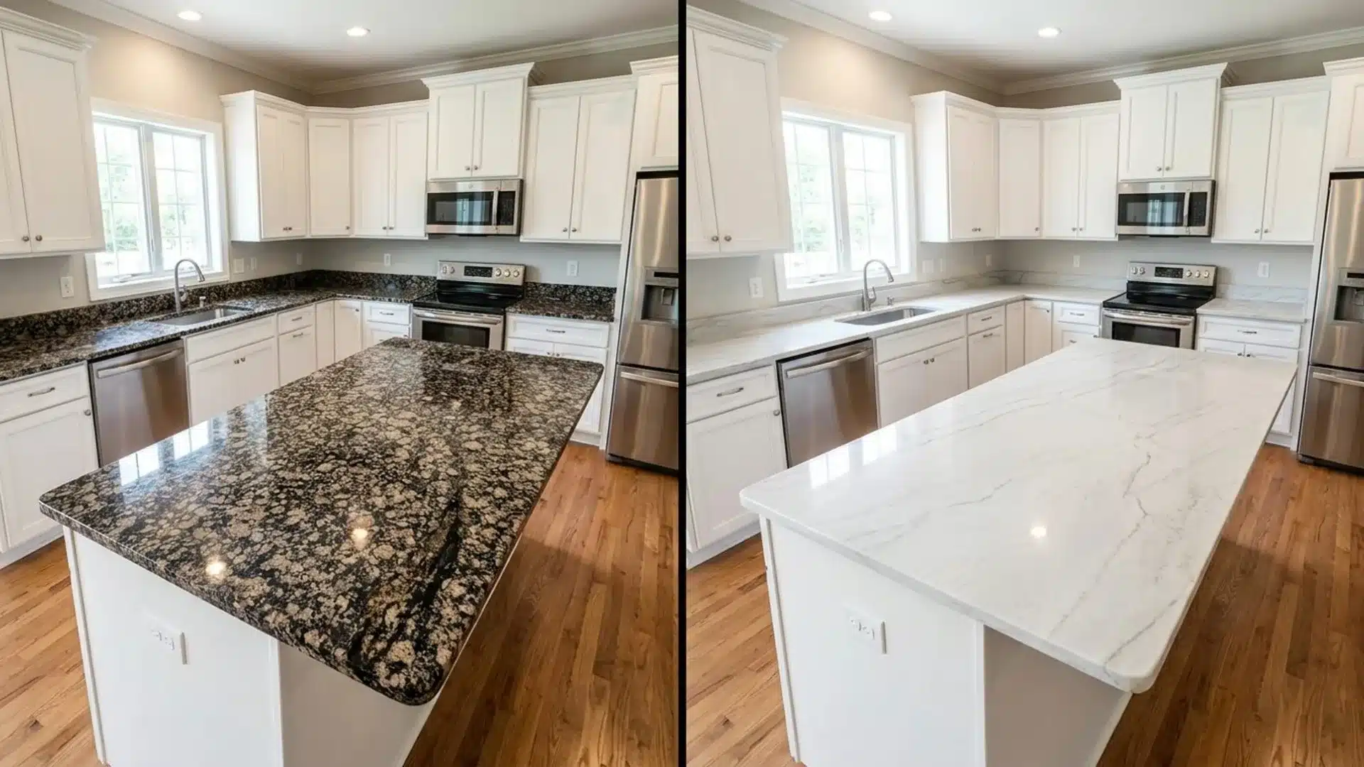
Before:Heavily patterned granite with dense speckling and dark veins competed with every surrounding element, making it difficult to add visual interest elsewhere without creating visual chaos throughout the room.
After:Softer quartzite with subtle, flowing veining in lighter tones replaced the busy slab, letting cabinetry, backsplash, and lighting choices stand out individually across the kitchen.
Quartzite also handles daily heat and prep work without compromising its surface appearance over time.
11. Waterfall Edge Addition
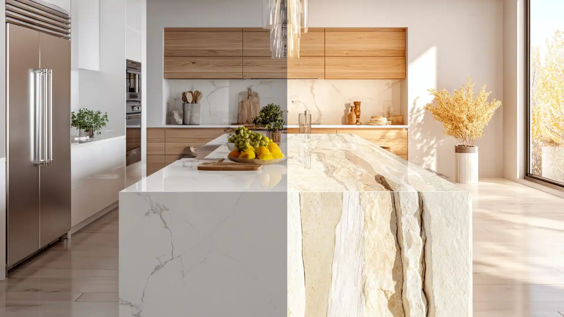
Before:The exposed cabinet side panel below the original flat-edge island counter looked unfinished and plain from the seating side, undermining the overall quality of the surrounding finishes.
After:The stone slab was extended vertically down the island side panel to the floor, giving the island a sculptural, furniture-like presence while concealing the plain cabinet side completely.
The vertical drop also protects the cabinet side from everyday knocks and spills at floor level.
12. Dark Countertop on White Cabinets
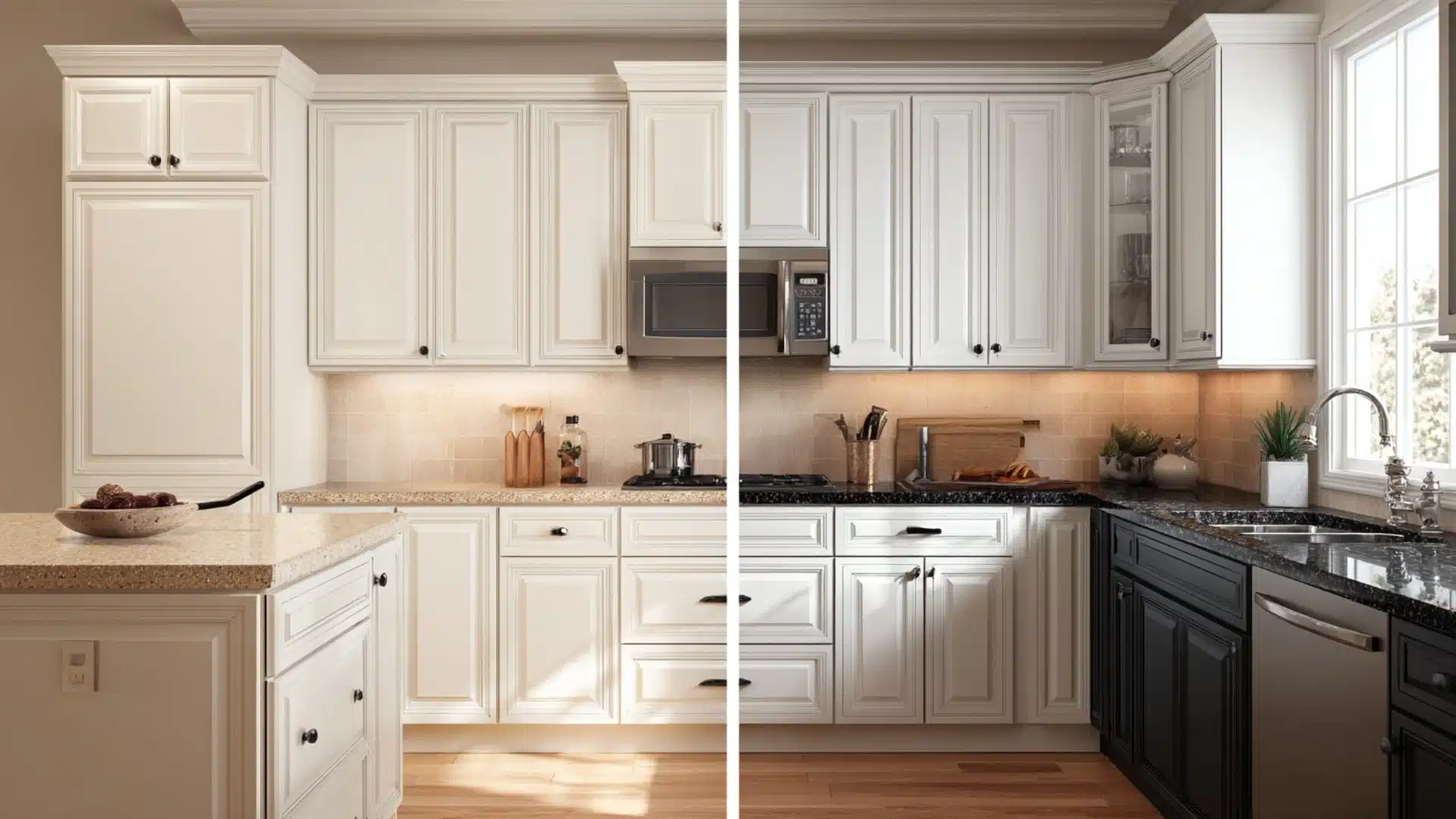
Before: White cabinetry paired with a matching light countertop left the entire kitchen feeling washed out, with no clear visual separation between the work surface and the cabinet doors above.
After: A dark leathered granite or honed soapstone surface replaced the light counter, creating a strong contrast at counter height that made the white cabinetry appear brighter and more defined.
Dark surfaces also conceal water marks and daily prep residue more effectively between cleaning sessions.
13. Thick Mitered Edge Countertop
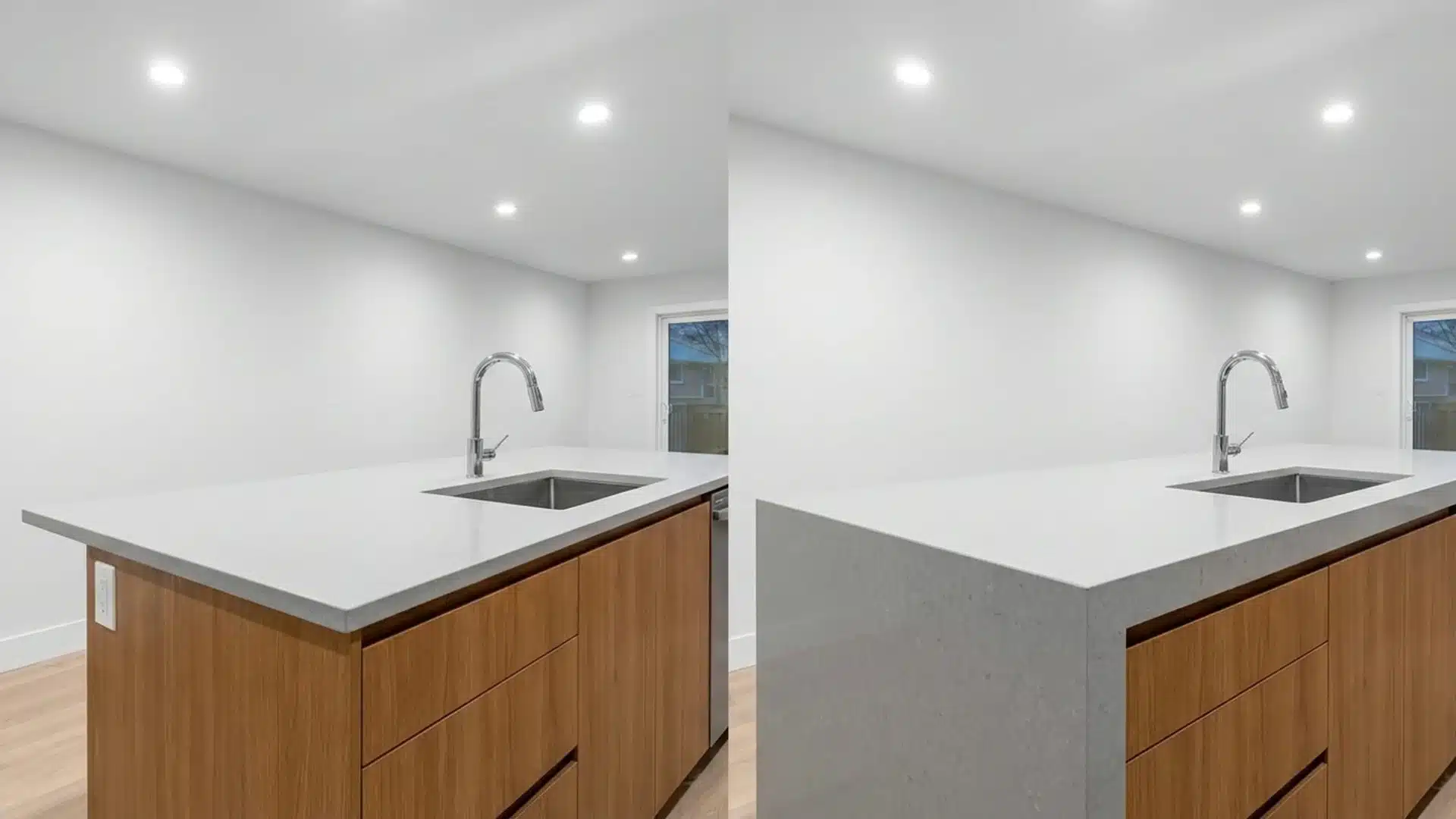
Before: A thin standard slab under an inch and a quarter thick made the island and counters look lightweight and less substantial than the surrounding finishes suggested they should be.
After: A mitered edge was added by fusing a second strip of matching stone beneath the front lip, creating the appearance of a much thicker slab without the added structural weight.
The mitered detail gives the counter a custom, tailored finish that reads as a deliberate design decision.
14. Galley Kitchen Opened Up
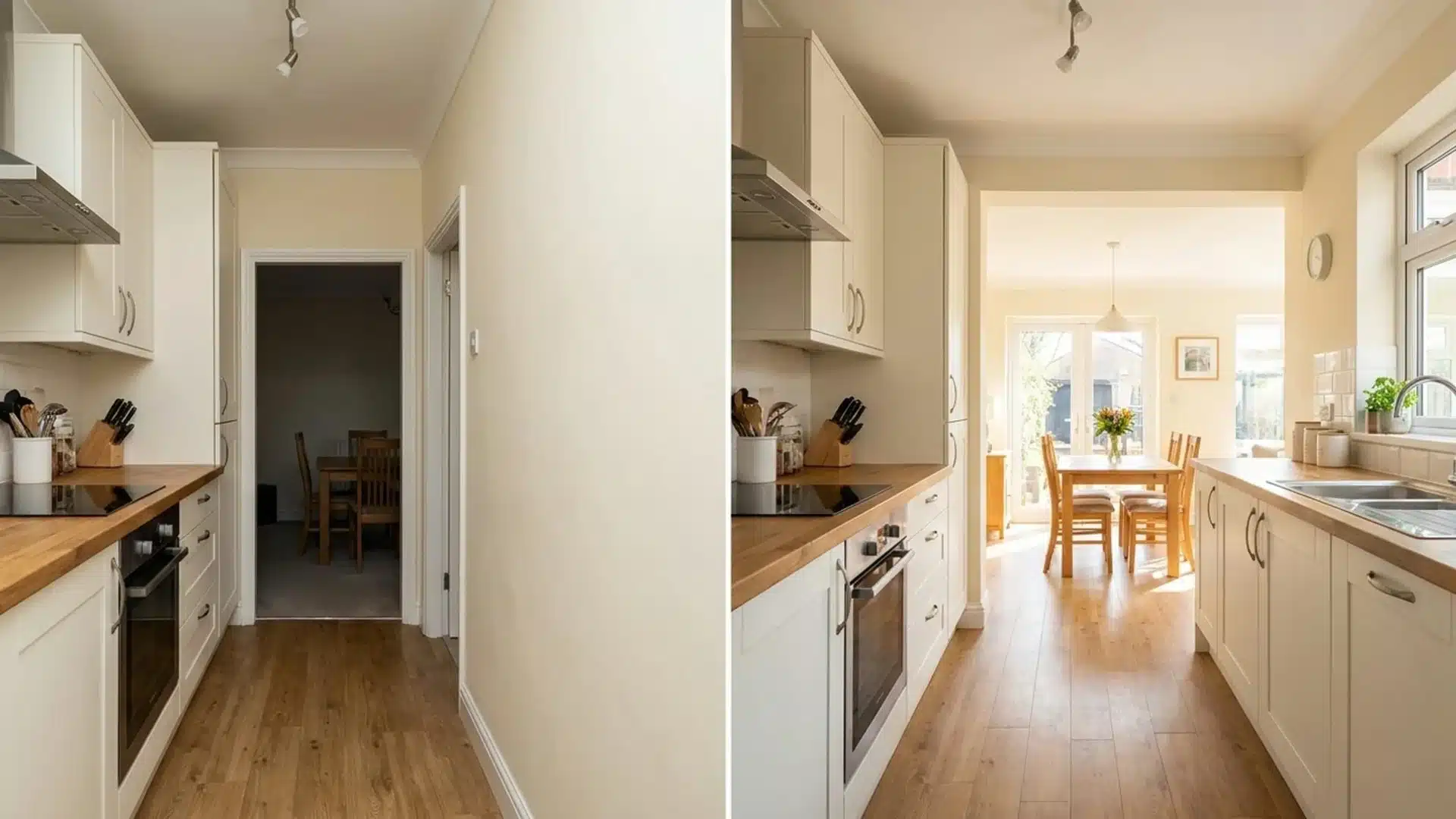
Before: A solid wall on one side of the galley had trapped cooking smells, blocked natural light from reaching either room, and left whoever was cooking completely disconnected from the household.
After: The wall between the kitchen and adjoining dining room was removed, allowing light and conversation to flow freely and turning a corridor-style kitchen into a connected, social cooking space.
The additional visual depth also makes both the kitchen and dining areas feel larger than their actual measurements.
15. Island Added to Small Kitchen
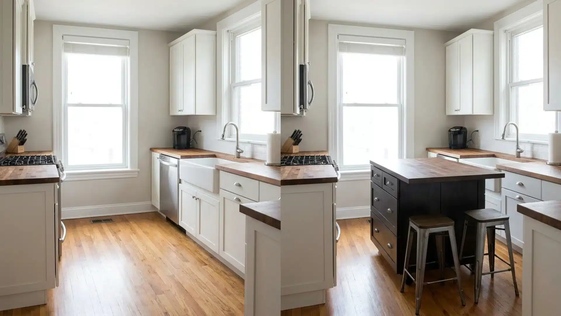
Before: Without a central surface, all food preparation had squeezed onto a narrow counter run that also held the sink, making simultaneous cooking tasks nearly impossible to manage.
After: A mobile cart or fixed island was installed in the open floor zone, introducing dedicated prep space, additional storage underneath, and pull-up seating that the original layout never offered.
The island also creates a natural gathering point that the kitchen had previously lacked entirely.
16. Moving the Sink Location
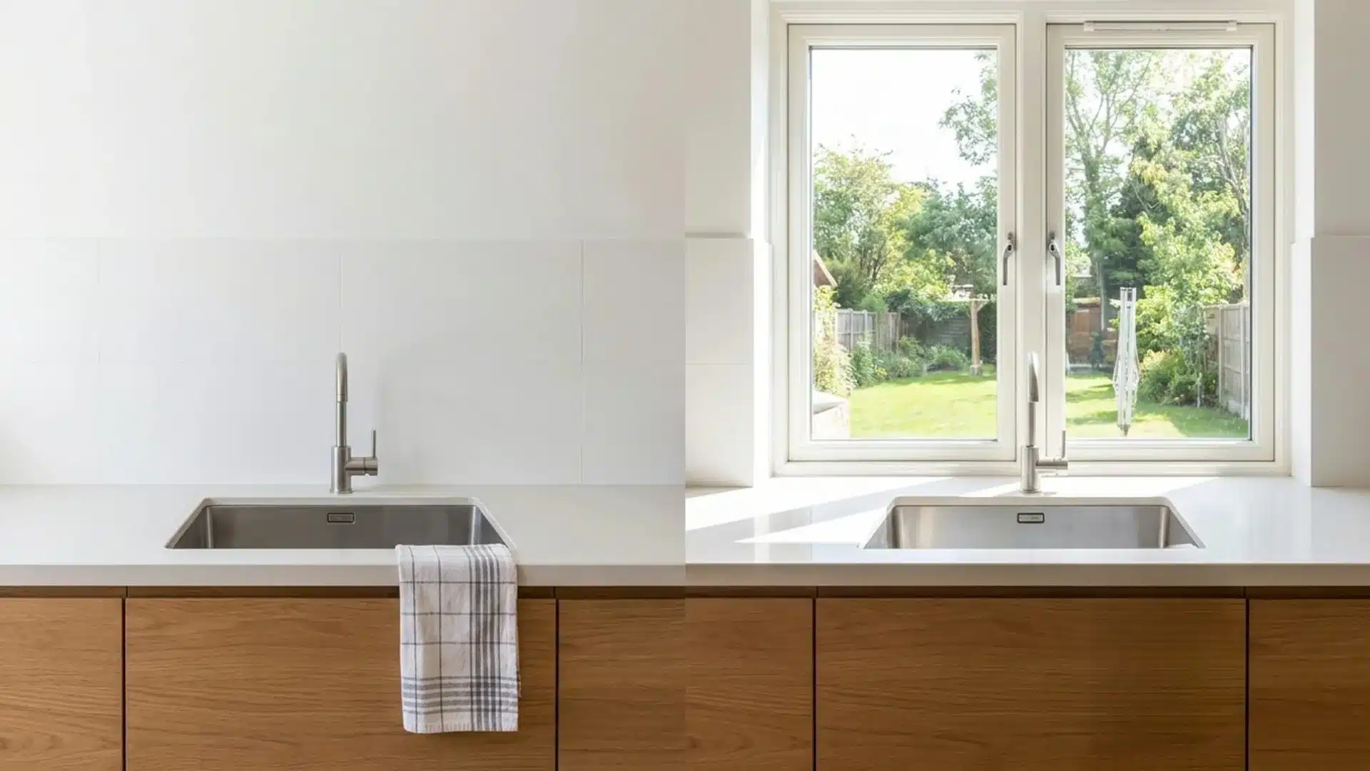
Before: Facing a blank interior wall while washing dishes had made one of the most frequent daily kitchen tasks feel monotonous, with no visual relief and no connection to the outside.
After: The sink was relocated beneath a window, requiring new plumbing lines, but giving the dishwashing position a view outside and allowing natural light to fall directly onto the work area.
The improved placement makes a routine task noticeably more pleasant without changing the kitchen’s overall layout.
17. Pantry Closet Conversion
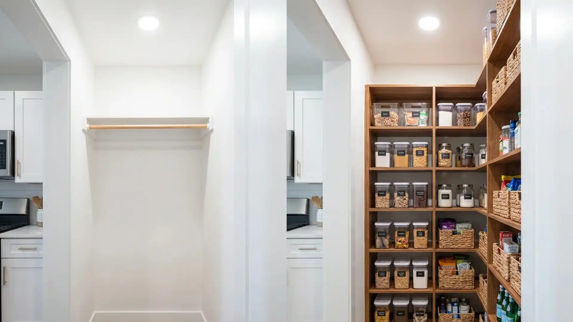
Before: An underused hallway closet near the kitchen had collected miscellaneous items with no consistent purpose, wasting square footage that could have served the kitchen directly.
After: The same closet was emptied and fitted with shelving, hooks, and labeled bins, adding significant dry storage capacity without expanding the footprint or removing any existing kitchen cabinetry.
A dedicated pantry also keeps main kitchen cabinets reserved for cookware and daily-use items only.
18. Kitchen and Dining Room Merged
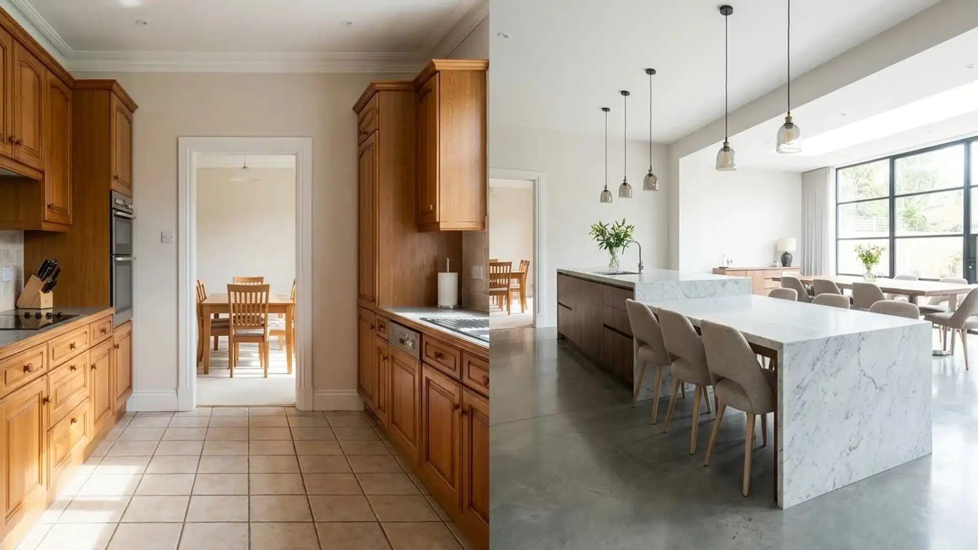
Before: The formal dining room had been underused for most of the year, while the kitchen remained cramped, despite sitting directly next to all that unused, wasted square footage.
After: A wall between the two rooms was removed, combining them into a single continuous space where a large island or extended table serves both cooking and dining in a unified layout.
Guests can now interact with whoever is cooking rather than waiting separately in a disconnected room.
19. Peninsula Removed for Traffic Flow
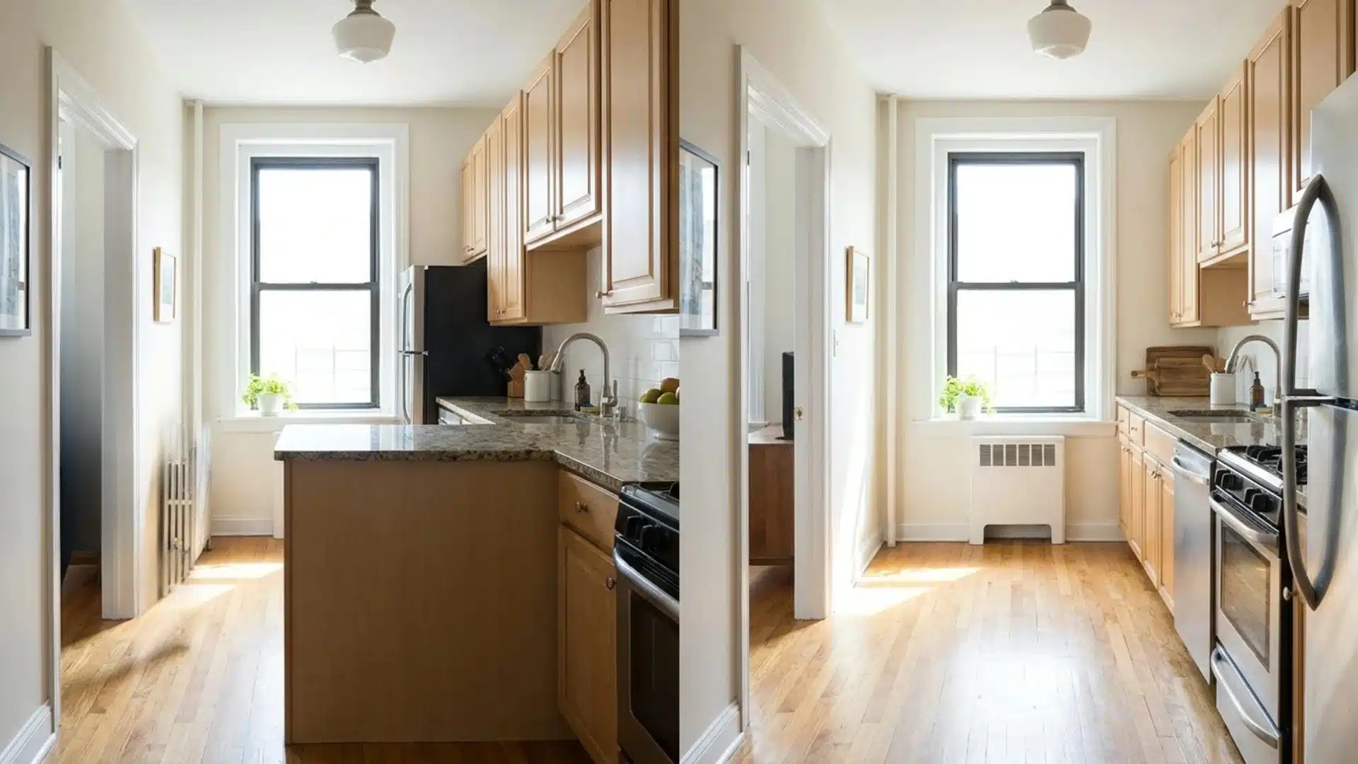
Before: A bulky peninsula counter made it impossible for two people to pass through the kitchen simultaneously, forcing one person to step aside whenever someone needed to move through.
After: The peninsula was demolished entirely, opening a clear walking path through the kitchen and connecting it more naturally to the adjoining room, with no additional structural work required.
The open floor space also makes the kitchen feel more integrated into the surrounding living area.
20. L-Shape to U-Shape Layout
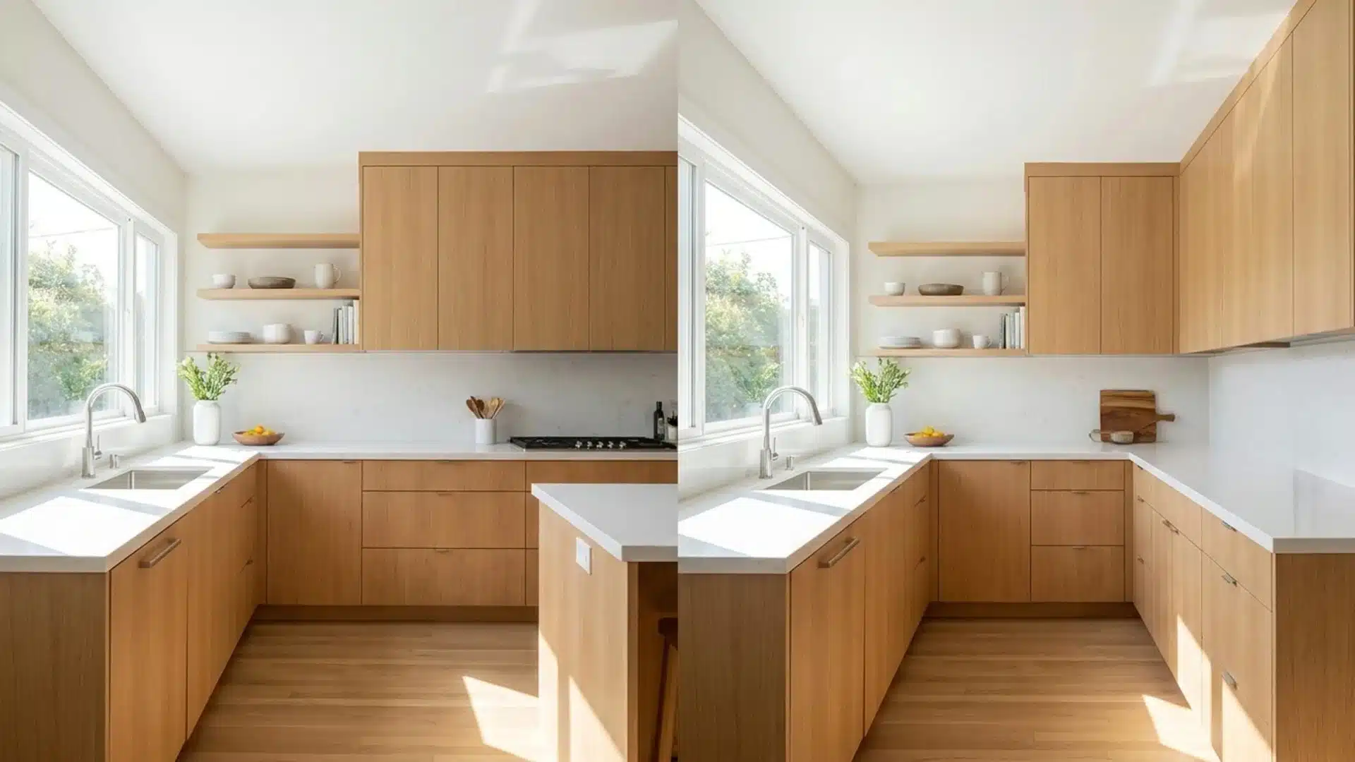
Before: The open third wall had offered no storage or counter function, leaving a large section of the kitchen perimeter completely unused despite being prime real estate within the room.
After: A third run of cabinetry and counter was added to close the layout into a U-shape, increasing storage and counter capacity while keeping the work triangle between appliances fully intact.
The U-shape also creates a natural boundary separating the kitchen zone from the adjoining open living area.
21. Pass-Through Window Added
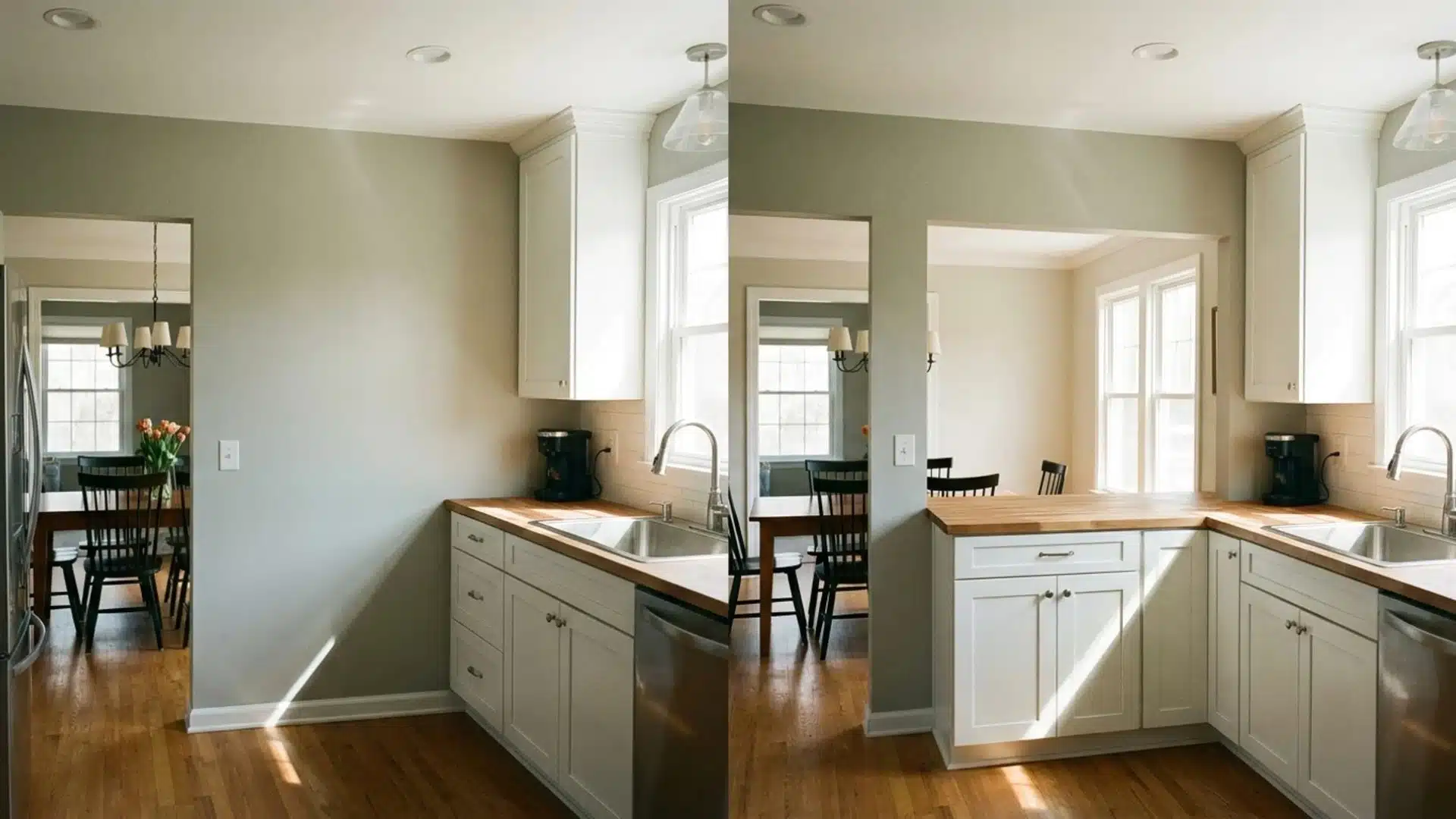
Before: The closed wall between the kitchen and dining room had made serving food a full circuit around the kitchen rather than a simple, direct handoff between adjacent spaces.
After: A counter-height pass-through was cut into the same wall, allowing food and dishes to move directly between rooms and letting light and conversation flow through what had been a blank surface.
The ledge created at pass-through height also doubles as an informal counter during buffet-style gatherings.
22. Vinyl Tile to Hardwood
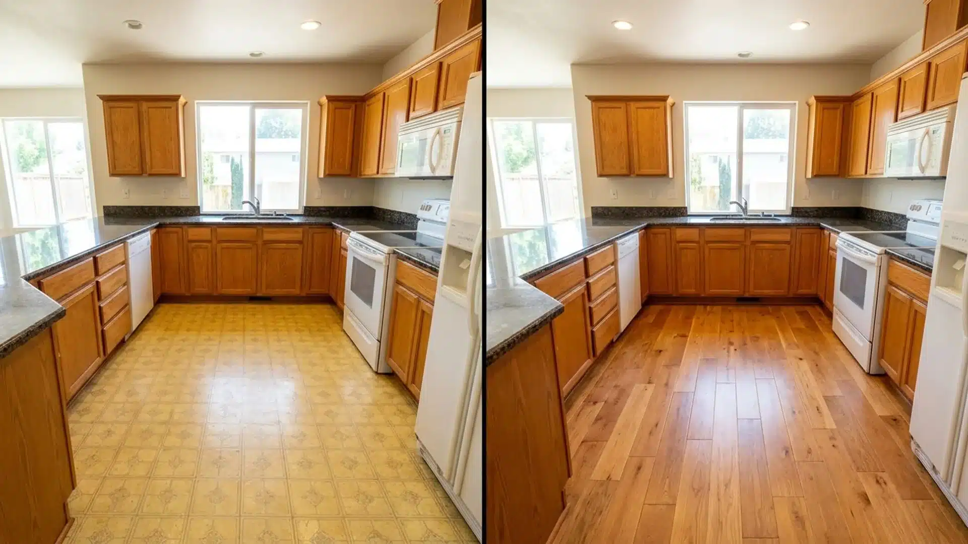
Before: Lifted tile edges in high-traffic zones had created trip hazards and allowed moisture to seep beneath, weakening the adhesive bond and accelerating deterioration across the floor.
After: Engineered hardwood planks were installed over the same footprint, adding warmth underfoot, lasting far longer under daily wear, and flowing more naturally into adjoining rooms throughout the home.
Hardwood also removes the visual break that vinyl tile had previously created at the room boundary.
23. Large Format Tile Installation
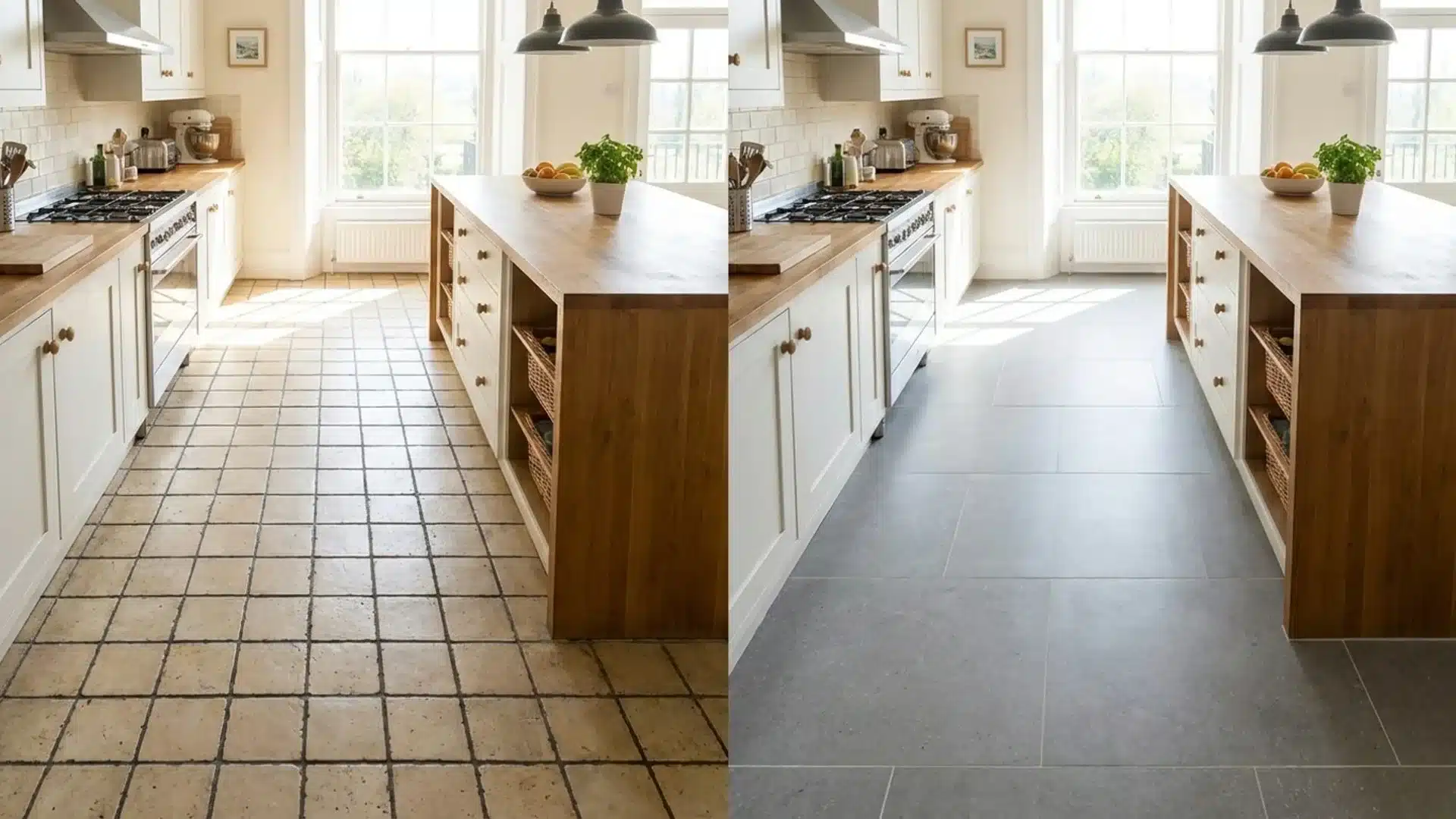
Before: A dense grid of small ceramic tiles across the floor had made the kitchen feel smaller and required more frequent deep cleaning to maintain the grout lines between each tile.
After: Oversized 24-by-48-inch porcelain slab tiles replaced the smaller format, dramatically reducing visible grout lines and giving the floor a cleaner, more expansive, contemporary appearance overall.
Large-format tile also reflects light across a wider surface area, adding brightness to the entire room.
24. Herringbone Pattern Tile
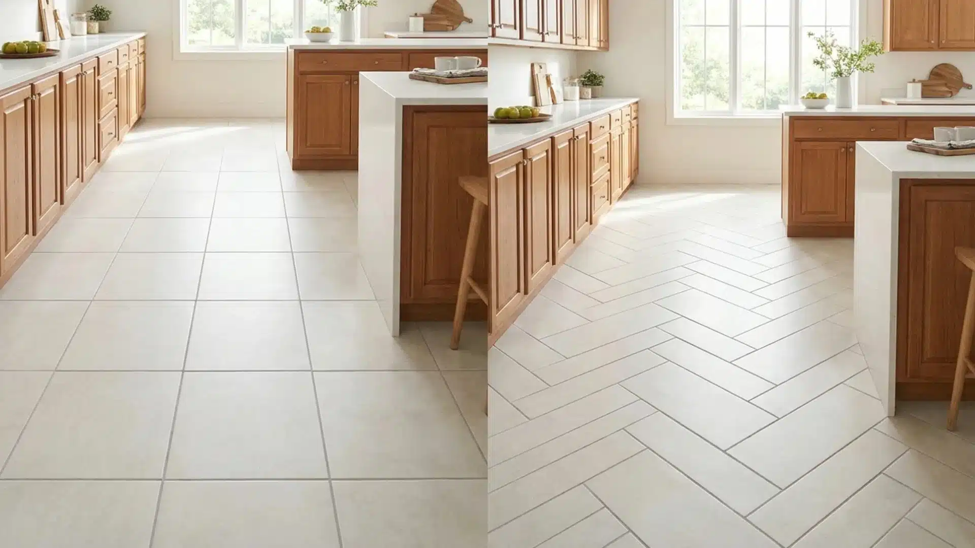
Before: Straight grid tile had read as plain and predictable underfoot, adding nothing to the visual character of the space and blending into the background regardless of the tile color chosen.
After: The same tile material was relaid in an angled herringbone pattern, adding visual movement and a custom, designed quality to the floor that a basic grid simply cannot achieve.
The herringbone direction also leads the eye toward a specific focal point, such as the island or range wall.
25. Mixing Wood and Tile
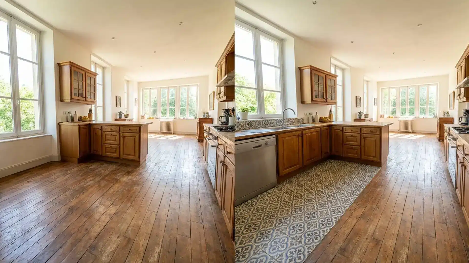
Before: A single continuous flooring material had treated the entire kitchen as a single, undifferentiated zone, ignoring the fact that different areas of the room serve very different daily functions.
After: A deliberate transition was added between wood flooring in the main cooking area and tile near the sink, clearly defining functional zones within the same open layout without any wall additions.
Tile near the sink provides water resistance exactly where it matters most during daily kitchen use.
26. Dark Floor vs. Light Floor
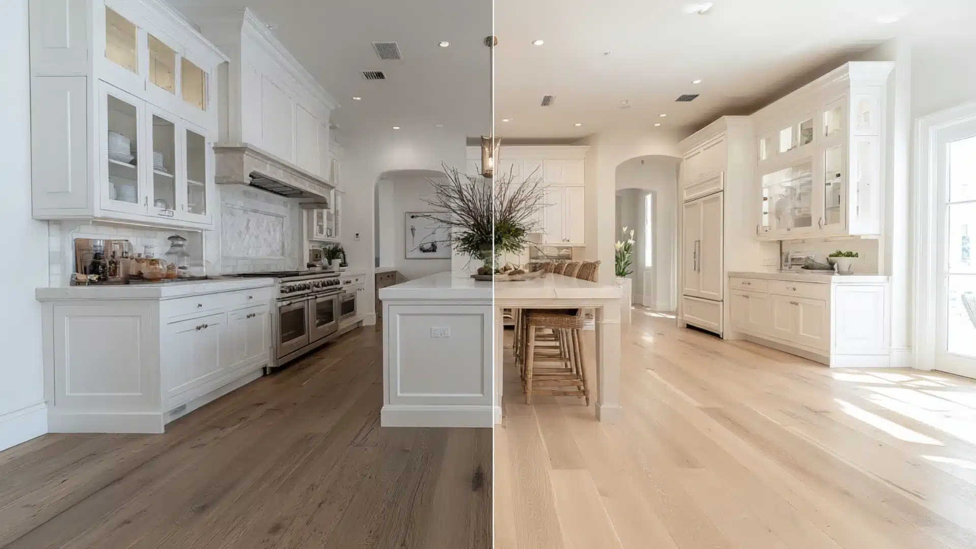
Before: A mid-tone floor had done neither job well, neither grounding the room strongly nor opening it up visually, leaving the kitchen feeling unresolved from the floor upward.
After: The floor was replaced with either dark espresso planks to ground the space or light whitewashed oak to visually expand it, depending on what the cabinet color required for balance.
Choosing floor tone relative to cabinet color is one of the highest-impact flooring decisions a kitchen remodel can make.
27. Luxury Vinyl Plank Over Tile
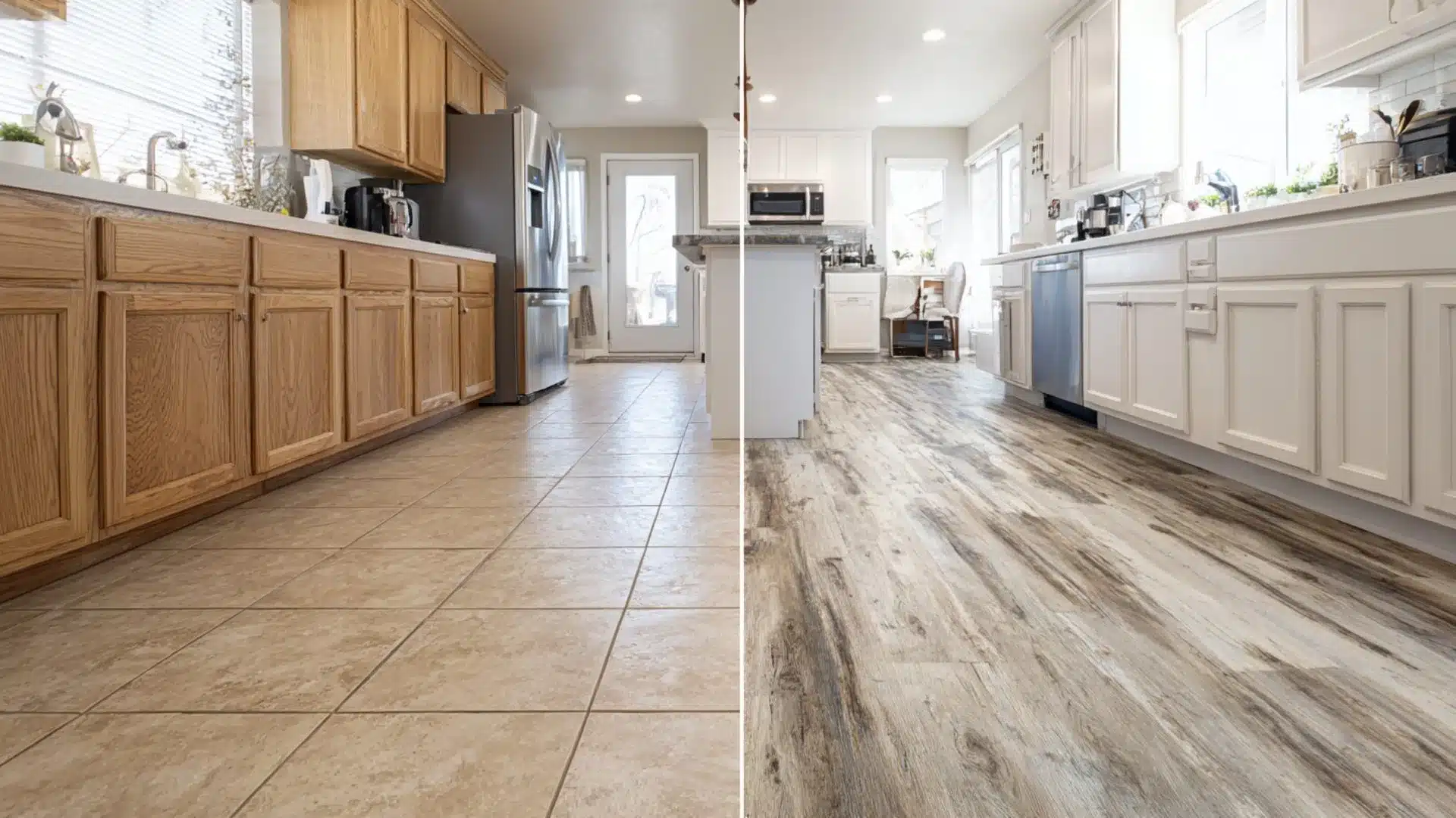
Before: Tearing out the original ceramic tile would have required significant labor, subfloor repairs, and additional project time, making full removal an impractical choice given the available budget.
After: New luxury vinyl plank flooring was floated directly over the existing tile, avoiding demolition entirely while delivering a wood-look finish that feels noticeably warmer underfoot than ceramic tile.
Luxury vinyl also handles moisture and temperature fluctuations better than real wood in kitchen conditions.
28. Skylights or Solar Tubes Added
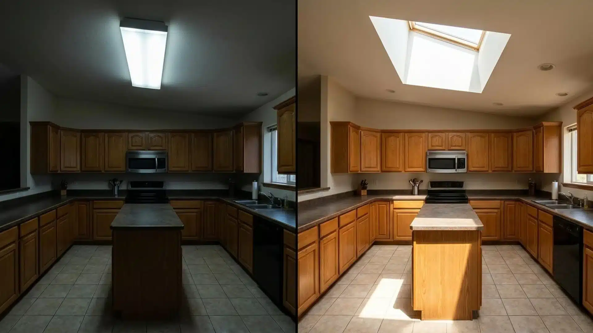
Before: Running artificial lights throughout the day had made the room feel sealed off, regardless of how well the cabinets and counters had been updated around the lighting problem.
After: Skylights or solar tubes were cut into the roof structure above the kitchen, brightening the room with real daylight and reducing dependence on electric lighting during daytime cooking and cleanup.
Natural overhead light also renders food colors and surface materials more accurately than any artificial alternative can.
29. Recessed Lighting Grid Added
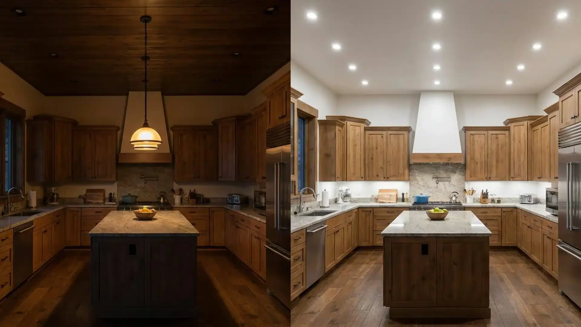
Before: A single central ceiling fixture had cast light primarily onto the floor and middle of the room, leaving every work surface in the shadow of whoever was standing at it.
After: A grid of recessed can lights was wired across the ceiling, spreading illumination evenly over every counter and removing shadow gaps near the sink and stove throughout the kitchen.
A well-planned recessed layout entirely eliminates the need for supplementary task lighting in most kitchens.
30. Pendant Lights Over Island
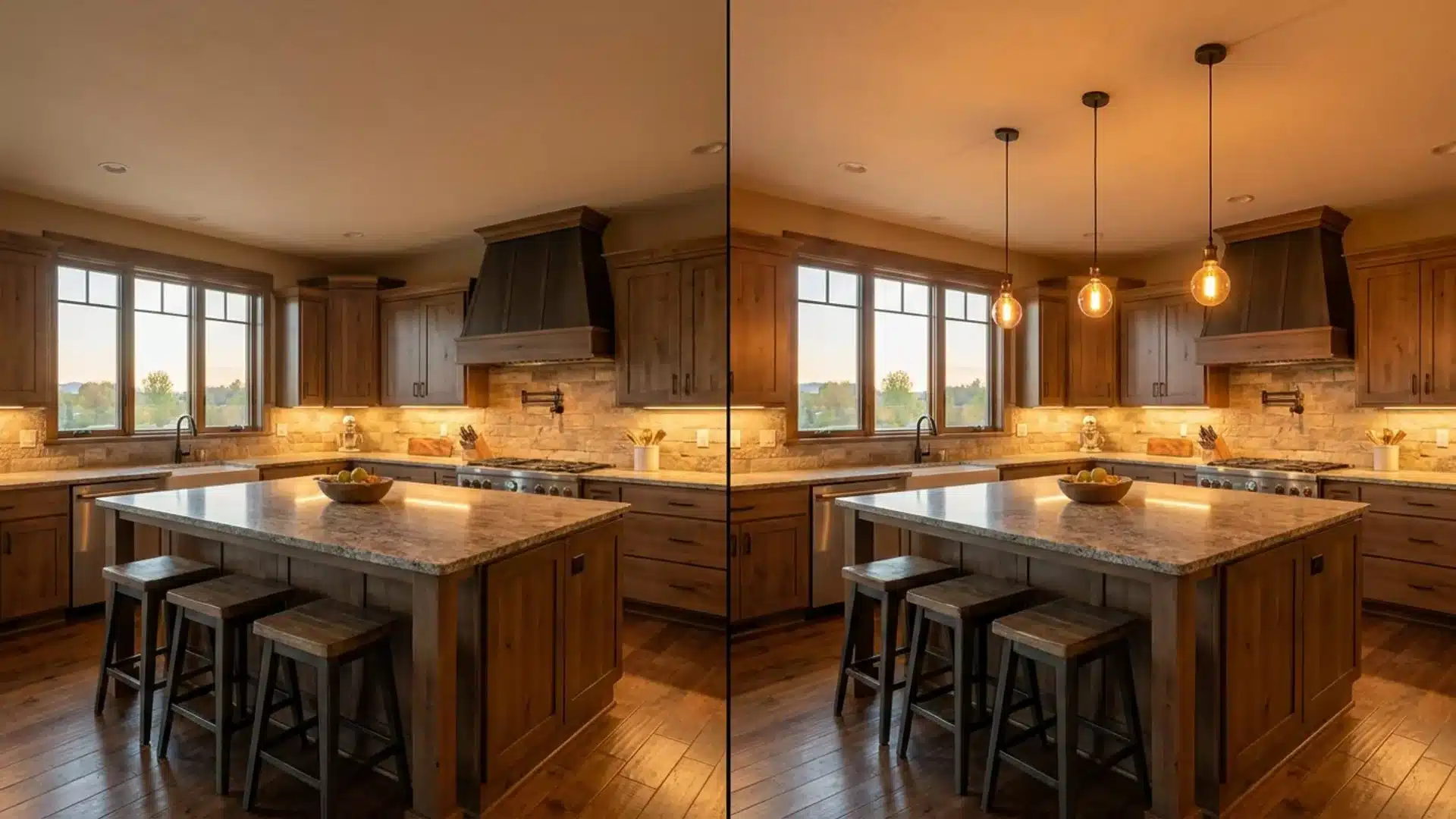
Before: Without a dedicated light source directly above, the island had relied on ambient room light, which never adequately illuminated the work surface during evening food preparation.
After: A row of pendant lights was hung at counter height above the island, directly fixing the light gap, creating a visual centerpiece, and making the island fully usable after dark.
Pendants also introduce fixture style and material that influence the kitchen’s overall design direction more than most people expect.
31. Under-Cabinet LED Strip Install
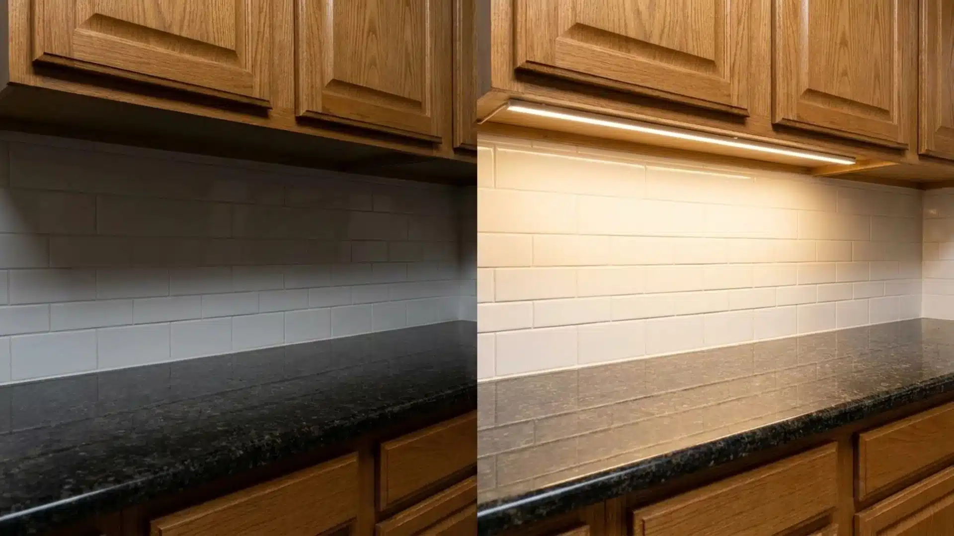
Before: The shadow cast by the upper cabinet boxes had fallen directly onto the counter below, making precision tasks like slicing and measuring consistently harder than the overall light level suggested.
After: LED strips were installed along the underside of every upper cabinet, placing direct light exactly where hands work and highlighting backsplash materials previously lost in the dim counter zone.
The strips also significantly reduce the risk of cutting or burning during food preparation.
32. Replacing Fluorescent Tubes
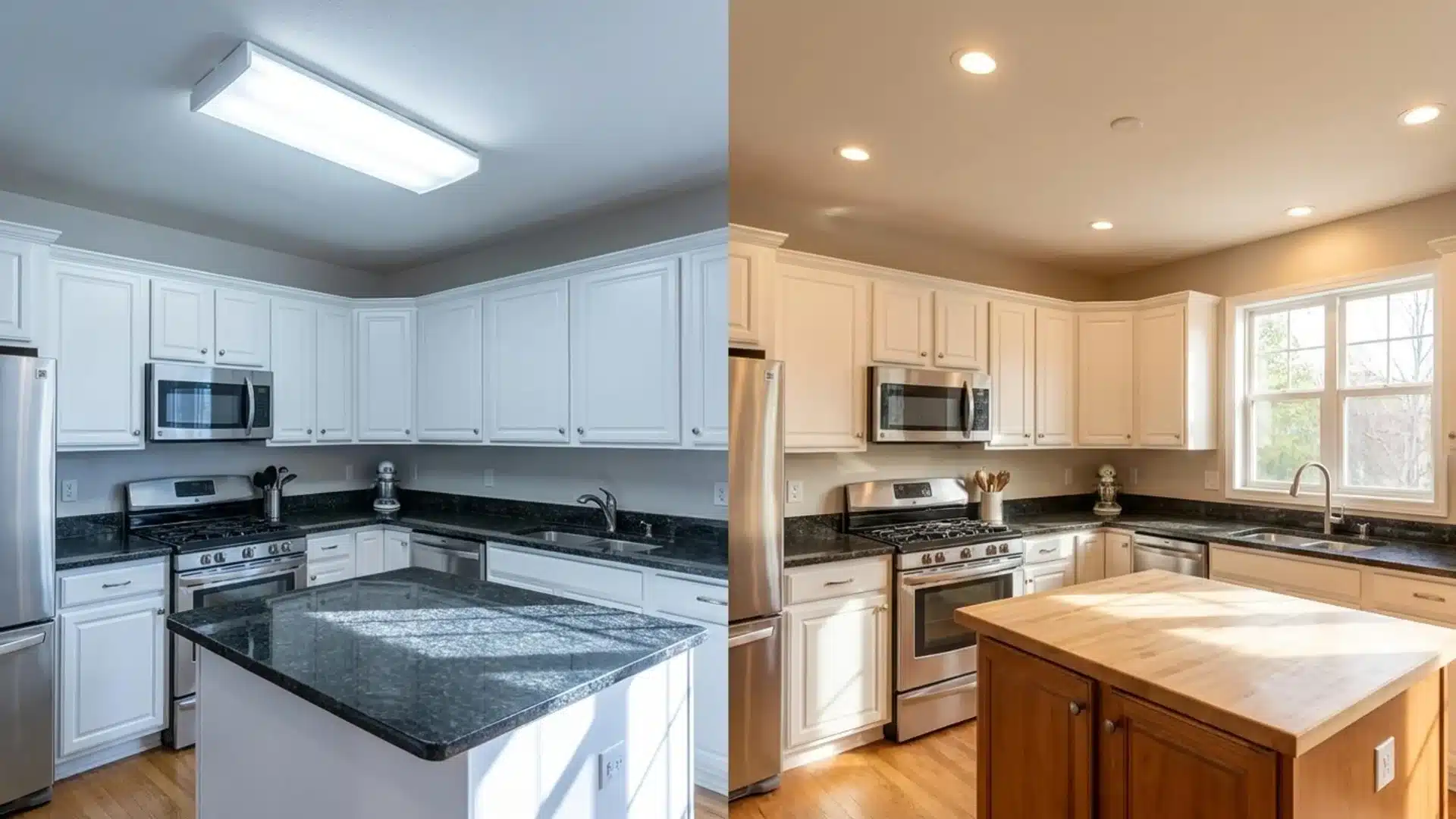
Before: The cold blue-white tone of the original fluorescent box had made fresh ingredients look washed out and given the entire kitchen a clinical atmosphere far removed from any sense of warmth.
After: A modern flush-mount LED fixture or recessed layout replaced the fluorescent box, instantly warming the color temperature and removing the dated office-ceiling appearance from the room entirely.
The replacement also eliminates the audible hum fluorescent fixtures develop as their components age.
33. Statement Chandelier in Kitchen
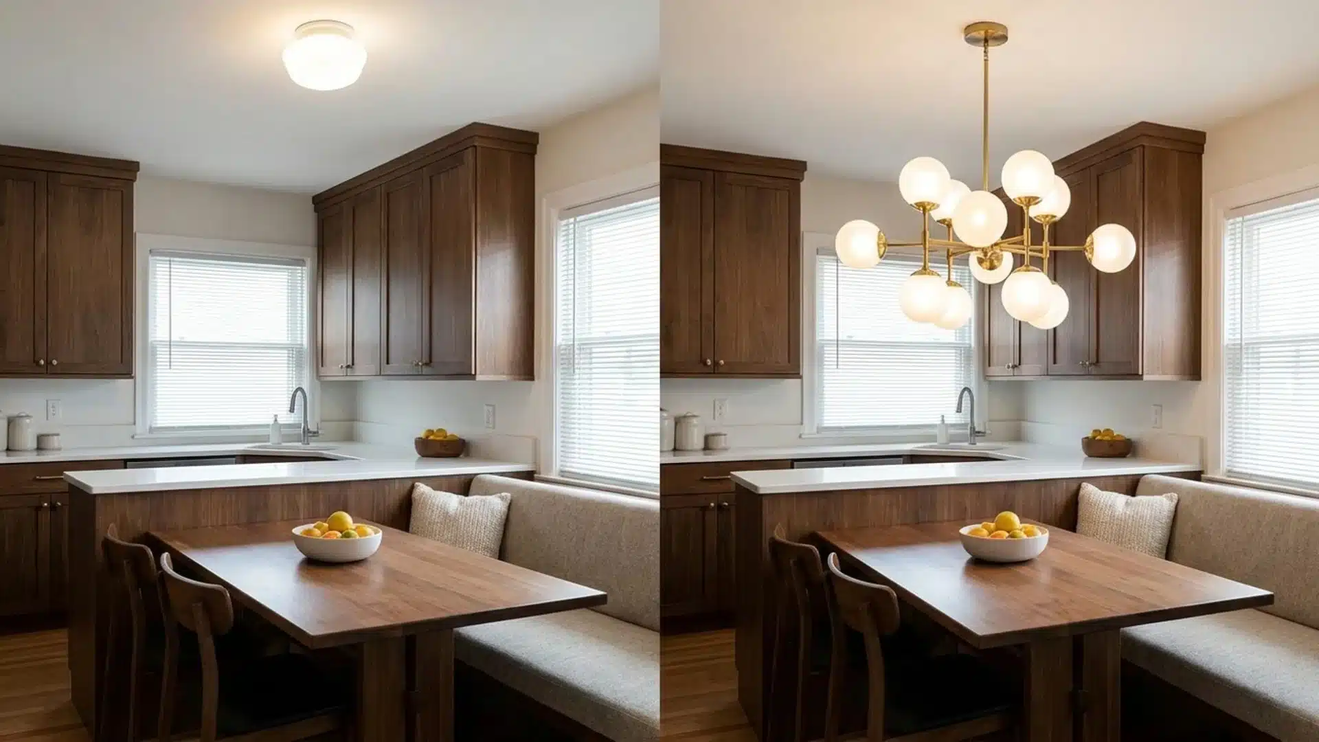
Before: A plain dome fixture hanging above the island had made the upper zone of the kitchen feel like an afterthought, pulling attention away from everything that had been carefully updated below it.
After: A brass or glass globe or linear chandelier replaced the basic fitting, turning a purely functional ceiling element into the focal point people notice first upon entering the room.
The fixture choice alone sets the overall tone for the kitchen’s design direction more than almost any other single element.
34. Cabinet Interior Lighting
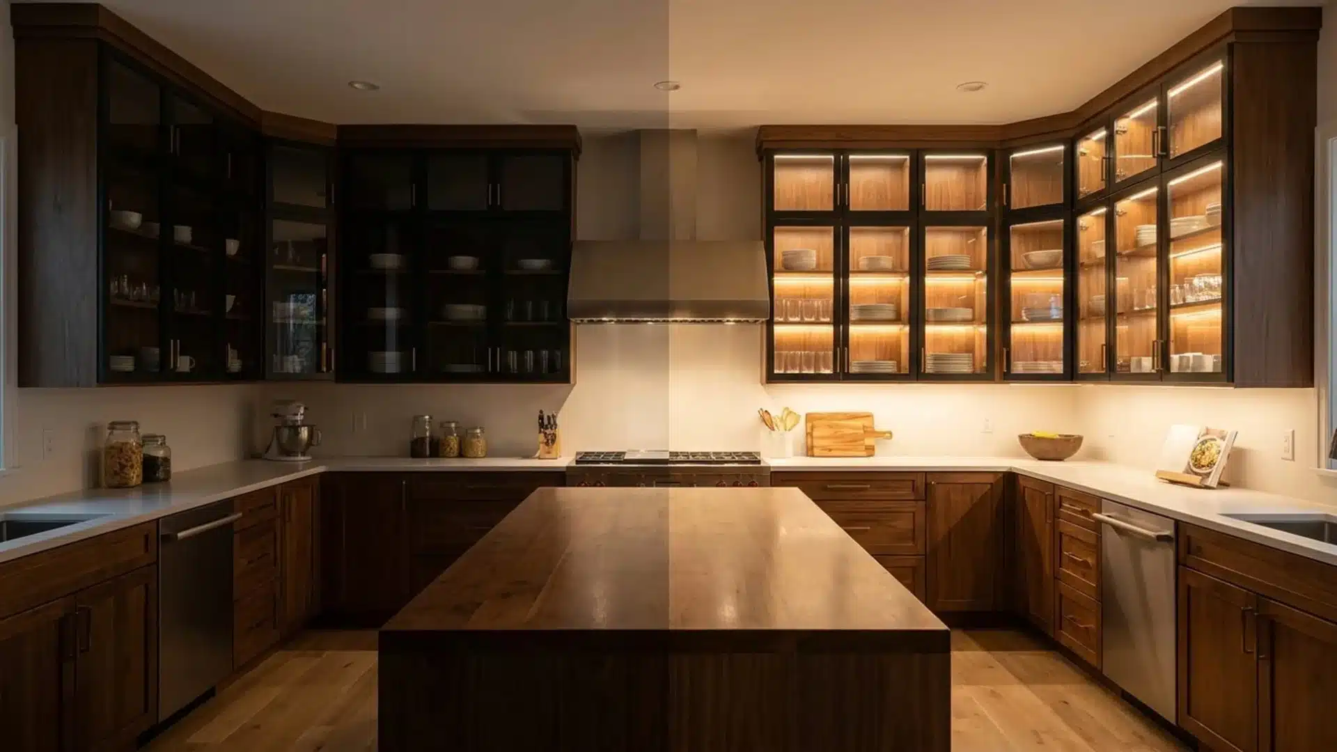
Before: Exterior room lighting had never reached the interior of the cabinet boxes, leaving glassware and dishes sitting in shadow behind glass that was specifically installed to frame and display them.
After: Small LED strips were added inside the cabinet boxes, turning plates, glassware, and collectibles into an actual display feature rather than items sitting in unlit, invisible storage behind glass.
The interior glow also adds warmth to the overall kitchen atmosphere, particularly in the evening.
35. Adding a Kitchen Island with Seating
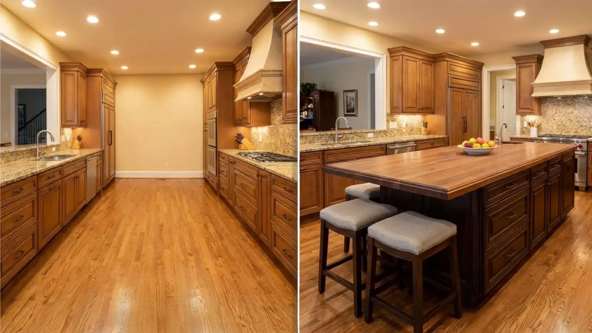
Before: Open floor space between the counter runs had created a disconnected gap in the kitchen, making the room feel sparse and leaving no surface available for casual seating or additional prep work.
After: A fixed island with an extended overhang was added to the open floor zone, introducing dedicated prep space, under-counter storage, and pull-up stool seating that the layout had never previously offered.
The island also creates a natural boundary between the kitchen and the adjoining room without requiring any walls.
36. Tile to Full Slab Backsplash
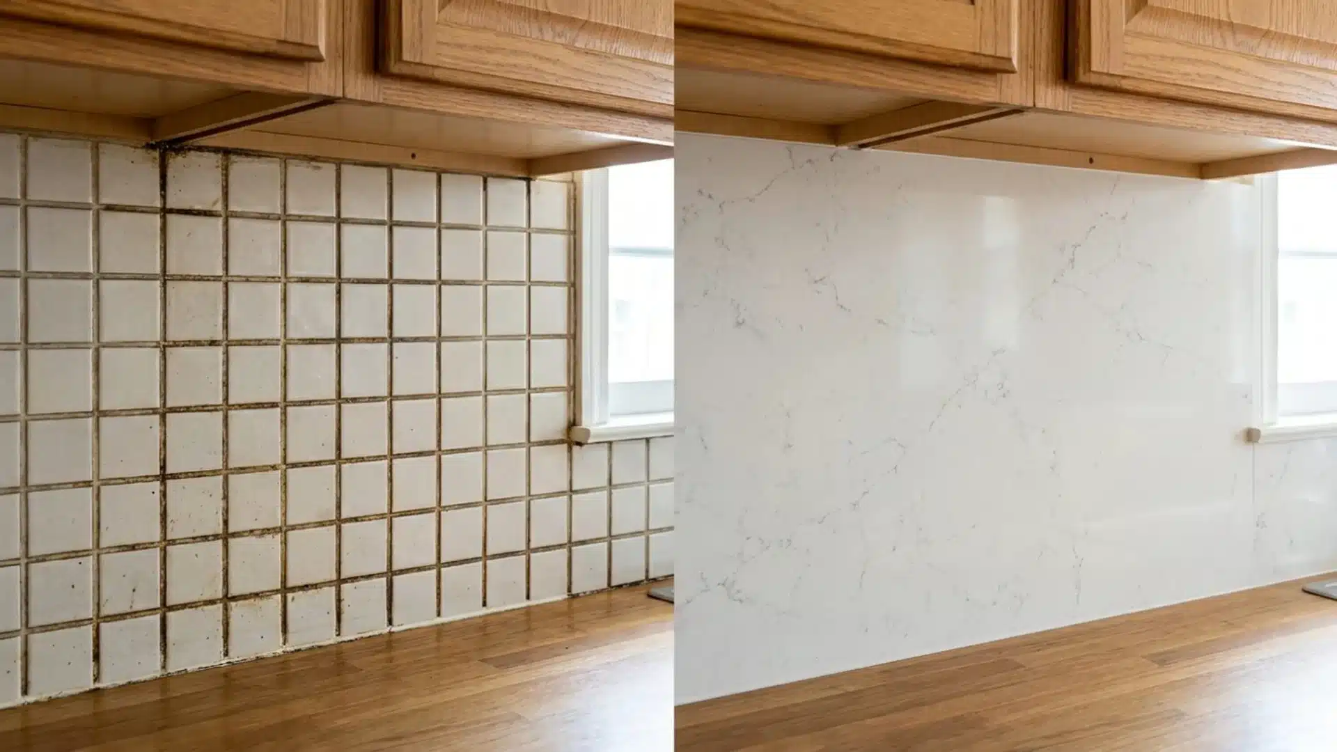
Before: Grout lines between the small backsplash tiles had darkened permanently over time, making the wall look aged regardless of how thoroughly or frequently the surface was cleaned.
After: A single matching stone slab was installed across the same wall, eliminating every grout line and creating a smooth, continuous surface that wipes clean in seconds after cooking.
The slab also makes the counter-to-wall transition read as one unified material rather than two separate elements.
37. Standard Tile to Zellige Tile
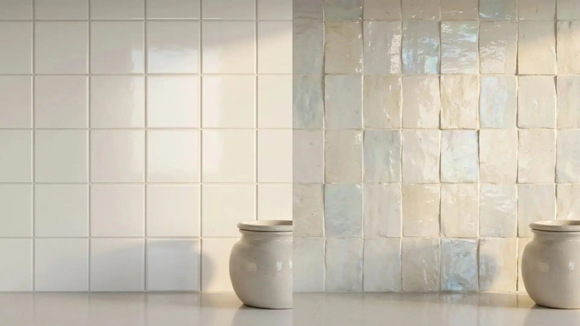
Before: A flat, machine-made tile backsplash had made the wall behind the counter disappear into the background, contributing nothing to the kitchen’s character despite occupying a prominent visual position.
After: Handmade Moroccan zellige tile in a soft glaze was installed over the same area, introducing subtle color and surface variation that catches light differently depending on the angle and time of day.
The irregular surface means the backsplash looks genuinely different throughout the day as natural light shifts.
38. Removing Old Decorative Tile
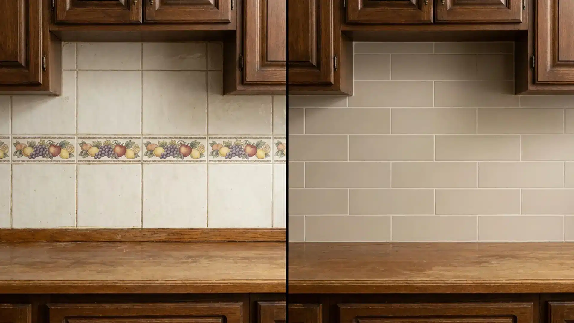
Before: A fruit-or-rooster-motif tile border had become the first thing anyone noticed upon entering the kitchen, drawing attention away from everything that had been improved around it over the years.
After: The dated border was removed and replaced with a plain, neutral tile in a simple pattern, keeping the rest of the kitchen design current without a competing, outdated focal point.
Removing the border also made the backsplash wall feel taller and more visually open overall.
39. Brick Veneer Backsplash
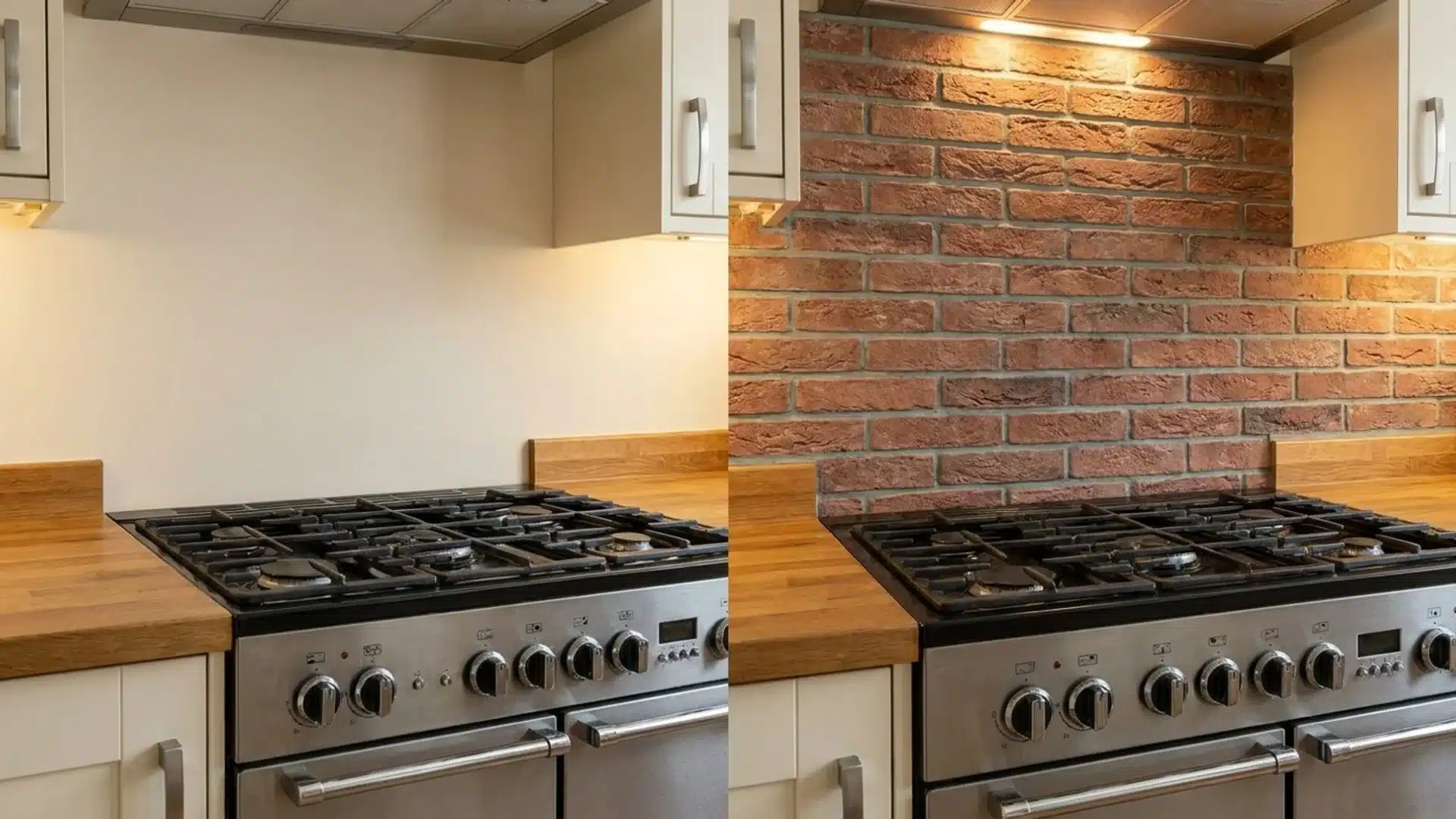
Before: A flat, featureless painted wall behind the range had made the most active area of the kitchen feel like the least considered part of the entire room’s design.
After: Thin brick veneer panels were installed along the same wall section, adding an industrial texture that contrasts effectively with both modern flat-panel and traditional raised-panel cabinet styles.
The textured surface also frames the range and hood as a deliberate design centerpiece rather than standalone equipment.
40. Bold Pattern Tile Behind Range
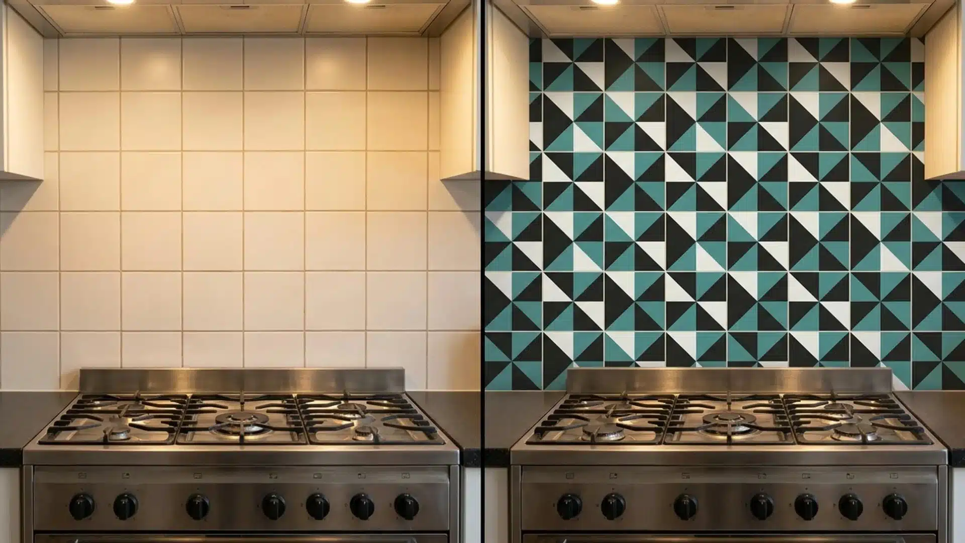
Before: A plain neutral tile wall behind the stove had blended so thoroughly into the surrounding kitchen that the cooking zone carried no visual distinction from any other part of the room.
After: A bold geometric or patterned tile replaced the plain surface in that spot, creating a clear visual anchor behind the range that draws the eye directly to the cooking area.
A strong pattern behind the range also makes the hood and appliances read as part of a designed vignette.
41. Mirrored Backsplash Installation
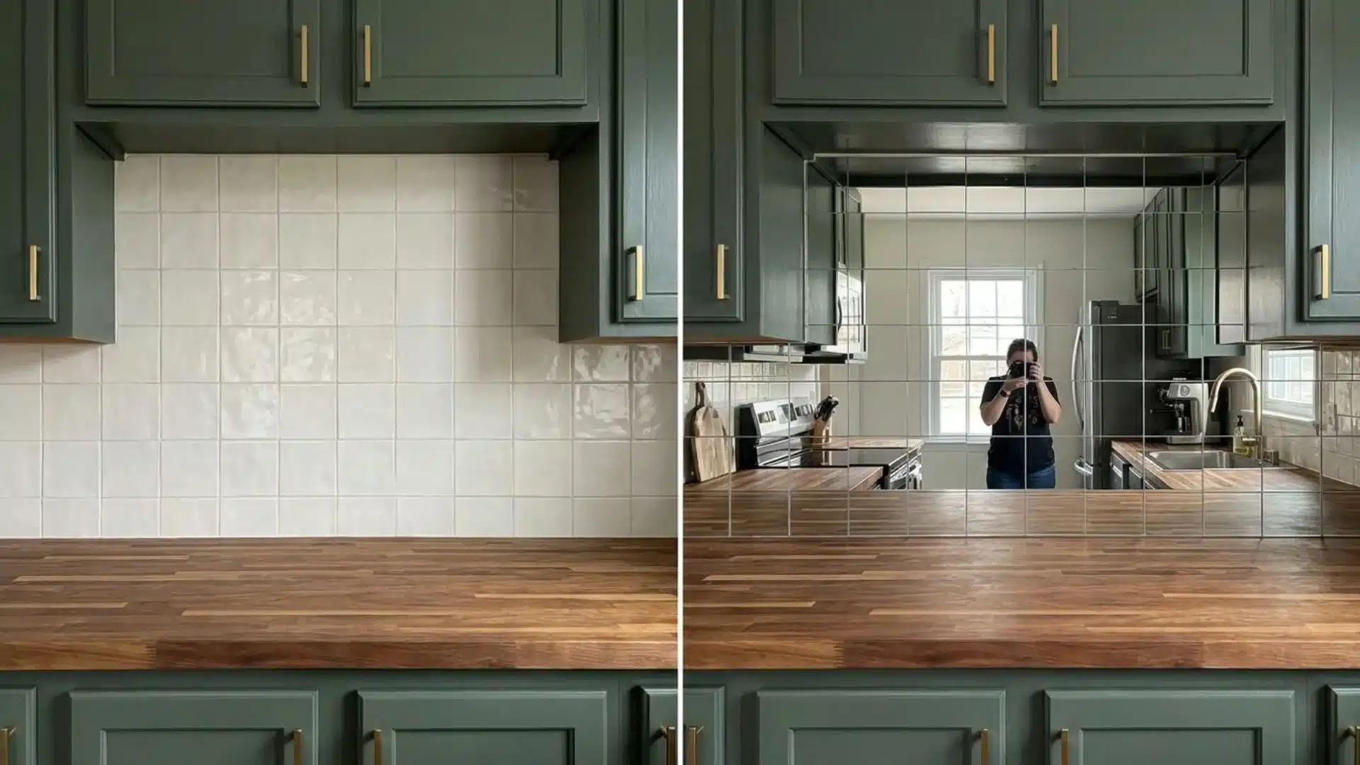
Before: A matte tile finish on the counter wall had absorbed available light, making the already compact kitchen feel more enclosed, particularly at midday, when outside brightness was at its peak.
After: Mirrored tile panels replaced the matte surface, bouncing light back across the room and creating the visual impression of a larger, more open space without adding any physical square footage.
The reflective surface also makes counter materials and fixtures appear richer by reflecting them back into the room.
42. White Appliances to Stainless
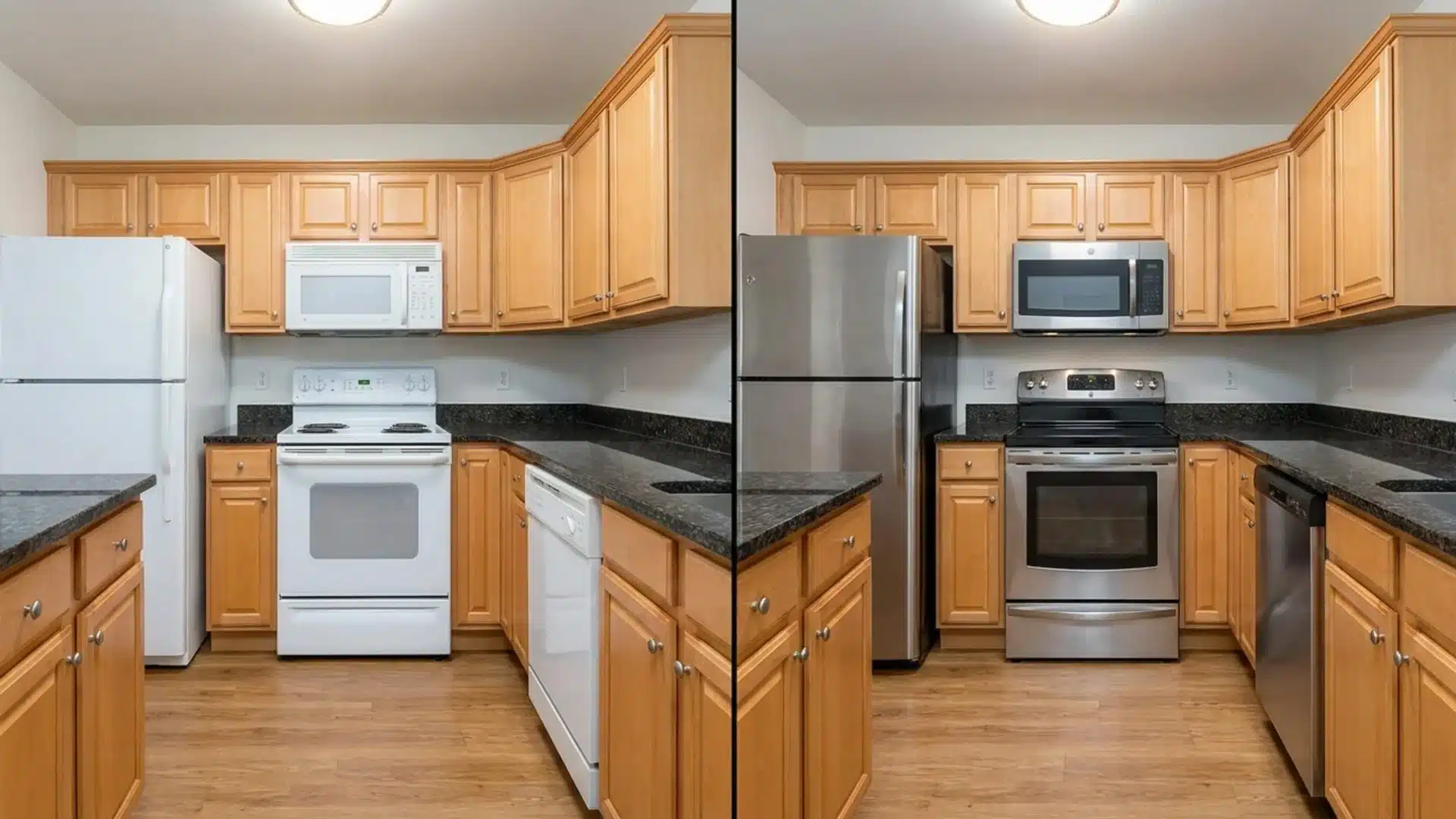
Before: A white appliance suite had slightly yellowed with age and clashed visibly with newer cabinet colors and countertops added during partial updates over several years.
After: Each appliance was replaced with a stainless-steel model in the same footprint, delivering a finish that pairs more easily with a wider range of cabinet and counter color combinations.
Stainless steel also reinforces the sense that the kitchen is built around performance rather than period aesthetics.
43. Single Basin to Farmhouse Sink
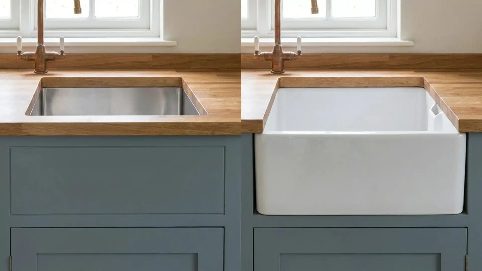
Before: Fitting a sheet pan or stockpot into the shallow standard basin had required awkward repositioning and careful balancing, making routine kitchen tasks more inconvenient than they needed to be.
After: An apron-front farmhouse sink replaced the original, extending past the cabinet face to easily accommodate oversized cookware while introducing a distinct traditional focal point at the counter.
The exposed front panel of the farmhouse sink also introduces a design element visible from across the room.
44. Freestanding Range to Built-In
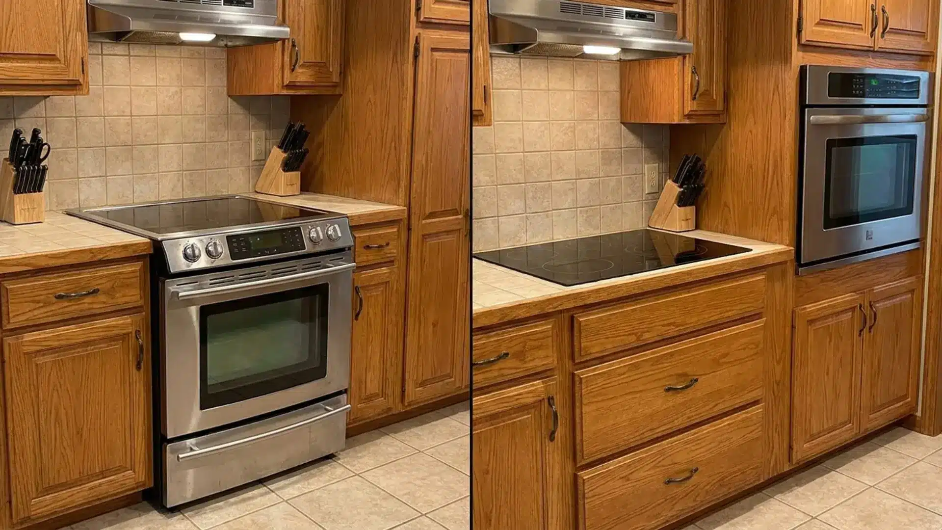
Before: Side gaps between the freestanding range and adjacent cabinets had constantly collected crumbs and spills, requiring the heavy appliance to be moved repeatedly just for routine cleaning underneath it.
After: A built-in cooktop and separate wall oven replaced the slide-in range, closing the side gaps entirely and positioning the oven at a standing height more comfortable for daily use.
Separating the cooktop from the oven also allows two people to use both simultaneously without interference.
45. Adding a Drawer Microwave
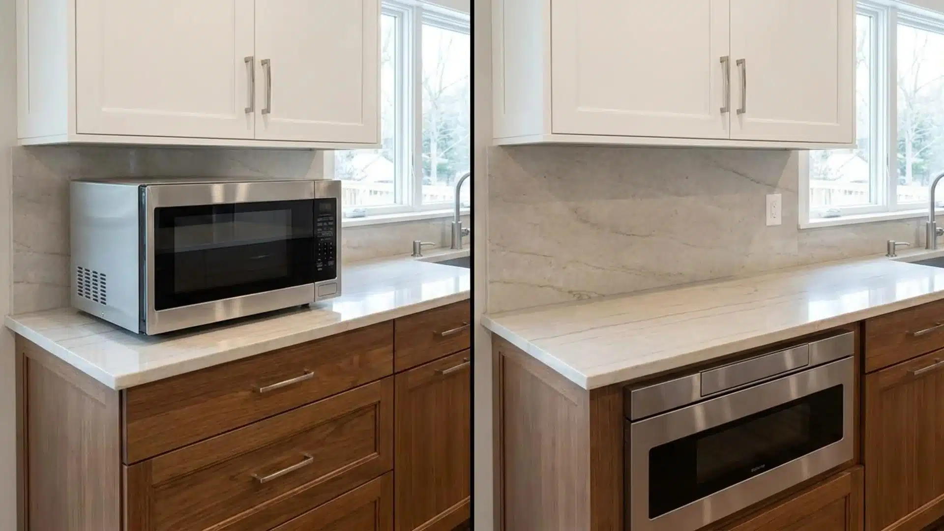
Before: A countertop microwave positioned at eye level visually dominated the counter despite being one of the least attractive appliances in the kitchen, significantly reducing usable prep space.
After: A drawer microwave was installed in a lower cabinet, freeing the entire counter surface and placing the appliance at a pull-out height that is more convenient and safer for all household members.
Relocating the microwave below the counter also removes it from the primary sightline when entering the room.
46. Upgrading to a Counter-Depth Fridge
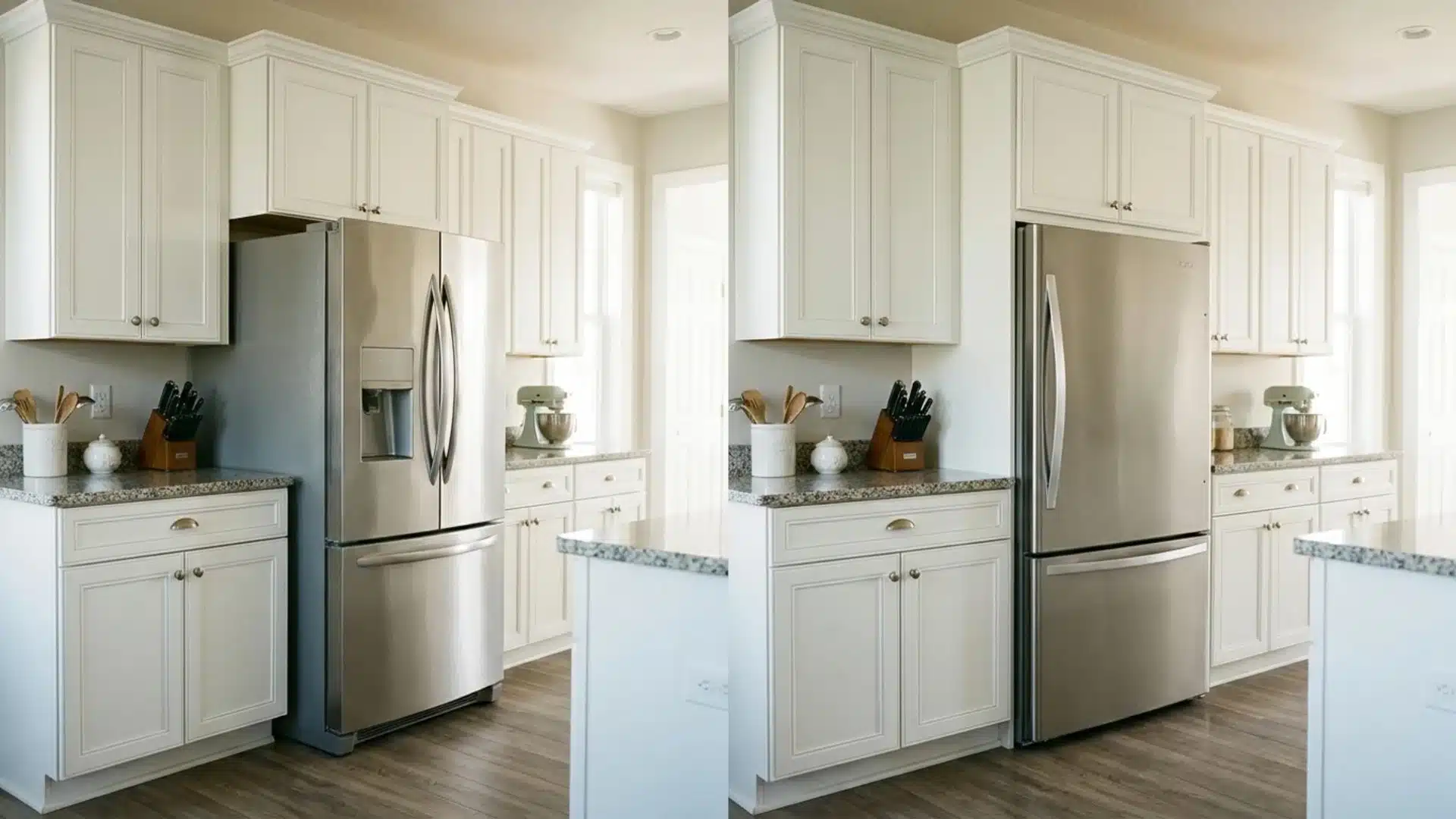
Before: A standard-depth refrigerator had disrupted the clean line of the counter run and created a physical obstacle in the walking path near the kitchen entrance, affecting daily movement.
After: A counter-depth model replaced it in the same spot, sitting flush with the surrounding counters to improve circulation through the kitchen and making the refrigerator feel like it was planned into the cabinetry.
The flush alignment removes the visual interruption that a protruding appliance creates along an otherwise clean wall.
47. Converting a Kitchen Ceiling to Coffered or Shiplap
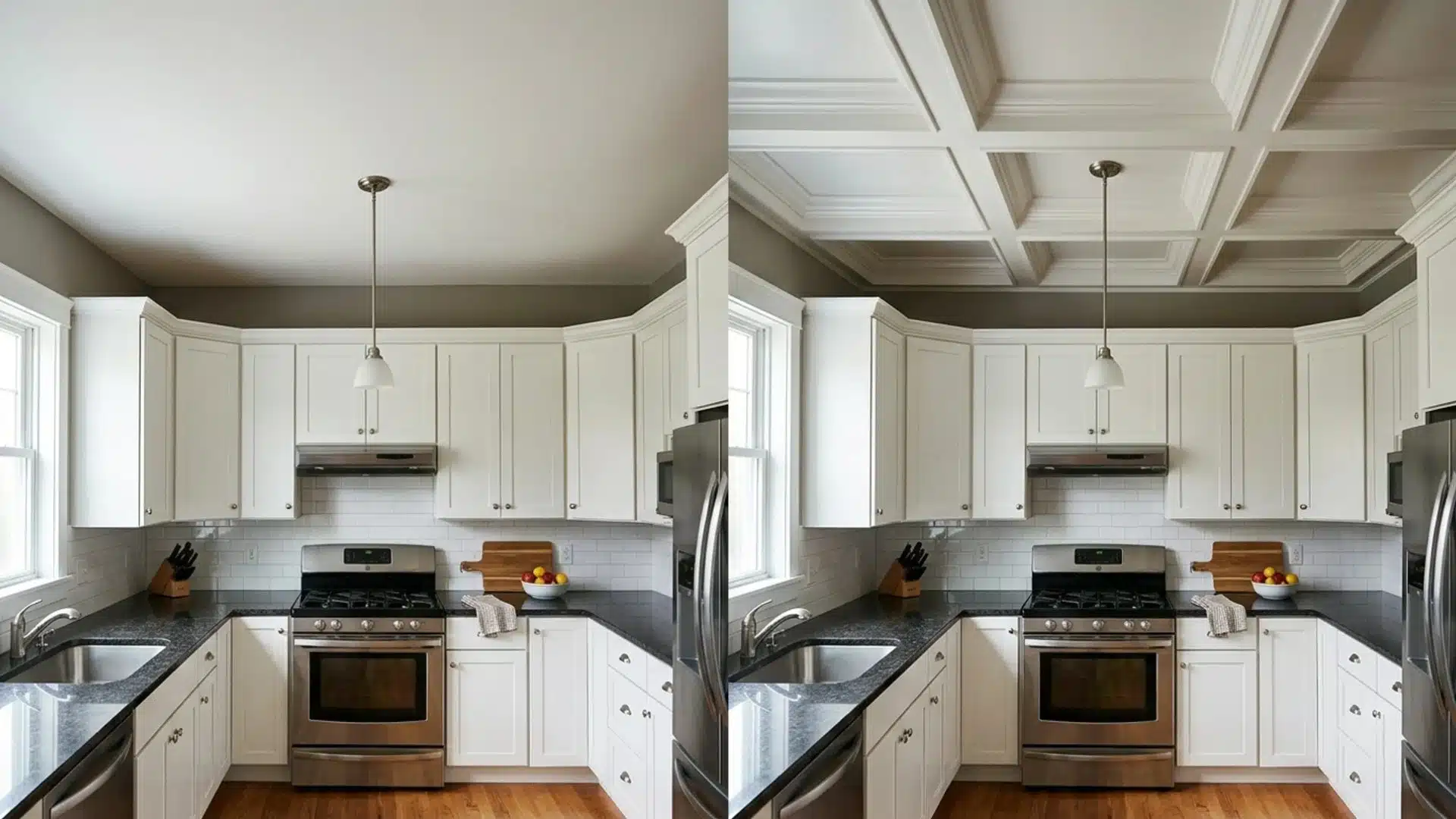
Before: Every update to cabinets, counters, and the flooring below had only highlighted how bare and overlooked the plain drywall ceiling above remained at every stage of the renovation.
After: Coffered panels or shiplap planking were installed across the ceiling, drawing the eye upward and giving the kitchen a finished architectural character that no amount of lower-surface work can replicate.
The added ceiling texture also improves room acoustics by reducing the echo that hard kitchen surfaces typically create.
48. Tiny Galley Kitchen Full Redo
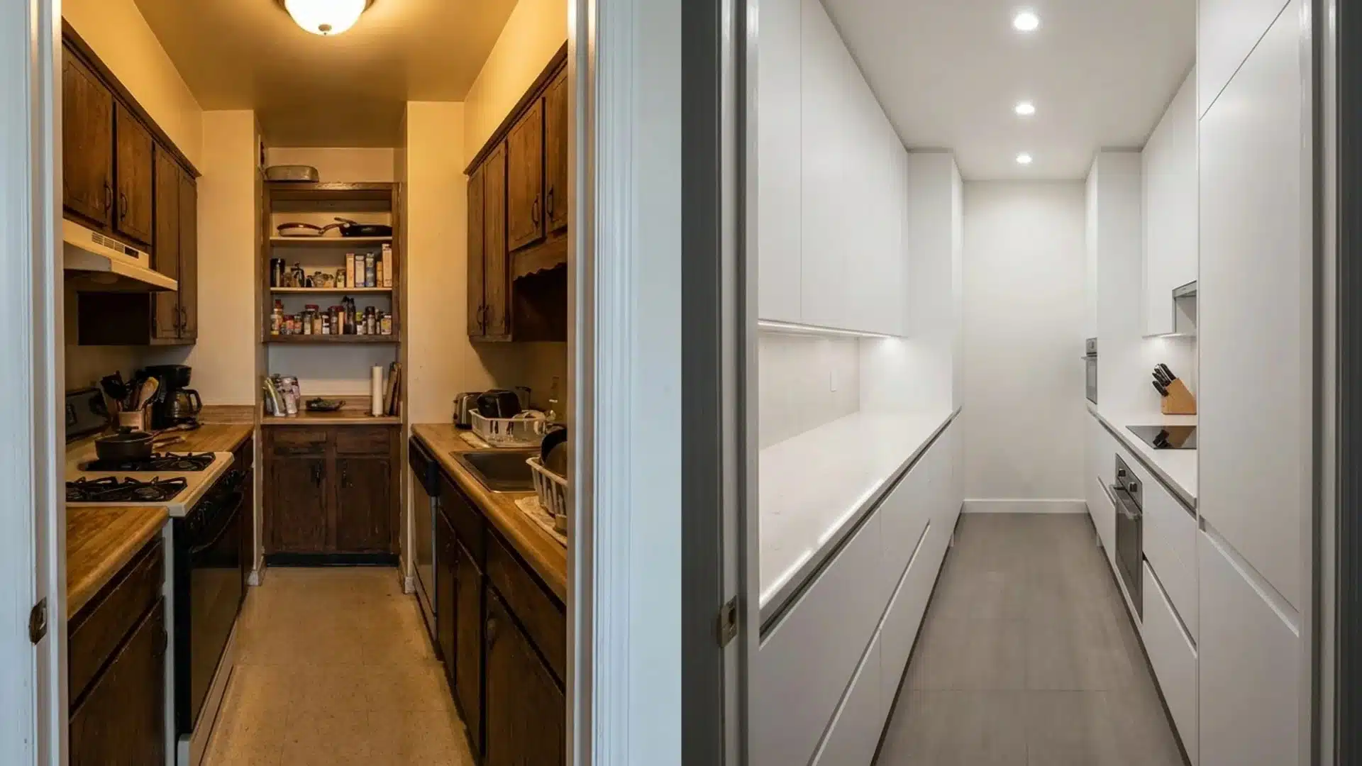
Before: The layout had packed too much into too little space, with no consideration for how the room would actually function during daily cooking across a full household schedule.
After: The entire space was gutted and rebuilt with slim-profile cabinets, a continuous counter run, and lighter finishes, maximizing every inch without changing the room’s existing footprint at all.
A complete visual and functional overhaul does not always require additional square footage to deliver meaningful results.
49. Studio Kitchen Redesign
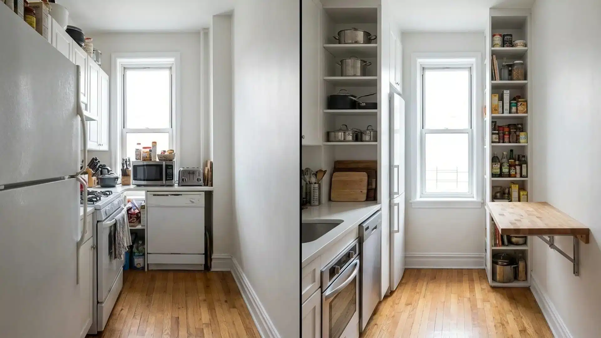
Before: The lack of separation between appliances had made it physically impossible to use any two simultaneously, limiting all meal preparation to a single task at a time on a cramped surface.
After: Slimmer appliances, vertical shelving, and a fold-down counter extension reorganized the same single wall, creating usable workspace and visual breathing room that the original configuration had completely eliminated.
Vertical shelving above the counter reclaims wall space that standard upper cabinet layouts often overlook entirely.
50. Adding Storage to a Small Kitchen
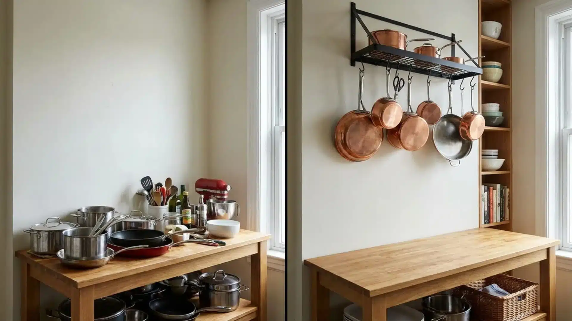
Before: Cluttered counters had reduced the available prep area to a fraction of the actual counter length, making the kitchen harder to work in than its square footage alone would suggest.
After: Magnetic knife strips, a hanging pot rack, and vertical wall shelving were added to the same walls, clearing the counter surface while keeping everyday items within immediate reach during cooking.
Freeing the counter surface made the kitchen feel noticeably less cluttered without relocating or removing a single cabinet.
51. Corner Cabinet Solution
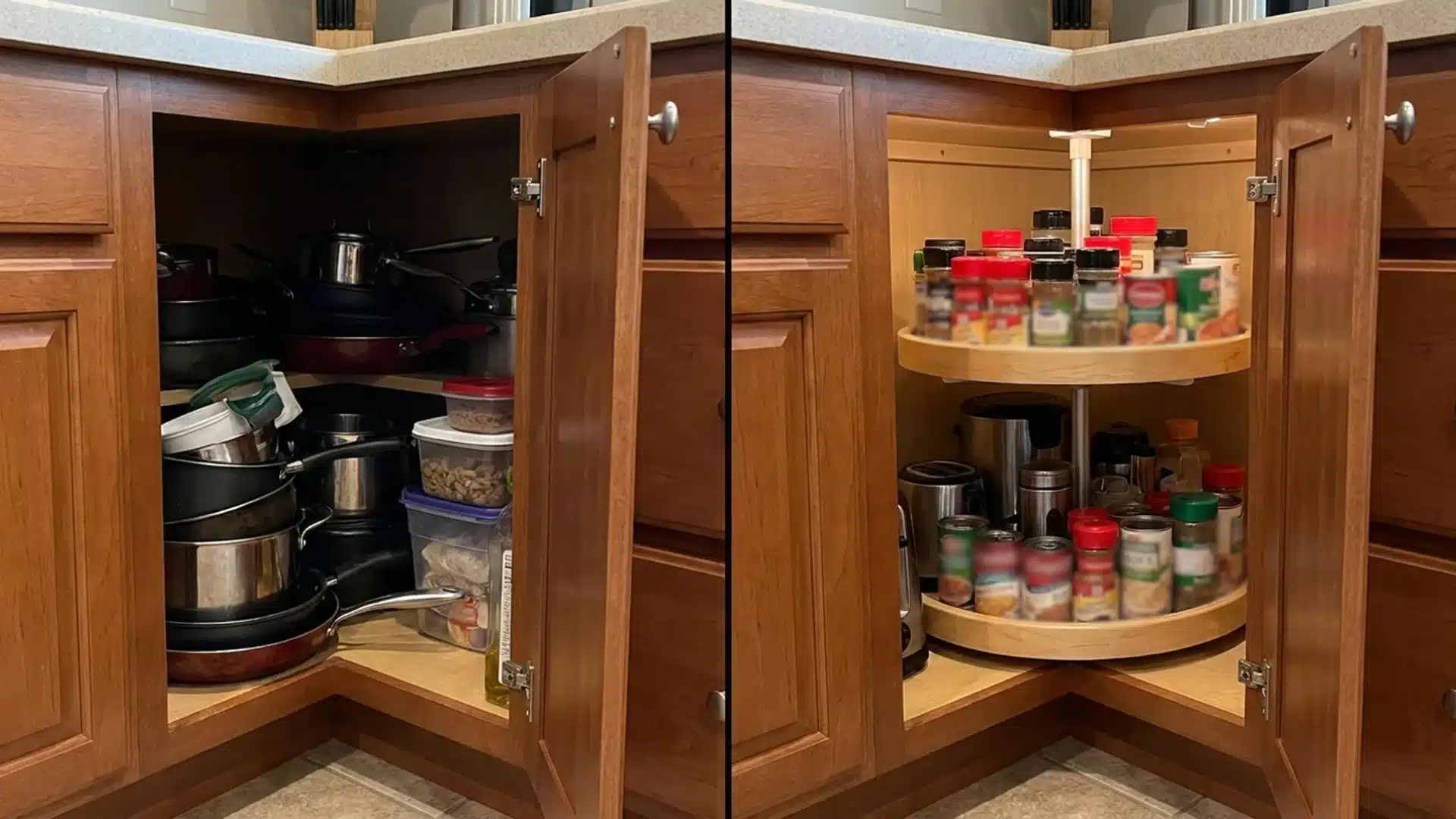
Before: Anything stored at the back of the blind corner cabinet was essentially out of permanent rotation, reducing the kitchen’s functional storage count despite the physical cabinet space being present.
After: A lazy Susan or pull-out shelving system was installed inside the same box, making every inch of that corner fully accessible and usable for the first time since the kitchen was built.
Reclaiming a blind corner often adds the storage equivalent of an entirely separate cabinet to the kitchen.
52. Replacing a Range Hood
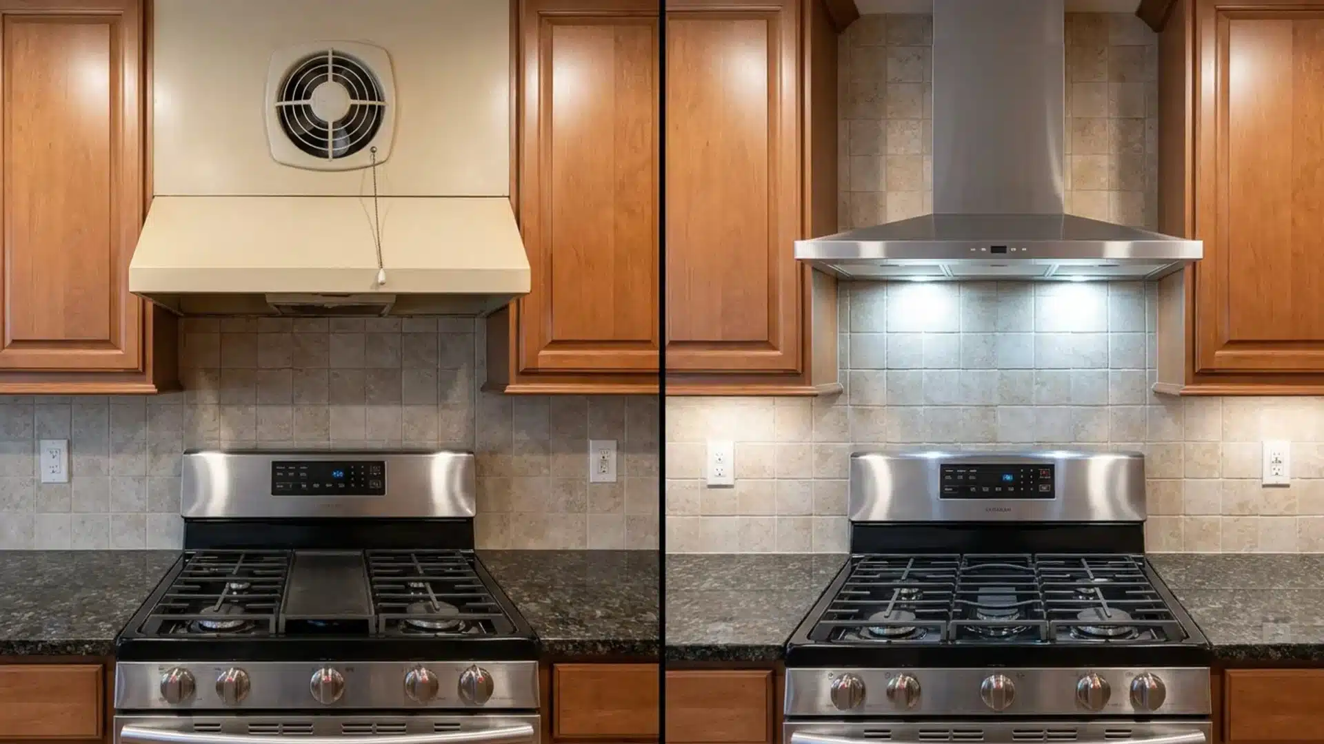
Before: The oversized box shape of the original hood immediately drew the eye upon entering the kitchen, while providing inadequate ventilation and no design value whatsoever to the room.
After: A sleek stainless-steel or custom wood-paneled hood replaced it, improving ventilation noticeably and turning what had been a visual liability into a centerpiece above the range.
A correctly sized hood also removes cooking smoke and grease particles from the air far more effectively than an undersized original.
53. 1970s Kitchen Full Gut
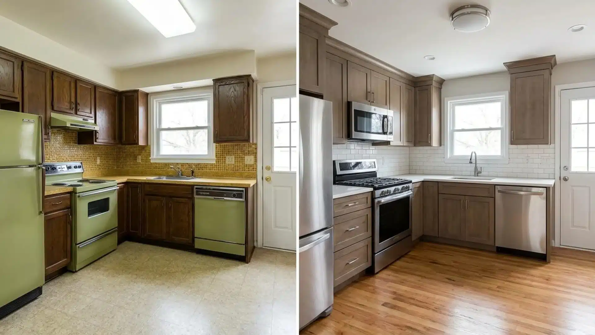
Before: Every surface in the room immediately communicated its decade of original installation, making updates to individual elements feel insufficient given how comprehensively dated the overall kitchen was.
After: The entire room was gutted to the studs and rebuilt with new cabinets, countertops, flooring, and appliances, removing every trace of the original era and meeting current construction standards throughout.
Starting from a bare structure also allowed plumbing and electrical systems to be brought fully up to code during the same project.
54. 1980s Oak and Tile Overhaul
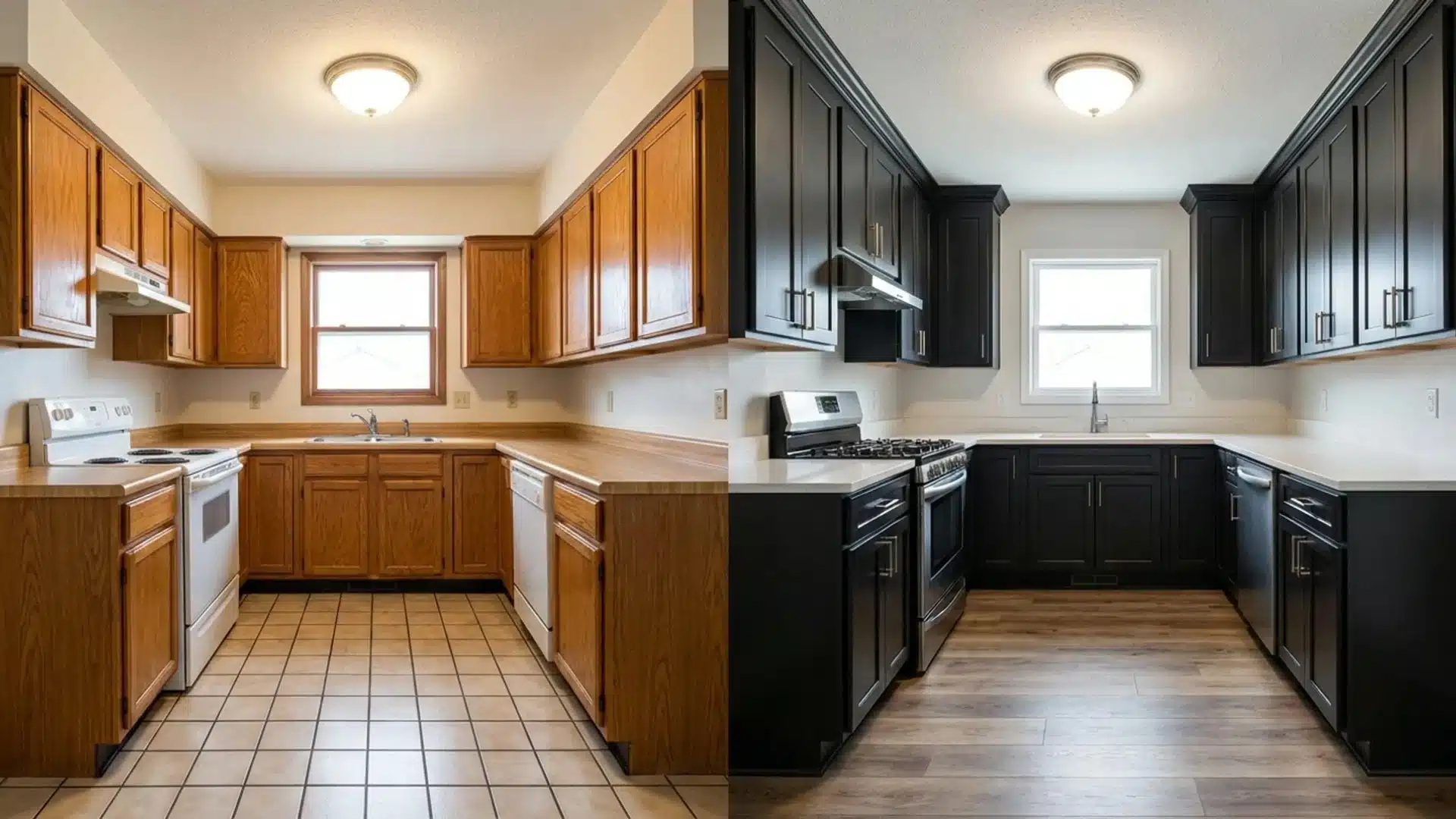
Before: Partial changes made over previous years had only made the contrast between old and new more apparent, leaving the room looking inconsistent rather than progressively improved.
After: New cabinetry, flooring, countertops, and lighting replaced every dated surface throughout, bringing the room fully into a current design style and allowing the layout to be reconsidered during the process.
A complete overhaul also enables layout adjustments that incremental surface updates could never make possible.
55. Contemporary Minimalist Gut
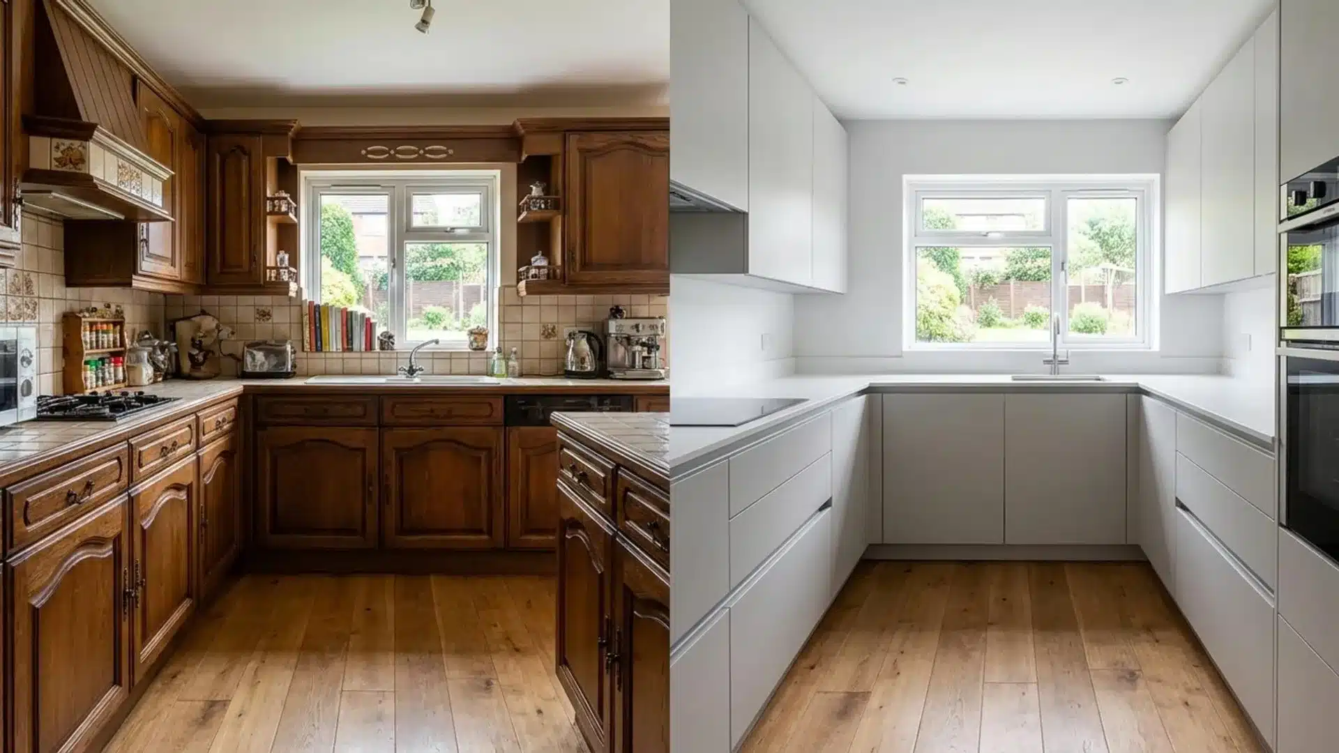
Before: Heavy detailing accumulated across multiple partial renovations had left the kitchen with no clear design direction and no visual rest for the eye anywhere across the room.
After: Flat-panel cabinetry, hidden hardware, and a simplified color palette replaced the ornate original, stripping every redundant detail in favor of clean, uninterrupted lines throughout the rebuilt space.
Restraint in the new design makes each remaining material choice carry significantly more individual visual weight.
56. Historic Home Kitchen Modernization
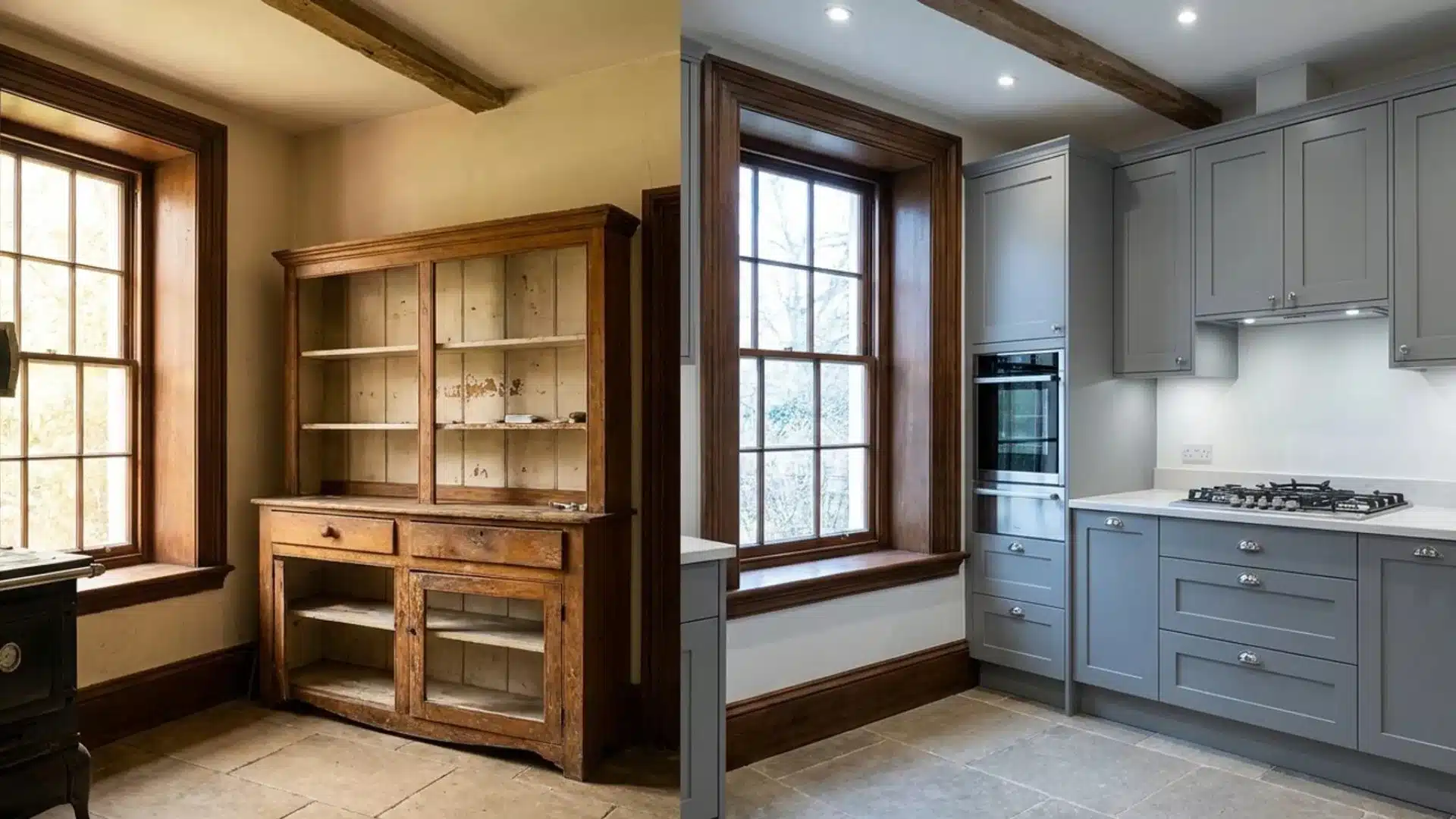
Before: The original layout had been designed around cooking habits and equipment from an entirely different era, leaving the room impractical for modern daily use without meaningful structural intervention.
After: New cabinetry, appliances, and lighting were installed, while the original trim, window casings, and architectural details were preserved intact, adding full functionality without erasing the room’s period character.
Keeping original details intact also maintains the period consistency valued by historic preservation standards throughout the home.
57. Mid-Century Modern Restoration
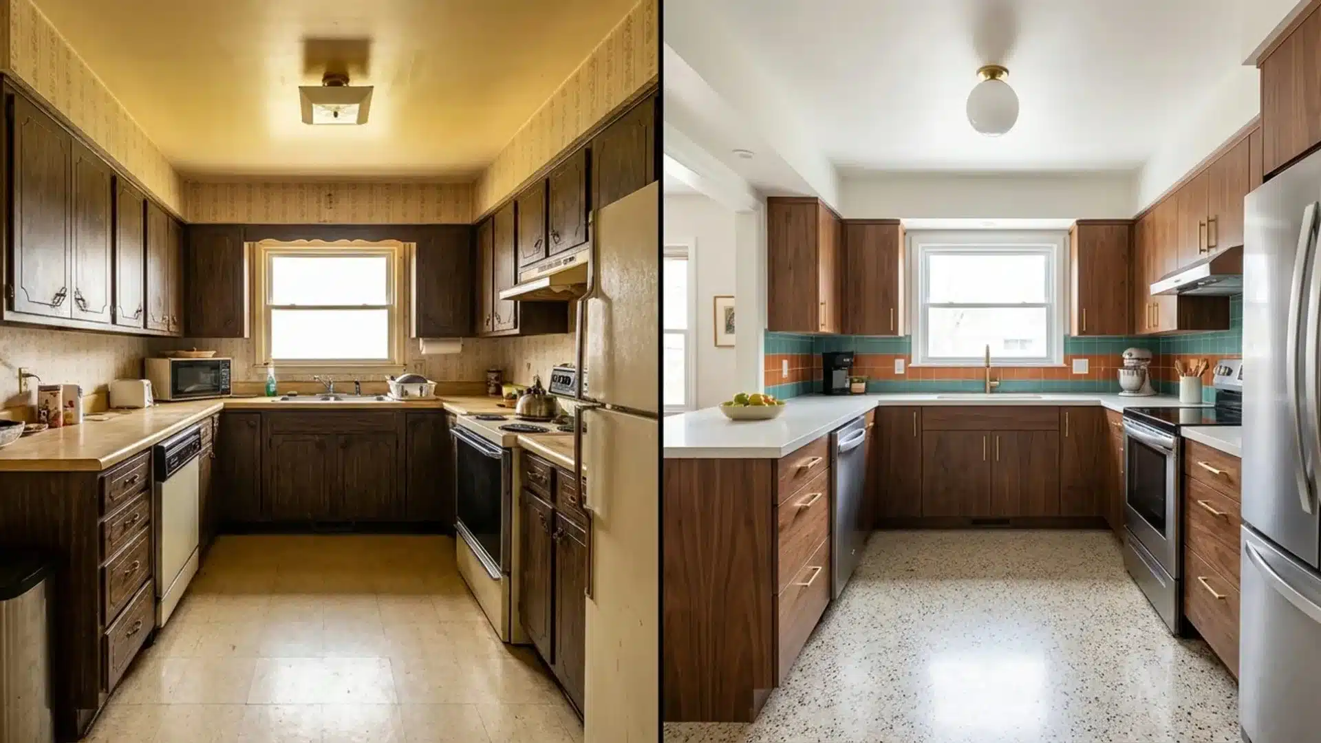
Before: Vinyl flooring layered over original tile, painted-over wood, and mismatched hardware replacements had buried the room’s original design identity under choices made with no regard for the period.
After: Period-appropriate hardware, color palettes, and materials were used throughout the restoration, while modern appliances and updated wiring were incorporated discreetly behind the original-style surfaces.
The kitchen now functions as a fully modern room while reading as a faithful example of its original era.
Common Mistakes in Kitchen Makeovers
Some kitchen updates face issues like poor layout, inadequate storage, or unsuitable materials.
- Layout Flow: Poor placement of the sink, range, and refrigerator slows down daily cooking.
- Storage Planning: Updating cabinet looks without adding storage leaves the kitchen cluttered.
- Material Mismatch: Choosing countertops or flooring for looks alone can lead to maintenance problems later.
- Ventilation Oversight: Installing a powerful range without a matching hood leaves grease and smoke behind.
- Lighting Gaps: Updating cabinets and counters without new lighting leaves the kitchen looking flat.
Planning each of these areas before work begins keeps the remodel on track and avoids costly fixes later.
Budget Tips for Kitchen Makeovers
Plan updates in stages: small changes first, bigger ones as budget allows.
| Update | Budget Tip | Estimated Savings |
|---|---|---|
| Cabinet Painting | Paint cabinets instead of replacing | 70–80% less than replacement |
| Hardware Replacement | Swap knobs and pulls | $150–$600 total |
| Cabinet Refacing | Replace doors/fronts, keep boxes | 40–50% less than replacement |
| Plumbing Placement | Keep the sink and appliances in place | Saves $1,000–$3,000 |
| Vinyl Plank Flooring | Install LVP over the existing subfloor | 30–50% less than tile/hardwood |
| Appliance Bundle | Buy all appliances together | 10–20% off |
| Staged Remodel | Spread work across phases | Avoids one large payment |
Staging keeps each phase affordable while building toward a full remodel.
Ready to Remodel?
A coat of paint, a new set of pulls, and better lighting can shift a kitchen more than most people expect.
This list of before-and-after kitchen remodel ideas moves through cabinets, countertops, layout, flooring, lighting, backsplashes, appliances, small fixes, and full gut renovations.
What stands out across all of them is how rarely the size of a change lines up with the effort it took to get there.
Start with one category, pick a single item within it, and go from there. Even a kitchen makeover as small as swapping out a cabinet door can set the whole room on a new path.
Which of the before-and-after kitchens spoke to you the most? Tell us in the comments; we would love to hear where your own remodel might start.
Frequently Asked Questions (FAQs)
What is the Average ROI for a Minor Kitchen Remodel?
A minor kitchen remodel returns around 70 to 80 percent of the total project cost at resale.
Does Replacing a Range Hood Improve Air Quality in the Kitchen?
A properly rated range hood removes grease, steam, and odors more effectively than a microwave vent.
How Long Does Cabinet Paint Last Before it Needs to Be Redone?
A professionally painted cabinet finish with proper primer and semi-gloss paint typically lasts 8 to 10 years.