
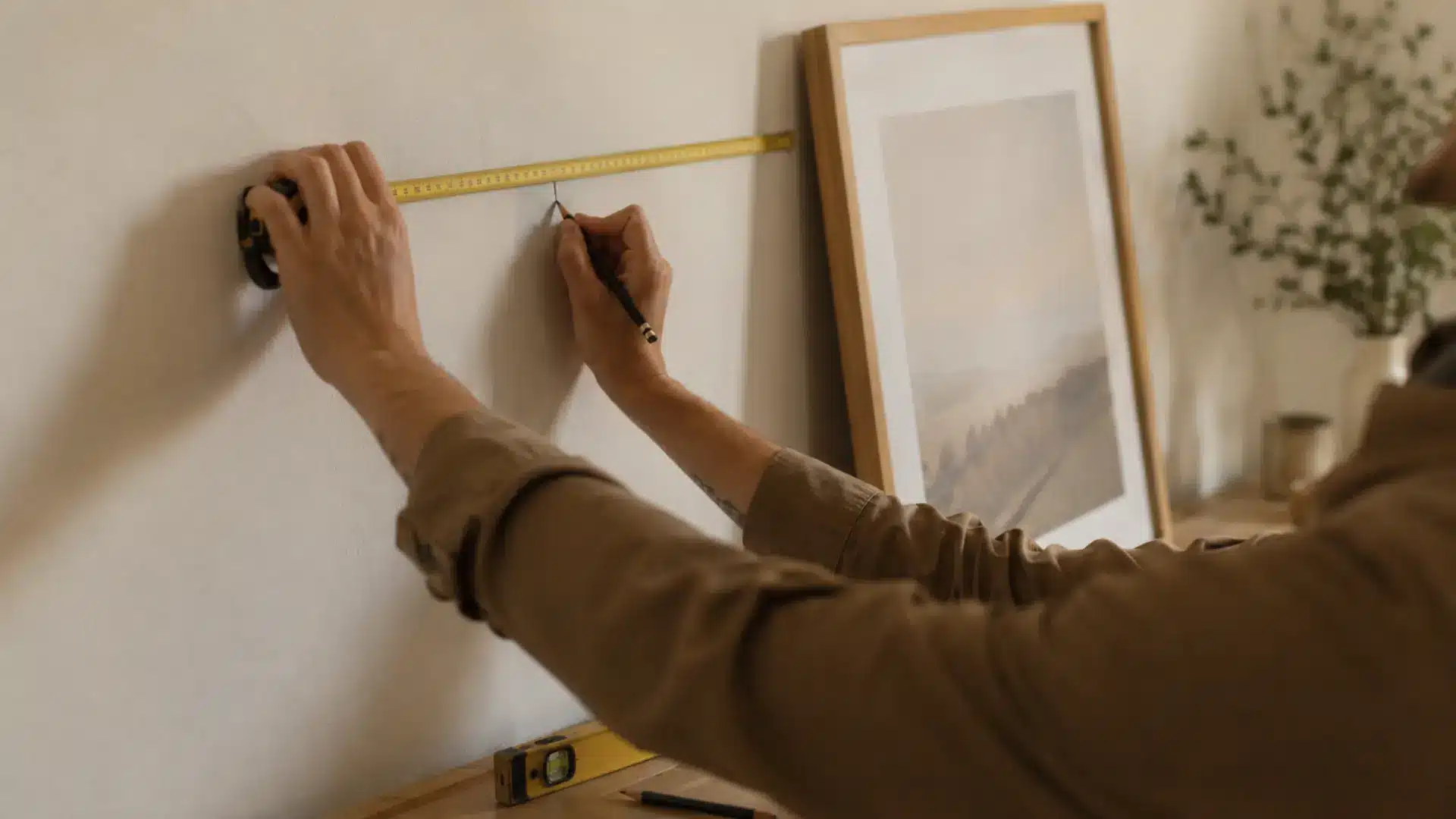
Your pictures are probably hung too high or too low, and either way, it is throwing your whole room off.
Knowing how high to hang pictures is one of those things that looks simple but makes a huge difference. A picture at the wrong height can make even a well-decorated room feel incomplete.
The fix is easier than you think. There is a standard rule that designers and galleries follow. It works in almost every room and with almost every type of artwork.
Once you know it, hanging pictures starts to feel less like guesswork. Your walls are about to look a lot better.
What Is the Standard Height to Hang Pictures?
Hanging pictures at the right height makes a bigger difference than most people expect. The standard is 57 inches from the floor to the center of the frame. It can make a room feel pulled together or slightly off.
There is a simple fix. Interior designers and art galleries follow this rule for picture height. It keeps walls looking intentional and balanced.
The rule centers on eye level. Your eye should land naturally on the middle of the frame. No craning your neck up or looking down.
This section walks you through the standard height rule. You will learn what it means, how to measure it, and when to use it in different rooms.
Factors That Affect the Height to Hang Pictures
The 57-inch rule is a great starting point. But a few factors can shift that number up or down depending on your space. Here are the main things that affect the right hanging height for your pictures:
- Ceiling Height: Standard, high, and vaulted ceilings all call for slightly different placement to keep pictures feeling proportional.
- Furniture Below the Picture: A sofa, bed, console, or dining table changes where your eye naturally lands on the wall.
- Picture Size and Shape: Oversized, vertical, and horizontal frames each have their own visual weight that affects ideal placement.
- Room Purpose: A formal living room and a casual family space do not always follow the same rules.
- Wall Space Available: A large empty wall and a narrow hallway require different approaches to make pictures look balanced.
These factors do not make the process complicated. They just help you fine-tune the standard rule for your specific space.
Picture Hanging Guidelines by Space and Artwork
Every space has its own rules for hanging pictures. Getting placement right makes a big difference in how a room looks and feels. Here is what works best for each space and artwork type:
1. Above a Sofa
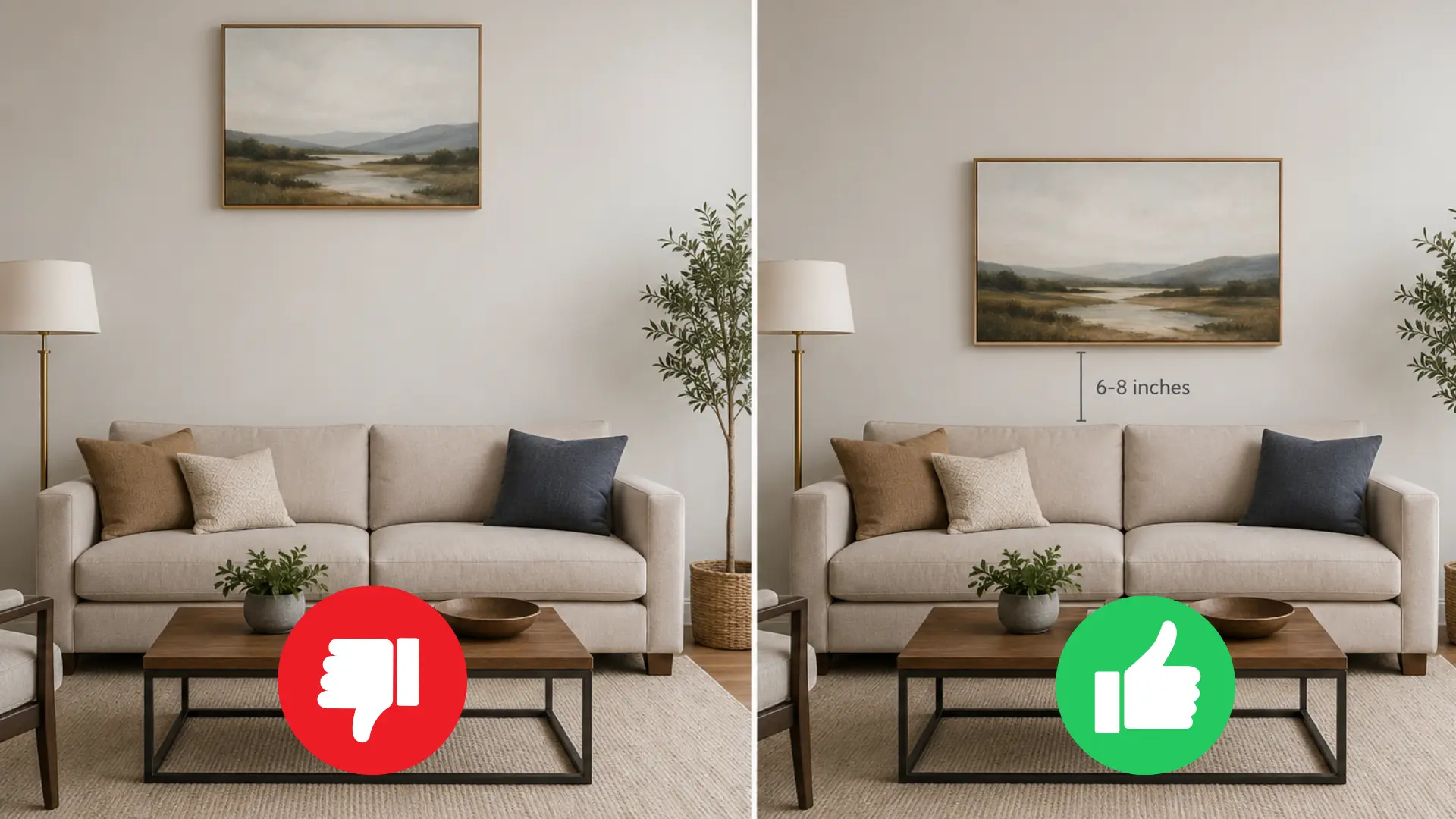
A sofa is one of the most common places to hang artwork. The spacing between the furniture and the frame matters more than most people think. Here are the key things to keep in mind:
- Leave the Right Gap: Aim for 6 to 8 inches between the top of the sofa and the bottom of the frame.
- Match the Artwork Width: The artwork should be roughly two-thirds the width of the sofa for a balanced look.
- Center It Carefully: Always center the piece horizontally over the sofa, not over the entire wall.
Getting this right makes the sofa and artwork feel like a single, cohesive unit. It stops the picture from looking like it is floating on the wall.
2. Above a Bed
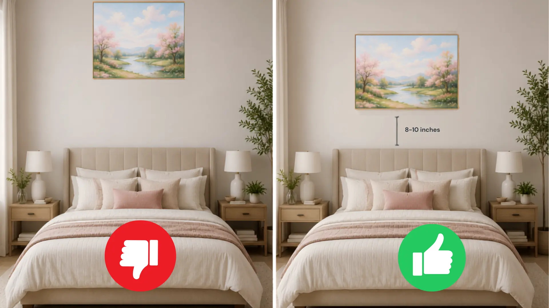
Artwork above a bed needs to feel anchored and secure. Placement matters just as much as the piece itself. Keep these points in mind:
- Mind the Gap: Leave eight to ten inches between the top of the headboard and the bottom of the frame.
- Check It Is Secure: Use proper wall anchors or hooks rated for the weight of the piece.
- Size It Right: The artwork should be no wider than the headboard to keep things visually balanced.
A well-placed piece above a bed makes the whole headboard wall feel intentional. It also gives the room a finished, put-together look.
3. Above a Fireplace
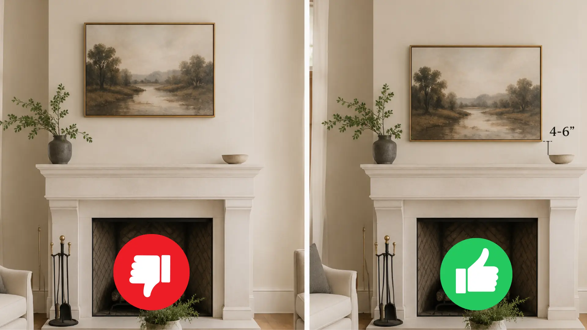
A fireplace is already a focal point, so artwork here needs careful placement. The gap between the mantel and the frame sets the whole tone. Here is what to focus on:
- Keep the Gap Small: Leave four to six inches between the top of the mantel and the bottom of the frame.
- Match the Scale: The artwork should be slightly narrower than the mantel for a proportional look.
- Center It Over the Mantel: Always align the piece to the center of the fireplace, not the surrounding wall.
Getting this right makes the artwork feel like it belongs above the fireplace. It becomes part of the feature rather than competing with it.
4. Above a Console Table or Sideboard
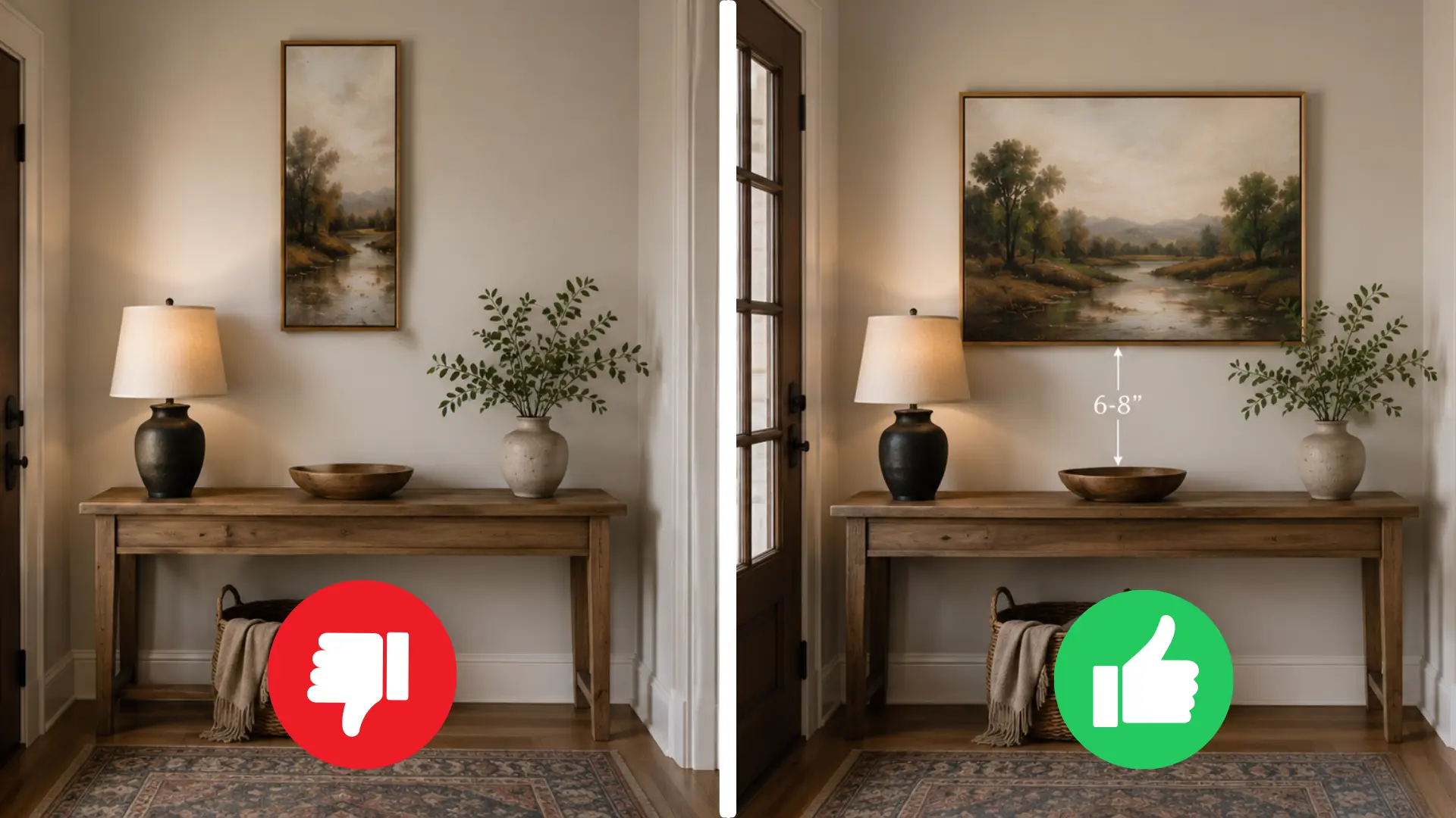
A console table or sideboard gives you a natural anchor point for artwork. The gap and the width of the piece both play a role. Here are the basics:
- Use a Six- to Eight-Inch Gap: Leave 6 to 8 inches between the top of the furniture and the bottom of the frame.
- Match the Width Proportionally: The artwork should be about two-thirds the width of the console for a balanced look.
- Layer With Objects Below: Adding a lamp or small decor on the console helps tie the artwork and furniture together.
These simple proportions keep the wall looking intentional and well thought out. The furniture and artwork end up feeling like a pair.
5. In Living Rooms
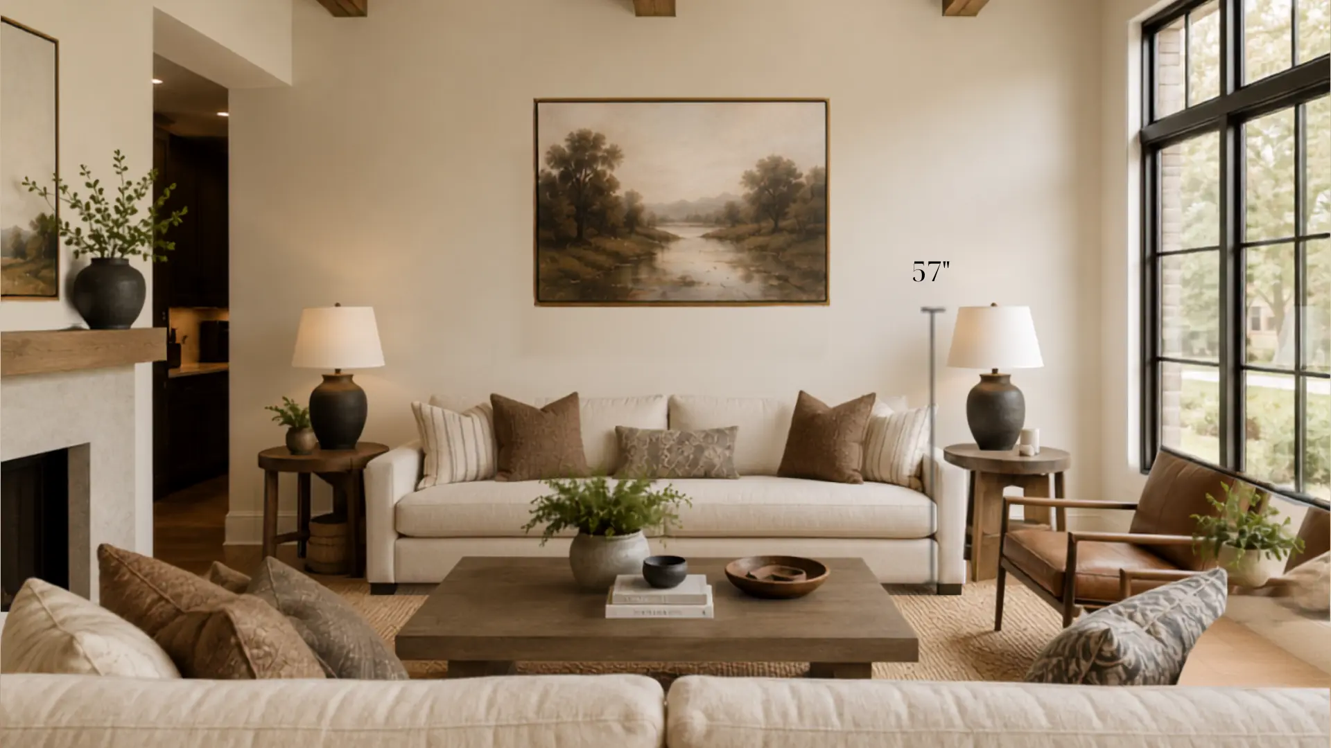
Living rooms have more wall space and more seating arrangements to work around. Placement here affects how the whole room feels. Keep these tips in mind:
- Stick to Eye Level: The center of the frame should sit at around 57 inches from the floor.
- Anchor to Furniture: Hang artwork in relation to the sofa or seating area, not the open wall.
- Create a Focal Point: One strong piece or a grouped arrangement can anchor the main seating area.
A living room with well-placed artwork feels cohesive and intentional. It pulls the furniture and the walls together into one space.
6. In Bedrooms
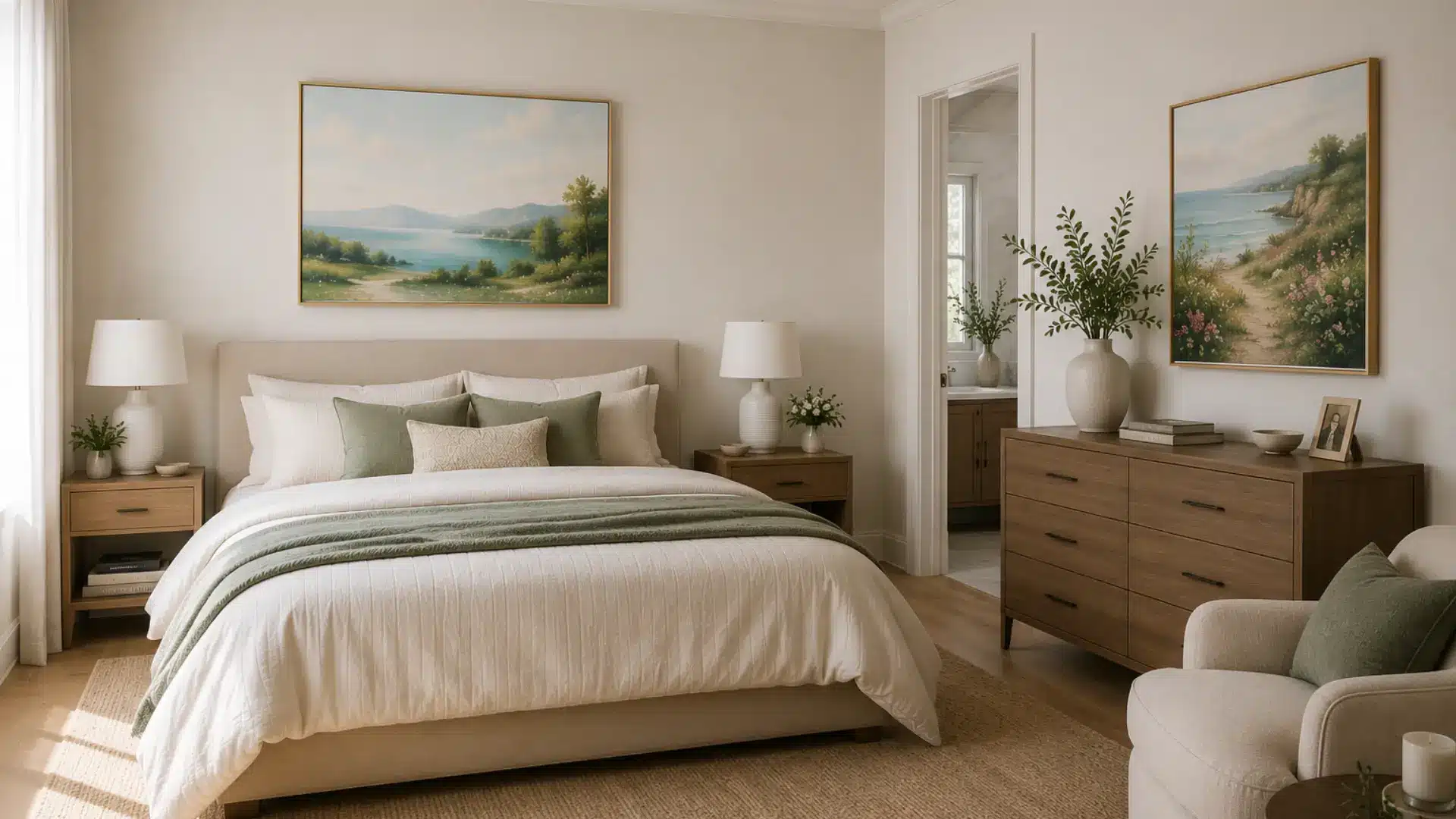
Bedrooms are more personal spaces, so placement can be a little more flexible. That said, a few basic rules still apply. Here is what works best:
- Center Over the Bed: Artwork above the bed should be centered over the headboard, not the whole wall.
- Use the Dresser Wall Wisely: A single piece or small grouping above a dresser works well in most bedrooms.
- Keep Spacing Consistent: Make sure the gap between the furniture and the frame is even on all sides.
Getting bedroom placement right adds to the restful feel of the room. It keeps the space looking tidy without feeling bare.
7. In Dining Rooms
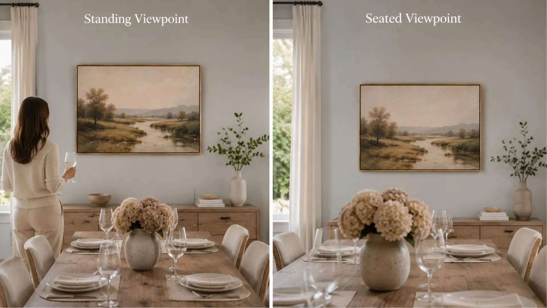
Dining rooms are viewed mostly from a seated position, which changes the ideal hanging height. The 57-inch rule needs a slight adjustment here. Here is what to keep in mind:
- Hang Slightly Lower: Aim for the center of the frame to sit around 54 to 56 inches from the floor.
- Think About Sightlines: The artwork should be easy to see from a seated position and not look awkward when viewed from a standing position.
- Center It Over the Dining Area: Align the piece to the dining table or buffet, not the full wall width.
Dining room artwork sets the mood for the whole space. Getting the height right makes meals feel more relaxed and the room more welcoming.
8. In Hallways and Entryways
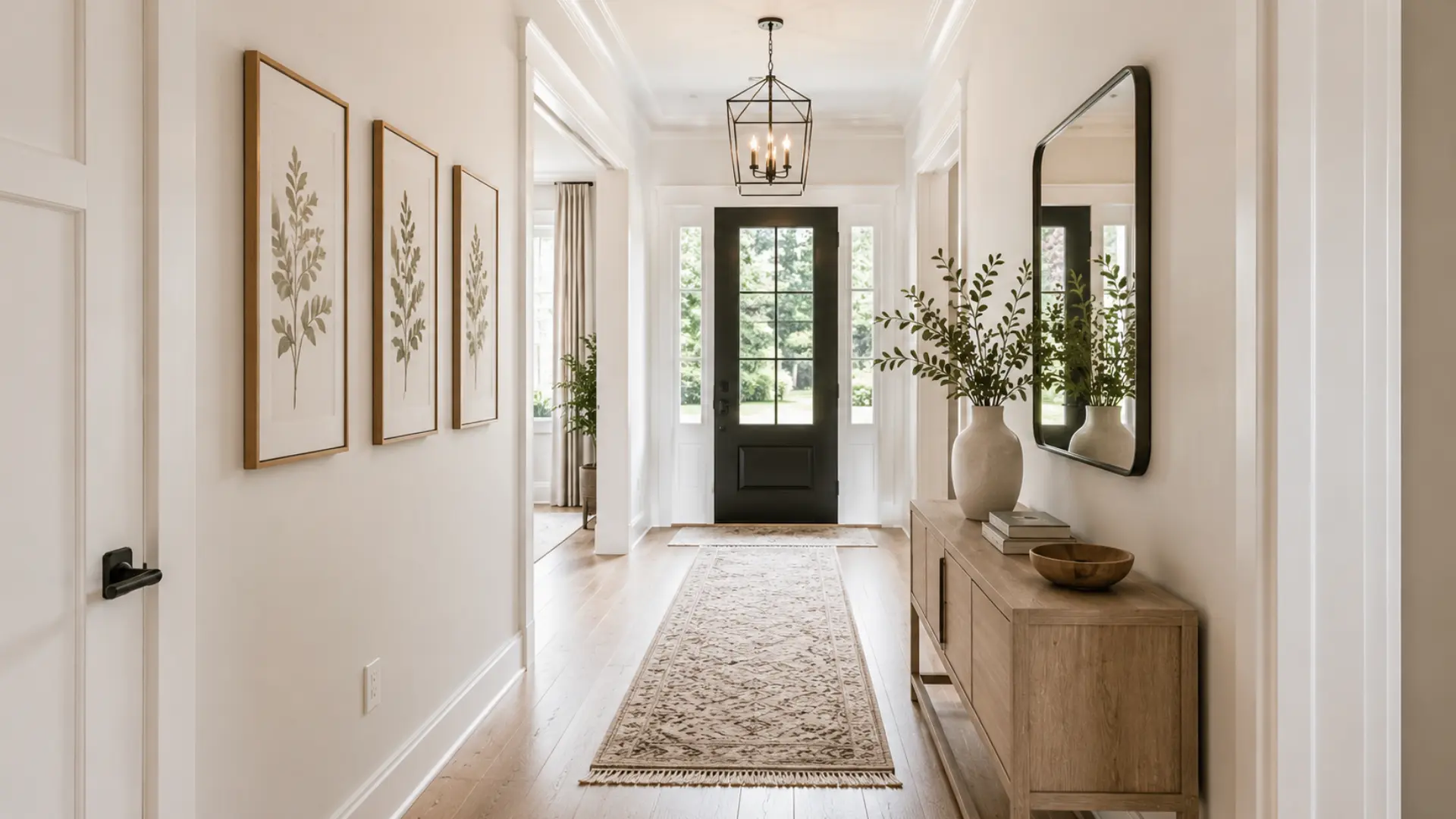
Hallways and entryways are transitional spaces, so artwork here needs to work quickly. People move through these areas fast. Keep these points in mind:
- Stick to Eye Level: The 57-inch center rule works well in most hallways and entryways.
- Choose the Right Size for Narrow Walls: On a narrow wall, a single vertical frame tends to work better than a wide horizontal one.
- Space Pieces Evenly: If hanging multiple pieces in a hallway, keep the gaps between frames consistent throughout.
A well-dressed hallway or entryway makes a strong first impression. It sets the tone for the rest of the home.
9. On Staircase Walls

Staircase walls are tricky because the floor level keeps changing as you go up. The key is to follow the angle of the stairs. Here is how to approach it:
- Follow the Stair Angle: Keep the center of each frame at a consistent height above each step as you move up.
- Maintain Even Diagonal Spacing: Keep the gap between frames consistent along the diagonal line of the staircase.
- Step Back and Check: Walk up and down the stairs to make sure the arrangement flows naturally at eye level.
A staircase gallery done well feels like a natural progression up the wall. Consistent spacing and angle make all the difference.
10. For Gallery Walls
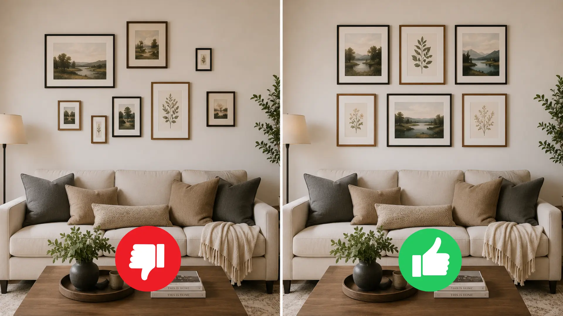
Gallery walls involve multiple pieces, so planning matters more here than anywhere else. A little prep work saves a lot of nail holes. Keep these basics in mind:
- Find the Center First: Treat the whole arrangement as one unit and center it on the wall at 57 inches.
- Keep Frame Gaps Consistent: Two to three inches between frames is a good standard gap to work with.
- Plan the Layout on the Floor: Arrange all the pieces on the floor first before committing to any nail holes.
A gallery wall looks best when it feels intentional rather than random. Planning ahead makes the whole process far easier.
11. For Large Pictures
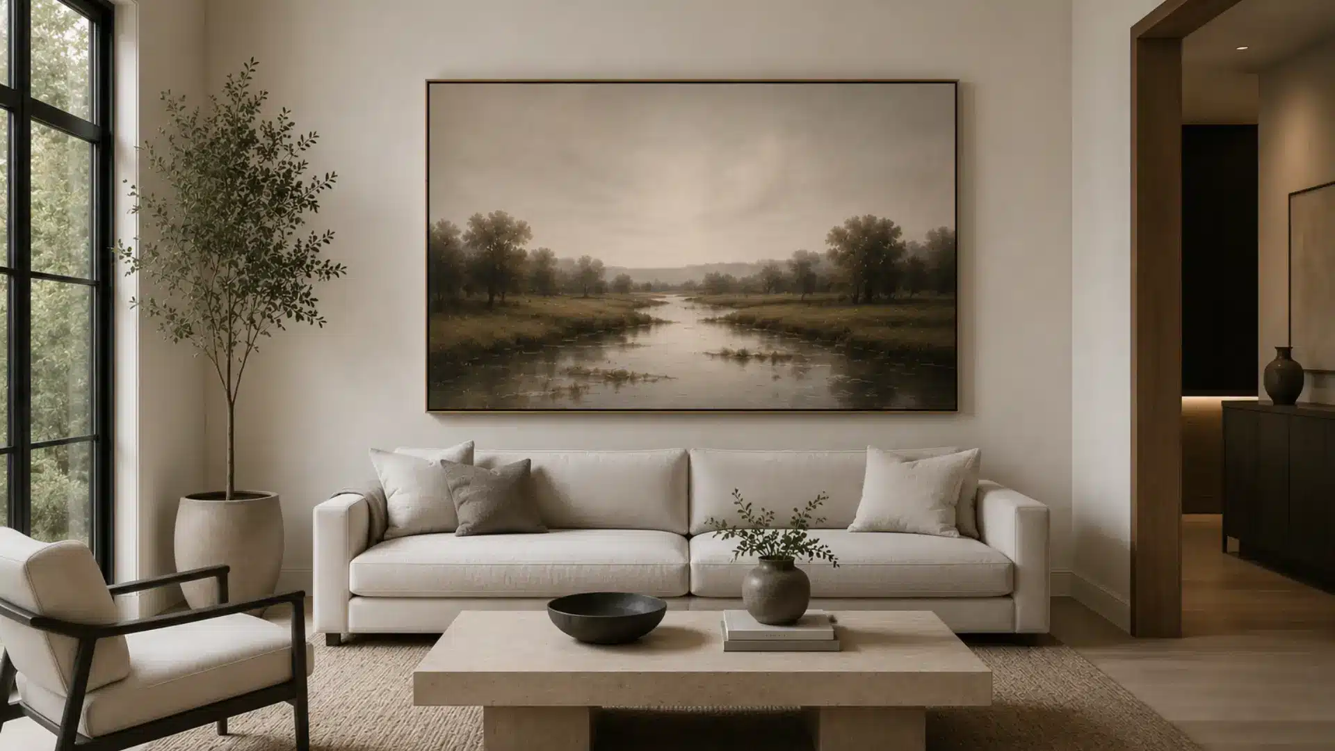
Oversized artwork has more visual weight, so placement needs extra thought. The standard rules still apply, but scale changes a few things. Here is what to keep in mind:
- Center It at 57 Inches: Even with oversized pieces, the center of the frame should still sit at around 57 inches.
- Give It Room to Breathe: Make sure the artwork has enough open wall space around it to be seen properly.
- Balance It With Furniture: Anchor large pieces above a sofa, bed, or console so they feel grounded on the wall.
Large artwork can be a real statement piece when placed well. The key is giving it enough space to make the impact it deserves.
12. For Small Pictures
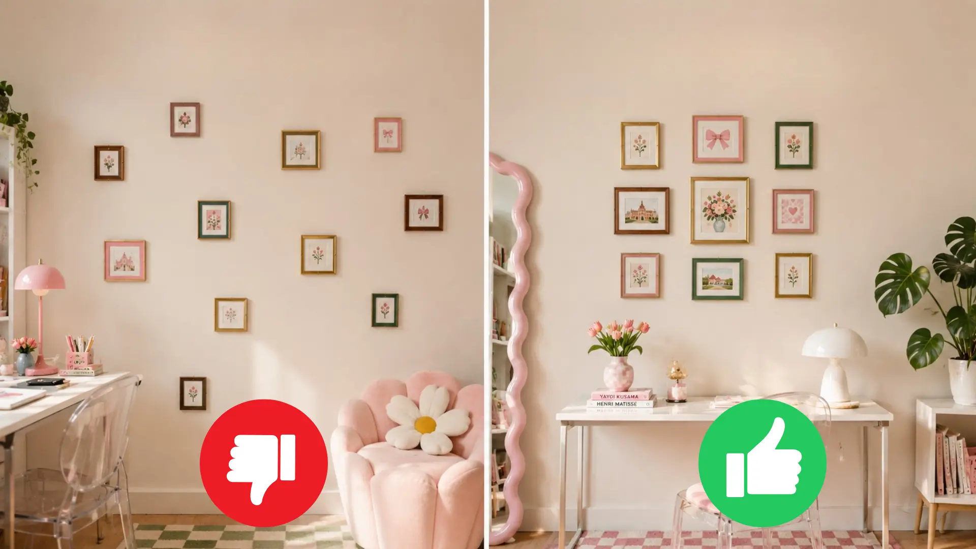
Small pictures can look lost on a wall if they are not placed thoughtfully. Grouping and positioning both matter here. Keep these tips in mind:
- Group Them Together: Cluster small pieces into a gallery arrangement rather than scattering them across the wall.
- Treat the Group as One Piece: Center the whole cluster on the wall the same way you would a single large frame.
- Use Consistent Spacing Within the Group: Keep the gaps between each small frame even so the arrangement looks deliberate.
Small pictures can have just as much impact as large ones when grouped well. The arrangement does the work that the individual pieces cannot do alone.
Mistakes That Make Your Pictures Look Off
Even with the best intentions, picture placement can go wrong in a few predictable ways. Knowing what to watch out for saves you a lot of unnecessary nail holes. Here is a quick breakdown of the most common mistakes:
| Mistake | Why It Happens | How to Fix It |
|---|---|---|
| Hanging too close to the ceiling | Measuring from the top of the frame instead of the center | Measure to the center of the frame and aim for 57 inches from the floor |
| Ignoring furniture placement | Treating the wall as a blank canvas instead of anchoring to furniture | Hang artwork in relation to the furniture beneath it, not the open wall |
| Using the wrong center point | Assuming the hook goes at eye level instead of the center of the frame | Always measure to the midpoint of the frame before marking the wall |
| Not measuring before hanging | Eyeballing the placement and hoping it looks right | Use a tape measure and a level every time before driving a nail |
| Spacing pieces too far apart | Hanging multiple pieces without a consistent gap between them | Keep two to three inches between frames for a clean, intentional look |
These mistakes are easy to make but just as easy to fix once you know what to look for. A little measuring and planning goes a long way.
Frequently Asked Questions
Can Pictures Be Hung Higher than Eye Level?
Yes, higher placement works on large walls and high ceilings. It helps fill vertical space without making the room feel top-heavy.
How Do I Know if a Picture is Too High?
If you have to look up to see the center of the frame, it is too high. The midpoint should sit at roughly 57 inches.
Should All Pictures in a Room Be Hung at The Same Height?
In most cases, yes. Keeping a consistent center line creates visual order. Exceptions apply for staircase walls and intentional gallery arrangements.
Final Words
The right picture height does not happen by accident, but it does not take much effort either. Understanding how high to hang pictures is one of the simplest ways to improve any room.
The center of the frame at eye level is your starting point. Your furniture, ceiling height, and room type do the rest. A tape measure and a level are all you really need. No design background required.
Just a little patience and a willingness to get it right. Try it in one room first and share how it turned out in the comments below.