

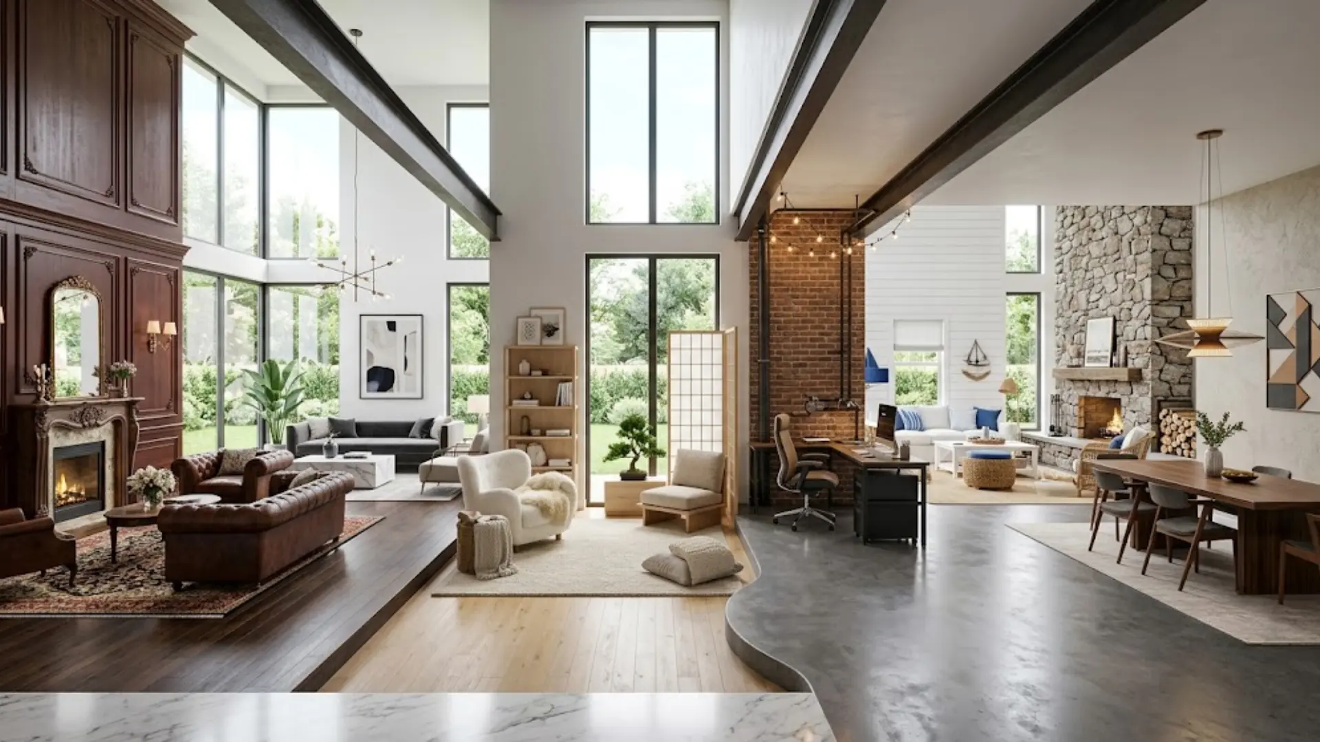
Interior design has been around for centuries, yet choosing a style still trips people up. That is because there are so many options, and most of them look good in different ways.
The furniture you pick, the colors on your walls, and the way a room feels all trace back to a specific style. Knowing the difference between them makes every design decision easier and faster.
Some styles are calm and simple. Others are bold and layered. A few are tied to a specific culture.
Interior design styles give you a clear starting point so you stop guessing and start building a space you actually love.
What Shaped the Interior Design Styles We Love Today
Every home tells a story. The way a room looks often traces back to history, culture, and how people lived in different eras. Ancient structures inspired grand European styles.
Trade routes brought new materials and patterns across continents. Wars and revolutions pushed people to rethink luxury and simplicity. As cities grew and lifestyles changed, so did design.
Smaller homes needed smarter layouts, and designers began focusing on techniques for making small roomslook bigger without sacrificing style.
Busy families wanted easy-to-clean surfaces and flexible spaces. Yet some classic styles never fade. Their classic shapes and quality craftsmanship still feel relevant today.
Many newer trends borrow from older ones. Mid-century modern, for example, blends postwar practicality with clean artistic lines. Good design always builds on what came before.
Interior Design Styles From Every Corner of the World
Interior design styles range from centuries-old European traditions to fresh modern movements still finding their shape. Here is a closer look at the ones most likely to inspire your next room:
1. Traditional
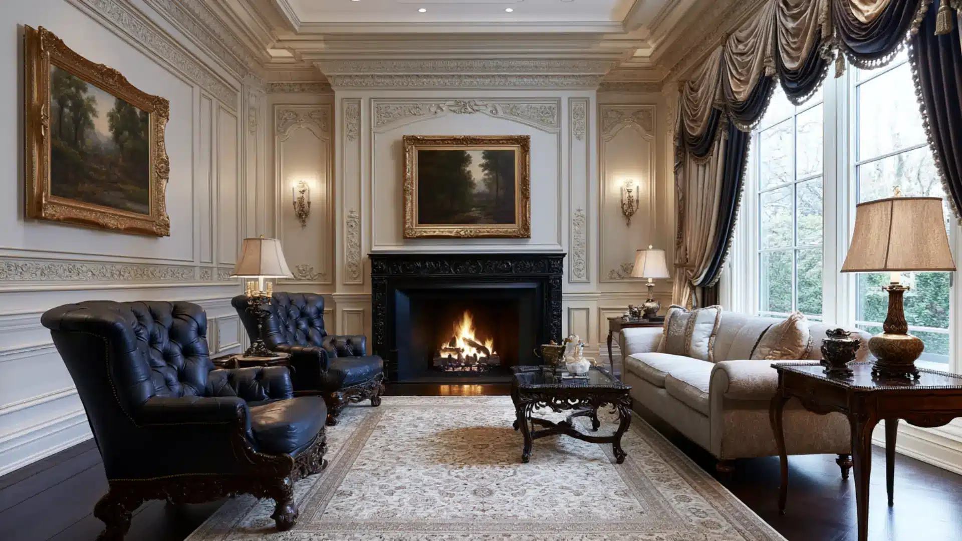
Traditional style pulls from centuries of European design, particularly English and French influences.
Richly carved wooden furniture, symmetrical layouts, and layered fabrics such as velvet and silk give rooms a polished, formal feel. Detailed crown moldings and ornate accessories complete the portrait.
Modern style strips everything back, but traditional style leans into craftsmanship and decoration, creating spaces that feel established and deeply classy.
- Color Palette: Deep reds, navy blue, forest green, warm beige, ivory, and rich brown
- Best for: Larger homes, formal living rooms, dining rooms, and master bedrooms
2. Modern
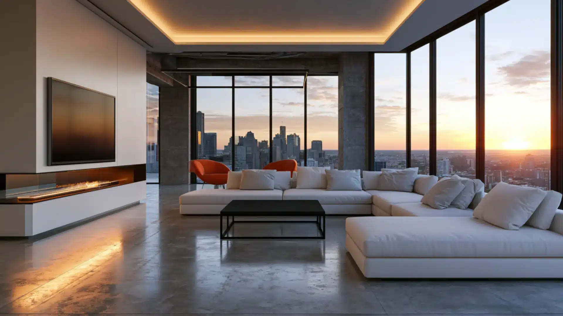
Modern style is rooted in a specific design movement from the early to mid-1900s, not simply whatever looks new today. Steel, glass, and concrete replaced ornate materials.
Furniture sat low, lines stayed flat, and decoration was stripped to almost nothing. Function always came before form.
That sharp focus on purpose over prettiness is what separates true modern design from the softer, ever-shifting world of contemporary style.
- Color Palette: White, black, gray, taupe, and occasional bold accent colors
- Best for: Urban apartments, open-plan homes, living rooms, and home offices
3. Contemporary
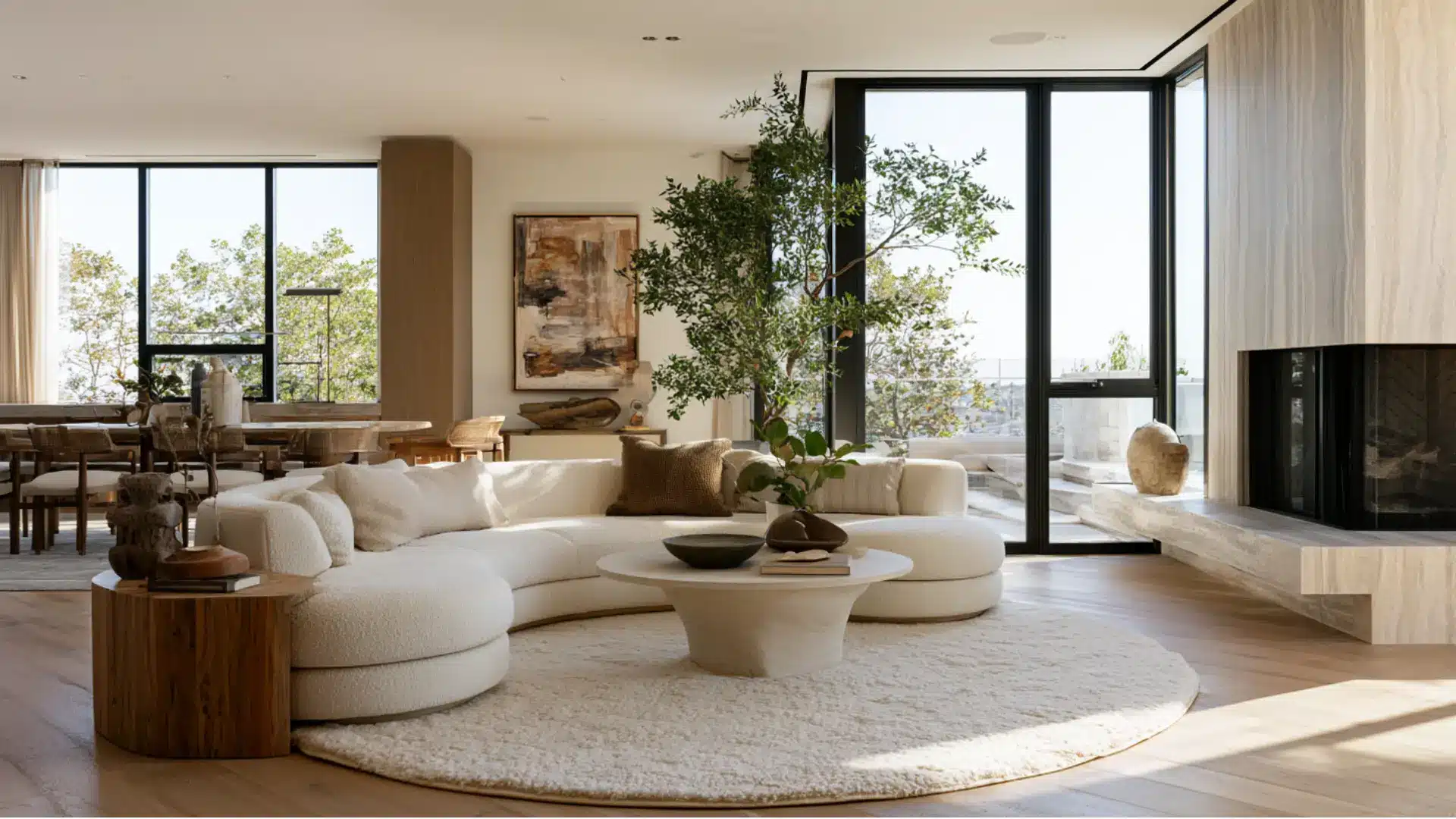
Contemporary style is a moving target because it reflects the design trends of the moment.
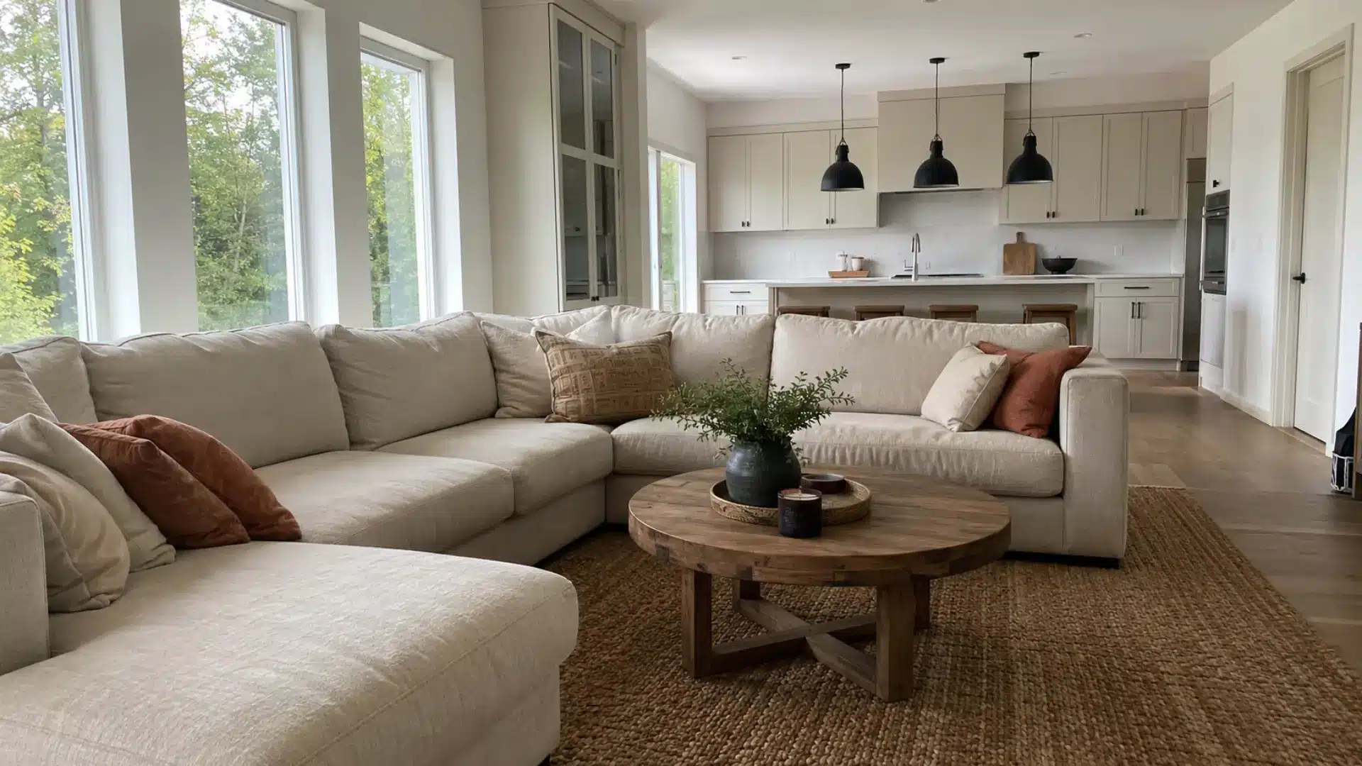
Furniture tends toward softer curves than classic modern pieces, and natural materials often sit alongside sleek finishes. Open, uncluttered spaces feel current without feeling cold.
Bold accents appear occasionally but never overpower the room. Where modern style belongs to a fixed era, contemporary style keeps reinventing itself with every passing season.
- Color Palette: Warm whites, soft grays, charcoal, beige, and muted earth tones
- Best for: New builds, open living spaces, condos, and living and dining rooms
4. Minimalist
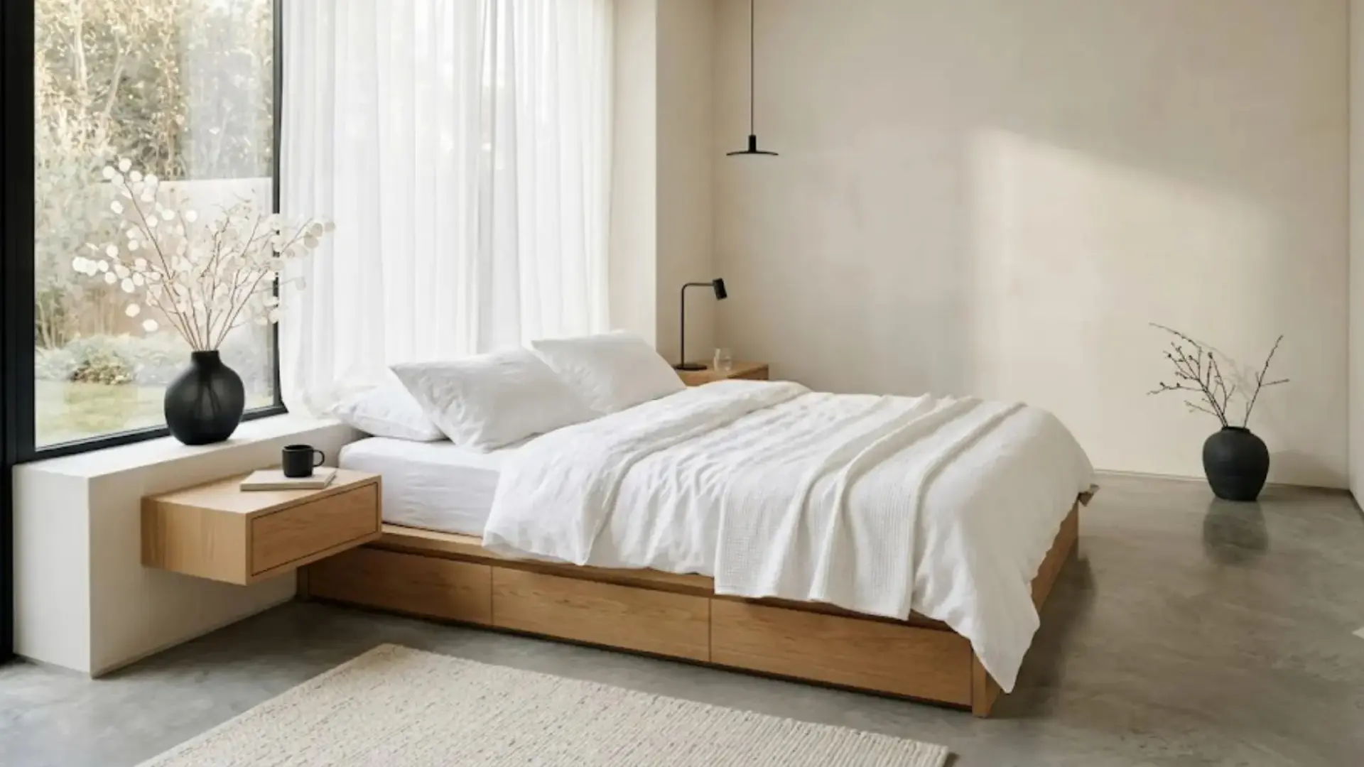
Minimalist style is built on one simple idea: keep only what serves a purpose. Furniture is stripped to clean, essential shapes. Surfaces stay clear.
Empty space is treated as a design element rather than something to fill. The color story stays quiet and neutral throughout.
The visual similarities with modern style are there, but minimalism goes further as a philosophy, asking you to fundamentally rethink what a room actually needs.
- Color Palette: White, off-white, light gray, soft beige, and black accents
- Best for: Small apartments, studios, bedrooms, and bathrooms
5. Scandinavian

Scandinavian style grew from the Nordic belief that everyday objects should be both beautiful and useful. Light woods, simple furniture, and cozy textiles like wool and sheepskin make rooms feel warm without feeling heavy.
The Danish concept of hygge, which centers on comfort and togetherness, runs through every design choice.
Minimalism removes until almost nothing remains, but Scandinavian design stops well before that point, keeping spaces deliberately inviting and built for real life.
- Color Palette: White, light gray, soft blue, blush pink, and natural wood tones
- Best for: Small to mid-sized homes, living rooms, kitchens, and bedrooms
6. Japandi
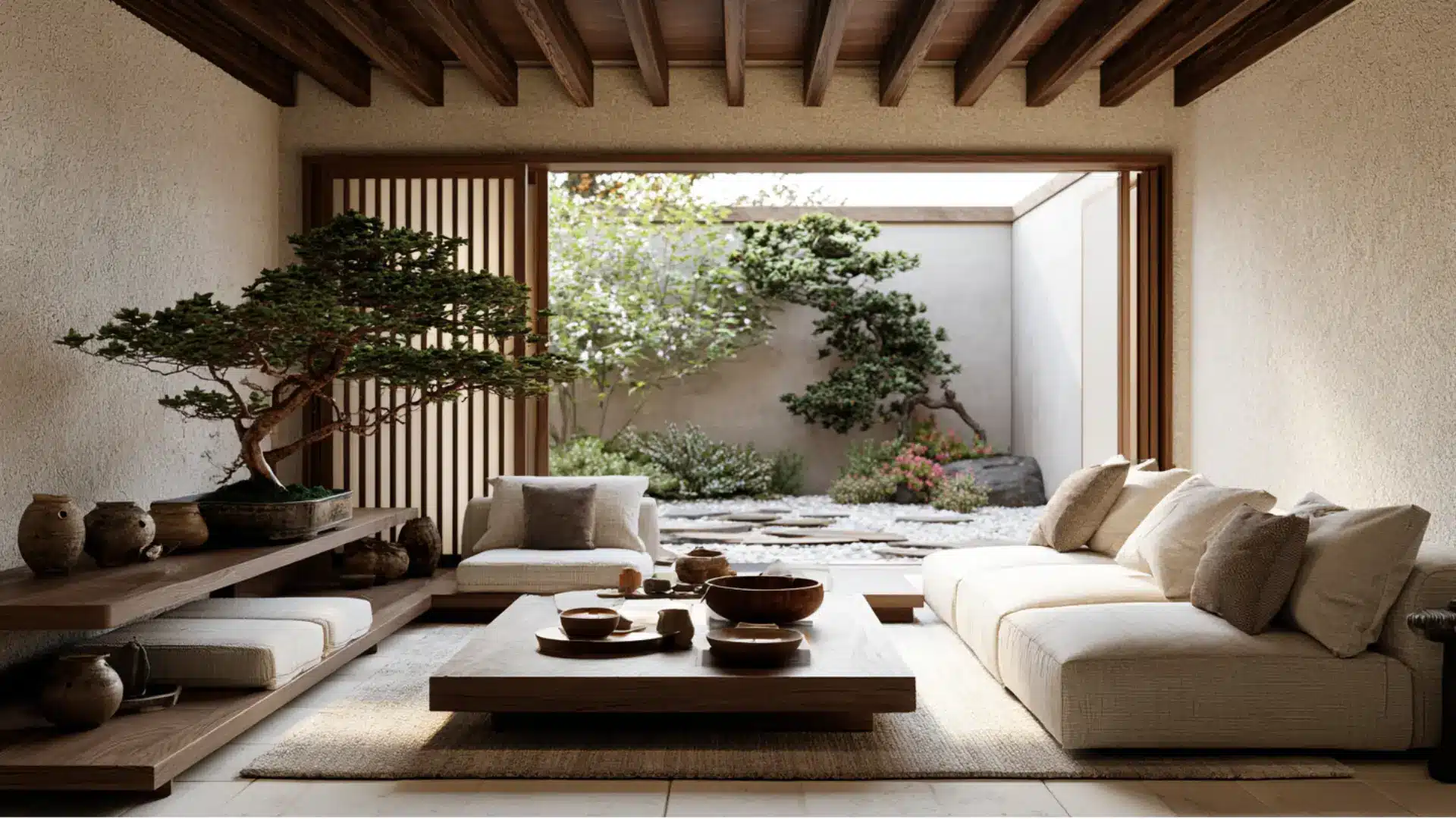
Japandi brings together two design philosophies that share more than they differ. Japanese wabi-sabi finds beauty in imperfection and age, while Scandinavian design values warmth and function.
Together they produce spaces that feel grounded, unhurried, and quietly refined.
Low furniture, natural textures, and a muted palette create a meditative calm that no single-origin style quite replicates on its own. The result is stillness and warmth existing in perfect balance.
- Color Palette: Warm whites, soft gray, charcoal, muted greens, and natural wood tones
- Best for: Bedrooms, living rooms, meditation spaces, and small modern homes
7. Mid-Century Modern
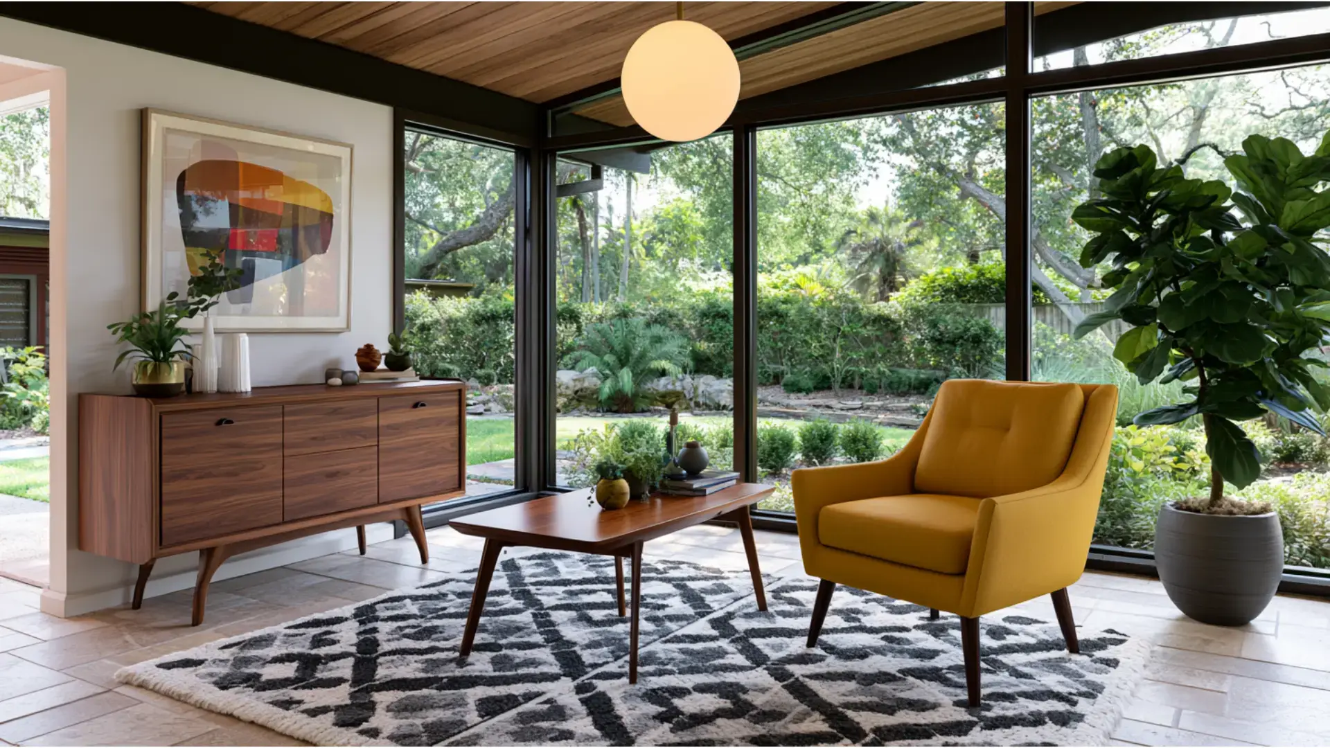
Mid-century modern grew out of postwar optimism and access to new materials like molded plywood and fiberglass.
Designers began creating furniture with tapered legs, organic curves, and a playful use of color. Large windows brought the outdoors in, and open floor plans replaced closed, formal rooms.
That rare combination of warmth, craft, and forward-thinking design is what keeps mid-century modern so recognizable and so deeply loved decades later.
- Color Palette: Mustard yellow, olive green, burnt orange, teal, walnut brown, and white
- Best for: Ranch-style homes, open living areas, home offices, and lounge spaces
8. Industrial
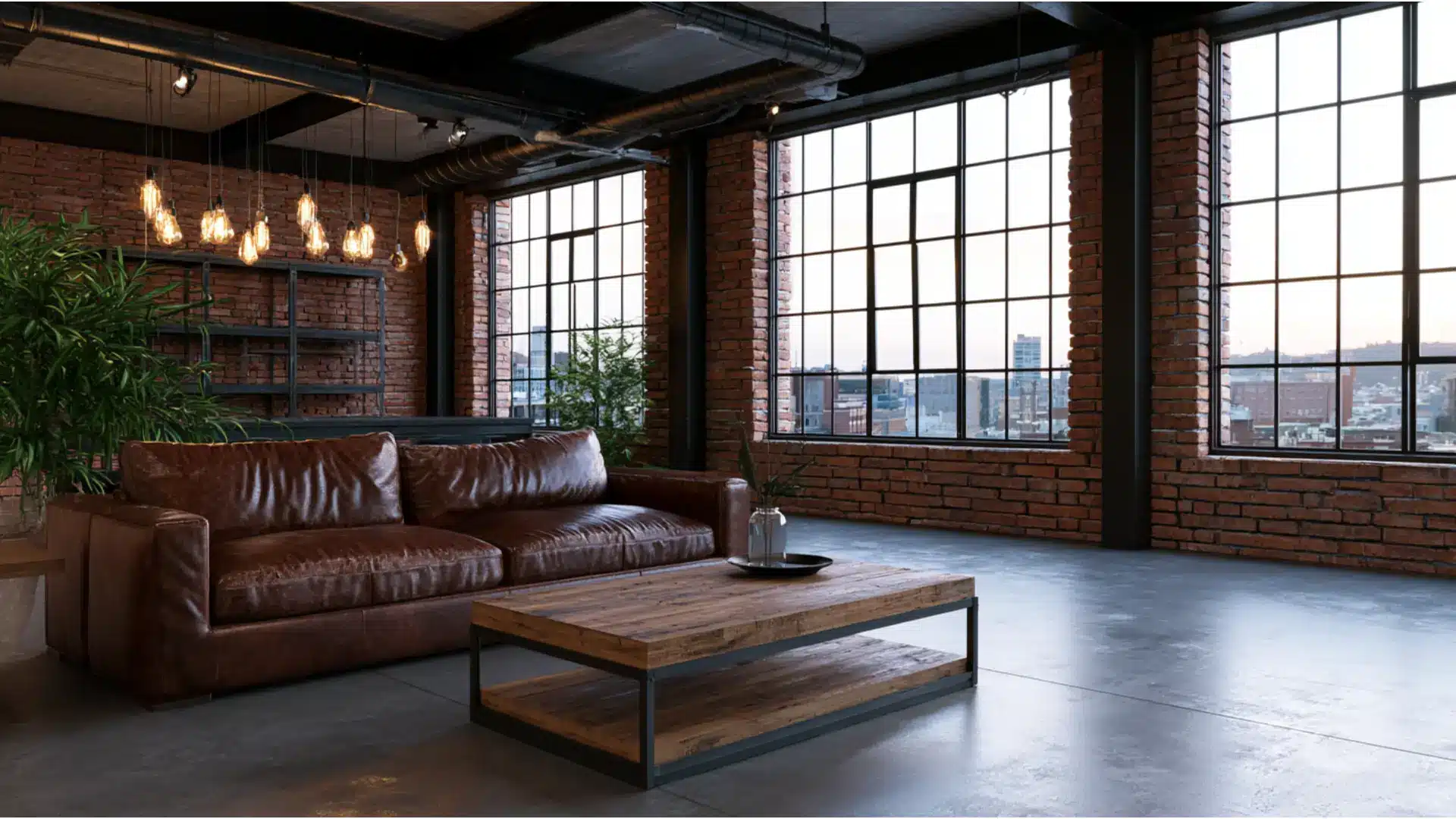
Industrial style finds its character in spaces that were never meant to be homes. Old warehouses and factories, with their exposed brick, bare concrete, and visible metal beams, became the template.
Raw, unfinished surfaces are left on show rather than hidden behind plaster or paint. Edison bulbs and iron fixtures reinforce the appeal.
Rustic style shares some raw-material qualities, but industrial style stays firmly urban, darker, and far less concerned with warmth.
- Color Palette: Charcoal, slate gray, black, rust brown, raw concrete, and aged metal tones
- Best for: Lofts, urban apartments, open kitchens, home bars, and studio spaces
9. Rustic
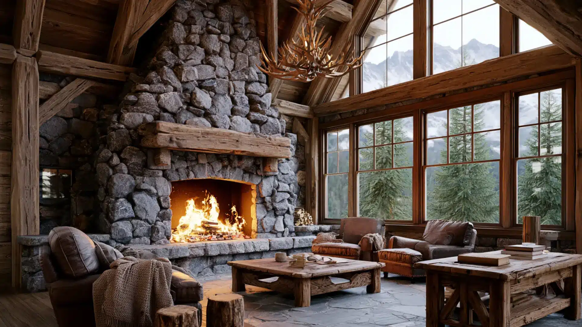
Rustic style takes its cues directly from the natural world. Reclaimed wood, rough stone, and aged metal bring texture and history into a space.
Imperfections in the grain or surface are part of the appeal rather than something to fix. Cozy textiles like wool, burlap, and flannel add layers of warmth.
Farmhouse style shares some of these elements but sits in a more refined, curated space, while rustic leans rawer and closer to a mountain cabin than a renovated barn.
- Color Palette: Warm brown, tan, cream, burnt sienna, forest green, and stone gray
- Best for: Cabins, country homes, living rooms with fireplaces, and dining rooms
10. Farmhouse
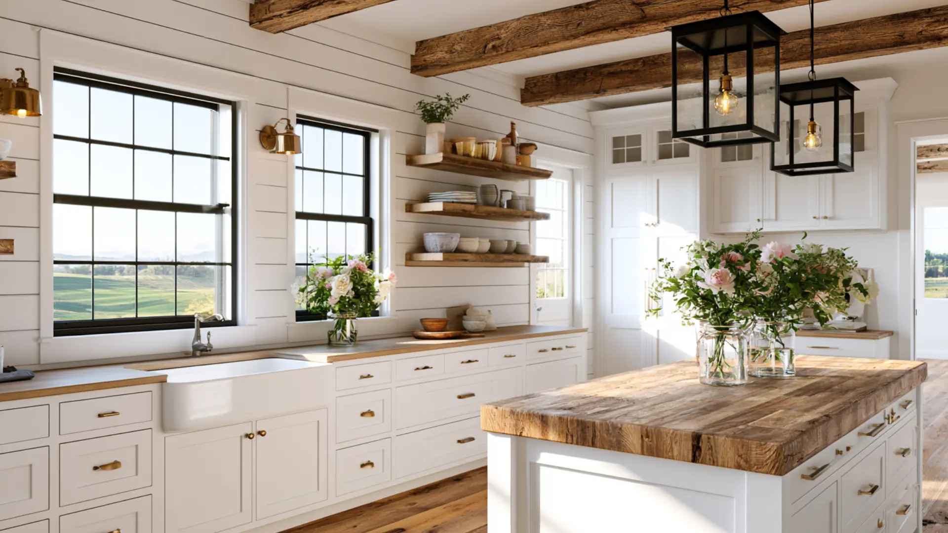
Farmhouse style grew out of practical American rural living, but it has long since moved beyond the countryside.
Shiplap walls, barn-style sliding doors, apron-front sinks, and open wooden shelving give it that signature homey character. White and cream tones keep spaces feeling fresh and light.
The rawness of rustic design gives way here to something more intentional and polished, striking a balance between everyday comfort and a clean, put-together look.
- Color Palette: Crisp white, cream, soft gray, black accents, and warm wood tones
- Best for: Family homes, kitchens, dining rooms, mudrooms, and living rooms
11. Coastal
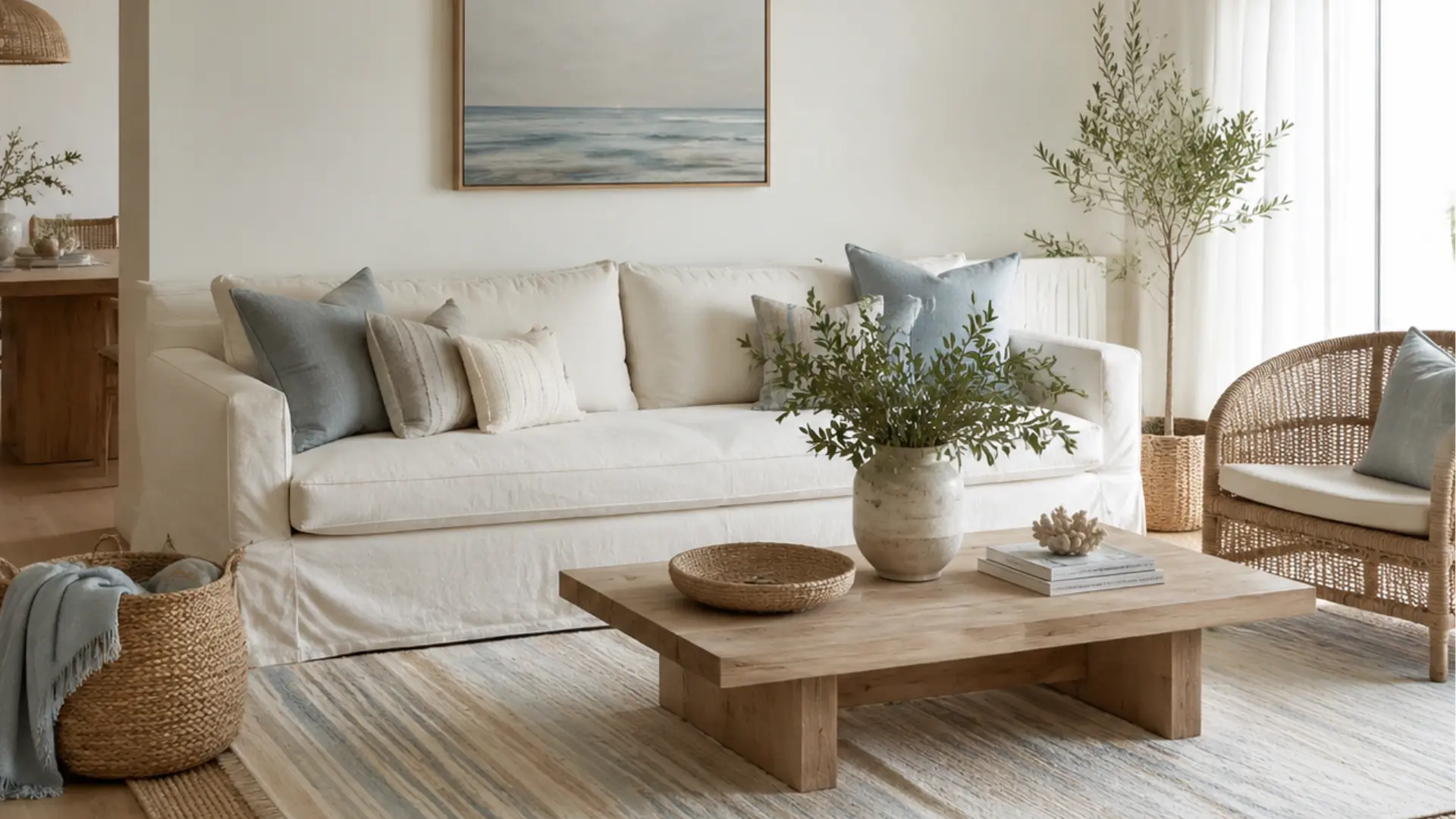
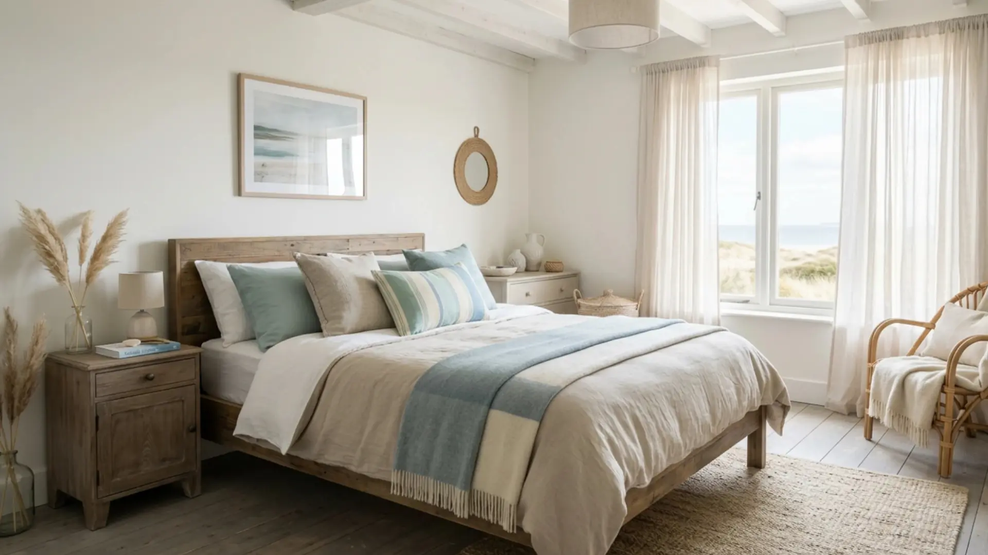
Coastal style captures the ease of living close to the water without relying on obvious nautical clichés. Whitewashed wood, woven rattan, and breezy linen fabrics let rooms breathe.
Soft blues, sandy neutrals, and muted greens echo the shoreline rather than spell it out.
Tropical style turns up the energy with bold color and lush greenery, but coastal keeps everything calm, soft, and unhurried. The goal is a home that always feels like a long exhale.
- Color Palette: Ocean blue, seafoam green, sandy beige, white, soft coral, and driftwood gray
- Best for: Beach homes, vacation properties, living rooms, and sunrooms
12. Bohemian (Boho)
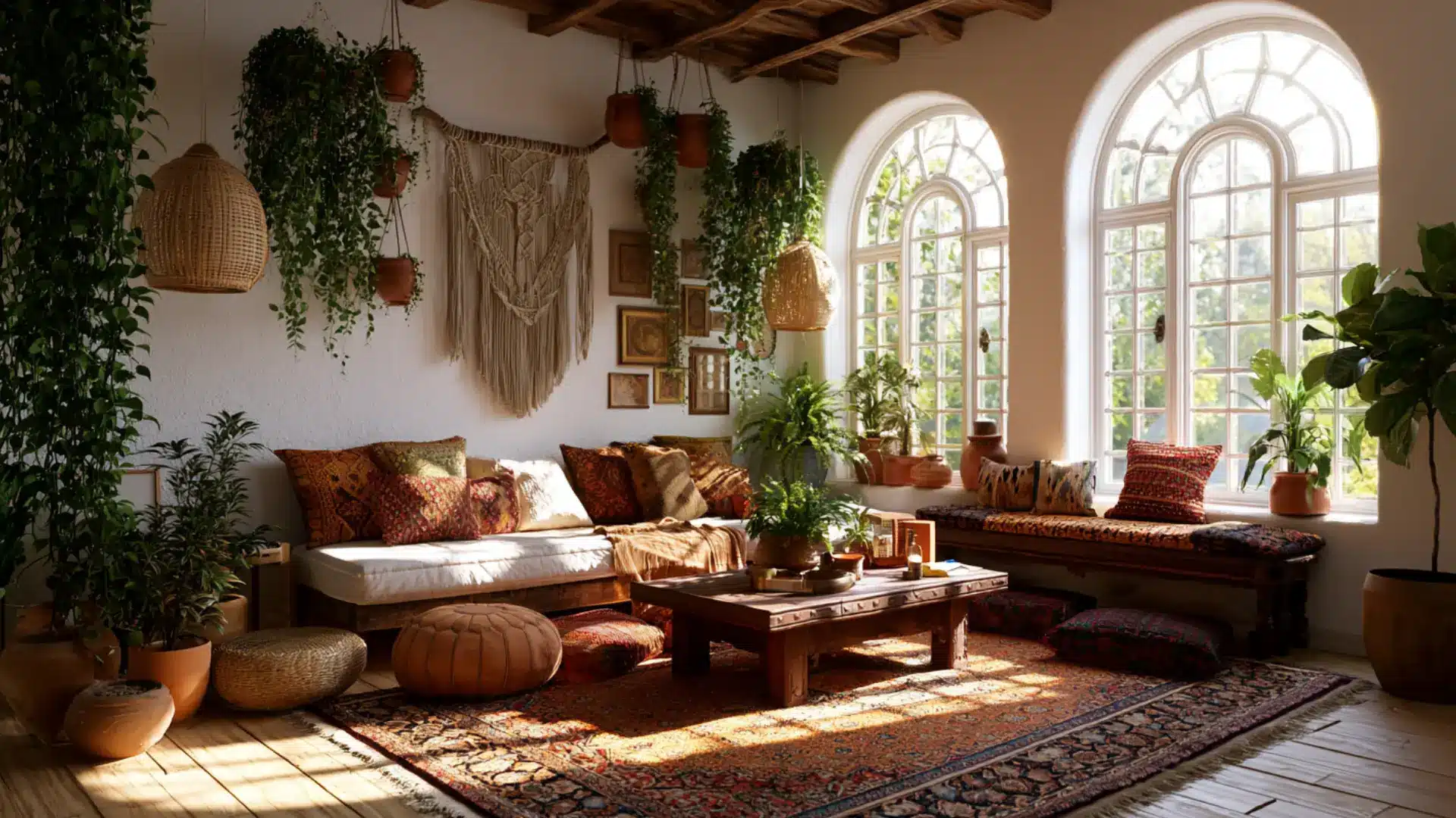
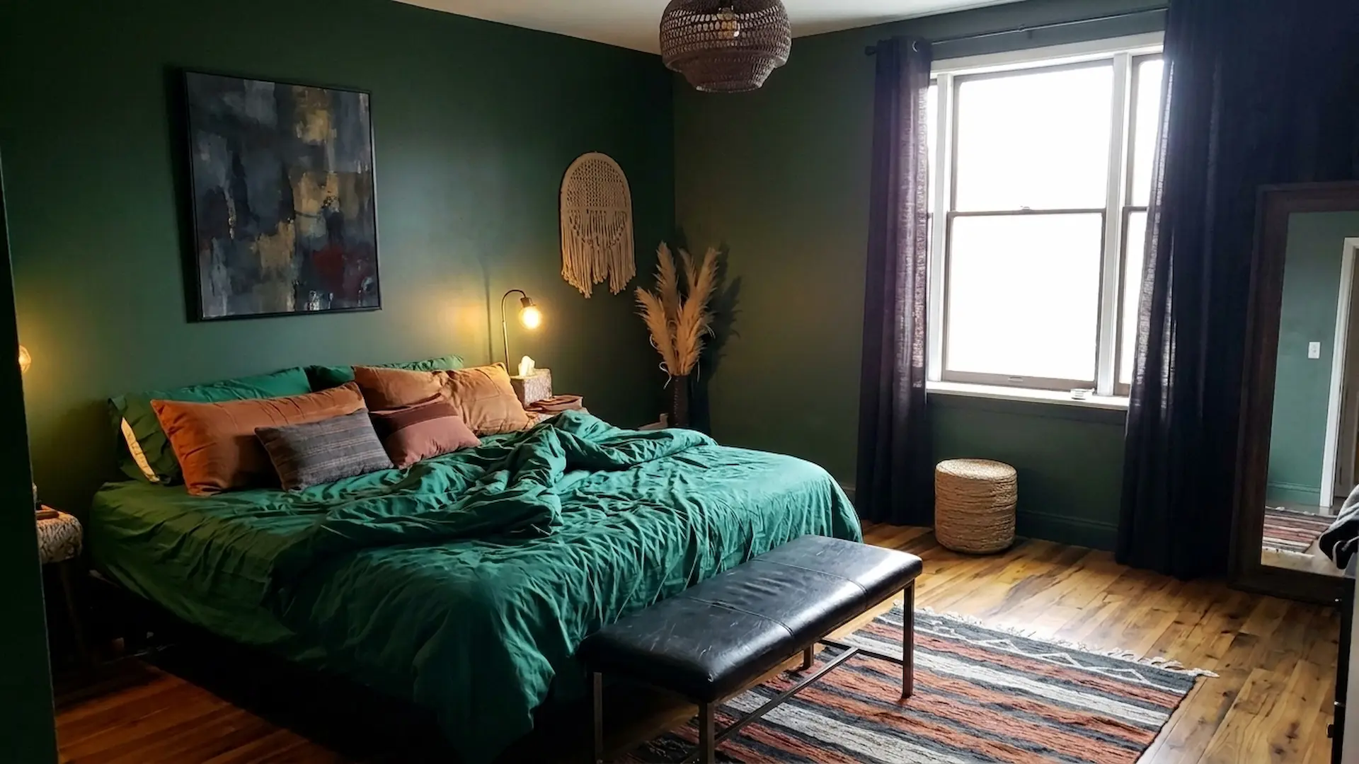
Boho style resists rules by design. It layers global textiles, handmade objects, trailing plants, and collected pieces from different cultures into something that feels lived-in and deeply personal.
Macramé, woven rugs, and mismatched cushions pile up in the best possible way.
Eclectic style also mixes freely, but boho has a specific free-spirited, artsy energy tied to travel and creativity that gives it a distinct identity all its own.
- Color Palette: Terracotta, deep jewel tones, saffron, turquoise, rust, and warm earthy neutrals
- Best for: Apartments, creative studios, bedrooms, living rooms, and outdoor spaces
13. Eclectic
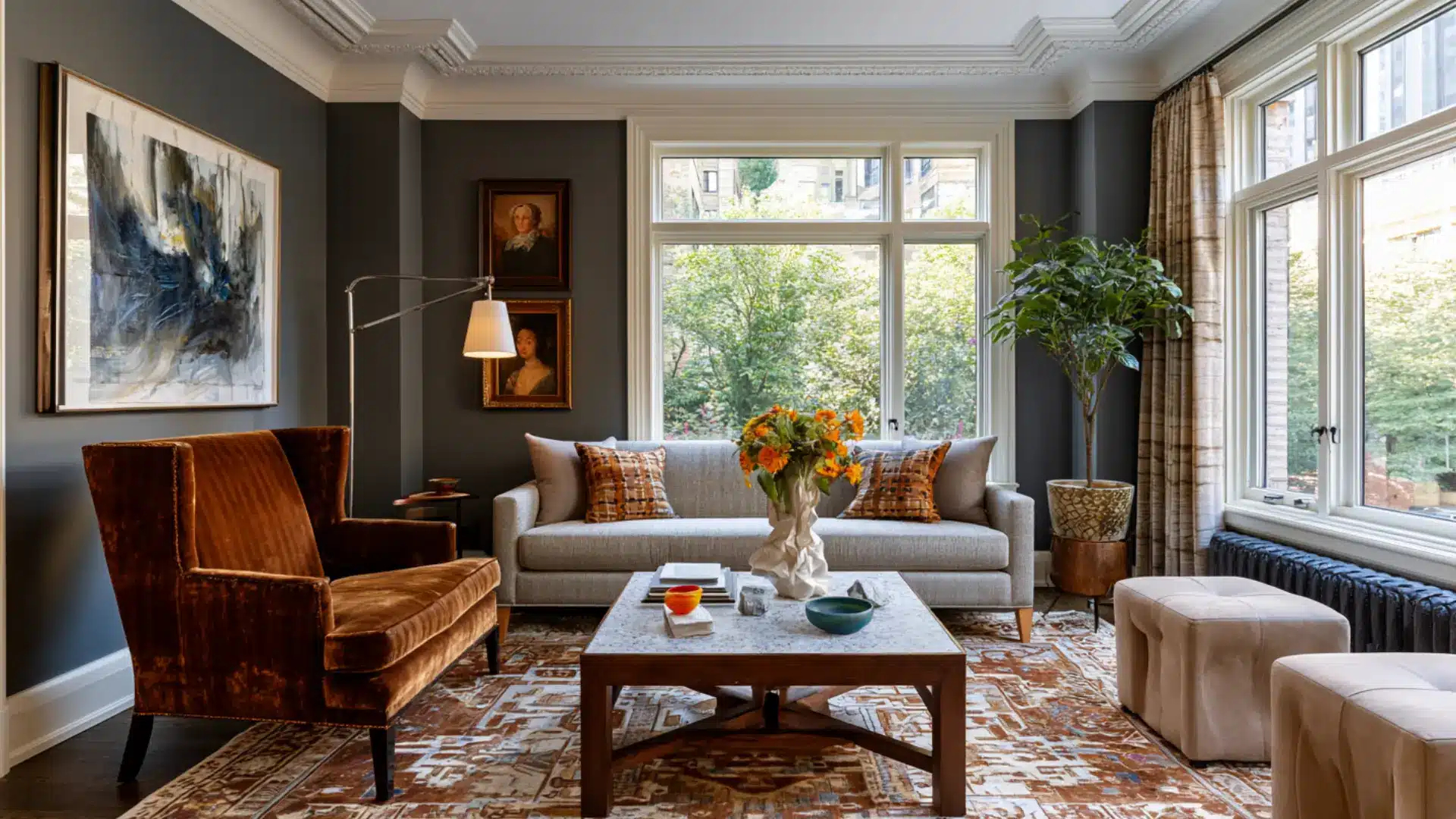
Eclectic style is what happens when someone with a strong design eye refuses to commit. Pieces from different periods, cultures, and styles share the same room without competing.
A vintage armchair might sit beside a sleek modern lamp. The secret to making it work is a consistent color thread that ties everything together.
Boho mixing tends toward the artsy and global, but eclectic can just as easily pull in formal or structured pieces alongside casual ones.
- Color Palette: Flexible, but grounded in one or two anchor tones with varied accent colors
- Best for: Creative homeowners, large living spaces, dining rooms, and unique statement rooms
14. Transitional
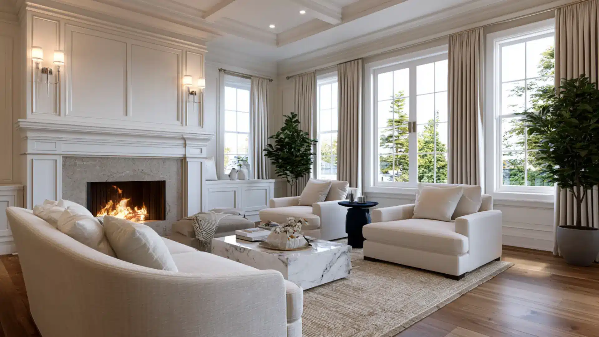
Transitional style exists in the space between two worlds. It takes the warmth and craftsmanship of traditional design and pairs it with the clean simplicity of contemporary spaces.
Furniture has soft curves but skips heavy ornamentation. Neutral tones keep things calm and cohesive.
Neither dated nor aggressively trendy, it sits in a sweet spot that feels classic without being stiff, which is exactly why it remains one of the most widely chosen styles in home design.
- Color Palette: Warm whites, soft taupe, greige, navy, charcoal, and light wood tones
- Best for: Family homes, living rooms, master bedrooms, and open-plan spaces
15. French Country
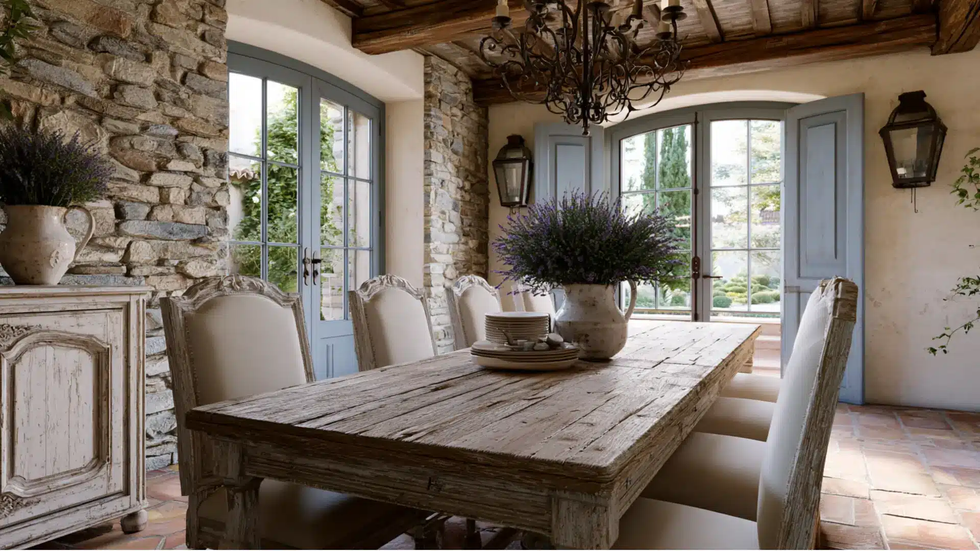
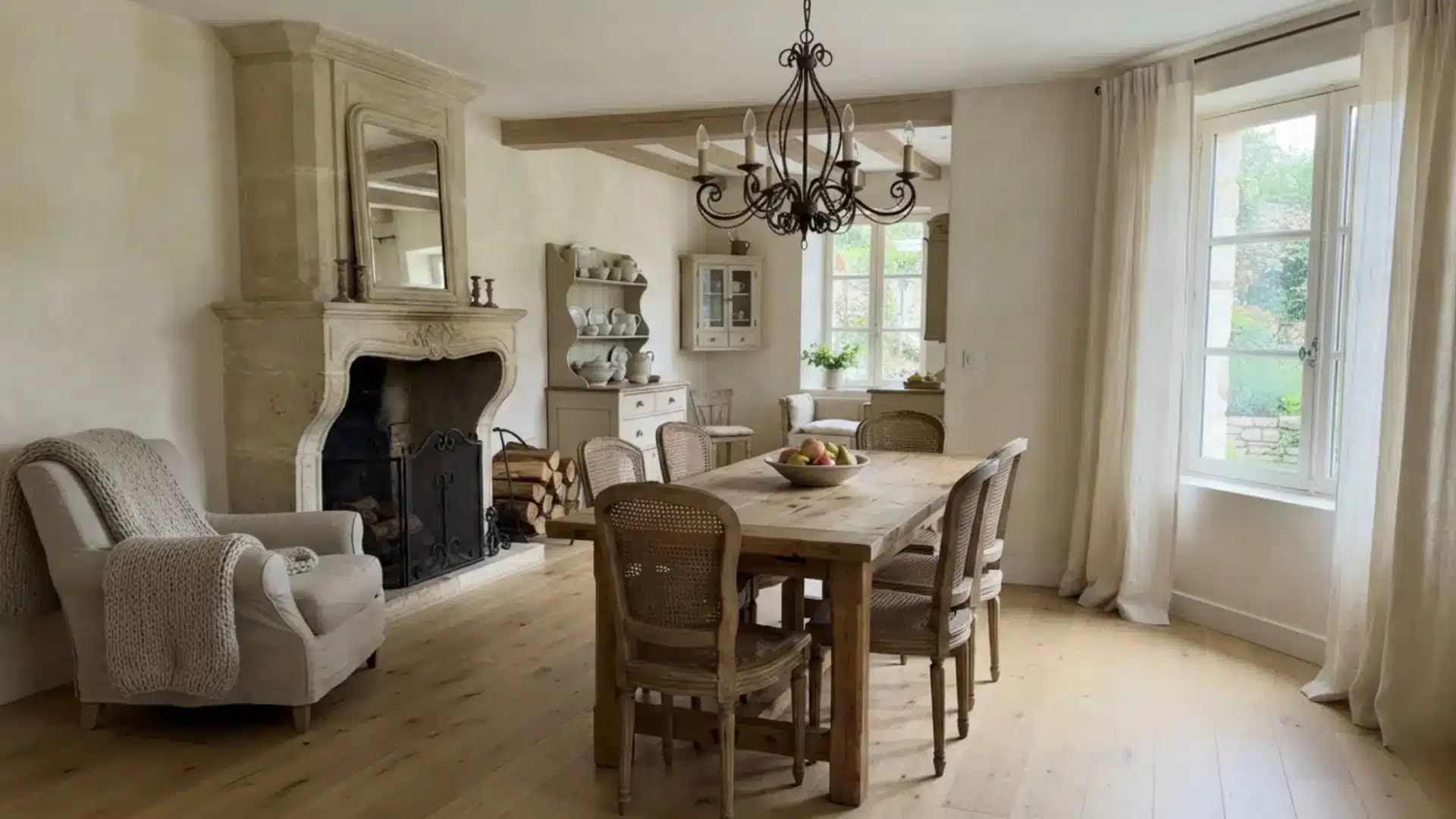
French country style draws from the sunlit farmhouses and lavender fields of Provence.
Distressed wood furniture, wrought-iron fixtures, stone floors, and floral fabrics create a look that feels romantic yet never fussy. The tones are soft and slightly faded, as if warmed by years of afternoon light.
Formal traditional style keeps visitors at arm’s length, but French country carries a relaxed classiness that welcomes everyday life rather than keeping it at a distance.
- Color Palette: Lavender, soft yellow, dusty blue, sage green, cream, and warm terracotta
- Best for: Kitchens, dining rooms, bedrooms, and homes with a country or cottage feel
16. Mediterranean
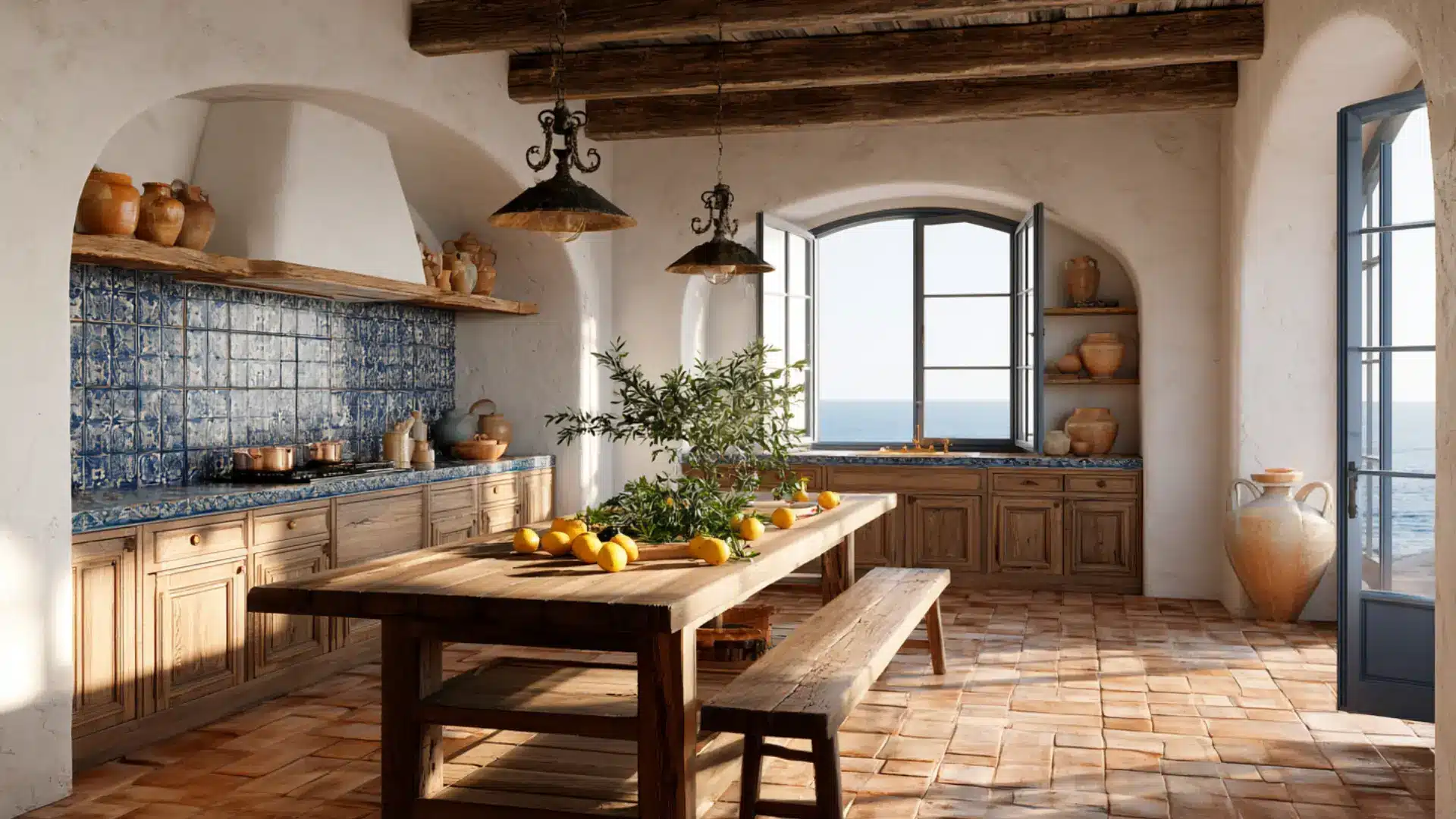
Mediterranean style draws from the sun-drenched coastlines of Spain, Italy, and Greece.
Terracotta tile floors, thick whitewashed walls, arched doorways, and hand-painted mosaic accents bring old-world warmth into every room. Bold textiles and decorative ironwork add layers of texture and culture.
Tuscan style stays closer to rural Italy with deeper, warmer tones, while Mediterranean casts a wider cultural net and feels more open and coastal in spirit.
- Color Palette: Terracotta, cobalt blue, warm white, ochre yellow, olive green, and sandy tan
- Best for: Villas, warm-climate homes, outdoor spaces, kitchens, and living rooms
17. Art Deco
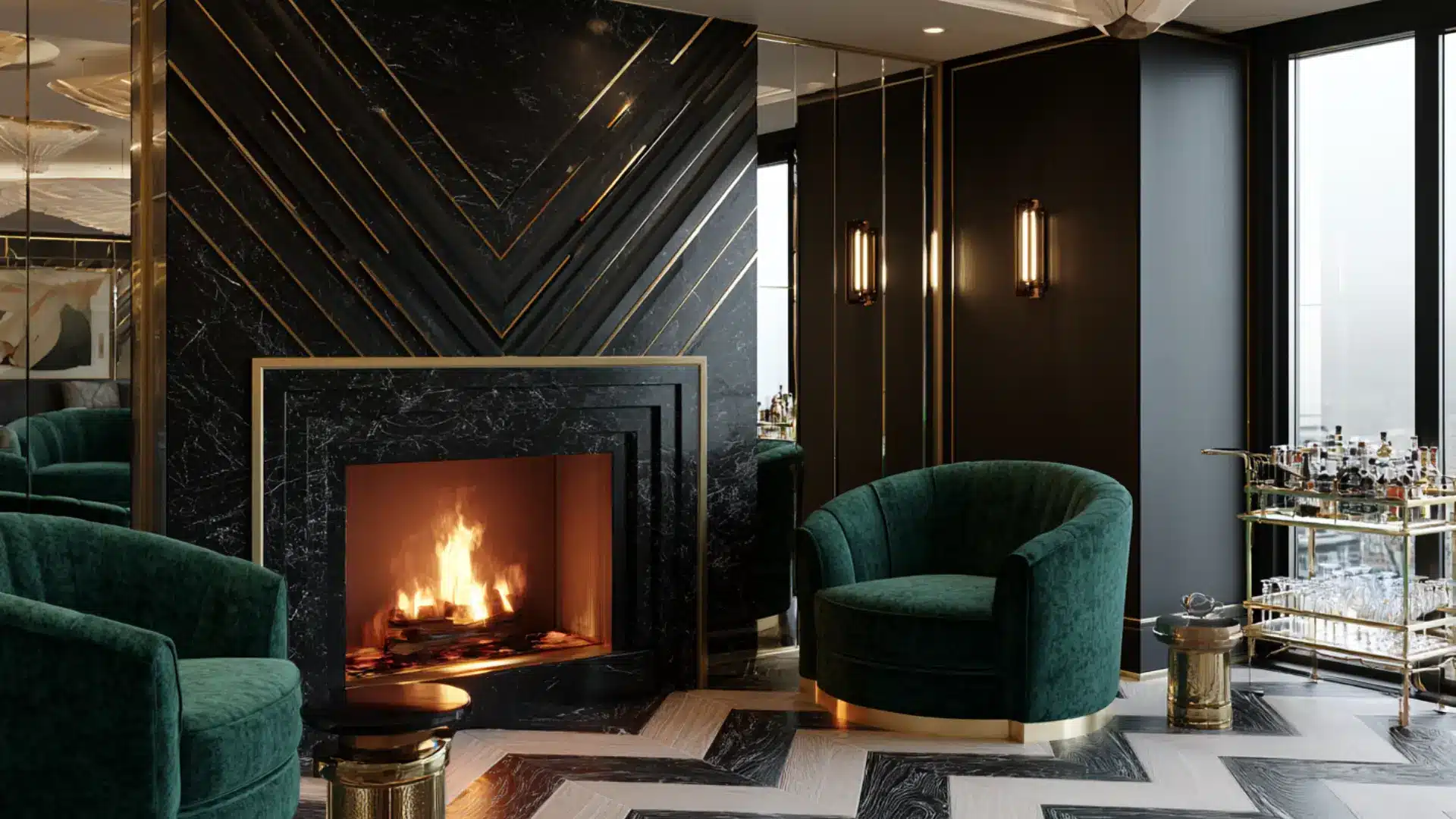
Art Deco emerged in the 1920s as a bold, geometry-driven reaction to the softer styles that came before it. Chevron patterns, stepped forms, and sharp angles defined the visual language.
Polished marble, lacquered surfaces, and materials like chrome and onyx added richness. Where Hollywood Regency reaches for pure glamour, Art Deco is more structural and graphic in its ambitions. Every detail feels deliberate, precise, and quietly theatrical.
- Color Palette: Black, gold, ivory, deep teal, emerald green, and rich jewel tones
- Best for: Formal living rooms, dining rooms, entryways, and upscale apartments
18. Hollywood Regency
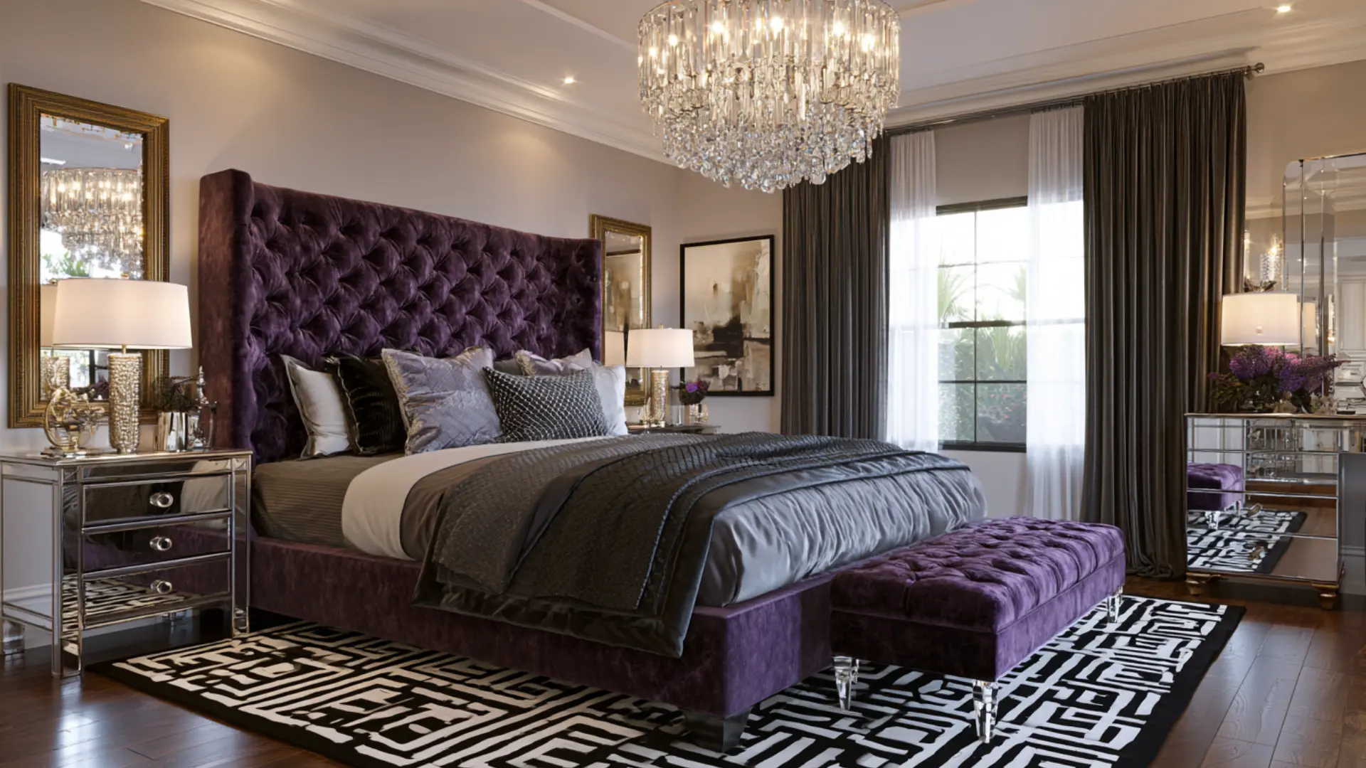
Hollywood Regency was born from the golden age of Los Angeles glamour, when film stars demanded homes as dramatic as their on-screen personas.
Mirrored furniture, jewel-toned velvet, bold graphic patterns, and gold accents turned every room into a statement.
Art Deco values geometry and precision, but Hollywood Regency operates in an entirely different register, where maximalist luxury is the only currency that counts. Restraint has no place here whatsoever.
- Color Palette: Hot pink, emerald green, royal purple, gold, black, and crisp white
- Best for: Master bedrooms, walk-in closets, living rooms, and home entertainment spaces
19. Victorian
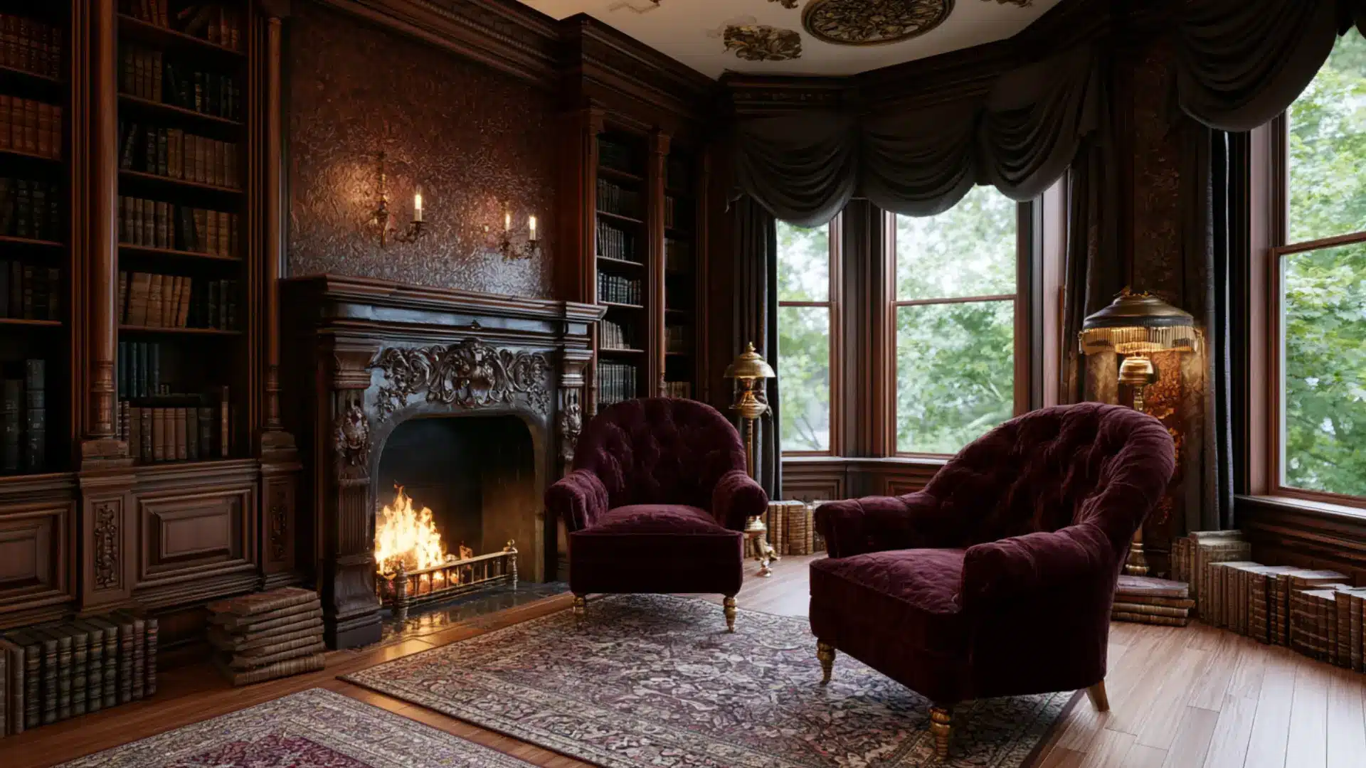
Victorian style reflects the design values of 19th-century England, where more was always more.
Dark wood furniture, richly patterned wallpaper, layered drapes, and ornate accessories filled every corner of a room. Tassels, fringe, and carved detailing appeared on nearly everything.
Traditional style stays restrained and symmetrical by comparison, while Victorian interiorsadopt density and decoration as proud expressions of taste and prosperity. For history lovers, it is mesmerizing.
- Color Palette: Deep burgundy, forest green, navy, mustard gold, rich plum, and dark walnut
- Best for: Period homes, formal sitting rooms, libraries, and master bedrooms
20. Georgian
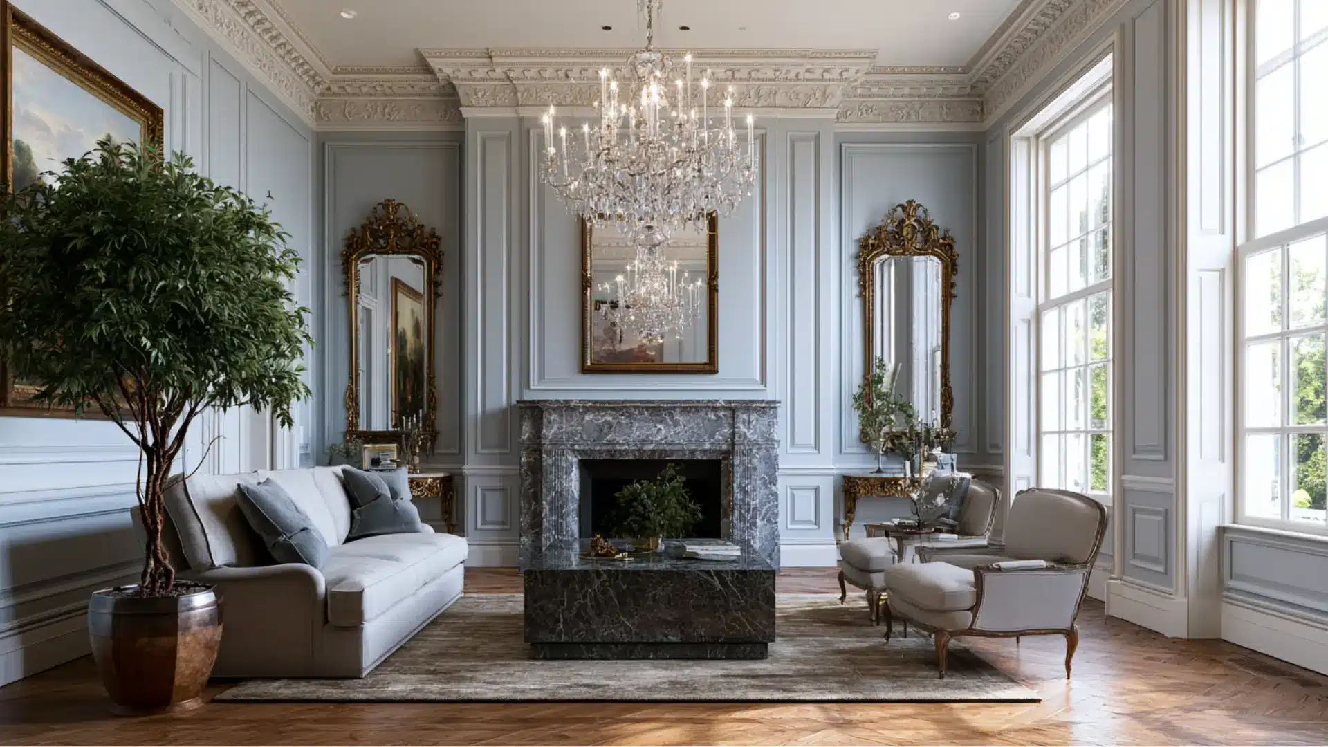
Georgian style emerged in 18th-century England as an expression of order, proportion, and classical restraint.
Paneled walls, lavish fireplaces, and symmetrical furniture arrangements gave rooms a dignified, constructive quality. Decoration was present but never excessive.
The dense layering of Victorian style came later as a deliberate swing in the opposite direction, while Georgian interiors remained committed to breathing room and balance. That clarity of structure has influenced formal design traditions ever since.
- Color Palette: Sage green, soft blue, cream, warm white, pale gold, and muted terracotta
- Best for: Period townhouses, formal living rooms, dining rooms, and entryways
21. Colonial
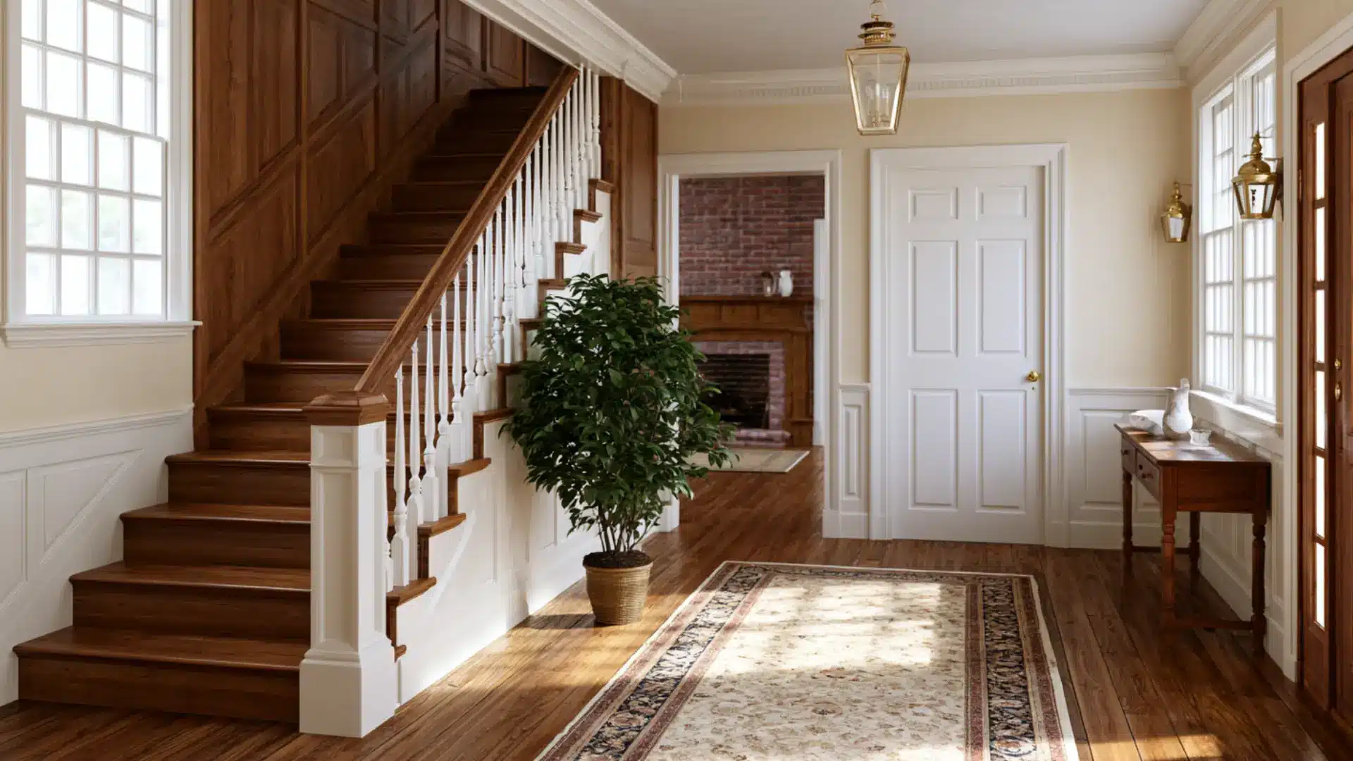
Colonial style grew from the practical needs of early American settlers who brought European tastes with them and adapted them to new surroundings.
Symmetrical floor plans, wood-paneled walls, and brick fireplaces formed the backbone of these homes. The look is grounded and unpretentious, with natural materials doing most of the work.
Georgian style carries a more formally European character, but colonial style has a warmer, more humble American quality rooted as much in necessity as in appeal.
- Color Palette: Navy blue, brick red, forest green, cream, warm white, and aged wood tones
- Best for: Traditional family homes, living rooms, dining rooms, and entryways
22. English Cottage
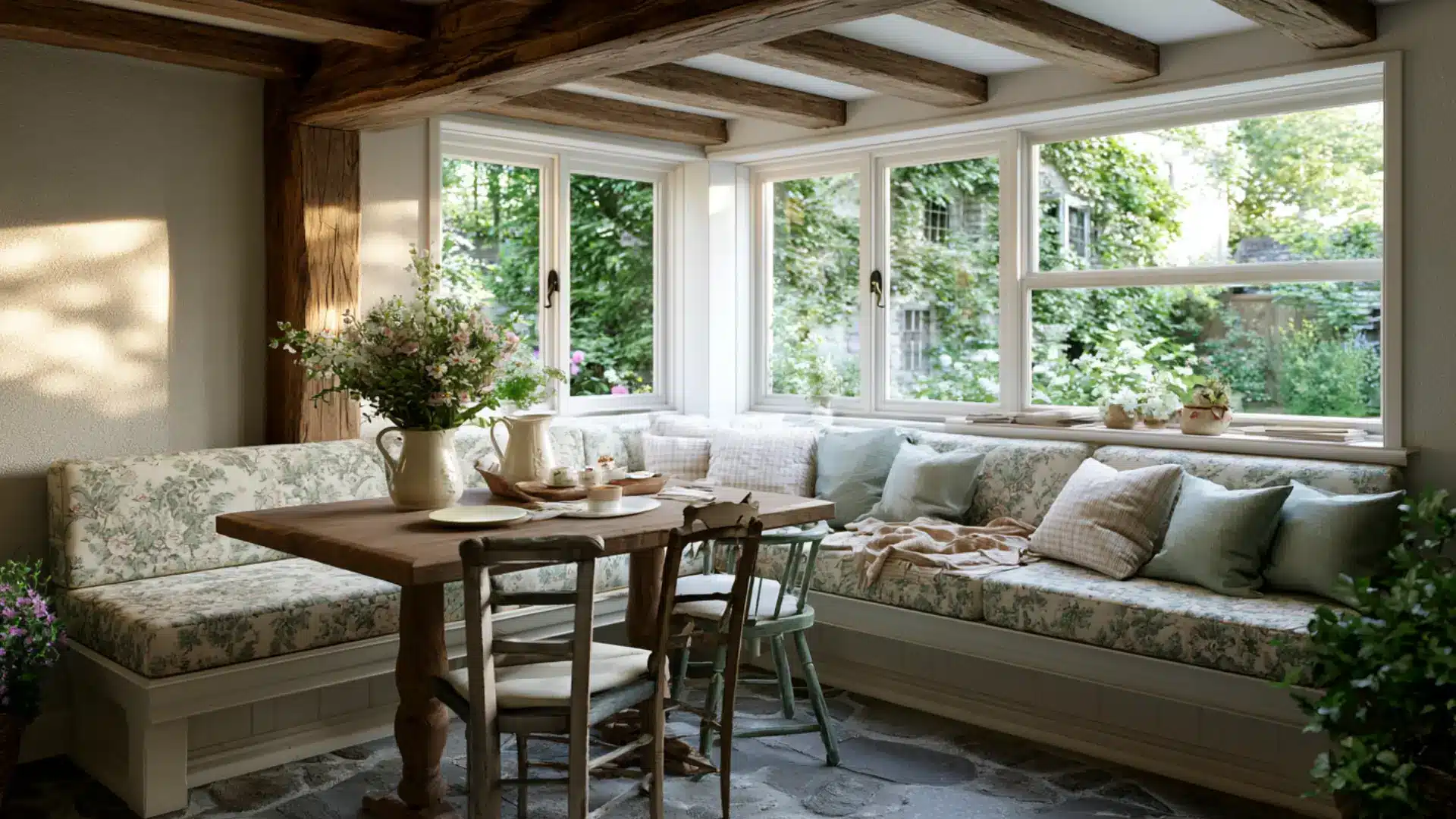
English cottage style feels like stepping into a home that has grown slowly over many decades.
Exposed ceiling beams, stone floors, floral wallpaper, and mismatched furniture pieces come together in a way that feels organic rather than designed. Nothing matches perfectly, and that is exactly the point.
French country shares a similar rural European spirit but arrives at it with more polish and deliberate grace, while the English cottage stays modest, slightly worn, and full of quiet appeal.
- Color Palette: Soft rose, sage green, sky blue, cream, warm yellow, and earthy brown
- Best for: Cottages, older homes, living rooms, reading nooks, and bedrooms
23. Shabby Chic
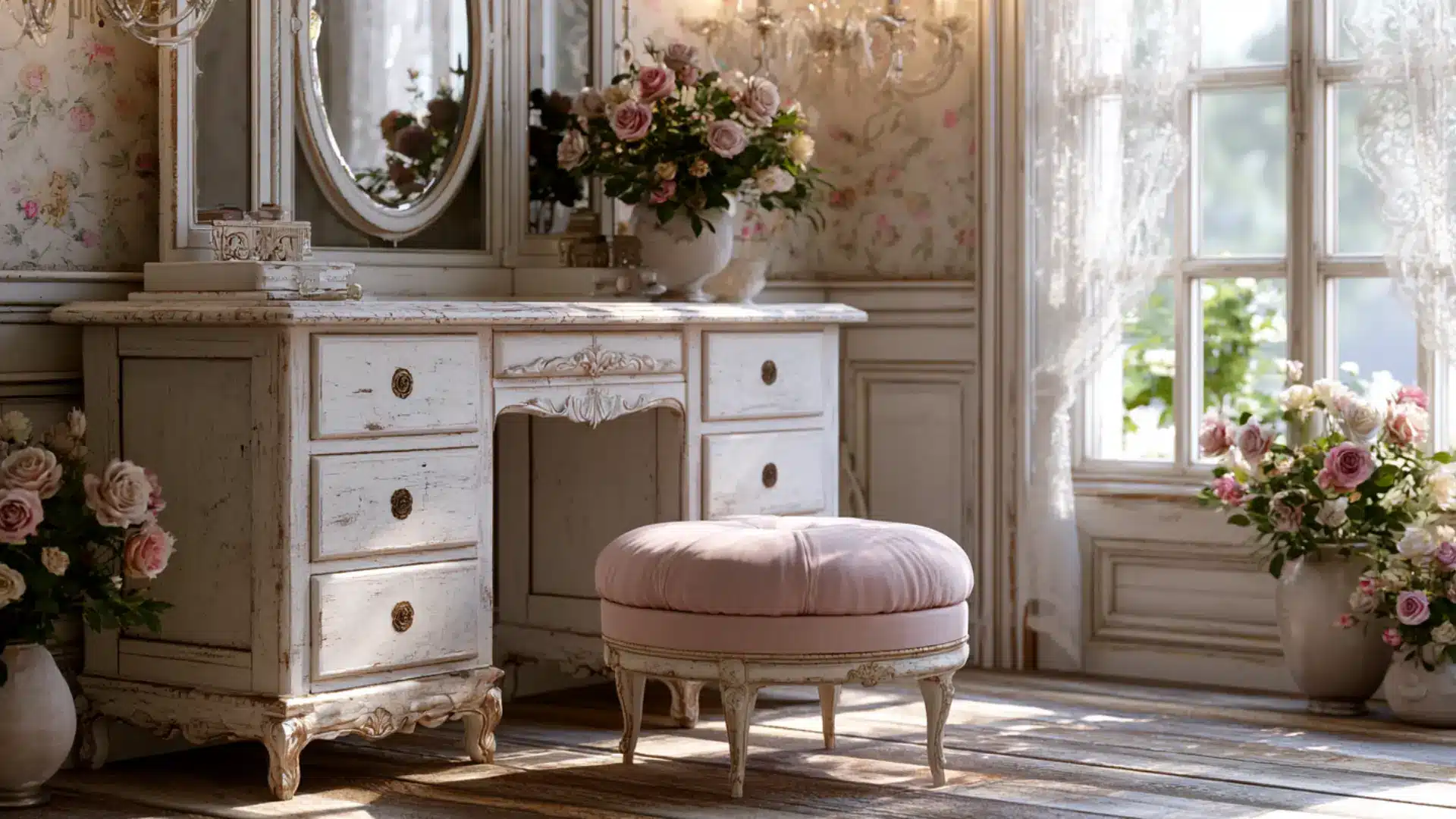
Shabby chic takes vintage furniture and softens it with a romantic, feminine touch. Pieces are often painted in chalky whites or pale pastels, then deliberately distressed to show wear.
Lace curtains, floral prints, and ruffled fabrics add to the dreamy, thoughtful mood.
English cottage and shabby chic are sometimes confused, but cottage style draws its character from rural structure and age, while shabby chic is more overtly decorative, softer in tone, and consciously romantic in intent.
- Color Palette: Soft white, pale pink, dusty lavender, mint green, and muted gold
- Best for: Bedrooms, dressing rooms, vintage-style living rooms, and small cozy spaces
24. Country
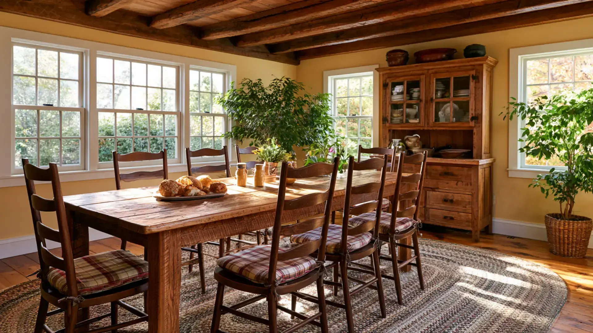
Country style is the broadest of all the rural-inspired appearances, covering everything from American farmland to English villages.
Plaid and gingham fabrics, solid wooden furniture, braided rugs, and handcrafted touches give rooms a warm, unpretentious feel. Nothing feels overdone or trend-chasing.
Farmhouse style has grown into something more curated and modern over time, but country remains classy in a quieter way, rooted in simplicity and the rhythms of everyday rural life.
- Color Palette: Warm red, golden yellow, forest green, cream, tan, and rich wood tones
- Best for: Rural homes, family living rooms, kitchens, and dining rooms
25. Southwestern
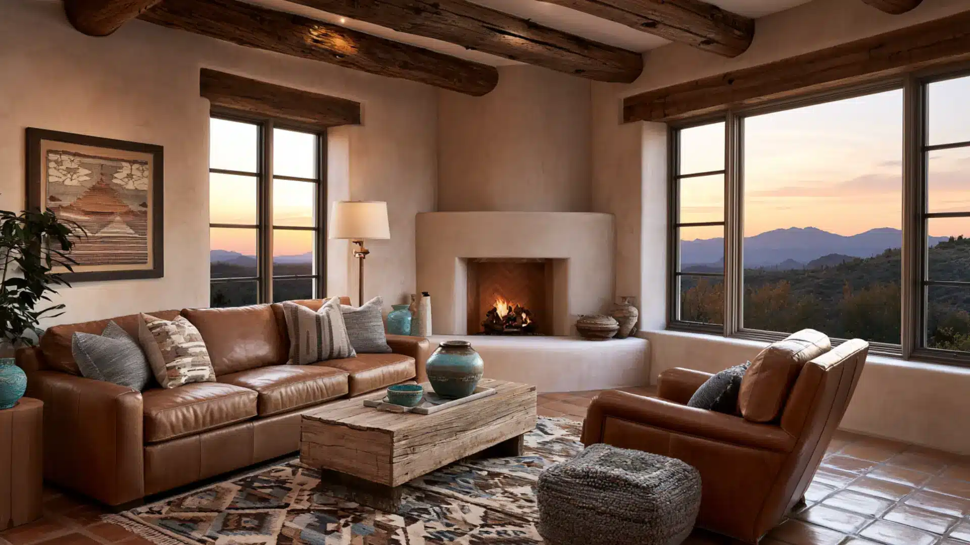
Southwestern style is deeply tied to the desert landscapes and indigenous cultures of the American Southwest. Adobe-inspired walls, terracotta pottery, leather furniture, and hand-woven textiles bring warmth and texture into every space.
Geometric patterns drawn from Native American and Spanish colonial traditions appear on rugs, cushions, and wall art.
The patterns here feel angular and sun-baked, shaped by open desert rather than any other cultural tradition.
- Color Palette: Terracotta, turquoise, burnt orange, sand, rust red, and warm brown
- Best for: Desert-region homes, living rooms, entryways, and outdoor patios
26. Moroccan
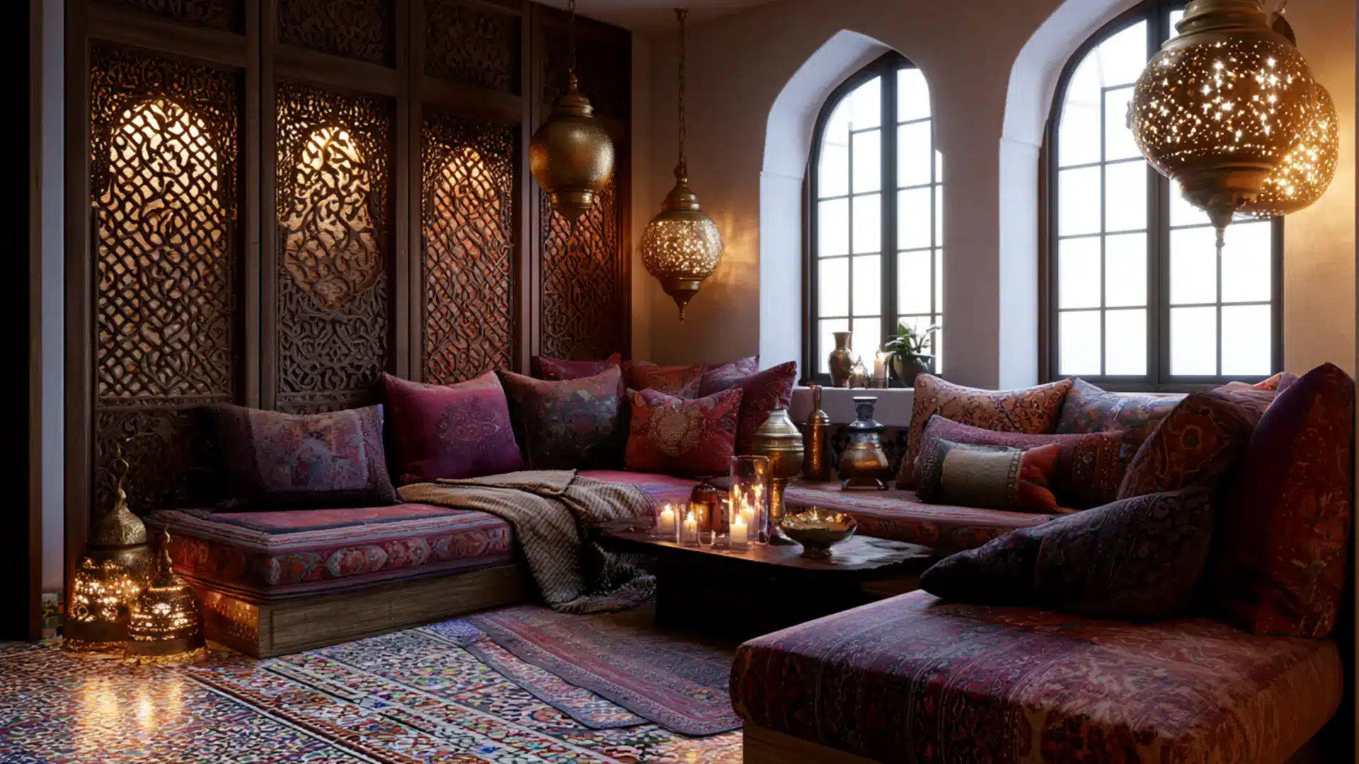
Moroccan style layers color, pattern, and texture at every turn. Intricately carved wood screens, hand-cut mosaic tiles, hanging lanterns, and richly dyed fabrics create an atmosphere that feels immersive and theatrical.
It blends Arabic, Berber, and Andalusian influences into something uniquely its own.
Boho borrows globally without a fixed identity, but Moroccan design is anchored in a specific place and visual language that cannot be replicated elsewhere.
- Color Palette: Deep saffron, cobalt blue, rich red, gold, emerald green, and warm ivory
- Best for: Living rooms, home lounges, dining areas, and statement bedrooms
27. Tuscan
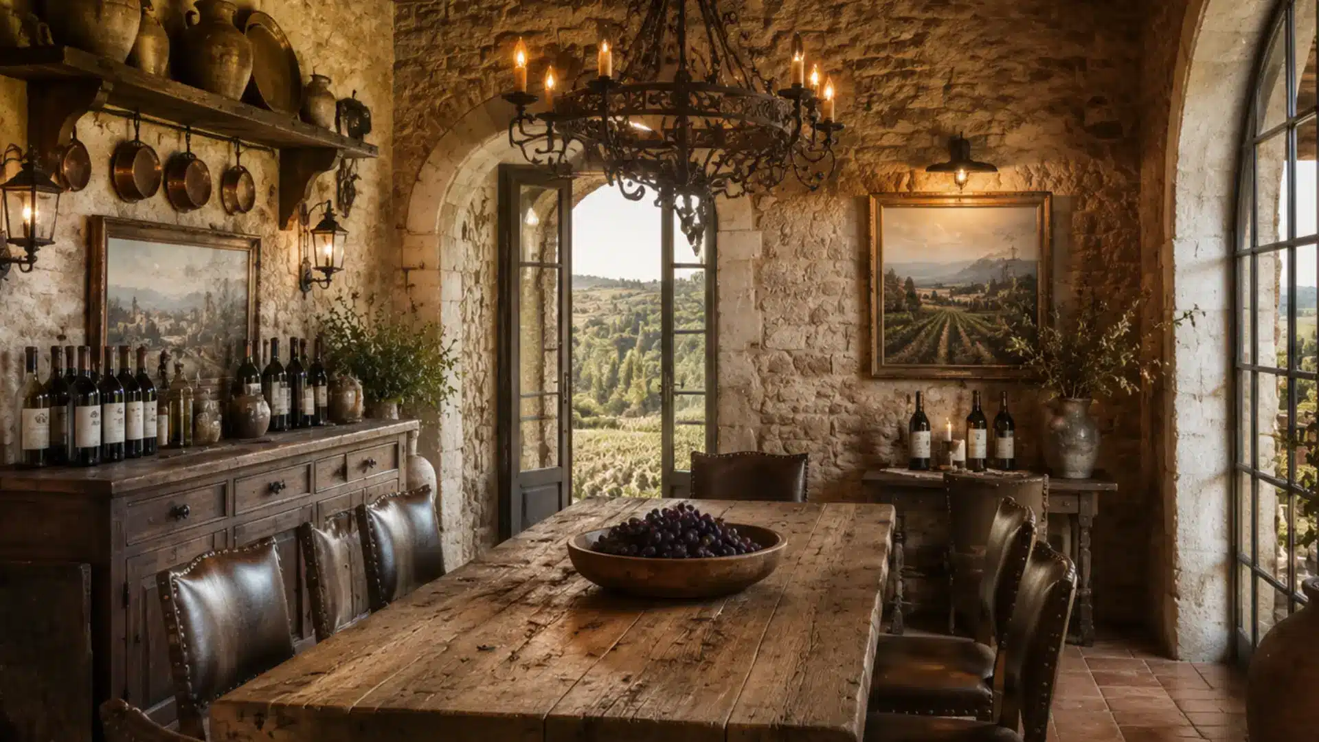
Tuscan style feels like it grew out of the land rather than being designed.
Rough stone walls, terracotta tile floors, heavy wooden beams, and wrought iron fixtures create a look that is earthy, warm, and full of age.
Rich fabrics and antique-inspired furniture reinforce the old-world mood. The broader Mediterranean style spans multiple cultures, but Tuscan stays specifically and warmly Italian in every detail.
- Color Palette: Warm terracotta, golden yellow, olive green, rust, cream, and aged stone
- Best for: Kitchens, dining rooms, warm-climate homes, and villas
28. Tropical
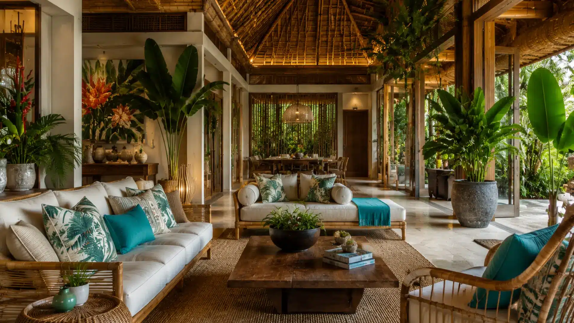
Tropical style brings the energy of lush living landscapes straight into the home. Oversized leafy plants, bamboo furniture, rattan accents, and bold botanical prints fill rooms with color and movement.
Indoor and outdoor spaces blur together through open layouts and natural materials.
Coastal style shares the warm-weather setting but stays soft and restrained, while tropical turns up the volume and celebrates nature at its most exuberant.
- Color Palette: Lush green, bright coral, sunny yellow, turquoise, white, and natural wood tones
- Best for: Sunrooms, warm-climate homes, outdoor-connected living areas, and vacation homes
29. Urban Modern
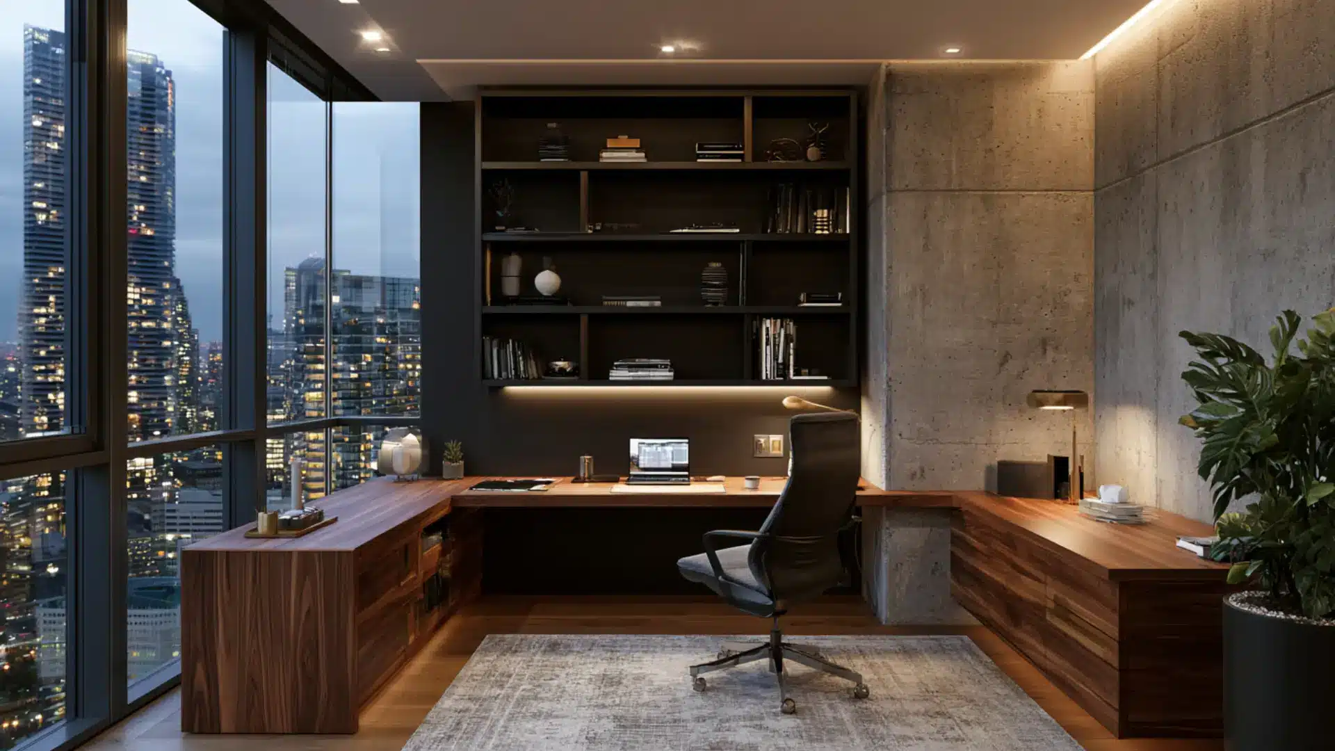
Urban modern style was shaped by the realities of city living, where space is limited, and every square foot works hard.
Sleek furniture, smart storage, and a neutral palette keep things open and uncluttered. Mixed materials like brushed metal, matte wood, and glass add depth without noise.
Industrial style leaves surfaces deliberately raw, but urban modern polishes everything to a refined finish built for city life.
- Color Palette: Charcoal, warm white, concrete gray, matte black, soft taupe, and brushed brass
- Best for: City apartments, condos, lofts, home offices, and open-plan living spaces
30. Organic Modern
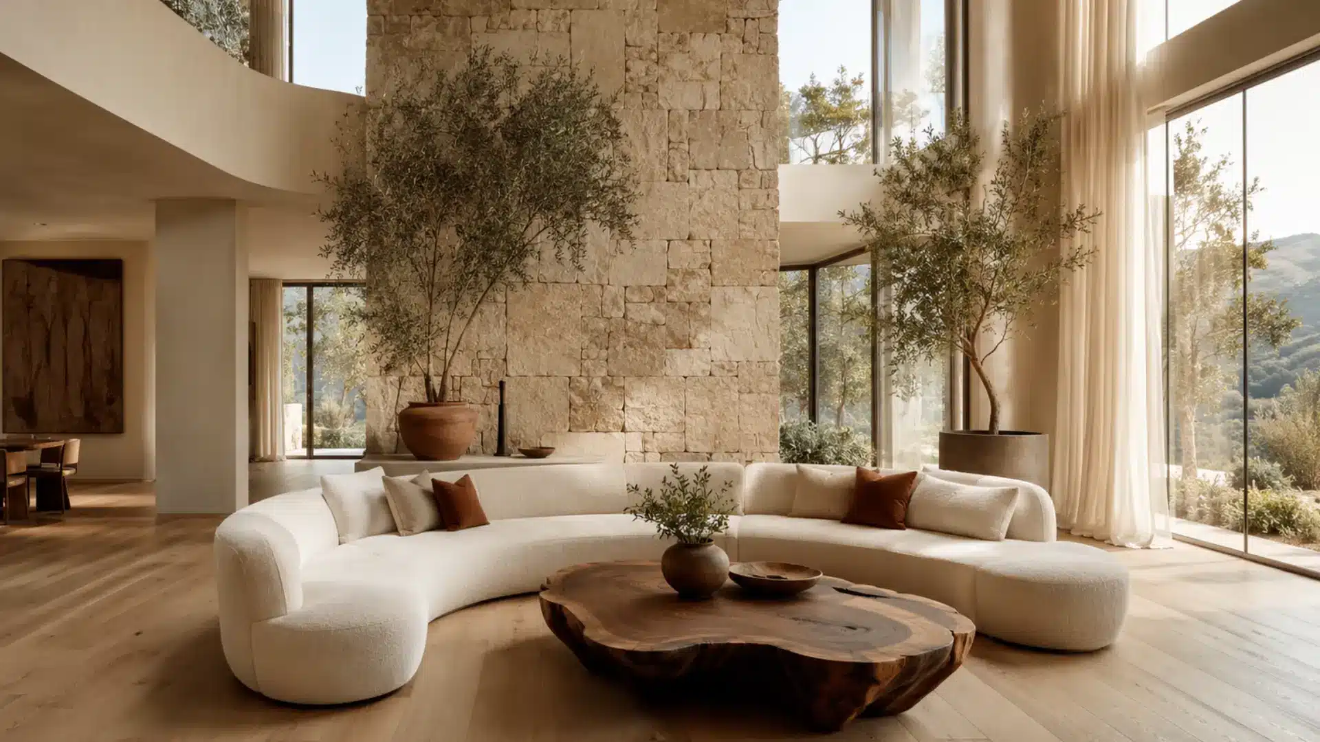
Organic modern softens contemporary design by bringing nature into the equation.
Curved furniture, natural stone surfaces, linen fabrics, and live-edge wood replace hard lines and synthetic materials. The palette stays neutral and grounded throughout.
Where Japandi achieves calm through cultural philosophy, organic modern arrives at a similar stillness through purely structural means, letting the sculptural quality of shapes and materials do all the talking.
- Color Palette: Warm white, sand, terracotta, soft brown, olive, and natural stone tones
- Best for: Contemporary homes, living rooms, open-plan spaces, and master bedrooms
31. Wabi-Sabi
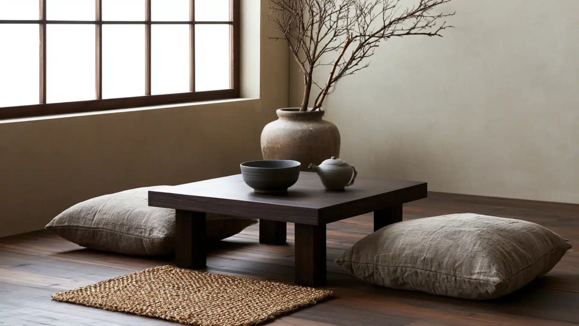
Wabi-sabi is a Japanese philosophy, before it is a design style. It finds beauty in impermanence, imperfection, and age.
Cracked pottery, weathered wood, faded textiles, and uneven surfaces are not flaws here.
They are the point. Rooms feel still and unforced, with objects chosen for genuineness over appearance. Minimalism seeks visual perfection through reduction, but wabi-sabi values the quiet dignity of things that have genuinely lived.
- Color Palette: Ash gray, warm beige, moss green, clay brown, faded white, and natural wood
- Best for: Bedrooms, meditation rooms, Japanese-influenced homes, and quiet reading spaces
32. Zen
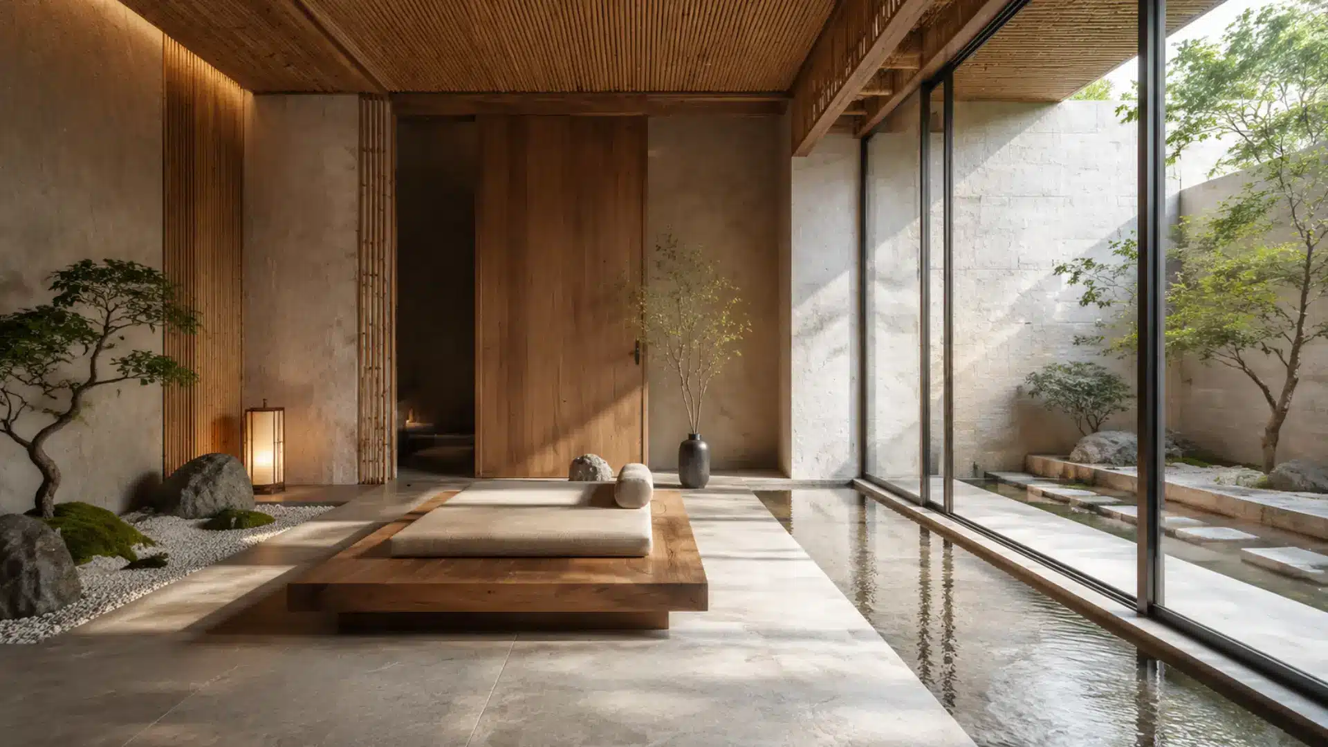
Zen style takes its cues from Buddhist principles of simplicity, balance, and mindfulness. Every object is chosen with care, and nothing competes for attention.
Natural materials like bamboo, stone, and unfinished wood create a grounded feel. Water features and indoor plants reinforce the connection to nature.
Wabi-sabi celebrates imperfection openly, but Zen interiors are more deliberately composed, designed to encourage a specific clarity of mind through the space itself.
- Color Palette: Soft white, pale gray, sand, warm beige, bamboo green, and natural stone
- Best for: Bedrooms, bathrooms, meditation spaces, and spa-inspired home retreats
33. Japanese Traditional
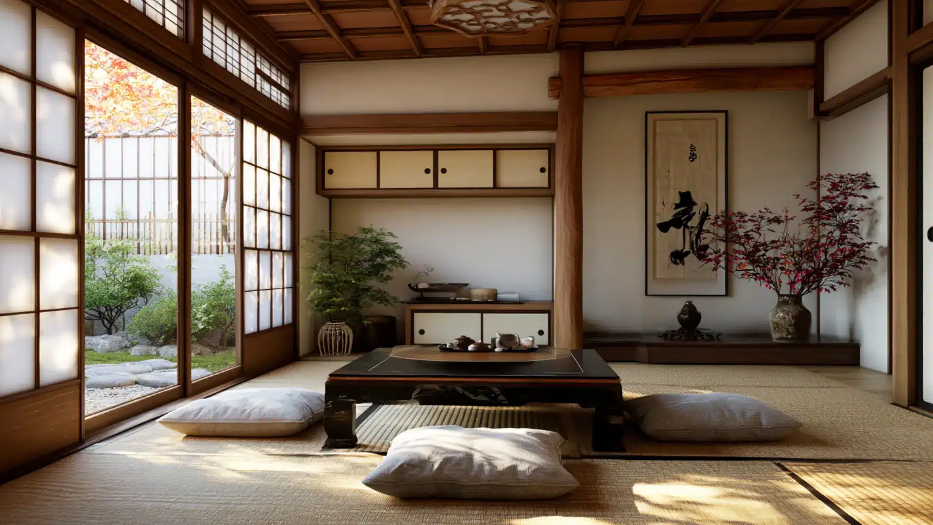
Japanese traditional style is built around deep respect for nature, craftsmanship, and spatial balance.
Shoji screens, tatami mat flooring, low furniture, and sliding doors define these spaces constructively. Natural light is carefully controlled to create soft, shifting patterns throughout the day.
Zen and Japandi both draw from Japanese influence, but Japanese tradition stays rooted in specific cultural conventions rather than any blended or contemporary reinterpretation.
- Color Palette: Natural wood, warm white, charcoal, pale green, stone gray, and earthy red
- Best for: Traditional Japanese homes, tea rooms, meditation spaces, and minimalist bedrooms
34. Chinese Traditional
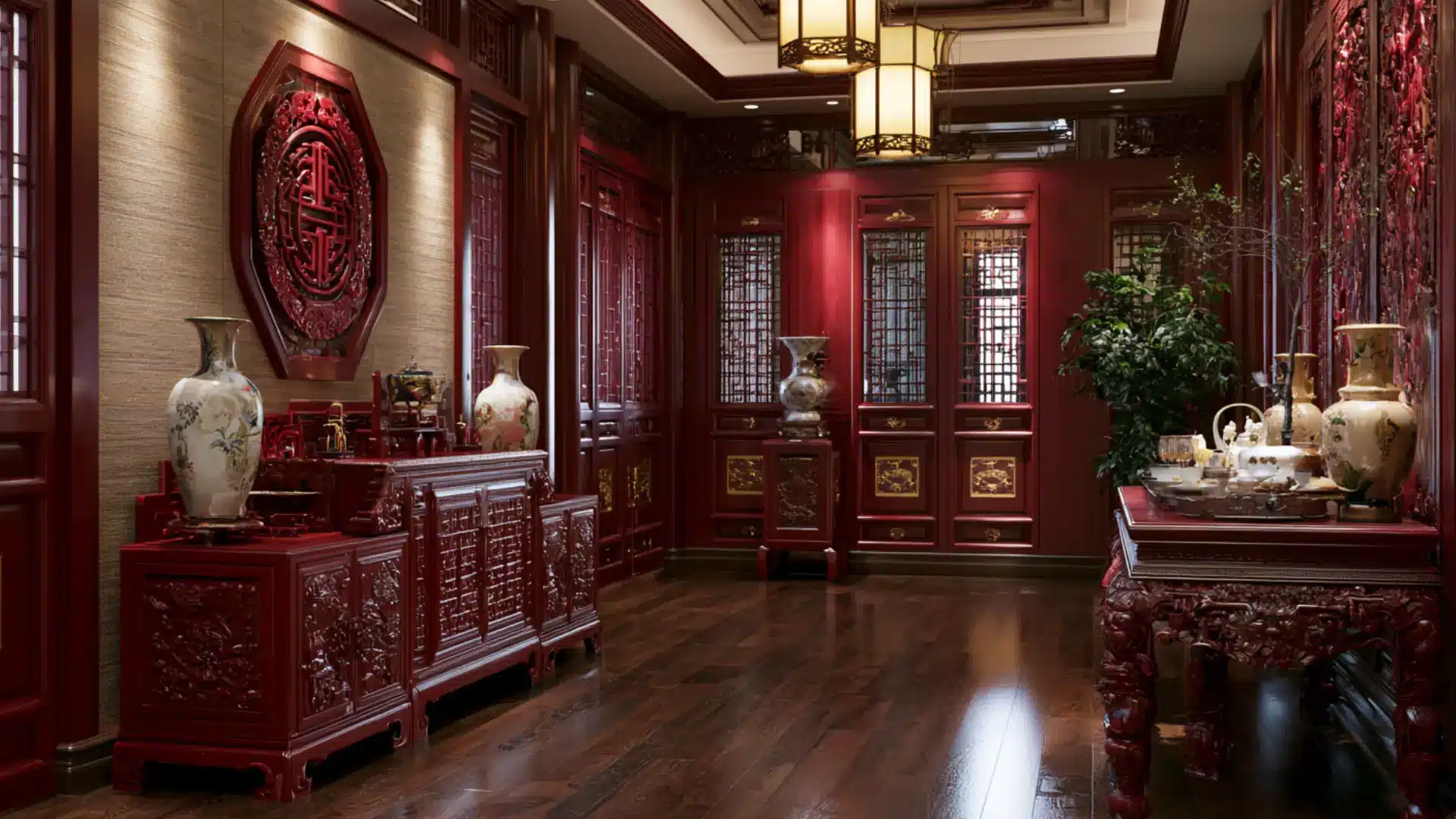
Chinese traditional style carries centuries of artistic heritage into its interiors.
Lacquered furniture in deep reds and blacks, carved wooden screens, silk fabrics, and porcelain accents create a look that is rich, symbolic, and layered. Furniture arrangements follow Feng Shui principles of balance and harmony.
Japanese traditional art finds meaning in restraint and negative space, but Chinese traditional art treats ornament and color as expressions of prosperity and cultural pride.
- Color Palette: Deep red, black lacquer, gold, jade green, imperial yellow, and warm wood tones
- Best for: Formal living rooms, dining rooms, entryways, and heritage-style homes
35. Korean Minimalist
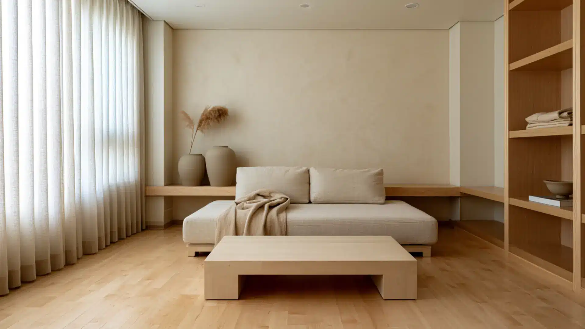
Korean minimalist style has a quieter, more understated character than most minimalist traditions. It draws from the traditional concept of dancheong, filtered through a very modern sensibility.
Rooms feel spacious and uncluttered, with furniture kept low and simple.
Natural materials and soft warm neutrals give spaces a gentle human quality that Japanese minimalism sometimes trades away in pursuit of something cooler and more deliberately austere.
- Color Palette: Warm white, pale wood, soft gray, dusty sage, ivory, and muted clay
- Best for: Apartments, bedrooms, living rooms, and calm home office spaces
36. Bali-Inspired
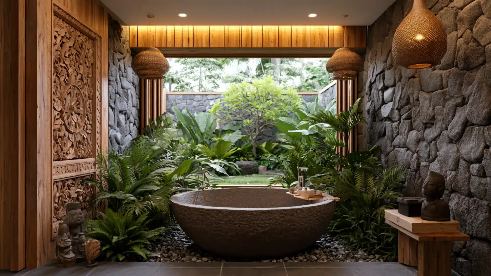
Bali-inspired style draws from the spiritual and artistic traditions of the Indonesian island.
Hand-carved wooden panels, stone sculptures, open-air layouts, and richly layered textiles create an atmosphere deeply connected to ritual and nature.
Indoor and outdoor spaces flow into each other easily. Tropical style focuses on visual energy and color, but Bali-inspired design carries a more meditative, ceremonial quality where every detail feels purposeful.
- Color Palette: Deep teak, warm gold, terracotta, stone gray, lush green, and earthy brown
- Best for: Tropical homes, outdoor living areas, master bedrooms, and spa-style bathrooms
37. Hygge
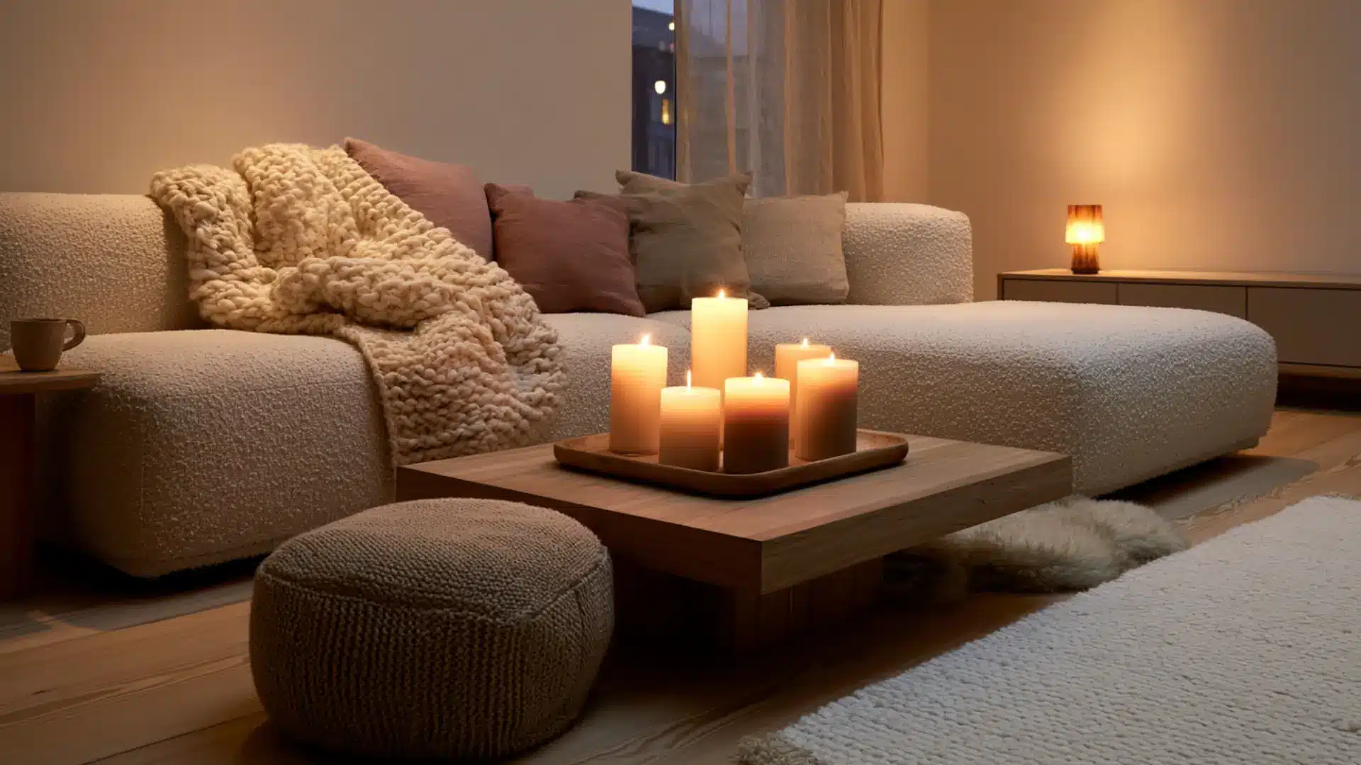
Hygge is less a visual style and more a feeling made physical. Rooted in Danish culture, it describes comfort, warmth, and togetherness through design.
Thick woolen throws, soft candlelight, oversized cushions, and natural materials fill these spaces. Every corner is made deliberately inviting.
Scandinavian design values function and beauty together, but hygge goes further by focusing on the act of slowing down and staying put.
- Color Palette: Warm cream, soft gray, dusty rose, oatmeal, muted sage, and natural wood tones
- Best for: Living rooms, reading nooks, bedrooms, and cozy family gathering spaces
38. Maximalist
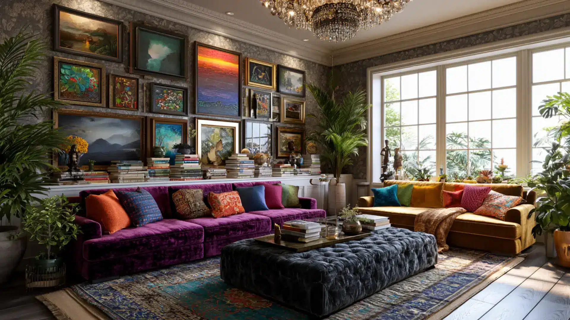
Maximalist style is the confident, fully committed opposite of minimalism. Layered patterns, bold colors, collected objects, and statement furniture fill every surface with personality.
Nothing is held back. The difference between maximalism and clutter is intention, as every piece is chosen and placed deliberately.
Eclectic style mixes carefully within limits, but maximalism pushes past those limits entirely, asking how much more a room can hold before becoming extraordinary.
- Color Palette: Deep jewel tones, bold contrasts, rich patterns, and layered mixed colors throughout
- Best for: Living rooms, dining rooms, home libraries, and creatively expressive personal spaces
39. Memphis Design
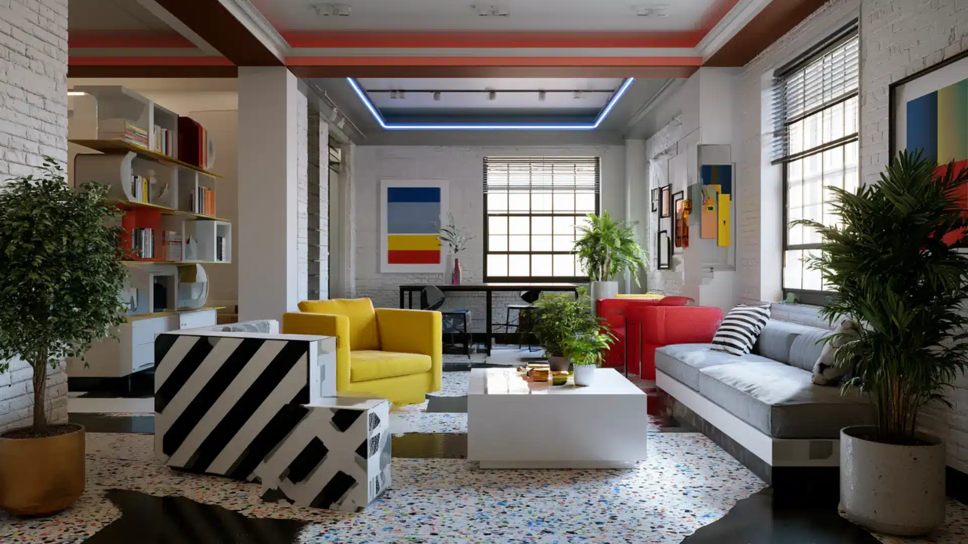
Memphis design burst onto the scene in 1980s Milan and immediately divided opinion. Created by Ettore Sottsass, it deliberately broke every rule of good taste.
Geometric shapes in clashing colors, bold patterns, and unexpected material combinations made furniture feel more like art.
Art Deco pursued glamour through precision, but Memphis chased joy through provocation and rule-breaking. It remains one of the most visually distinctive design movements ever produced.
- Color Palette: Bright primary colors, neon accents, black and white patterns, and bold mixed tones
- Best for: Creative studios, home bars, statement rooms, and design-forward living spaces
40. Brutalist
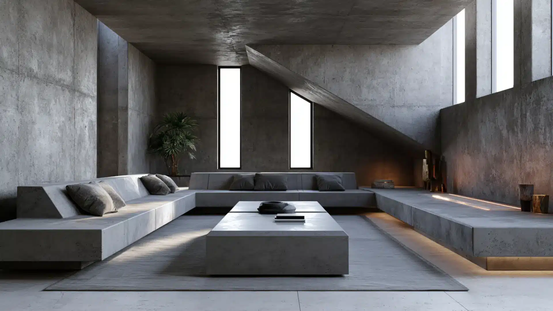
Brutalist interiors take their name from béton brut, the French term for raw concrete. What began as a 1950s architectural movement translated indoors as a preference for unfinished, weighty, structurally honest materials.
Thick concrete walls, exposed-aggregate surfaces, and heavy, angular furniture define the look.
Industrial style romanticizes factory heritage, but brutalism operates philosophically, asking spaces to be structurally honest rather than decorating over what lies beneath.
- Color Palette: Raw concrete, charcoal, matte black, cool gray, taupe, and warm off-white
- Best for: Architect-designed homes, loft spaces, studios, and design-forward urban interiors
41. Bauhaus
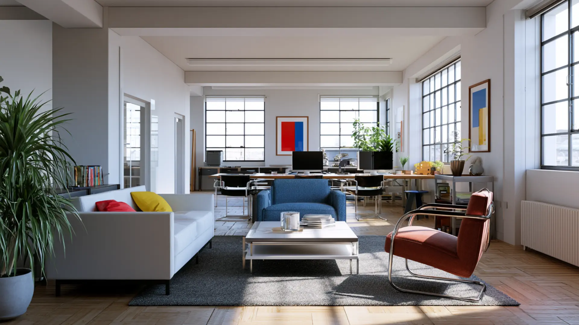
Bauhaus style came from the revolutionary German art school founded in 1919, where art and function were treated as inseparable. Furniture was designed for efficiency and practical use.
Forms were geometric, materials were honest, and decoration was eliminated entirely.
Minimalism can be a purely appealing preference, but Bauhaus is ideological at its core, built on the belief that good design should be democratic, functional, and available to everyone.
- Color Palette: Primary red, blue, and yellow alongside black, white, and neutral gray
- Best for: Design studios, home offices, open-plan apartments, and structure-forward living spaces
42. Streamline Moderne
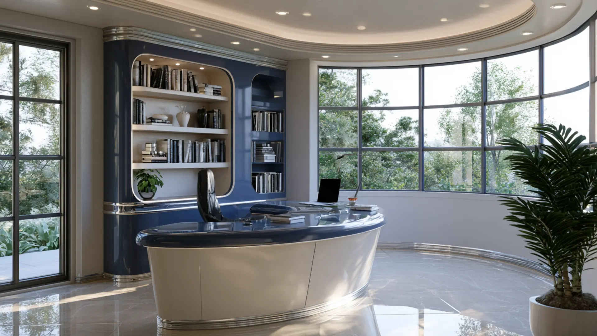
Streamline Moderne took the geometry of Art Deco and softened it with aerodynamic curves. In the 1930s, designers applied the visual language of speed and motion to furniture and buildings alike.
Rounded edges, horizontal lines, and smooth reflective surfaces replaced angular ornamentation.
Art Deco looked backward to classical richness for inspiration, but Streamline Moderne faced firmly forward, capturing the excitement of a world discovering technology and travel.
- Color Palette: Chrome silver, ivory, warm white, navy blue, black, and pale gold accents
- Best for: Retro-influenced homes, living rooms, home offices, and mid-century-inspired spaces
43. Gothic Revival
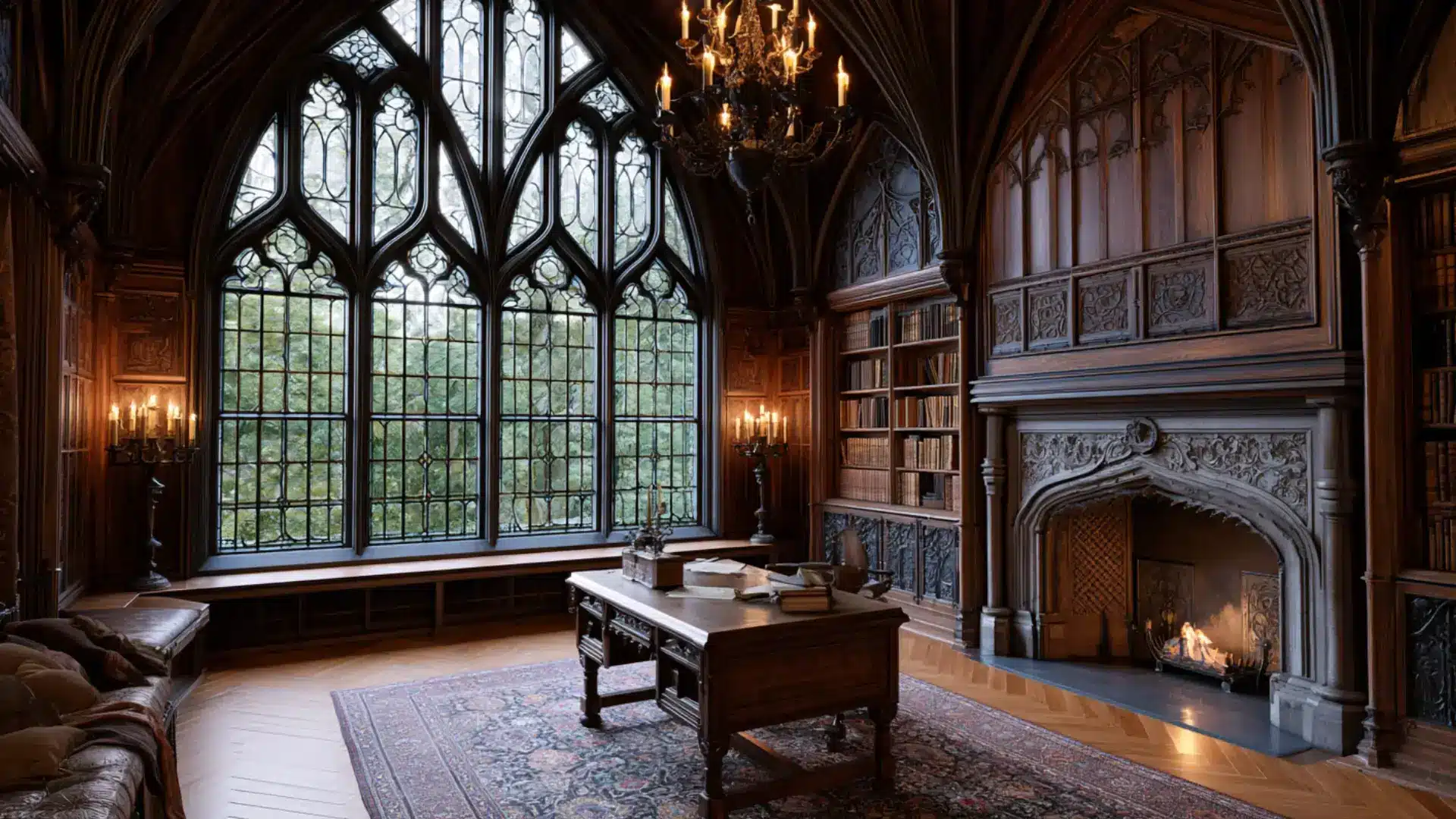
Gothic Revival brought the drama of medieval cathedrals into domestic spaces during the 19th century.
Pointed arches, stained glass, and dark carved wood converted homes into something closer to a sacred structure. Rich jewel tones and candlelit atmospheres deepened the theatrical mood.
Victorian style overlaps with the historical period and shares a love of ornament, but Gothic Revival carries a more specific spiritual and constructive identity rooted in reverence for the medieval world.
- Color Palette: Deep purple, black, ruby red, forest green, dark gold, and aged wood tones
- Best for: Period homes, libraries, formal sitting rooms, and dramatically styled bedrooms
44. Rococo
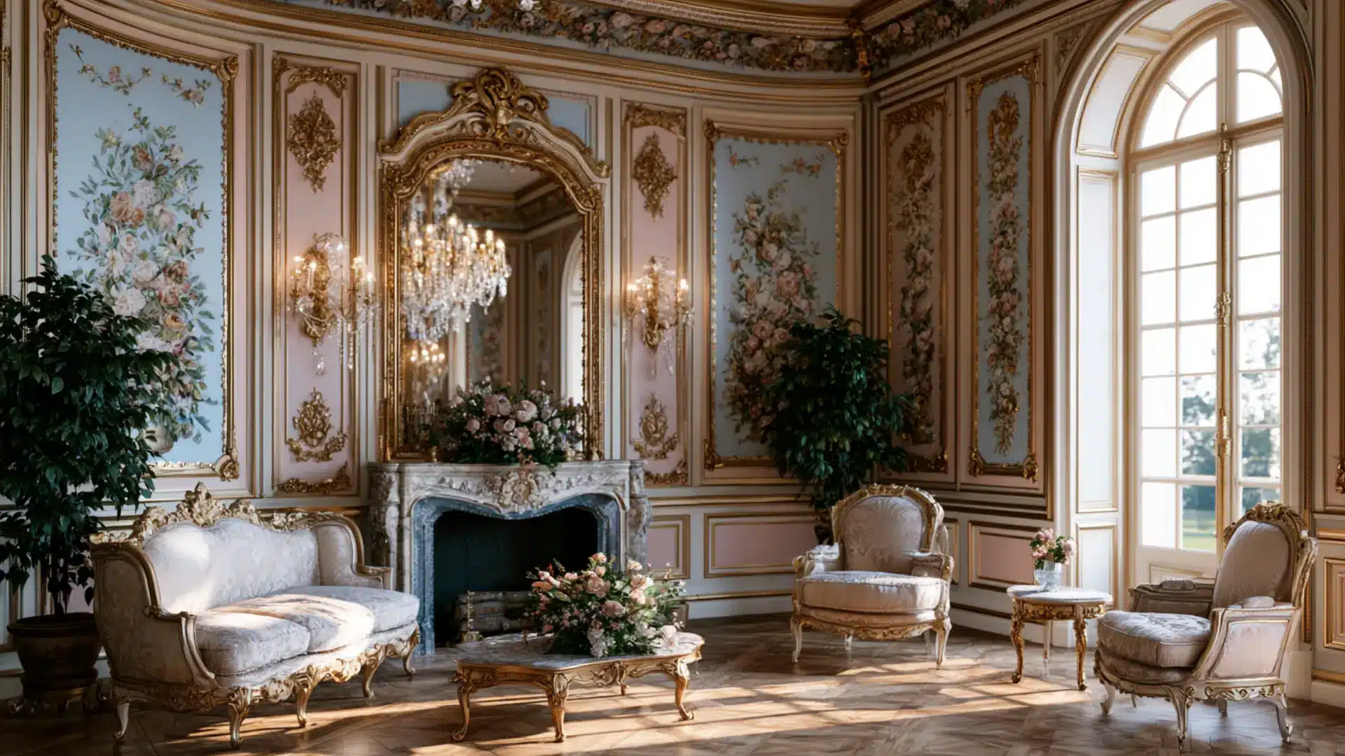
Rococo style peaked in 18th-century France as an expression of aristocratic pleasure and artistic excess.
Curved furniture, gilded frames, pastel panels, and elaborately carved floral motifs filled palatial rooms with lightness and whimsy.
Baroque came before it and shared the appetite for grandeur, but Rococo traded power and weight for intimacy and joy. Rooms felt designed purely for enjoyment rather than impression, which sets it apart entirely.
- Color Palette: Pale gold, soft pink, sky blue, mint green, ivory, and delicate gilded accents
- Best for: Formal sitting rooms, powder rooms, dressing areas, and grand heritage-style spaces
45. Baroque
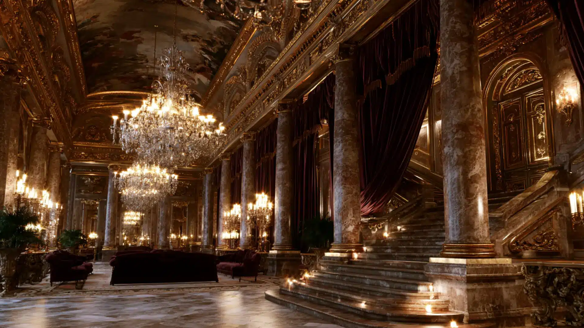
Baroque style emerged in 17th-century Europe as a deliberate expression of power, religion, and wealth.
Dramatic scale, heavy gilding, richly upholstered furniture, and ceiling frescoes created interiors designed to overwhelm. Dark, rich tones contrasted with gold to heighten grandeur.
The Rococo movement that followed softened everything into something more playful and intimate, but Baroque never lost its weight or intent. It is monumental and built to communicate authority.
- Color Palette: Deep gold, burgundy, royal blue, dark walnut, ivory, and rich jewel tones
- Best for: Grand historic homes, formal dining rooms, ballrooms, and statement entryways
46. Empire Style
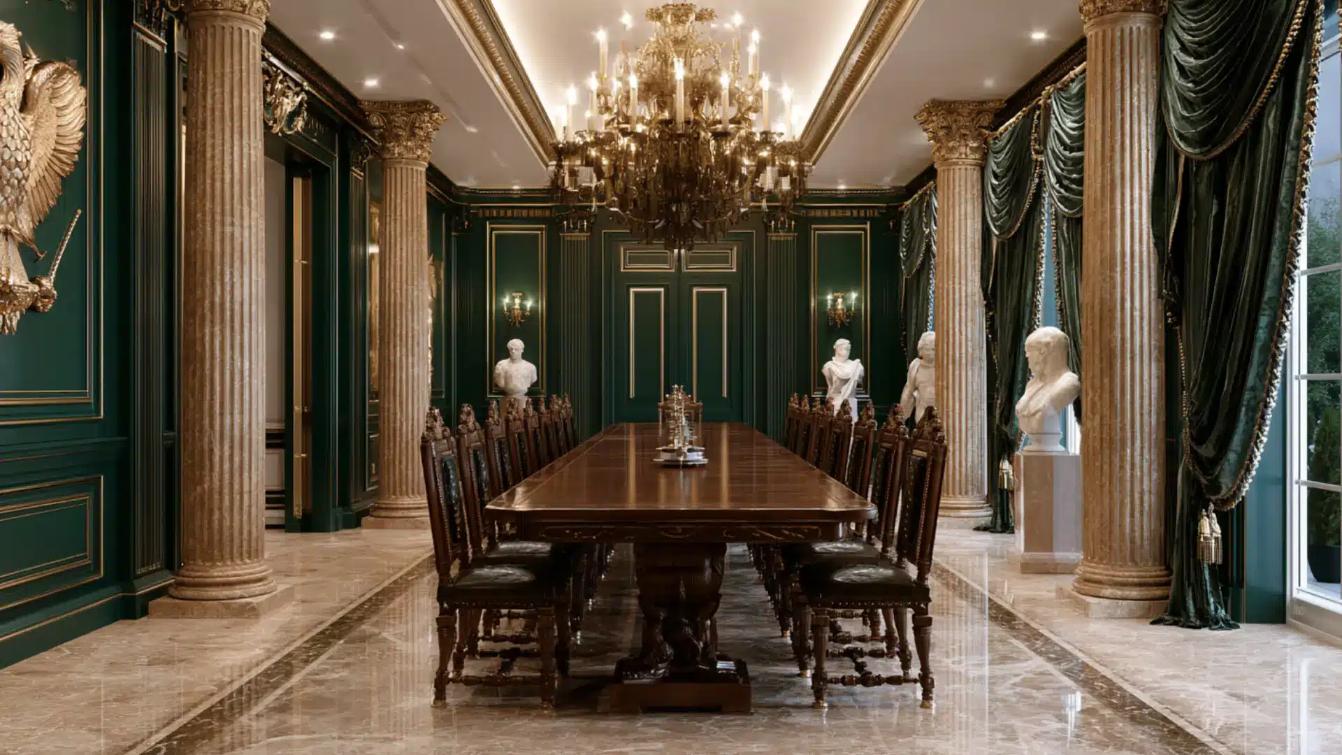
Empire style developed in early 19th-century France under Napoleon, designed specifically to project imperial power through interiors.
Symmetrical arrangements, military motifs, and ebonized wood with bronze ormolu mounts gave rooms a disciplined, monumental character.
Neoclassical style drew from ancient Greece and Rome for appealing reasons alone, but Empire loaded those same sources with a deliberate political agenda behind every single design choice made.
- Color Palette: Imperial gold, deep green, rich red, black, ivory, and dark mahogany tones
- Best for: Grand formal rooms, dining spaces, heritage homes, and historically inspired interiors
47. Neoclassical
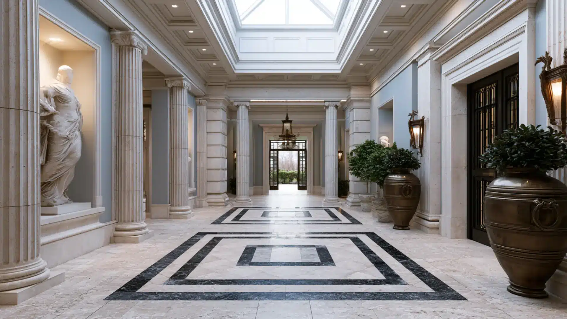
Neoclassical style emerged in the late 18th century as a reaction against Baroque and Rococo ornamentation.
Designers returned to the symmetry and restrained classiness of ancient Greece and Rome. Marble floors, coffered ceilings, and tapered furniture legs defined these interiors.
Empire style borrowed the same ancient references but loaded them with political meaning, while Neoclassical stays purely appealing, pursuing classic beauty through proportion, order, and structural clarity.
- Color Palette: Ivory, soft white, pale blue, warm gold, sage green, and marble gray
- Best for: Grand homes, formal living rooms, entryways, and heritage-style dining rooms
48. Craftsman
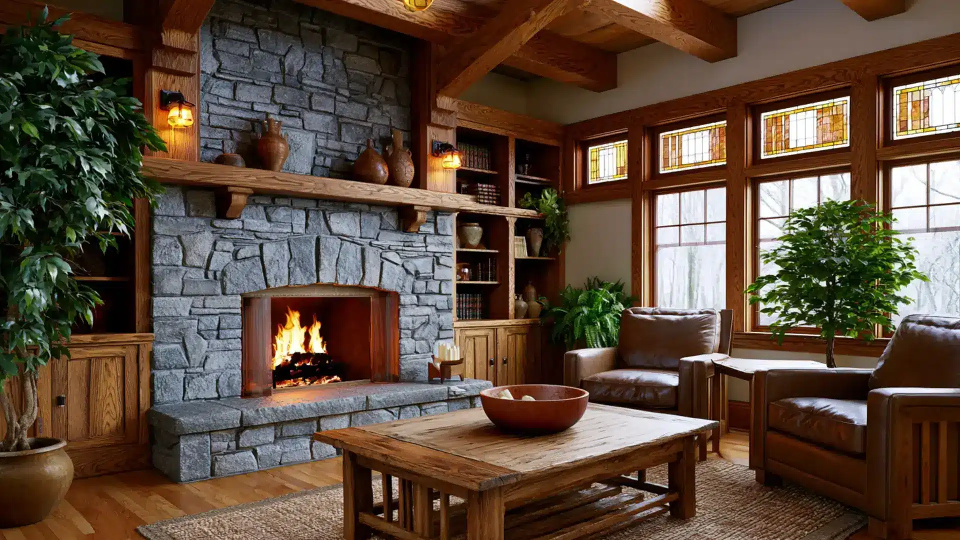
Craftsman style grew from frustration with industrial mass production in late 19th-century America. Handmade quality, honest materials, and functional beauty became its core values.
Built-in shelving, exposed wooden beams, stone fireplaces, and low-pitched rooflines gave homes a grounded, handcrafted character.
The Arts and Crafts movement provided the philosophical foundation, but Craftsman refers specifically to the American constructive tradition that translated those ideals into a widely built residential style.
- Color Palette: Warm brown, forest green, golden oak, rust, cream, and muted earthy tones
- Best for: Bungalows, craftsman-style homes, living rooms, and kitchens with built-in details
49. Arts and Crafts
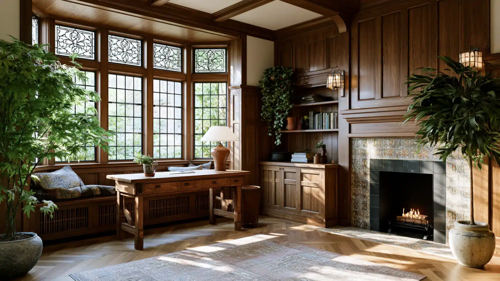
Arts and Crafts was a design philosophy before it was appealing. William Morris and his contemporaries believed industrial production stripped the joy out of making things.
Handcrafted furniture, hand-printed textiles, and decorative tile work celebrated the individual maker.
Craftsman style grew from this movement but became a specific American building tradition, while Arts and Crafts remained a broader cultural force shaping structure, ceramics, and graphic design across Britain.
- Color Palette: Olive green, terracotta, golden amber, deep blue, warm brown, and natural wood
- Best for: Heritage homes, living rooms, studies, and spaces that celebrate handmade craftsmanship
50. Prairie Style
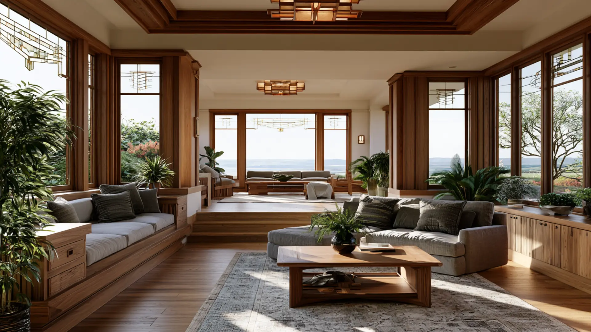
Prairie style was developed by Frank Lloyd Wright in the early 1900s as an American response to Midwestern landscapes.
Long horizontal lines, low-pitched roofs, and continuous window bands made buildings feel connected to the ground.
Inside, built-in furniture, geometric art glass, and open spaces replaced closed Victorian rooms. Craftsman style shares the handmade ethos but stays closer to tradition, while Prairie is more abstract and shaped by one singular design vision.
- Color Palette: Warm ochre, earthy brown, soft gold, muted green, brick red, and natural wood
- Best for: Frank Lloyd Wright-inspired homes, open living spaces, and architecture-forward interiors
51. Cabin Style
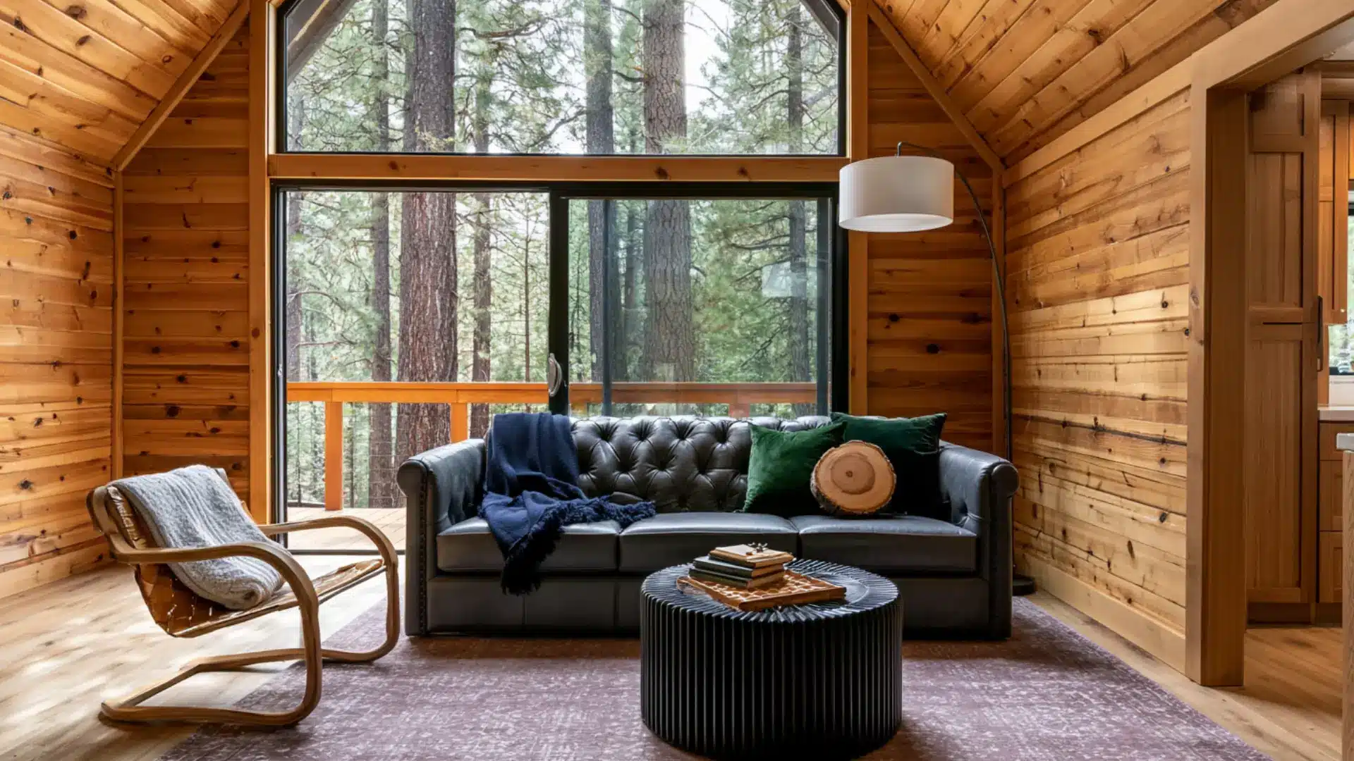
Cabin style distills the simple pleasure of time in the woods into a permanent interior mood.
Rough-hewn log walls, plaid wool blankets, cast iron surrounds, and pine furniture create a year-round retreat atmosphere.
Rustic style applies across many settings and scales, but cabin style is specifically tied to forest, mountain, and lakeside living. The spaces feel intimate and self-contained, with nature always visible just beyond the glass.
- Color Palette: Pine green, deep brown, warm tan, burgundy, cream, and natural log tones
- Best for: Forest cabins, lakeside retreats, small cozy living rooms, and mountain getaways
52. Mountain Lodge
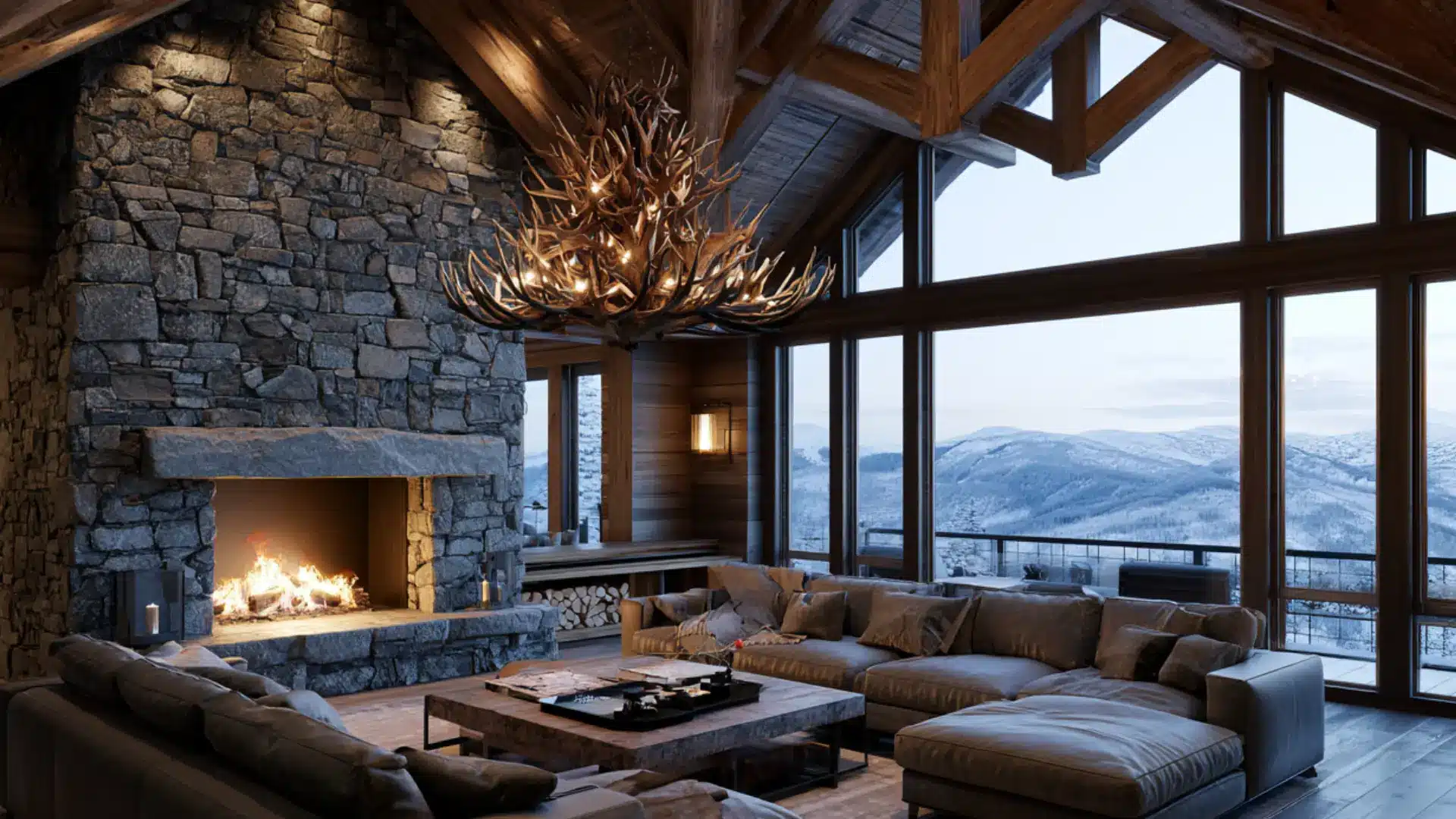
Mountain lodge style takes cabin warmth and scales it up into something far grander.
Soaring ceilings with exposed timber trusses, monumental stone fireplaces, and oversized leather sofas fill spaces built to impress as much as to comfort.
Cabin style is modest and intimate by nature, but the mountain lodge has a real structural goal: wide-open interiors where the landscape outside becomes as much a part of the room as anything within.
- Color Palette: Deep brown, slate gray, forest green, burgundy, warm amber, and stone tones
- Best for: Large mountain homes, ski lodges, great rooms, and grand open-plan living spaces
53. Parisian
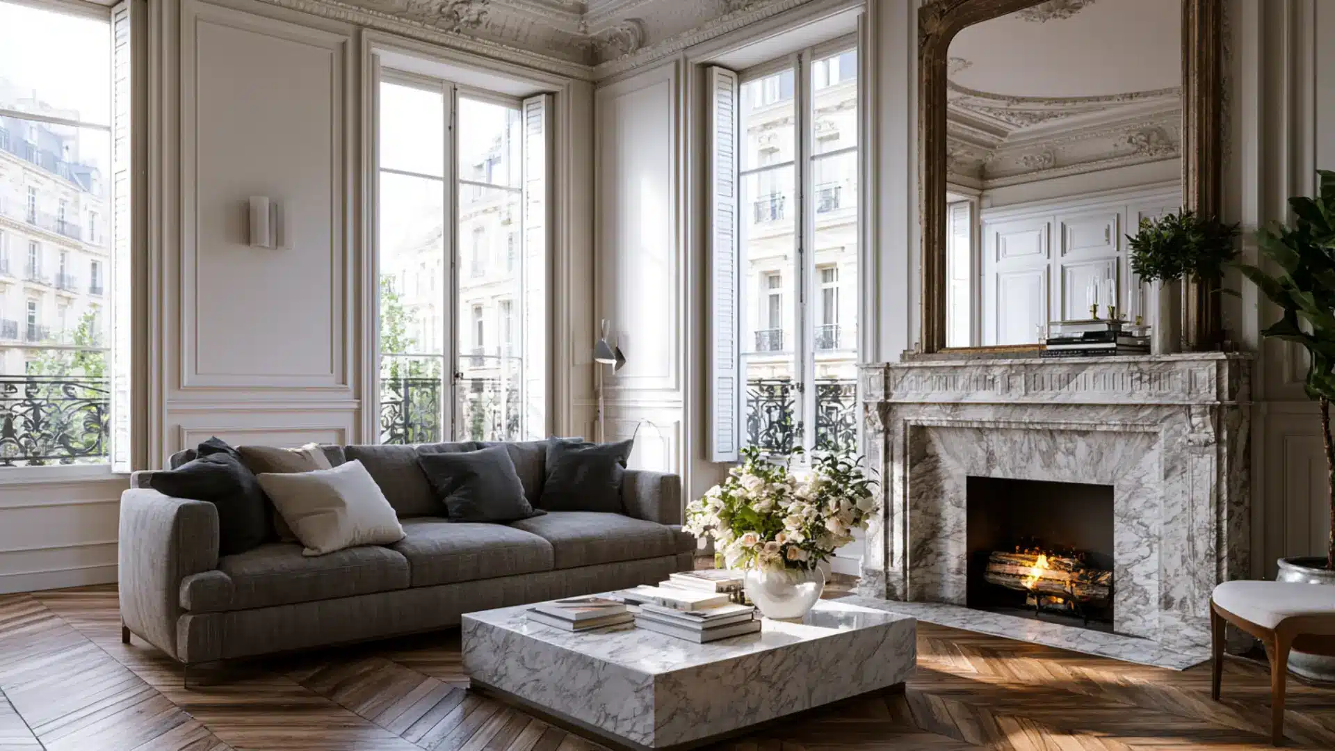
Parisian style carries the effortless grace of a Haussmann-era apartment in the French capital.
Herringbone parquet floors, ornate moldings, marble fireplaces, and tall shuttered windows form the structural backdrop. Furniture mixes antique finds with contemporary pieces in a way that feels entirely unstudied.
French country arrives at refinement through sunlight and rural simplicity, but Parisian style is urban and refined, with a nonchalance that takes considerable effort to achieve.
- Color Palette: Warm white, soft gray, aged gold, dusty blush, charcoal, and dark walnut tones
- Best for: City apartments, living rooms, bedrooms, and properly proportioned period spaces
54. Belgian
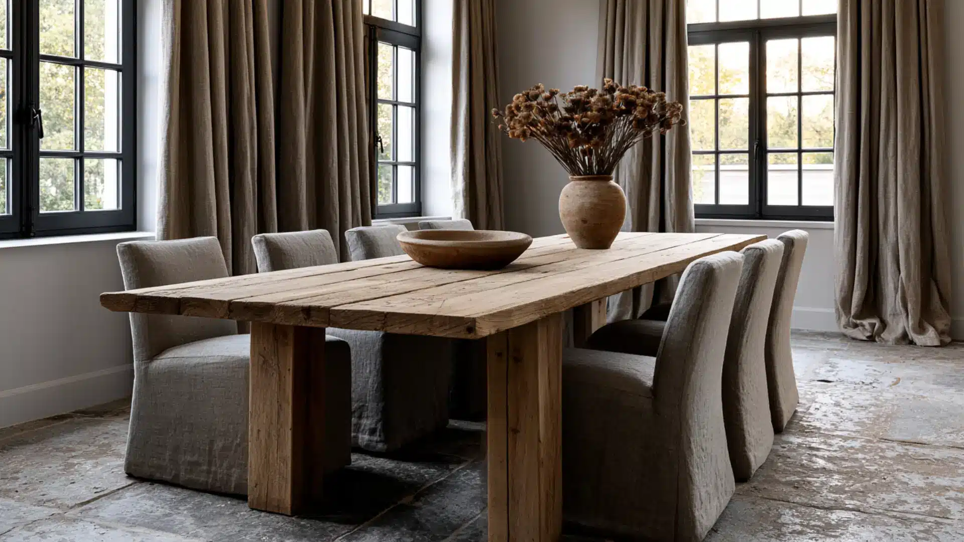
Belgian style is the most restrained and quietly confident appeal in European interior design.
Rough linen, aged oak, worn stone floors, and antique furniture stripped of pretension create spaces that feel ancient and contemporary at once. Color barely registers here.
Texture does all the work instead. Parisian style adopts ornament and accumulated classiness, but Belgian interiors resist all of that, arriving at a spare, monastic beauty that rewards close attention.
- Color Palette: Linen white, warm gray, aged oak, stone beige, dusty taupe, and pale charcoal
- Best for: Minimalist homes, living rooms, dining spaces, and structurally distinctive interiors
55. Monochromatic
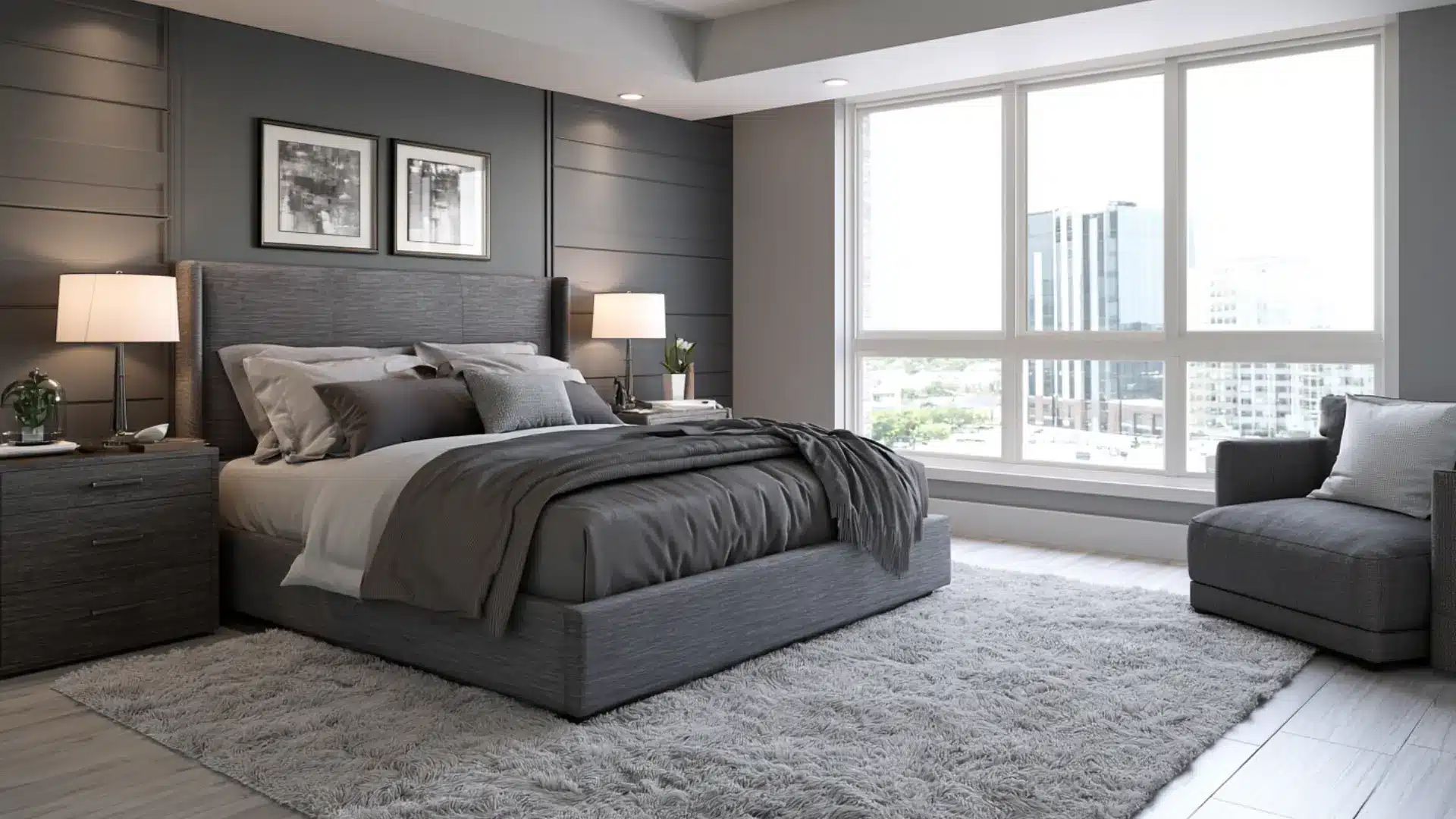
Monochromatic style builds an entire interior around a single color and its variations in tone, shade, and texture.
While other styles use contrast to create interest, monochromatic design achieves depth by layering a single hue across fabrics, walls, furniture, and accessories.
Minimalist spaces achieve calm through reduction, but monochromatic spaces can be full and richly layered, with all the discipline living in the palette rather than the quantity of objects.
- Color Palette: One dominant hue explored across light, mid, and deep tonal variations throughout
- Best for: Bedrooms, living rooms, home offices, and spaces designed around a strong color statement
56. Desert Modern
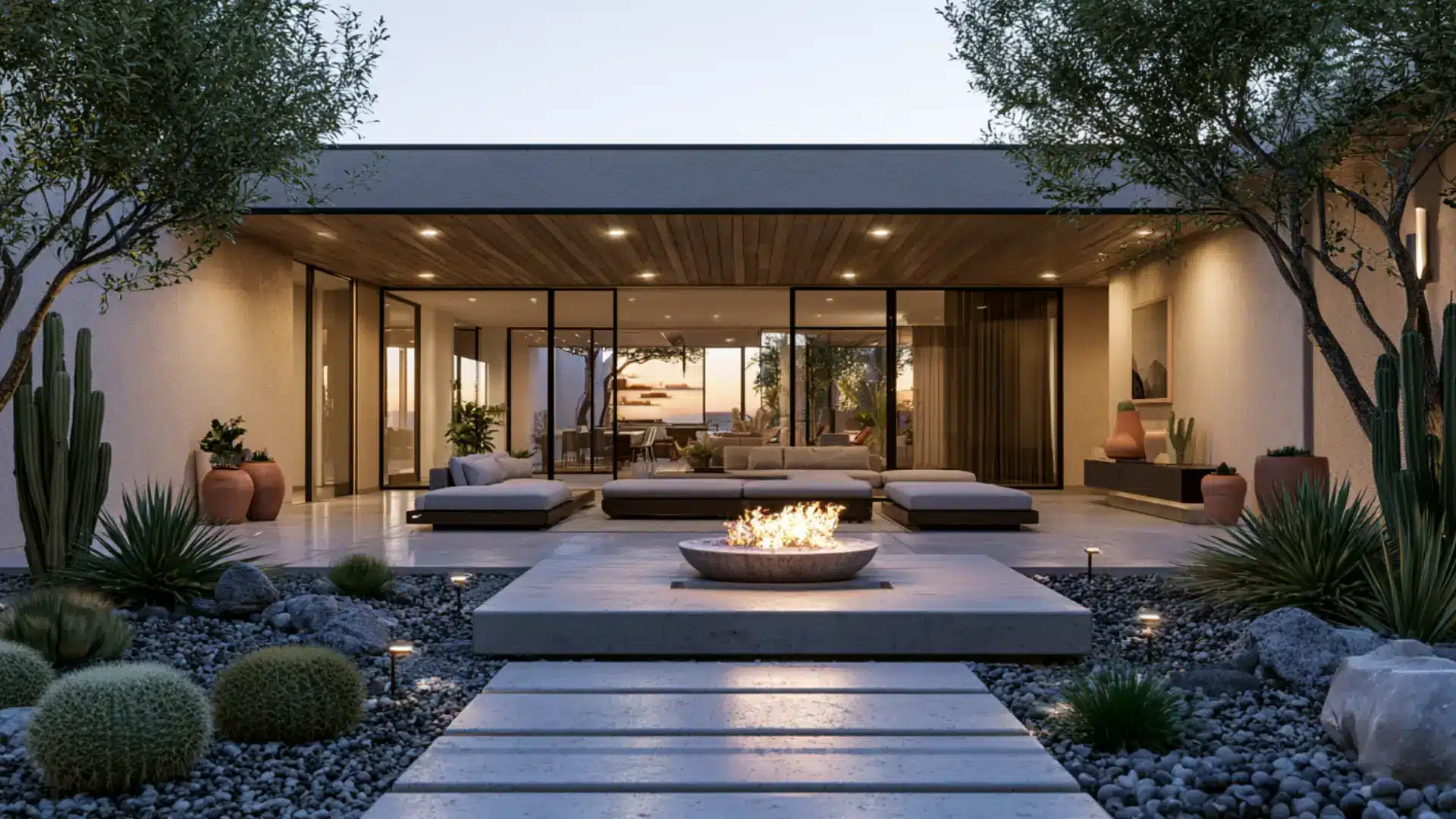
Desert modern grew from the architecture of the American Southwest, particularly around Palm Springs and Tucson. Adobe-inspired walls, flat rooflines, and large glass openings blur the boundary between sun-baked exterior and interior.
Warm plaster walls, woven textiles, and low furniture in sandy tones reflect the surrounding landscape.
Southwestern style carries strong indigenous cultural references, but desert modern is more structurally driven, shaped by environment and climate above all else.
- Color Palette: Sandy beige, warm terracotta, dusty pink, sage green, bleached white, and dry clay
- Best for: Desert-region homes, modernist construction, open living spaces, and indoor-outdoor spaces
57. Biophilic
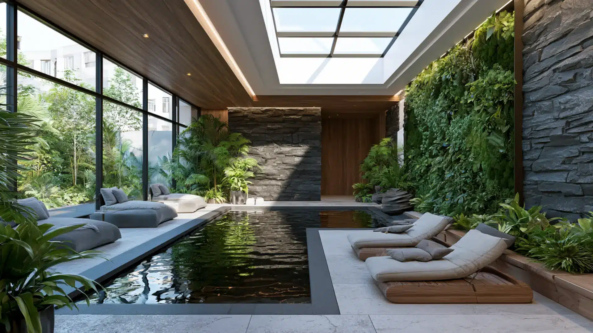
Biophilic designis rooted in the idea that humans have an innate need to connect with the natural world. Rather than simply adding plants, it rethinks the entire space around that connection.
Living walls, natural light channels, water features, and raw materials make nature a structural part of the interior.
Organic modern draws on natural appeal for visual appeal, but biophilic design is driven by research into how nature affects human wellbeing.
- Color Palette: Leafy green, warm wood, stone gray, earthy brown, sky blue, and natural white
- Best for: Homes, offices, wellness spaces, and any interior where wellbeing and nature are priorities
58. Retro
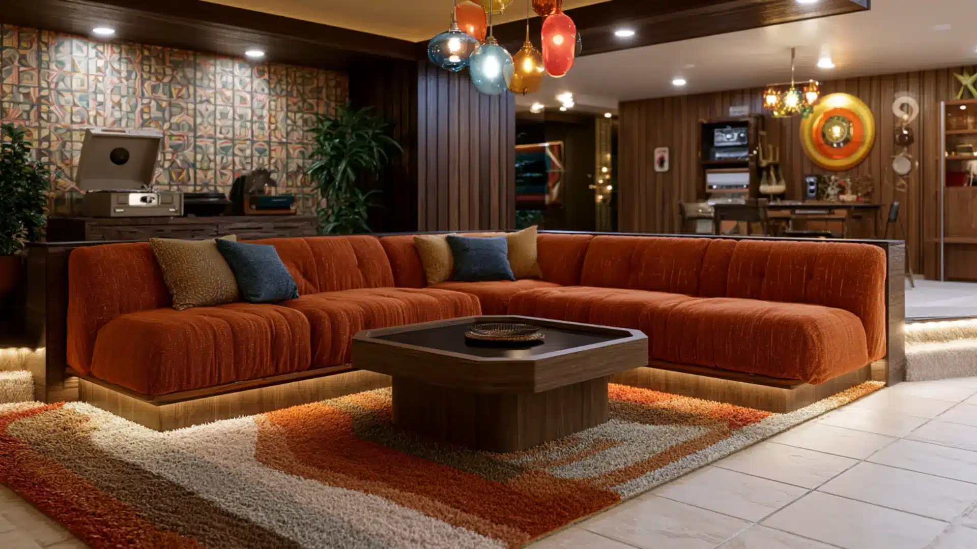
Retro style is a loving look back at design trends from the 1950s, 1960s, and 1970s. Bold pattern, graphic color, and furniture with personality define the look. It cherry-picks the most memorable elements of past decades and reassembles them in a contemporary setting. Mid-century modern is a genuine historical style with fixed design principles, but retro is more of an attitude, playful and thoughtful rather than a faithful recreation of any single era.
- Color Palette: Avocado green, harvest gold, burnt orange, chocolate brown, teal, and warm cream
- Best for: Kitchens, diners, home bars, living rooms, and spaces with a fun, dreamy character
59. Space Age
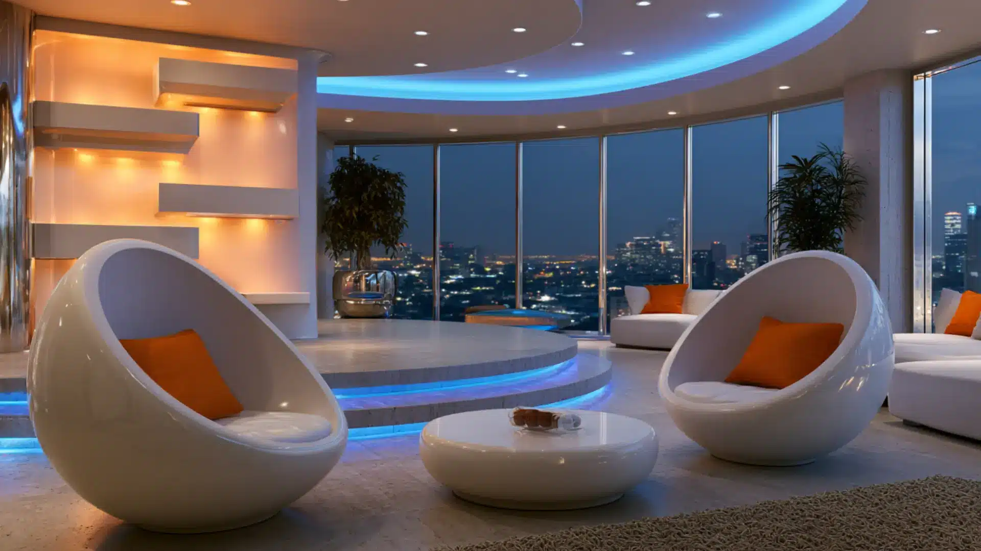
Space Age design emerged in the 1960s as the world became captivated by space travel. Designers like Eero Aarnio and Pierre Paulin created furniture that looked as if it had arrived from another planet.
Bubble chairs, pod sofas, and molded plastic in vivid colors captured the optimism of the era. Retro borrows loosely from multiple decades with dreamy warmth, but Space Age has a very specific futuristic obsession that still feels simultaneously dated and ahead of its time.
- Color Palette: White, chrome silver, vivid orange, electric blue, lime green, and glossy black
- Best for: Statement rooms, home offices, creative studios, and design-forward living spaces
60. Futuristic
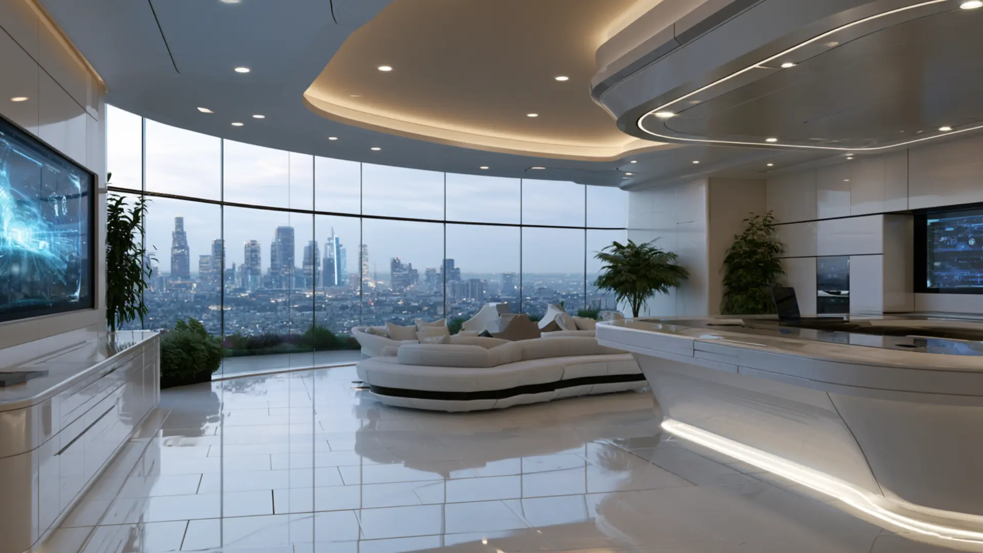
Futuristic style imagines the home of tomorrow built today. Smart technology, flawless surfaces, hidden storage, and integrated lighting make spaces feel precision-engineered rather than traditionally decorated.
High-gloss lacquer, tempered glass, polished concrete, and brushed metal dominate throughout.
Space Age looked forward from a fixed cultural moment in the 1960s, but futuristic design keeps growing alongside technology itself, meaning today’s futuristic interior becomes simply contemporary within a decade.
- Color Palette: Gloss white, matte black, chrome, electric blue, cool gray, and metallic silver
- Best for: Tech-forward homes, smart apartments, home offices, and architecture-led design spaces
How to Choose the Right Interior Design Style for You?
Picking an interior design style can feel overwhelming when there are so many options. But it does not have to be.
Start by thinking about how you actually live. A busy family home needs different things from a quiet solo apartment. Your constructure matters too. Some styles suit older homes far better than newer builds.
Color plays a bigger role than most people expect. The right palette can make a small room feel open, or a large one feel warm.
Practicality matters just as much as looks. A beautiful style you cannot maintain will quickly frustrate you.
Final Thoughts
Every room starts with a feeling you are trying to create. Interior design styles give that feeling a name and a direction. You do not need to pick just one and stick to it forever.
The best spaces often pull from two or three styles that work well together. Start with what catches your eye. Pay attention to the colors, materials, and shapes that feel right to you.
Then build from there at your own pace. A room does not have to follow any rules. It just has to feel like yours. Found a style that speaks to you? Drop a comment below and let us know.


One Response