
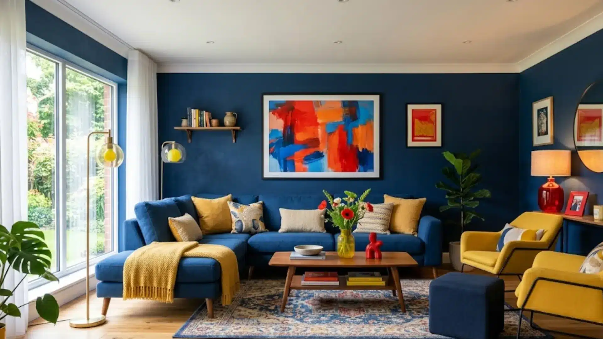
When you look at something or enter a room, it’s the colors that you notice before anything else.
That’s when you realize some logos feel playful, others feel serious; some rooms feel calm, others feel electric the moment you step in.
None of that happens by luck; it happens when colors work together and complement each other rather than drifting apart.
The triadic color scheme is one of the simplest tricks behind that effect: three colors, evenly spaced, built to feel bold without tipping into a mess.
Here’s how it actually works, and where you’ve probably already spotted it without realizing.
What are Triadic Colors?
A triadic color scheme is made up of three colors positioned evenly apart on the color wheel, each sitting roughly 120 degrees from the other two.
Connect all three points, and you get a perfect equilateral triangle.
That even spacing means no single color naturally overpowers the rest, creating real contrast while still feeling harmonious.
The color wheel itself is built from primary colors (red, yellow, blue), secondary colors (orange, green, purple), and tertiary colors formed by mixing the two.
It traces back to Sir Isaac Newton in 1666 and remains the foundational reference tool designers still use today.
How Does a Triadic Color Scheme Work?
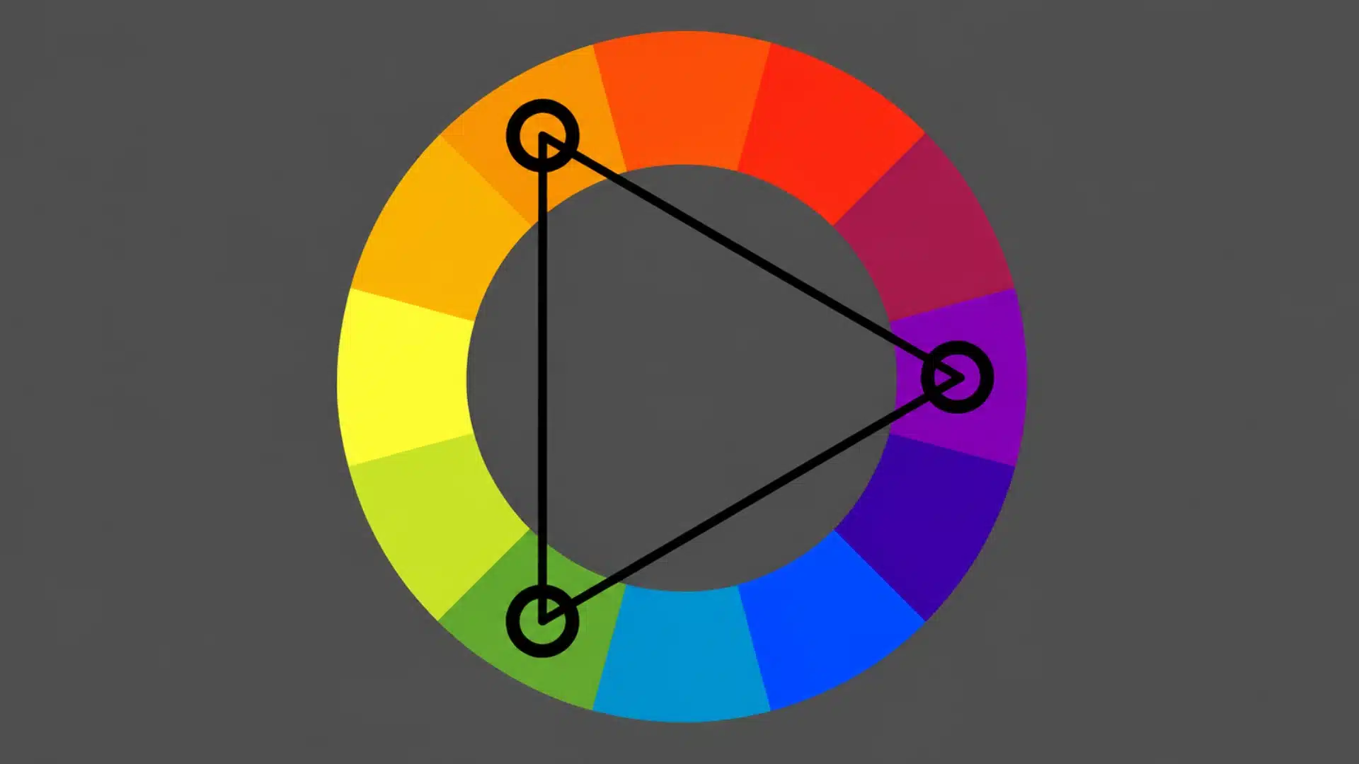
Dividing the color wheel into three equal 120-degree segments ensures that each color is at the maximum distance from the other two, so no single hue dominates.
This is why triadic palettes rarely feel chaotic like random combinations often do.
The spacing creates real contrast while keeping the palette feeling connected.
Even so, it works best with a clear hierarchy rather than three equally loud colors: one leads as dominant, one supports, and one stays reserved as an accent.
Triadic Color Schemes Across Interior Design
Triadic palettes can work throughout the home when their saturation and visual weight suit each room’s purpose.
Choose one dominant color, use the second as a supporting color, and reserve the third for smaller accents.
1. Living Room
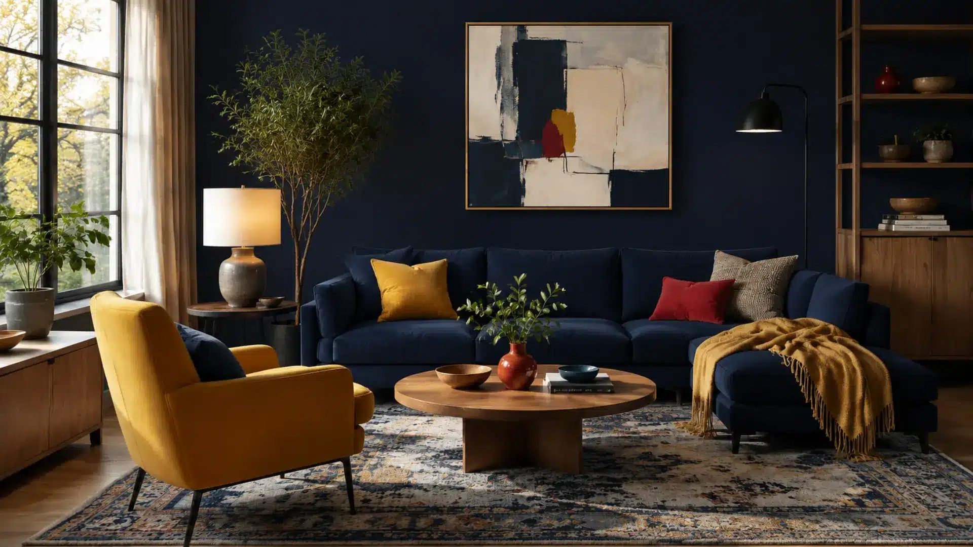
Suggested triadic palette: Blue, Yellow, Red
For a living room, let one color cover the largest surfaces and use the other two through upholstery, artwork, and accessories.
Blue creates a calm foundation, while yellow adds warmth and red supplies controlled energy.
Keep the brightest shade to roughly ten percent of the room so the combination feels layered rather than competitive, and don’t overwhelm the space with three equally loud tones.
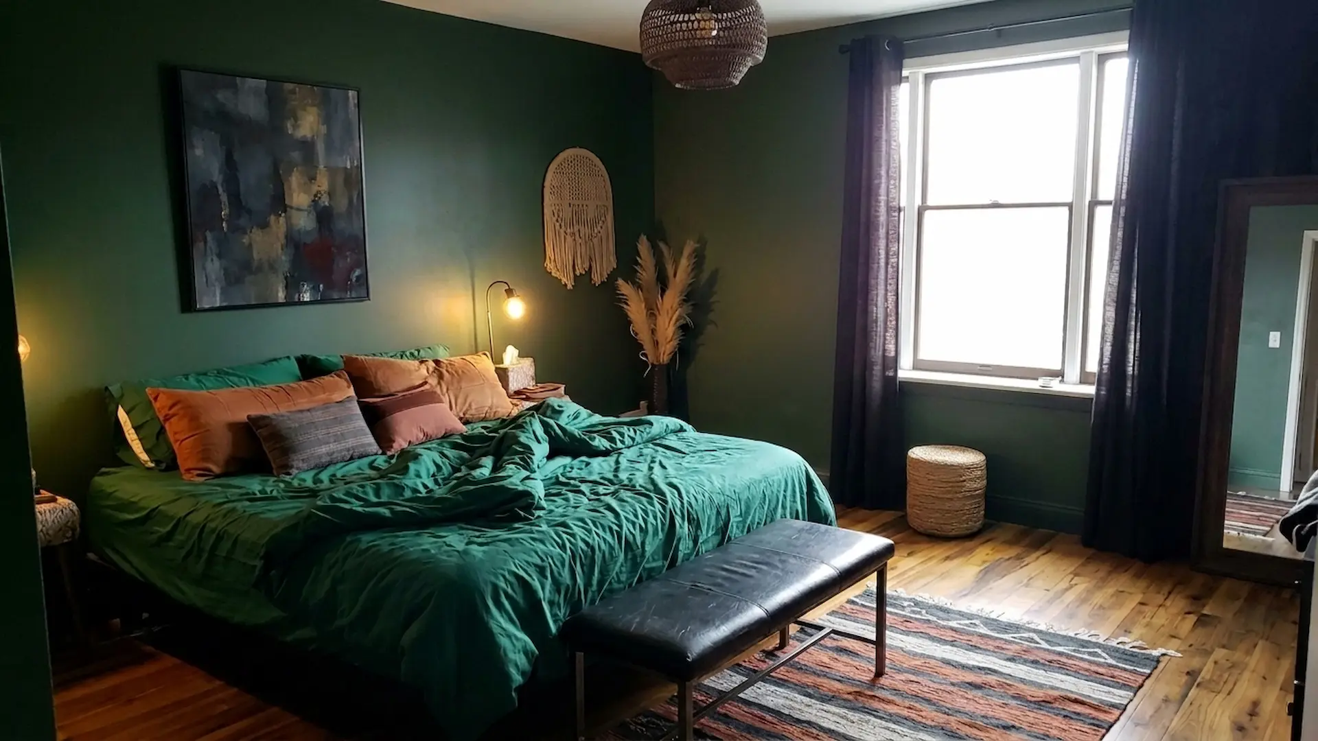
2. Bedroom
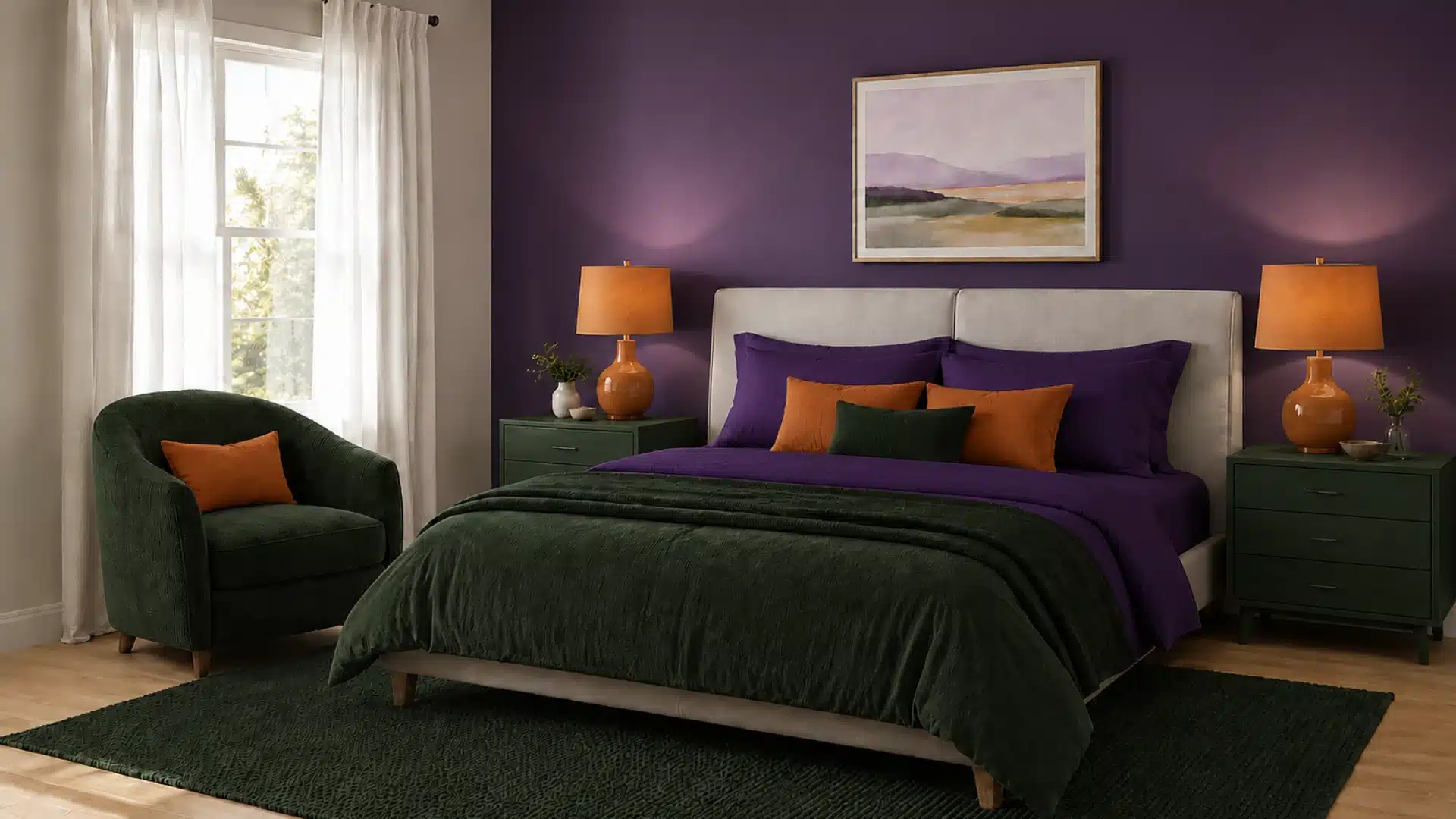
Suggested triadic palette: Purple, Orange, Green
Bedrooms benefit from lower-saturation triadic colors that preserve harmony without making the space feel busy at bedtime.
Use violet on one wall or the bedding, bring green into textiles or a chair, and add restrained orange through cushions and ceramics.
Support everything with warm white and natural wood, which keeps the room feeling restful and balanced rather than visually loud right before sleep.
3. Kitchen
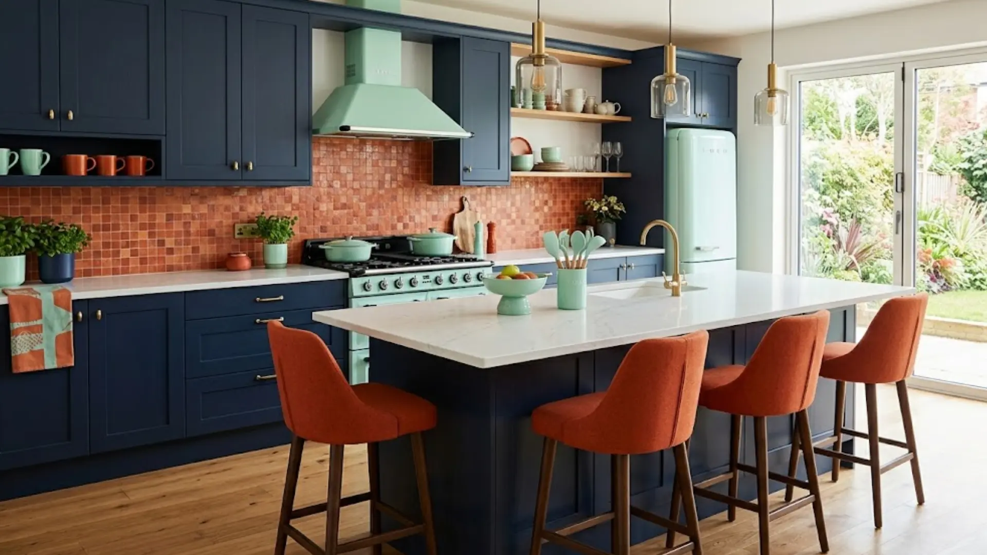
Suggested triadic palette: Navy, Burnt Orange, Mint Green
For a kitchen, let navy establish the main foundation through cabinetry or an island, while burnt orange and mint green appear in backsplash details, seating, appliances, and accessories.
Navy adds depth and sophistication, burnt orange introduces warmth and energy, while mint green keeps the space fresh and balanced.
Use burnt orange as the strongest accent and keep mint green lighter and more restrained, so the three colors feel cohesive without competing for attention.
4. Dining Room
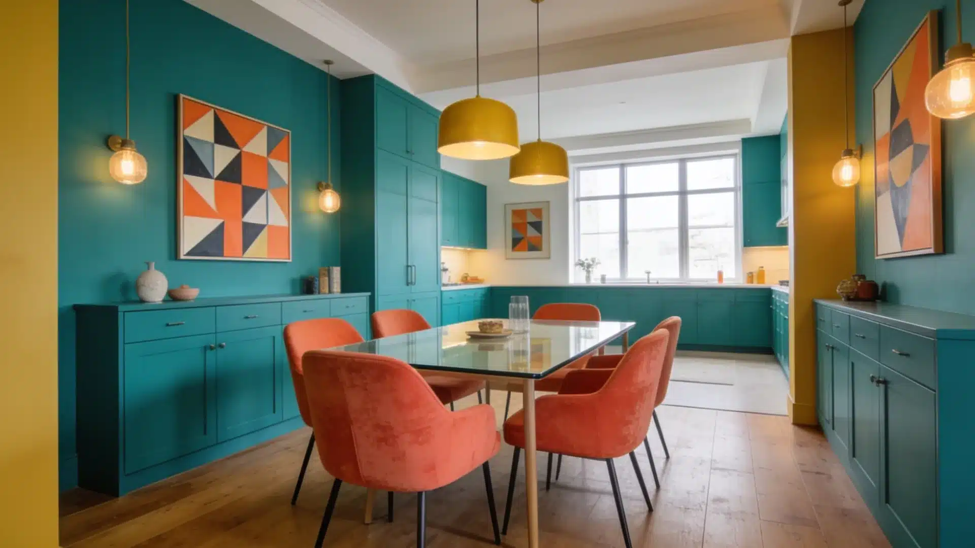
Suggested triadic palette: Teal, Coral, Mustard
For a dining room, use teal as the dominant color through walls, upholstery, or cabinetry, while coral and mustard bring warmth through chairs, artwork, lighting, and table accessories.
Teal creates a rich and inviting foundation, coral adds lively warmth, and mustard introduces a sophisticated golden accent.
Keep coral and mustard concentrated in smaller decorative elements, allowing teal to anchor the room while maintaining a balanced, welcoming atmosphere.
5. Bathroom
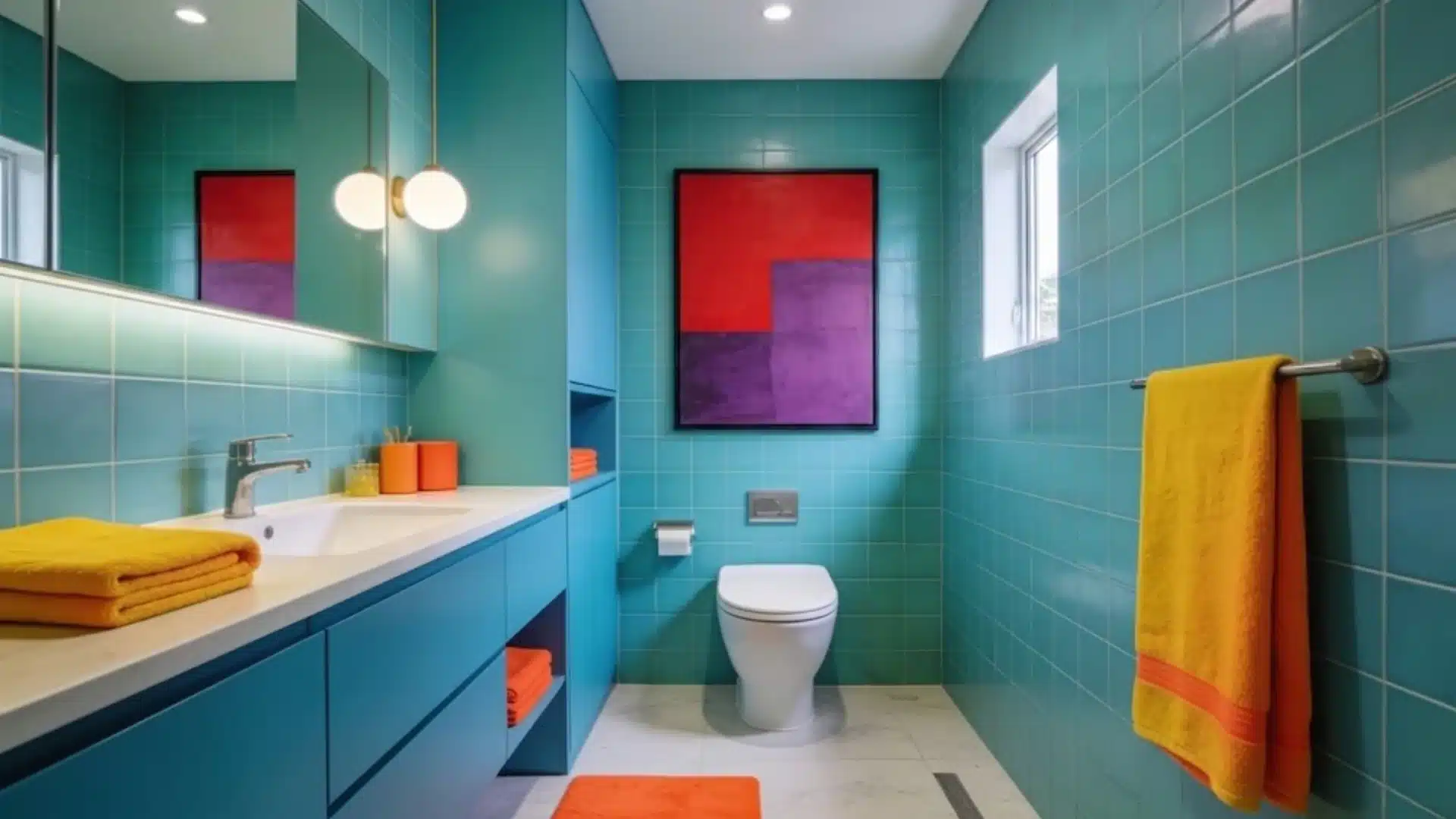
Suggested triadic palette: Yellow-Orange, Blue-Green, Red-Purple
For a bathroom, use blue-green as the dominant foundation through tiles, walls, or cabinetry, with yellow-orange and red-purple introduced through towels, fixtures, artwork, and accessories.
Blue-green provides a refreshing and calming base, while yellow-orange adds warmth and red-purple creates depth and visual richness.
Use red-purple sparingly and reserve yellow-orange for focused accents, keeping blue-green as the most prominent color for a sophisticated, balanced finish.
How to Select a Triadic Color Scheme for Your Design?

With four distinct triadic combinations on the color wheel and countless saturation variations within each, choosing the right one comes down to a few practical considerations, not personal preference alone.
- Understand the color wheel: Know where primary, secondary, and tertiary colors sit before choosing anything, so you already know what’s equidistant from what.
- Align your choice with your project’s purpose: Ask what feeling you want to create, and let your industry guide the dominant color, like blue for a trustworthy fintech app.
- Consider your audience and brand guidelines: Traditional brands may call for muted palettes, while younger audiences support bolder combinations.
- Understand the emotional weight of color: Bold, saturated colors create energy, pastels feel calmer, and cultural context shifts how colors are perceived.
- Test the color harmony: Use a tool like Adobe Color or Coolors to see how your three colors actually work together.
- Test for accessibility and contrast: Confirm your colors are readable, especially text on a colored background, by checking against WCAG guidelines.
It also helps to look at your home’s overall design style before locking in a palette, since a strongly modern space carries saturated triads differently than a traditional one.
What Does Each Color Communicate?
Before locking in a triadic combination, it helps to know what each individual color tends to signal on its own, since your dominant color, in particular, will set the emotional tone for the entire design.
| Color | Common Associations | Often Used For |
|---|---|---|
| Red | Energy, urgency, passion, boldness | Sales, food, entertainment, attention-grabbing branding |
| Orange | Warmth, enthusiasm, friendliness | Youthful brands, calls-to-action, playful design |
| Yellow | Optimism, warmth, happiness | Children’s brands, food, cheerful or approachable identities |
| Green | Growth, nature, health, stability | Wellness, sustainability, finance (in some markets) |
| Blue | Trust, calm, professionalism, security | Fintech, healthcare, corporate branding |
| Purple | Luxury, creativity, sophistication | Beauty, premium products, artistic branding |
| Pink | Softness, playfulness, romance | Beauty, lifestyle, gentle or nurturing brands |
Note: These associations aren’t universal; cultural context can shift how a color is perceived, so it’s worth researching how your specific audience relates to a color before treating any of this as a hard rule.
Step-by-Step: How to Create a Triadic Color Scheme?
Creating a triadic colour scheme involves selecting three colours evenly spaced around the colour wheel and balancing them thoughtfully.
Step 1: Choose Your Base Color
Pick a color based on the mood you want to create: blue for calm, red for energy, green for something nature-inspired, rather than personal preference alone.
This color will likely become your dominant shade later, so it’s worth thinking ahead to how much of it you’ll realistically want across the final design.
Choosing intentionally from the start beats picking whatever catches your eye first in the moment.
Step 2: Find the Other Two Colors on the Wheel
Move 120 degrees in both directions from your base color to land on its two triadic partners.
Four total triadic combinations exist on a standard 12-segment wheel, each rotated 30 degrees from the last.
Rather than calculating this manually, an online color tool can instantly generate the two partner colors once you select your starting base color, saving you time and reducing room for error.
Step 3: Adjust Saturation and Brightness
Avoid using all three colors at full saturation, since equal intensity across all three often feels overwhelming rather than balanced.
Soften the palette with muted tones, pastels, or darker shades to let the colors breathe instead of visually competing with one another.
Adding a neutral background helps too, especially somewhere you’ll see the palette daily, and it’s worth reassessing brightness once the palette sits in its intended context.
Step 4: Choose a Dominant Color (60-30-10 Rule)
Assign roughly 60% of the palette to your dominant color, the one carrying the most visual weight throughout the design.
Give 30% to the secondary color, and leave the remaining 10% purely for the accent.
This ratio prevents three otherwise legitimate colors from becoming visually competitive once they’re applied across a real layout or piece.
Step 5: Test and Refine the Palette
Preview all three colors together before finalizing, since colors shift in perceived intensity depending on what surrounds them.
For physical spaces, test under different lighting conditions, since color temperature changes how the whole scheme reads in practice.
Adjust intensity if any color feels off once applied, then revisit the palette after a day or two with fresh eyes, and get a second opinion before finalizing anything permanent.
Triadic Colors in Other Design Fields
Triadic colours are widely used across design fields to create visually balanced, energetic, and harmonious compositions.
1. Graphic Design & Branding

Triadic palettes appear frequently in logos, marketing materials, websites, and packaging, largely because the contrast built into the scheme naturally grabs attention.
A logo built on a well-balanced triadic combination tends to feel more memorable and energetic than one relying on a single color or a more muted palette.
That is why so many recognizable brands lean on this structure.
2. Fashion & Styling
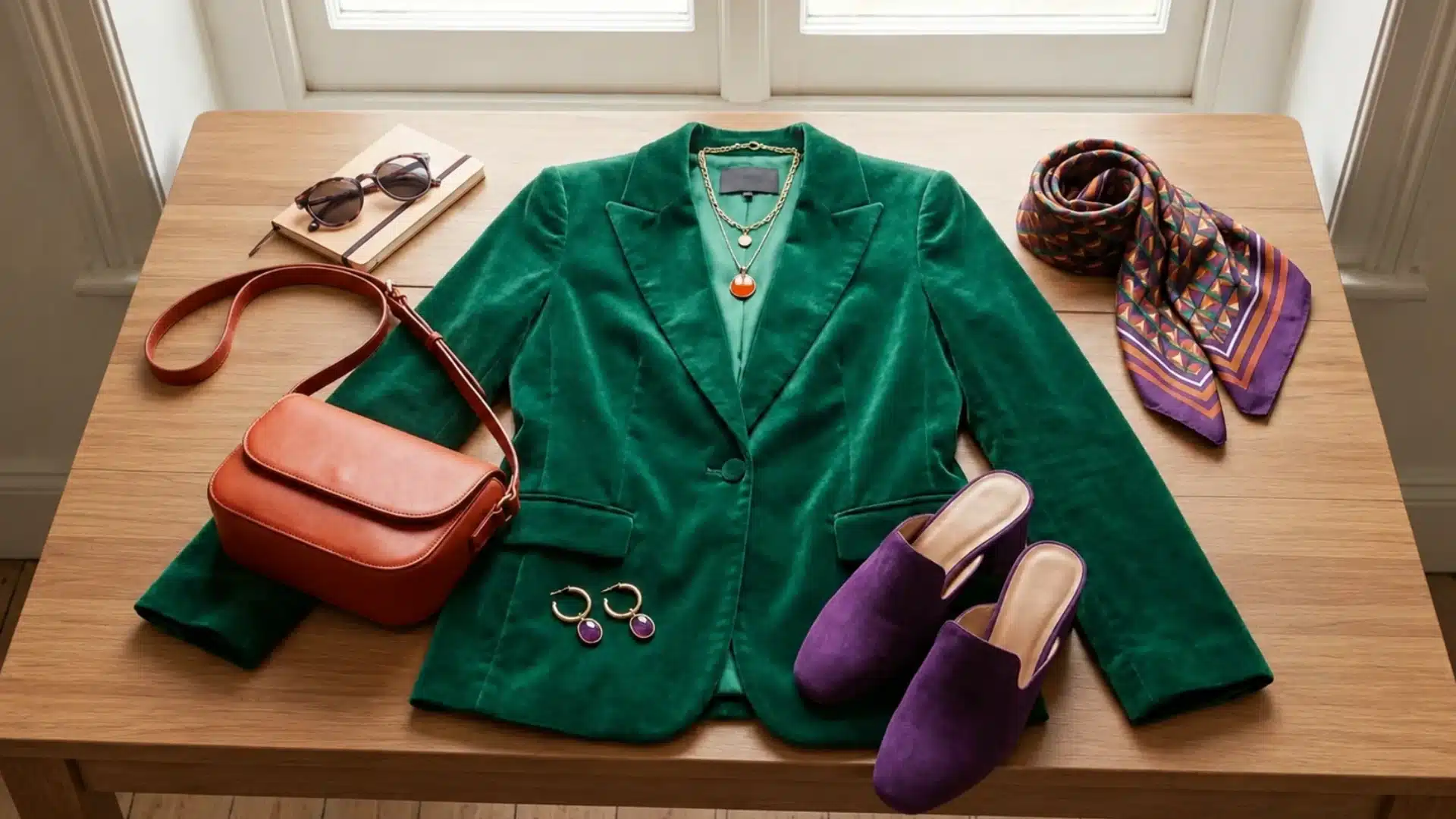
In fashion, a triadic scheme usually plays out through one dominant clothing color, a jacket, dress, or main garment, paired with supporting colors introduced through accessories like shoes, bags, or jewelry.
This keeps an outfit feeling intentional and coordinated rather than like three unrelated colors were thrown together.
The underlying 120-degree relationship still does the same balancing work it does in any other medium.
3. Art & Film
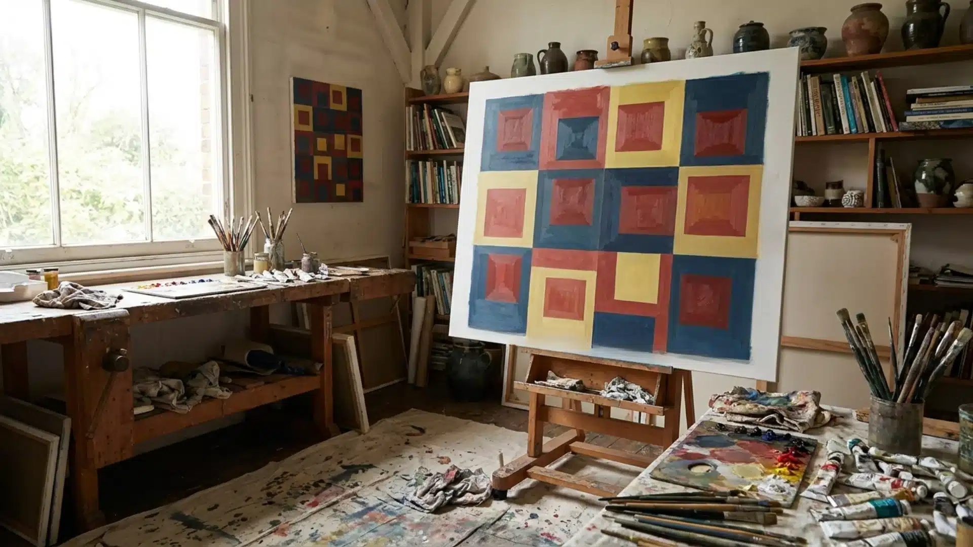
Piet Mondrian’s grid paintings remain the textbook art example of triadic color used deliberately and confidently.
In film, directors use triadic color grading to reinforce a story’s tone; chaotic, high-energy narratives often lean into strong red-yellow-blue contrast.
Specifically because that level of visual tension mirrors the emotional intensity happening on screen.
Triadic Color Scheme vs Other Color Schemes
A quick side-by-side look at how triadic stacks up against the other core color schemes designers reach for.
| Color Scheme | How It Works | Overall Feel |
|---|---|---|
| Triadic | Three colors evenly spaced on the wheel | Balanced and energetic |
| Complementary | Two opposite colors | High contrast |
| Analogous | Neighboring colors | Calm and cohesive |
| Split-Complementary | One color plus two neighbors of its opposite | Balanced contrast |
| Monochromatic | Different shades of one color | Minimal and harmonious |
Each scheme solves a different problem: complementary brings maximum contrast, analogous scheme stays subtle and cohesive and split-complementary softens that contrast.
Triadic sits apart from all of them, delivering real vibrancy while still holding together as a balanced, deliberate palette.
Tips for Using Triadic Color Schemes Like a Designer
Practical habits that separate an intentional, professional-looking triadic palette from a random one.
- Choose one dominant color first: Don’t give all three equal visual weight from the start.
- Use neutrals to create breathing space: whites, grays, and beiges help separate the three main colors.
- Adjust saturation for a softer result: This works especially well for interiors and fashion, where a more livable or wearable feel matters.
- Consider the mood you want first: Red brings energy, blue brings calm, yellow brings warmth, so let that guide your color choices.
- Test the full palette together: Colors shift depending on what surrounds them, so preview all three before committing.
- Use texture to balance bold combinations: A rougher fabric or matte finish can soften a color that feels too loud on its own.
Conclusion
Getting triadic color right takes a genuine mix of theory, intuition, and honestly, a fair bit of trial and error.
It helps to always circle back to the fundamentals: what your design is trying to say, who it’s speaking to, and what feeling you want left behind once someone looks away.
There’s no formula that guarantees success on the first attempt, only a willingness to test, adjust, and try again until something clicks.
So which combination are you going to try? Share in the comments below.
Frequently Asked Questions
Can I Use a Triadic Scheme with a Photo-Heavy Design?
It’s trickier, since photos carry their own color information. It usually works better to pull one or two colors from the imagery and treat the rest as accents.
Is There a Limit to How Many Shades of Each Color I Can Use?
Not really. Tints and shades of the same three hues still count as one scheme and can add depth. Keeping the ratio and mood consistent matters more than the count.
Do Triadic Color Schemes Date Quickly, or Stay Relevant over Time?
It depends more on saturation than on the scheme itself. Bold, highly saturated combinations feel more trend-driven, while muted versions tend to read as more timeless and less tied to a specific era.