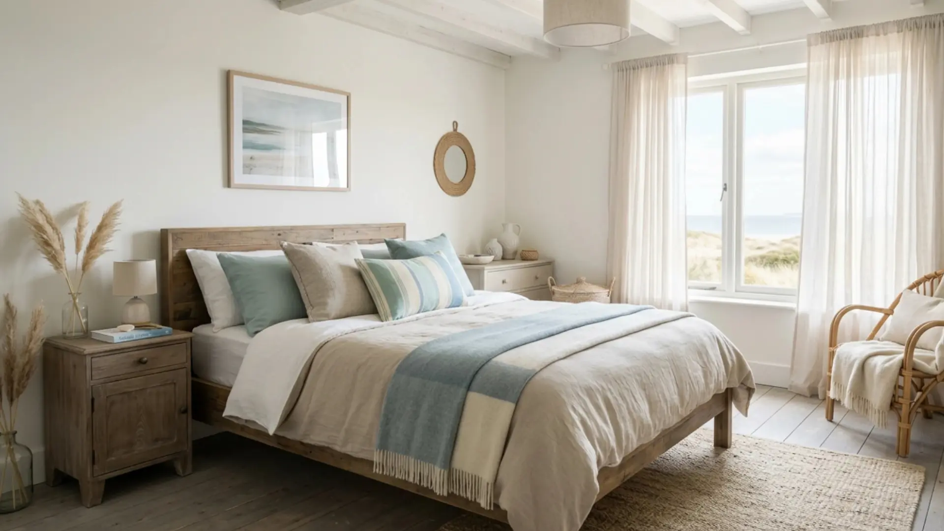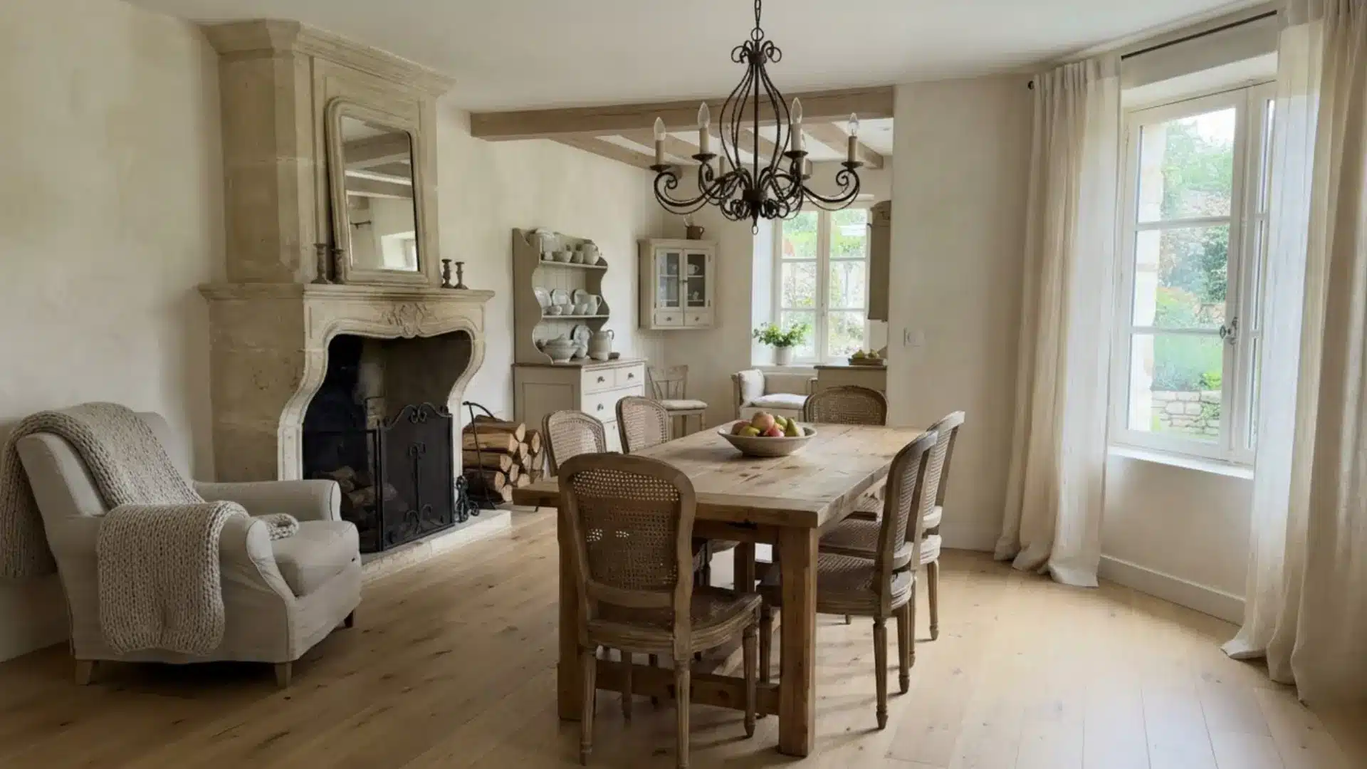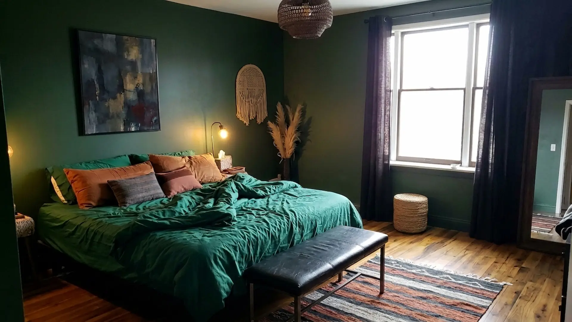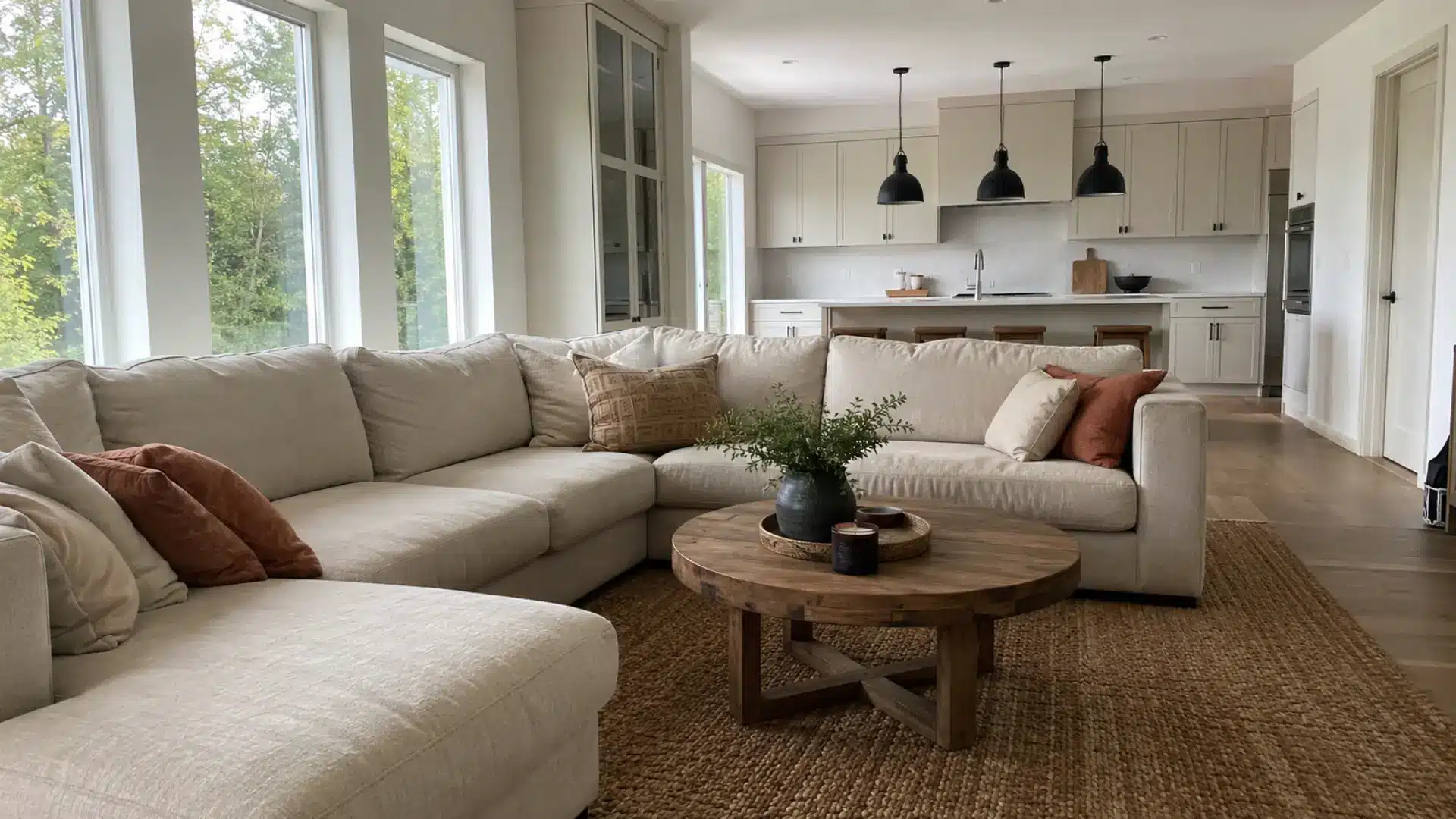

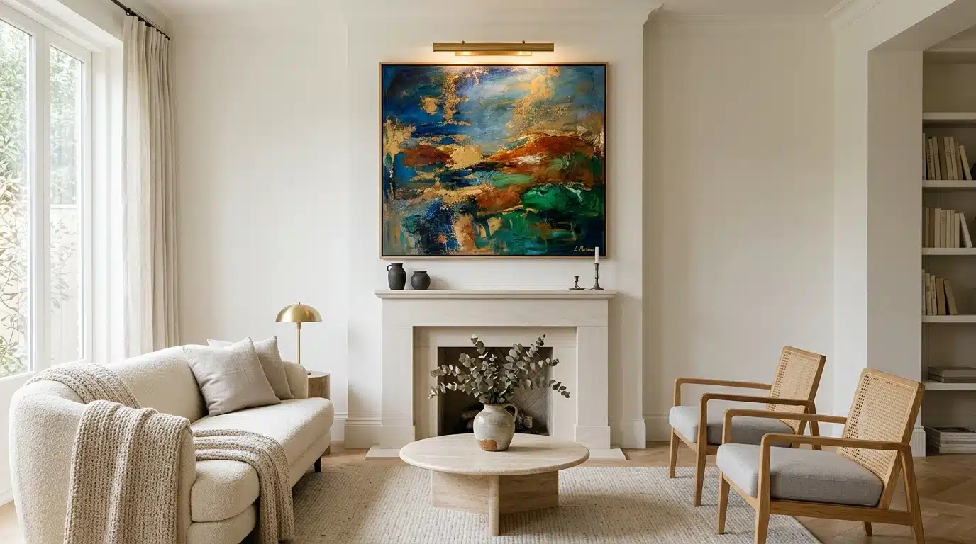
The moment you step into a room, your eyes are naturally drawn to a certain spot, whether consciously or not.
That’s emphasis in interior design. A great room isn’t loud everywhere; it’s loud in one spot and calm everywhere else. Imagine a gallery wall, fireplace, or chair intentionally painted in the wrong shade of orange.
Skip this principle, and rooms feel scattered, like everyone’s talking at once. Master it, and a space gains a voice.
This blog covers how color, scale, lighting, and placement create that unforgettable moment in any room.
Emphasis in interior design is the principle of directing the eye to one dominant feature in a room using color, contrast, scale, lighting, texture, or placement. It works by building a visual hierarchy, where one element leads, and everything else quietly supports it. The main use case is turning a flat, undirected room into a space with a clear focal point, whether that’s a fireplace, an accent wall, or a single statement chair.
What Does Emphasis Mean in Art and Interior Design?
Emphasis is the art of picking a favorite.
In art, it directs the eye straight to one figure, brushstroke, or burst of color before anything else registers.
Nothing else in the piece competes for that first glance.
In interior design, the same idea plays out through a focal point, like an accent wall behind a neutral sofa or a statement light above a plain dining table. The room organizes itself around that one anchor.
Skip it, and a space feels dull and unremarkable. Get it right, and the room comes together at a glance.
Designers use tools, scale, and placement, like a red door on a white house or a large mirror in a narrow hallway, to create a clear entry point into a bigger picture.
How to Create Emphasis in Interior Design
Creating emphasis requires strategy, not luck. Here are effective methods to achieve it.
1. Choose One Bold Color
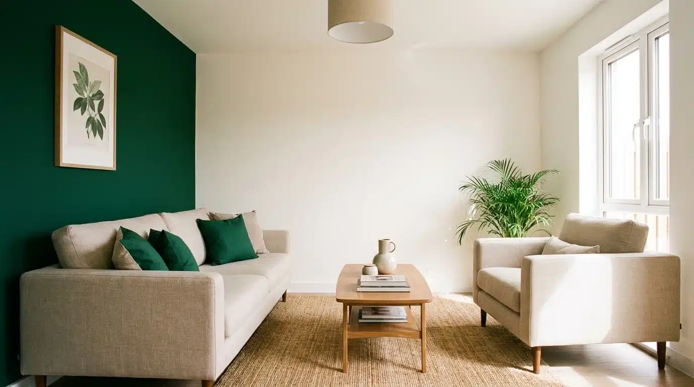
Pick a single hue and let it dominate.
Paint one wall a deep emerald while the rest stay soft and neutral; that contrast instantly attracts attention.
Avoid using bold color everywhere, or nothing will stand out. Save it for cushions, curtains, or a statement chair.
One strong color choice does more work than five scattered ones ever could.
Test the shade in different light before committing, as it changes throughout the day. If you’re considering a full wall of color this year, check current trends for accent walls in interior design before choosing paint.
2. Use Lighting to Direct Attention
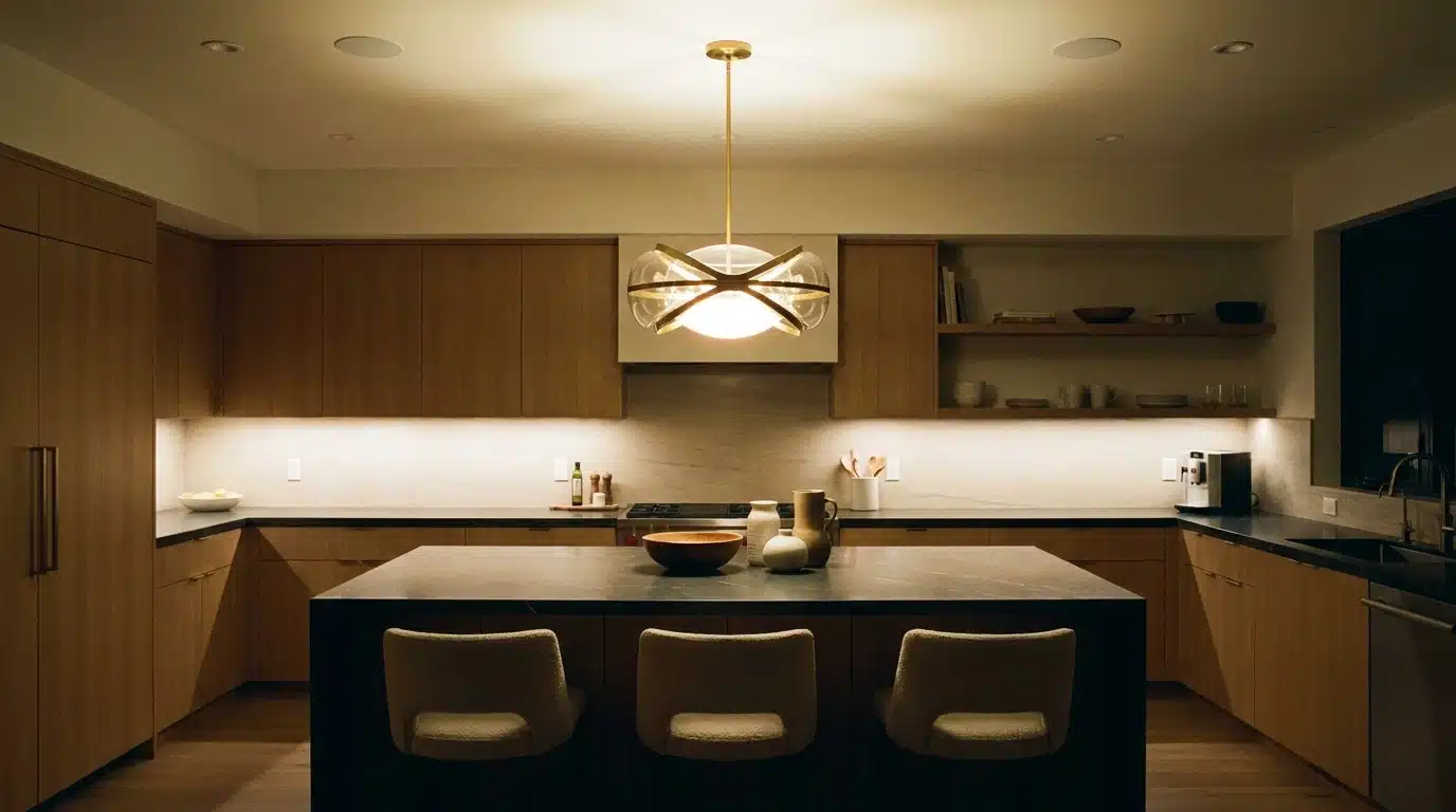
Light shapes where eyes first travel.
Hang a dramatic pendant over a kitchen island, and everyone looks up before anything else. Wall sconces can highlight artwork or textured surfaces at night. Skip flat, even lighting across a whole room.
Instead, layer bright and dim zones. That layering builds depth and guides the gaze exactly where you want it.
Dimmer switches make this easier to adjust as moods shift.
3. Add a Statement Furniture Piece
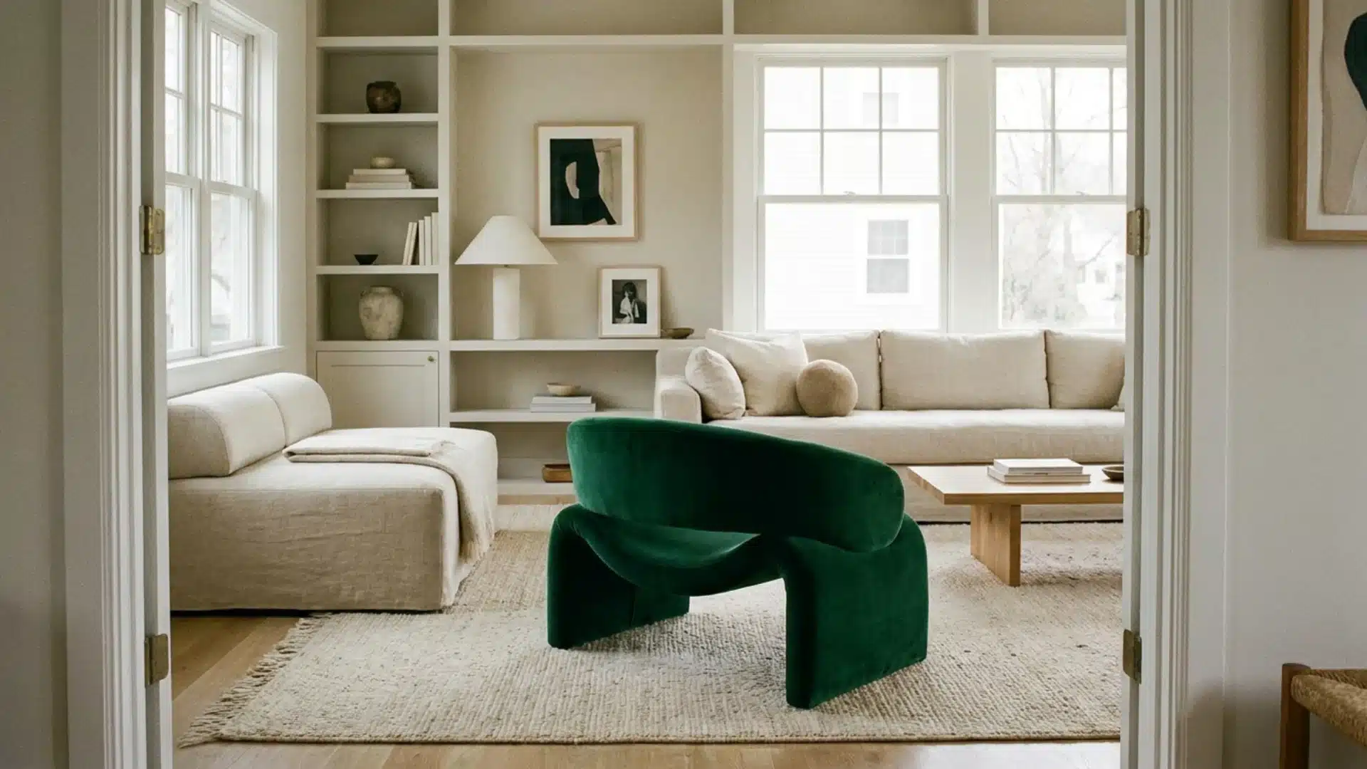
A single striking chair, sofa, or cabinet can carry an entire room’s personality.
Choose something with unusual shape, bold color, or unique material.
Place it where it’s immediately visible from the entrance. Surround it with quieter, simpler pieces so it doesn’t compete for attention. That balance lets the statement piece shine without overwhelming the space around it.
One bold piece per room is usually enough.
4. Hang Artwork at Eye Level
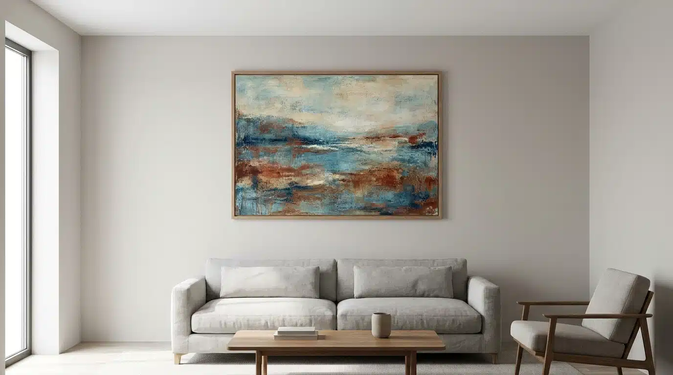
Large artwork commands attention when placed correctly.
Hang pieces at eye level, roughly 57 inches from the floor, so they feel intentional.
This is the same center line galleries use, and it works just as well over a console table at home.
A gallery wall works too, but keep one piece larger than the rest.
This size variation establishes a clear hierarchy within the display. Random placement or inconsistent sizing diminishes the impact and makes it unclear where the viewer’s attention should focus.
Measure twice before drilling, since crooked frames undo the effect fast.
5. Experiment with Size Relationships and Balance
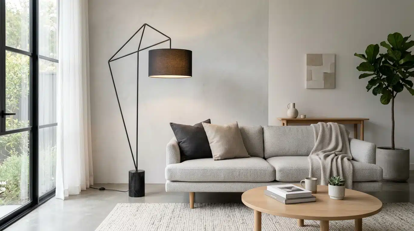
Oversized objects in small spaces grab attention fast.
A giant clock on a narrow wall or a tall floor lamp beside a low sofa creates instant contrast. Small spaces benefit from one large item, not several. Mixing proportions this way breaks visual monotony.
It signals importance without needing extra decoration or color to reinforce the point.
Balance the oversized piece with simple, low-profile furniture nearby.
6. Build Contrast Through Texture
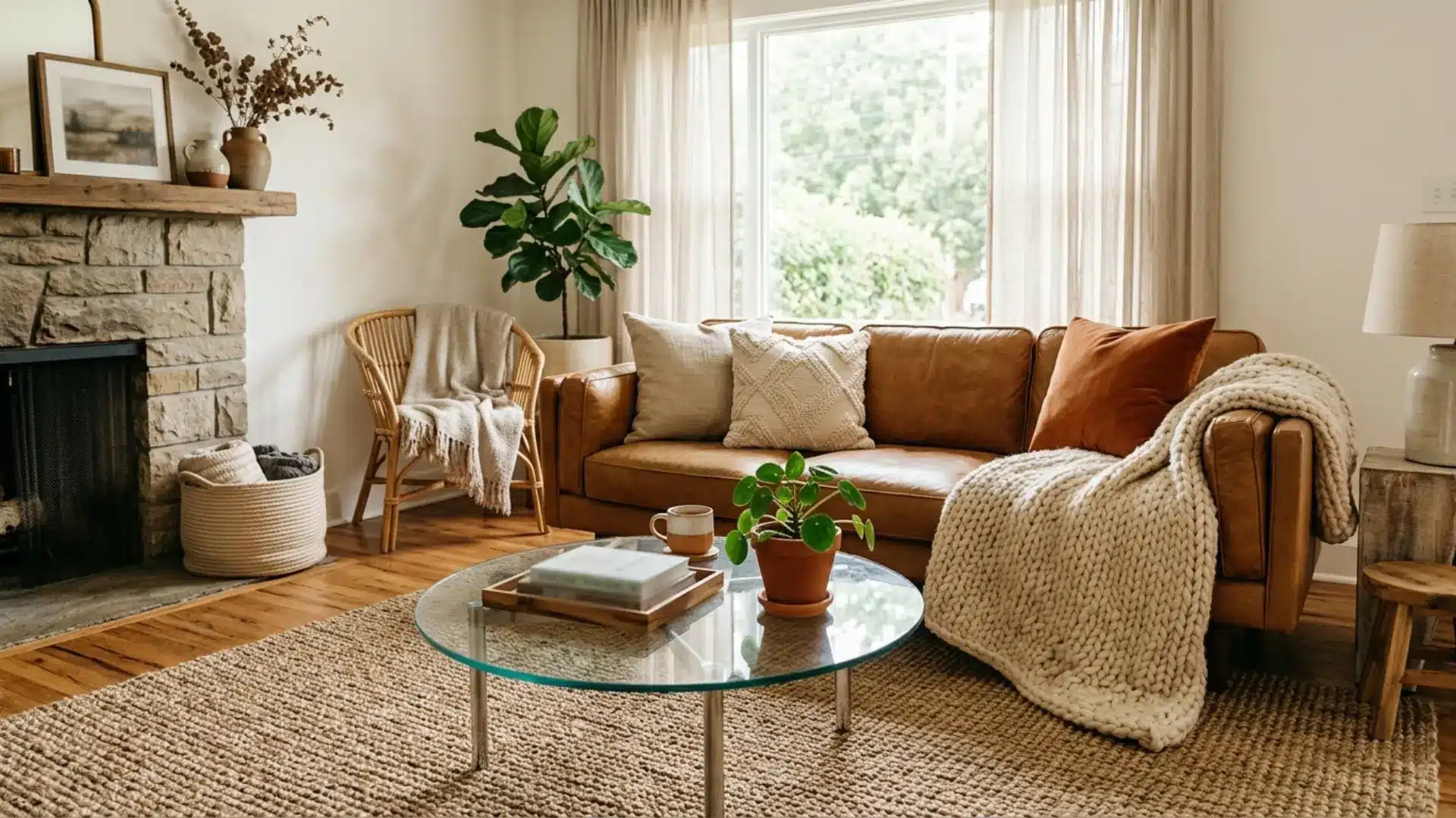
Rough and smooth surfaces placed side by side create tension that draws the eye.
Pair a woven jute rug with a sleek glass coffee table. Add a chunky knit throw over a leather sofa.
These textural clashes feel intentional, not accidental. Skip matching every material in a room; variety keeps the space visually interesting and alive. Even mismatched cushions can add this same spark cheaply.
7. Establish a Clear Focal Point
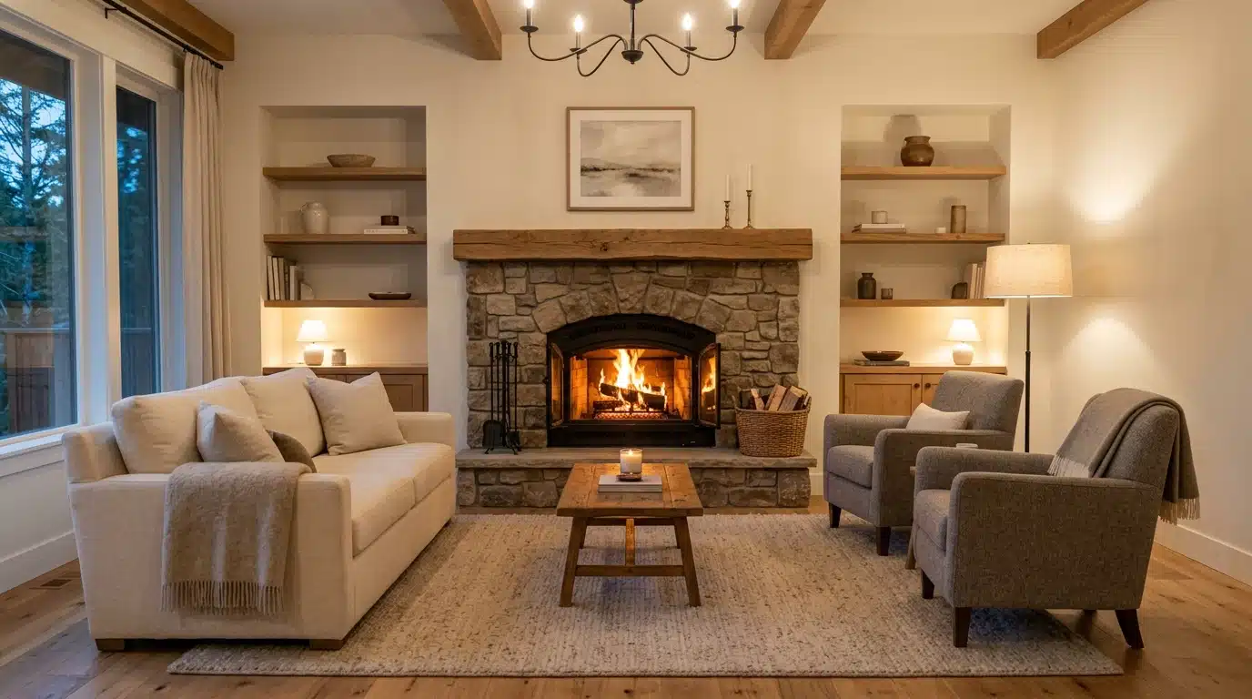
Every room needs one anchor, whether it’s a fireplace, window, or accent wall.
Arrange furniture to face that feature directly.
Avoid competing focal points, since two strong elements fight for attention and confuse the eye. Once that anchor is set, everything else becomes supporting detail, quietly reinforcing the room’s central story.
Test the layout by standing at the doorway first.
8. Create Visual Hierarchy with Placement
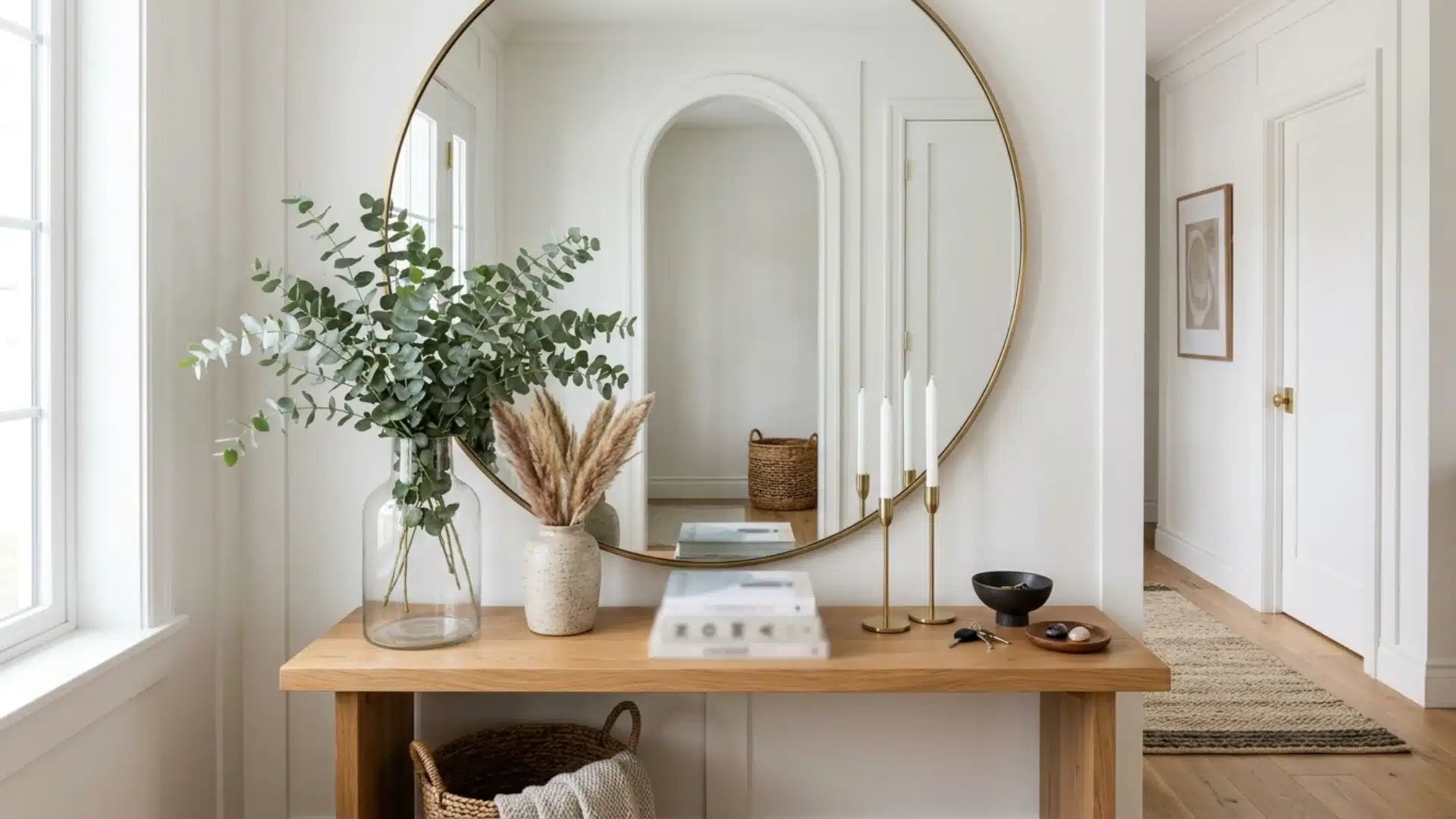
Place the most important item first, then arrange everything else around it in descending order of importance.
A large mirror above a console table, surrounded by smaller decorative items, illustrates this hierarchy.
Arrange items from largest to smallest. This guides the viewer’s eye naturally, reducing confusion and clutter.
Step back often to check that the flow still reads clearly.
9. Frame Focal Points with Negative Space
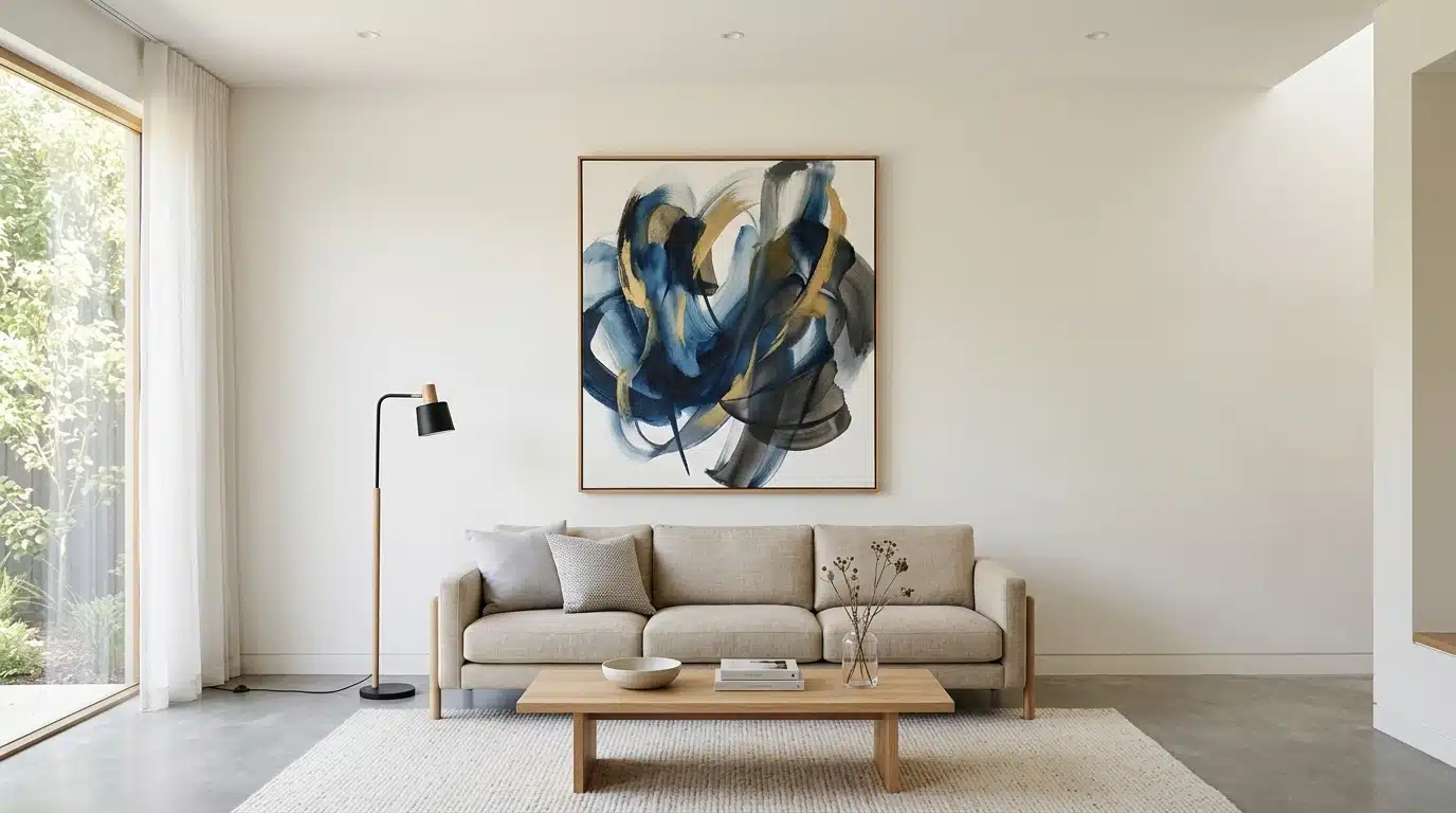
Empty space around a feature makes it stand out more. Don’t crowd a statement piece with clutter.
Give it breathing room on a bare wall or open shelf.
That emptiness acts like a spotlight, drawing focus without extra effort. Negative space costs nothing but restraint, yet it transforms how strongly a feature reads. Resist the urge to fill every gap on a shelf or wall.
Emphasis With Color and Contrast
Color and contrast work like a spotlight, pulling focus without saying a word.
A warm color contrasted with cool tones immediately distinguishes one element from others. Saturation also plays a role: a highly saturated cushion on a muted sofa stands out more than any pattern.
- Pair complementary colors such as blue and orange to create immediate visual tension.
- Place a dark frame on a light-colored wall to make the artwork stand out.
- Use color blocking on cabinetry to visually distinguish different zones.
- Maintain a mostly neutral color palette, then remove one saturated accent.
A single accent piece, such as a vase or chair leg, holds more visual significance than a matching set.
Emphasis Using Decor and Furniture
Furniture and decor carry emphasis through shape and material, not just color.
A curved chair among boxy ones instantly draws the eye.
Metallic finishes catch light differently than matte surfaces, adding quiet drama to a shelf or table.
Layer objects by height. A tall vase beside a low bowl creates rhythm without clutter.
Mixing materials, like brass against wood, adds richness without shouting for attention.
Group decor in odd numbers, since threes feel more natural than pairs.
Keep surrounding pieces simple, so the eye lands on the standout item first, then wanders naturally from there.
Getting the seating arranged around that standout piece matters just as much as the piece itself, so it helps to walk through a few layouts for arranging a living room before you settle on one.
Texture and Materials: Emphasis in Interior Design
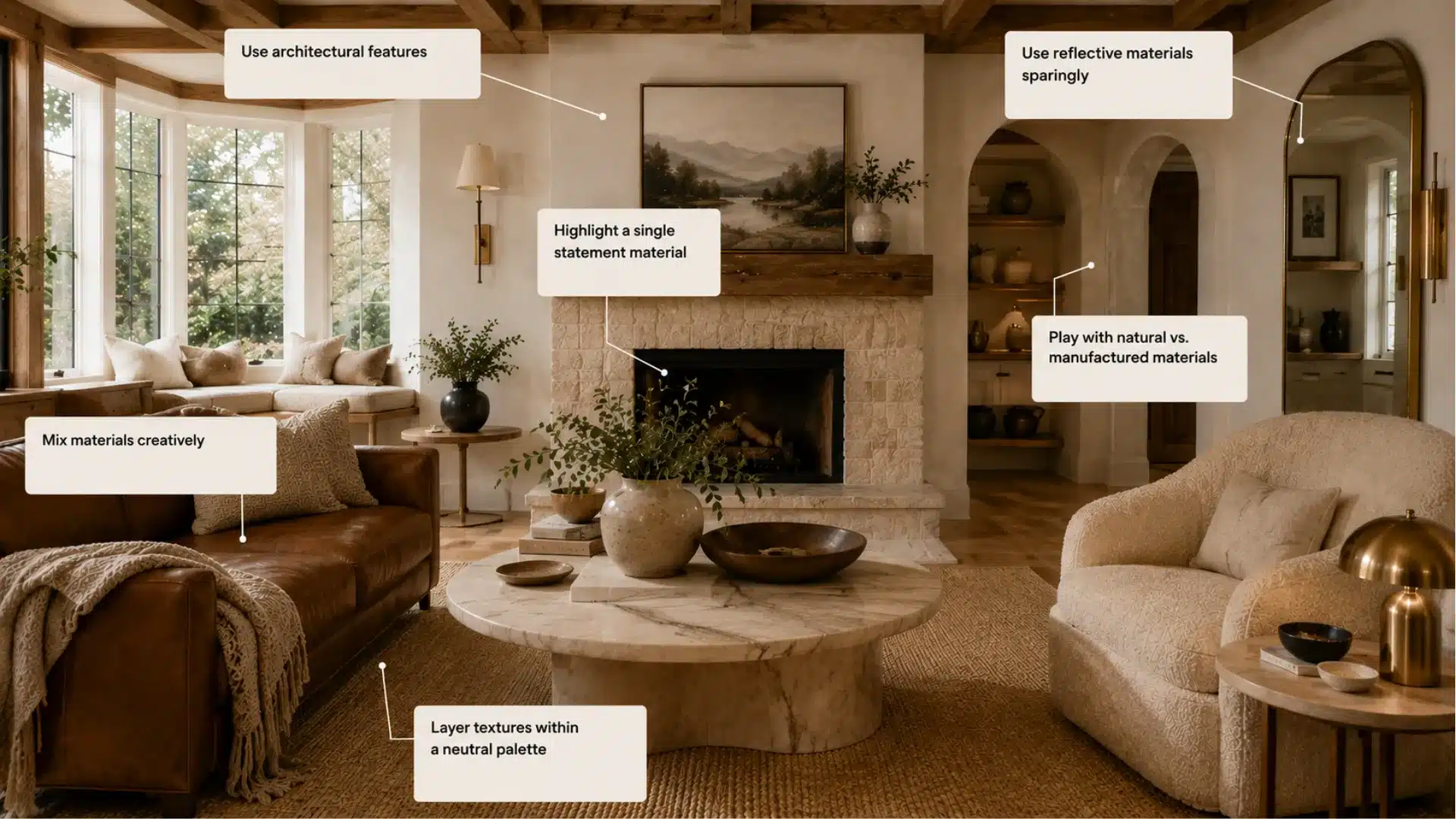
How combining different textures, materials, and finishes can highlight features without using color.
- Combine textures, a woven throw against sleek leather, or matte ceramics beside polished brass.
- Bay windows, exposed beams, or a fireplace surround make natural, effortless focal points.
- Pair stone, wood, or rattan against glass or lacquer for tactile contrast.
- A marble table or reclaimed wood beam gives an otherwise simple room instant weight.
- Bouclé, linen, and wool keep muted rooms from feeling flat.
- A single mirror or polished metal surface catches light and draws the eye.
How to Choose the Right Focal Point for Each Room
Every room contains a natural feature ready to guide the way.
In a living room, a fireplace or large window usually wins by default. Bedrooms often center on the headboard wall, framed simply. Kitchens work best when the island or a striking backsplash takes charge.
Observe where people instinctively focus upon entering. That instinct is usually reliable.
Don’t try to create a focal point where the structure doesn’t support one.
Small rooms need a single anchor, not several fighting for space.
Adjust the focal point’s size to match the room’s scale, ensuring it feels intentional.
If a fireplace is the natural anchor but looks outdated, updating the surround quickly makes it stand out.
How to Combine Multiple Emphasis Techniques
Combining techniques is more effective than relying on a single one.
Begin with two methods rather than five, as too many conflicting signals tend to neutralize each other quickly.
| Combination | Effect |
|---|---|
| Color + Scale | Bold hue on an oversized piece doubles the impact |
| Lighting + Texture | Spotlighting a rough surface deepens shadows and detail |
| Contrast + Placement | Dark object against light wall, positioned at entry sightline |
| Artwork + Negative Space | Framed piece alone on a wall reads as gallery-worthy |
| Furniture + Hierarchy | Statement chair sized largest among smaller seating |
| Texture + Color | Matte accent wall paired with a glossy furniture piece |
How Emphasis Works With the Other Principles of Design
Emphasis relies on other design principles to be effective.
- Balance: Emphasis requires a stable foundation to prevent the focal point from dominating the room.
- Rhythm: Repeated smaller elements direct the viewer’s attention toward the main feature.
- Proportion: The focal point should logically correspond to the overall size of the room.
- Unity: Supporting elements should gently reinforce the main focus without conflicting with it.
- Movement: Sightlines should naturally guide the viewer from the entry point to the focal feature.
Mistakes that Make a Room Feel Visually Confusing
Too many focal points fight for attention, and the room loses direction fast.
Matching everything, from cushions to curtains, flattens the space until nothing stands out.
Overcrowded shelves bury the one piece worth noticing. Weak lighting, spread evenly with no layering, leaves the whole room looking flat and lifeless. Ignoring scale causes small decor to vanish beside oversized furniture.
Randomly placing artwork without a size hierarchy creates confusion instead of guidance.
Skipping negative space fills every surface, leaving no room to breathe.
Confusion arises when all elements compete loudly instead of one being clear.
Frequently Asked Questions (FAQ’s)
1. What is the 3-5-7 Rule in Decorating Interior Design?
Group decor in odd numbers, like 3, 5, or 7 items, since asymmetry feels more natural and visually balanced.
2. What are the 7 Key Elements of Interior Design?
Space, line, form, light, color, texture, and pattern together shape how a room feels and functions.
3. What is the Difference Between Focal Point and Emphasis?
A focal point is the specific feature; emphasis is the broader technique used to make that feature stand out.
4. How is Emphasis Different from Contrast?
Emphasis highlights a dominant feature, while contrast pairs opposing elements to create visual tension.
5. What are Some Famous Examples of Emphasis in Artwork?
Caravaggio’s dramatic lighting and Van Gogh’s bold colors both use emphasis to instantly direct the viewer’s eye.
End Note!
Emphasis in interior design turns a random collection of furniture into something with actual direction, something that feels considered. Pick one feature. Let it lead.
Everything else the rug, the lamps, the cushions should support that choice rather than compete with it.
Start small: repaint one wall, swap in a bold chair, or hang a single oversized print.
Notice how the room instantly reads differently.
Ready to test it? Pick one wall in your home this weekend and give it a real focal point.
Share your experience in the comments below; it might help someone who is searching for this.