
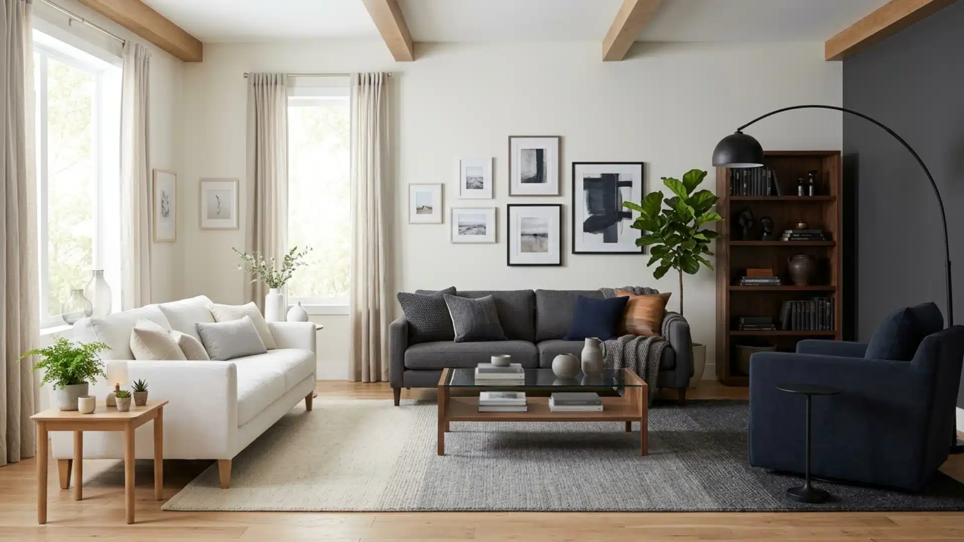
Some rooms just feel right, and it’s hard to put into words why. Gradation in interior design is often the hidden reason.
It’s the difference between a space that feels curated and one that feels thrown together overnight.
It’s a smarter way to arrange what’s already there. This concept borrows from art, music, even nature, where things rarely jump from one extreme to another without a bridge in between. Interiors work the same way.
This blog defines what gradation means, breaks down how it pairs with rhythm and repetition, and shows how the three principles shape a space that feels whole.
What is Gradation in Interior Design?
Gradation refers to the gradual transition between shades, such as from dark to light or bold to soft.
In interior design, gradation means arranging colors, textures, or shapes in a step-by-step order, not a random jumble. Like five throw pillows on a sofa, each a shade darker than the last. That’s gradation.
It’s also about more than just color. You can grade texture with silk cushions, nubby linen, and rough jute.
Or scale with small vases, medium ones, and a tall statement piece.
The eye perceives this progression as deliberate, almost like music.
Designers use gradation to add depth and create smooth transitions between rooms or elements.
A room with gradients appears more layered and intentional, not haphazardly assembled.
How It Works With Gradation: Repetition in Interior Design
Repetition is a principle in its own right, and it holds a room together the same way gradation guides it forward.
The same color, shape, and material shown again and again until it clicks into a pattern.
A brass lamp here, brass drawer pulls there, a brass frame on the wall. Suddenly the space feels pulled together.
It’s not necessary to match everything precisely; focus on echoes. For example, a striped cushion can be echoed in a striped rug across the room. This recurring element weaves furniture, walls, and accessories into a cohesive story.
Ignore it, and the room feels disorganized. Use it correctly, and everything falls into place.
Gradation turns static objects into a sequence the eye wants to follow.
Gradation vs Repetition vs Rhythm: What is the Difference?
Line them up side by side, and each principle turns out to move a room in its own direction.
Combine them, and a room appears intentionally designed, not randomly decorated. All three arrange a space, each with a different movement: one accumulates, another echoes, and the third alternates.
| Principle | How It Moves | Visual Cue | Best For |
|---|---|---|---|
| Gradation | Shifts step by step | Gradual change in shade or size | Smooth transitions |
| Repetition | Reappears at intervals | Same element, repeated | Unifying a space |
| Rhythm | Alternates back and forth | Contrast that pulls the eye | Guiding movement |
Main Types of Gradation You Can Use in a Room
Gradation appears in more contexts than just color; here are other areas where it functions.
- Size: Furniture or decor arranged from small to large, like nesting tables.
- Texture: Materials shifting from rough to smooth, such as jute to velvet.
- Light: Brightness fading from strong to soft, as in layered lamp placement.
- Pattern: Prints scaling from bold to subtle across a room.
- Shape: Forms shifting from angular to rounded, like furniture silhouettes.
How to Use Gradation Without Making a Room Look Random
Choose one direction, light to dark or dark to light, and stay consistent; never mix both on the same wall.
Sudden jumps immediately ruin the effect.
Anchor the gradation to a single element first. A curtain, a bookshelf, a stack of cushions. Once that’s set, echo the same shift somewhere else in the room, maybe a smaller version on a side table. Keep the steps even.
Three shades that jump too far apart look like mismatched paint samples, not a gradient.
Test swatches side by side before committing. Skipping a step in between usually causes this mismatch.
Limit gradation to one or two spots per room. Overdo it, and the whole space feels busy instead of calm.
A single, clear gradient communicates more effectively than five scattered ones.
Practical Ways to Add Gradation in Interior Design
Gradation establishes a clear sequence, guiding the eye from one point to the next and relating to rhythm, with gradients creating movement that directs attention from entry to focal point.
Layering bold accent colors works on the same principle, since both rely on planned transitions rather than guesswork.
1. Layer Bedding by Shade
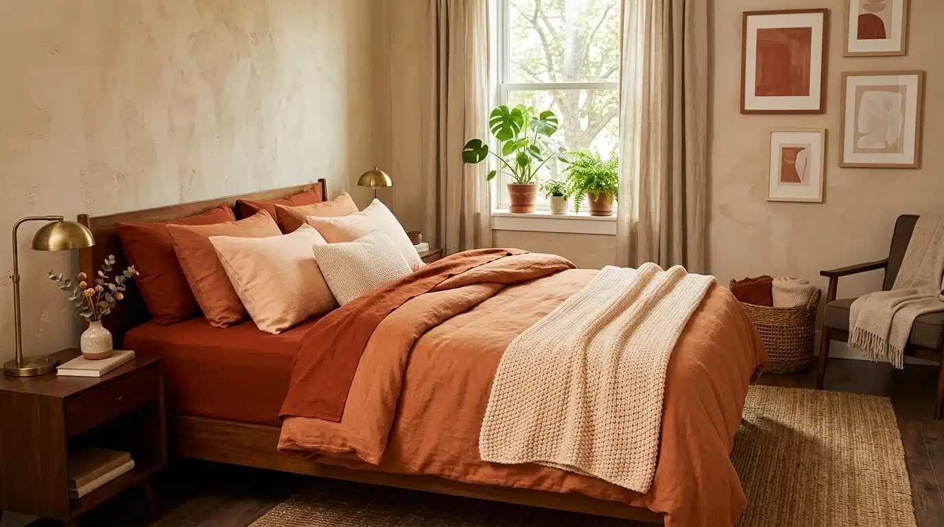
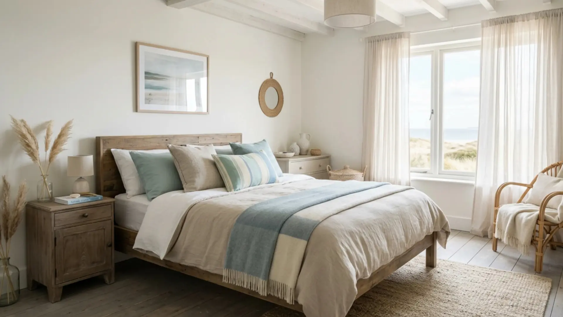
Stack a duvet, throw, and pillows in a single color family, moving from darkest at the base to lightest on top.
This creates a gentle gradient at eye level, making it an accessible starting point for anyone trying out gradation for the first time, especially since bedding changes are common and inexpensive.
Swap pieces seasonally to keep the sequence fresh without much effort.
2. Grade Tile Patterns in Bathrooms
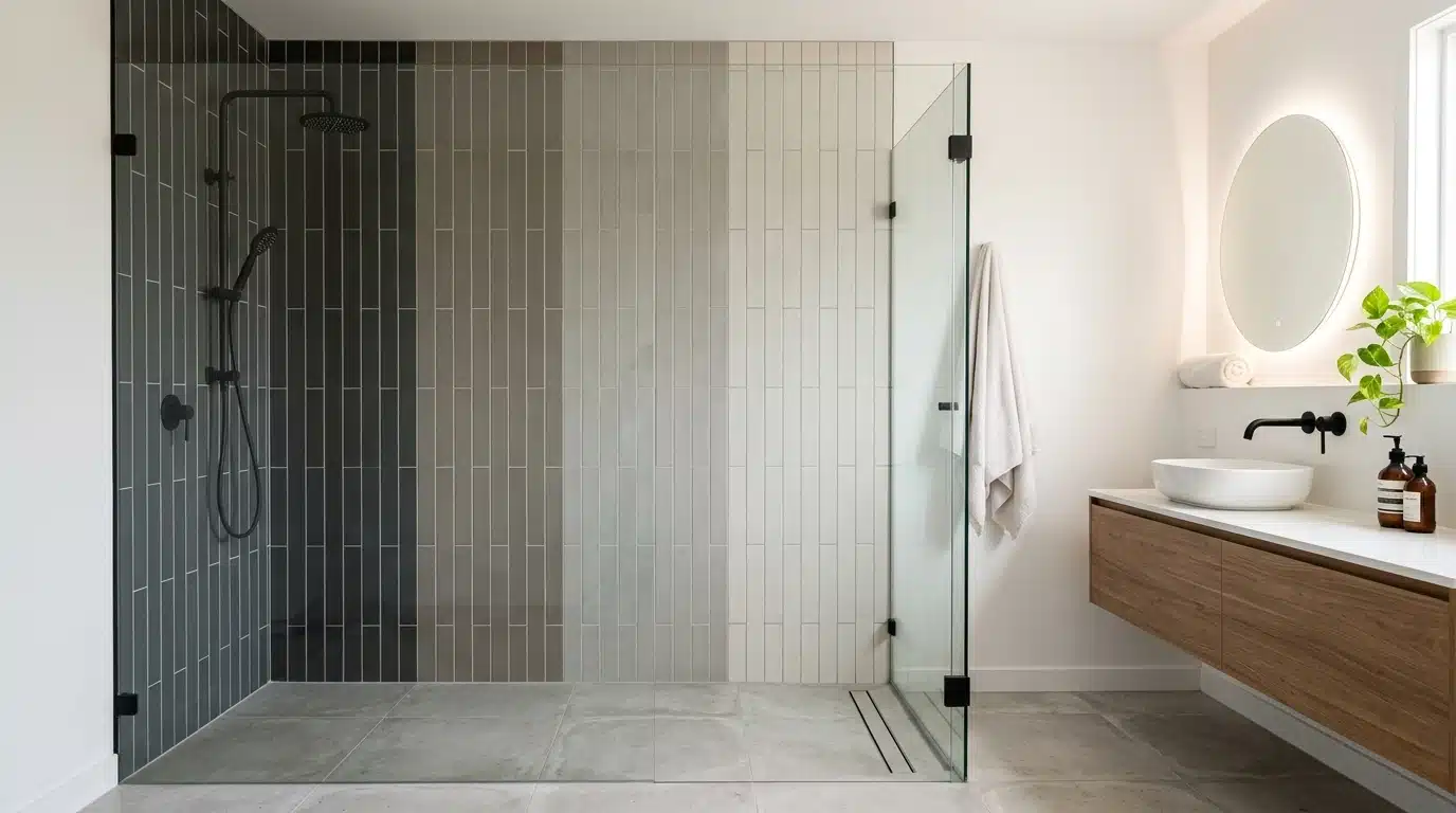
Choose tiles in three or four related tones for a shower wall or floor. Lay them from deep to pale, top to bottom or side to side. This adds subtle depth to a small space without needing bold patterns.
Keep the grout color neutral to avoid breaking the sequence.
Matte finishes also help the tonal shift look deliberate rather than accidental.
3. Arrange Books by Spine Color
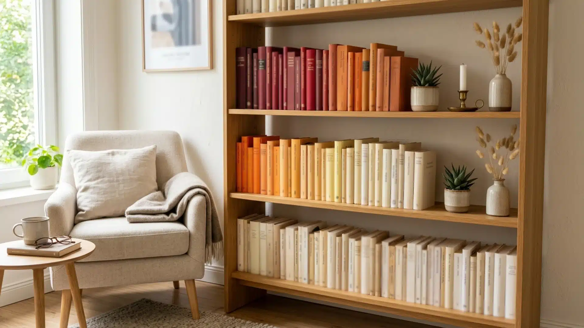
Sort a bookshelf by spine tone instead of author or genre.
Move from deep reds through oranges to soft creams across the shelf.
This turns storage into a visual feature. It works especially well in reading nooks or home offices where shelves face natural light. Rotate a few titles monthly to keep the gradient looking curated, not static.
4. Choose a Fading Wallpaper Panel
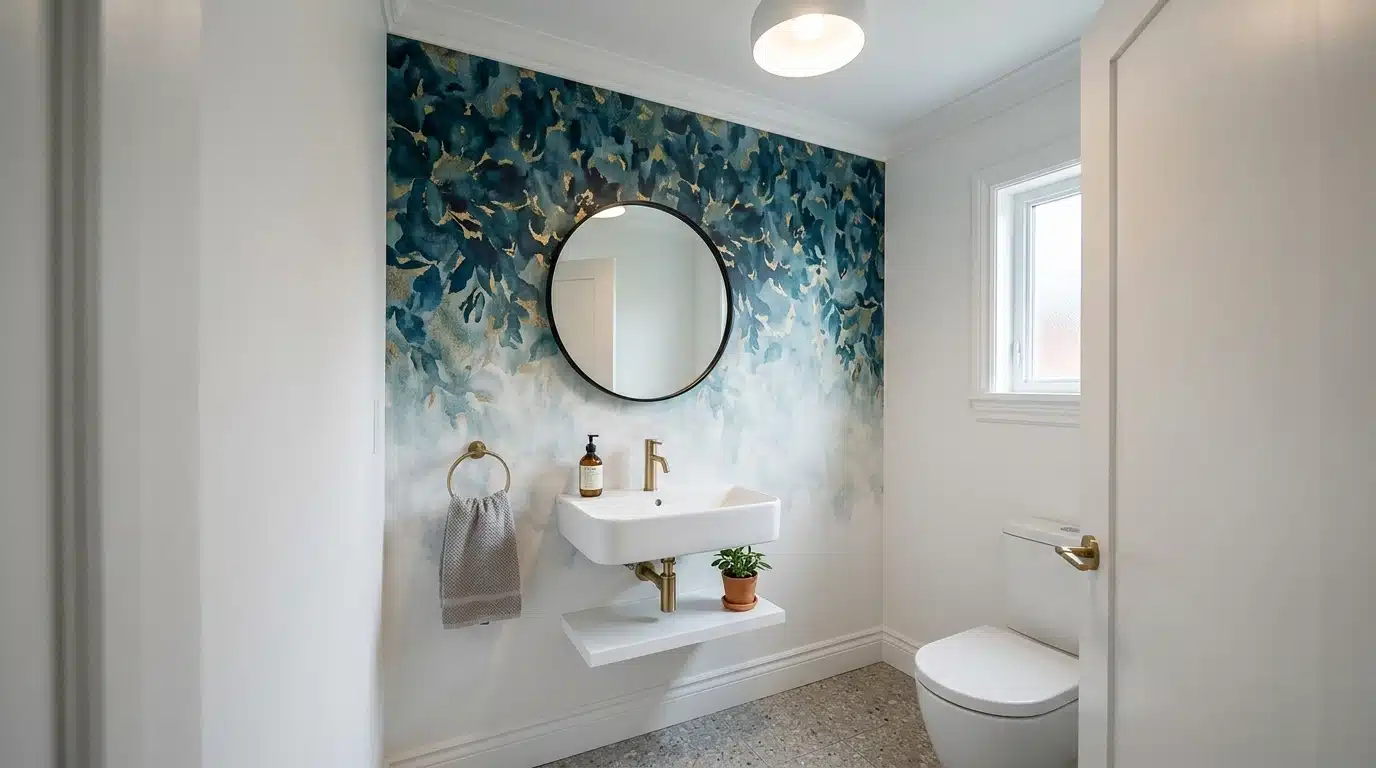
Some wallpapers are printed with a built-in gradient, shifting from bold to muted across a single roll.
Installed on one accent wall, this does the gradation work automatically.
It suits small entryways or powder rooms where a full gradient wall might otherwise feel overwhelming.
Pair it with plain trim so the wallpaper stays the clear focal point.
5. Layer Sheer to Blackout Curtains
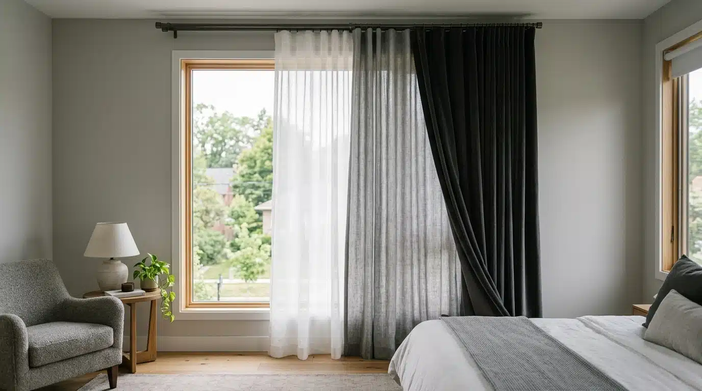
Hang a sheer panel closest to the glass, then a mid-weight fabric, then a blackout layer furthest out.
The light-to-dark shift controls both privacy and visual weight. This technique doubles as a function, since each layer serves a different practical purpose beyond looks.
Adjust panel order slightly by season to balance light control and visual comfort.
6. Grade Cushion Sizes on a Bench
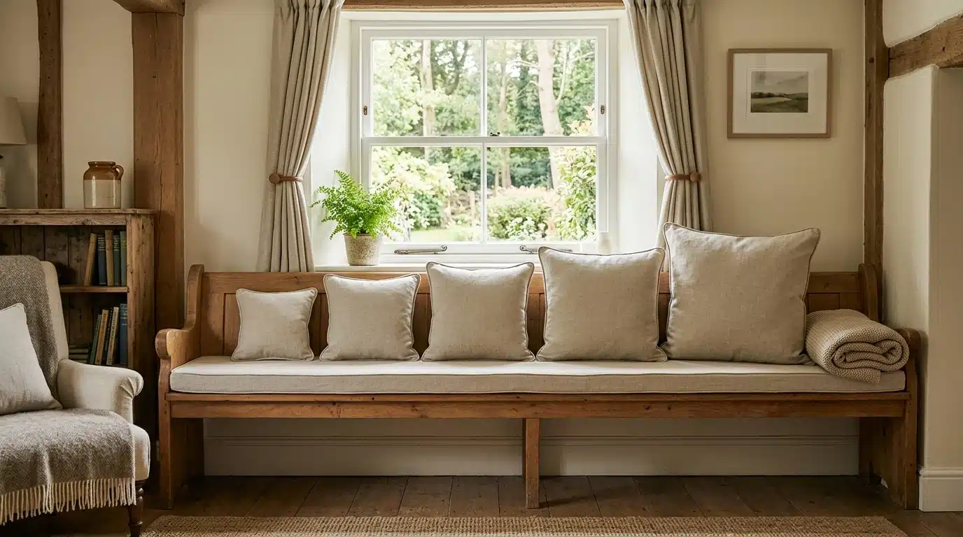
Line up cushions from smallest to largest along a window bench or daybed.
Size gradation reads just as clearly as color gradation.
Keep the fabric family consistent so the eye focuses on the size shift rather than competing textures or prints. Anchor the largest cushion at one end to give the sequence a clear stopping point.
7. Build a Gradient Gallery Wall
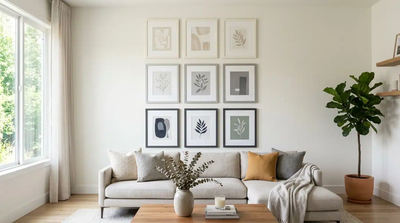
Frame photos or prints in mats that shift tone gradually, cream to charcoal, across the wall layout.
This adds gradation to what’s usually a repetition-only feature. Keep frame sizes uniform so the tonal shift remains the clear focal point of the arrangement.
Hang the darkest frame last, letting it act as a natural visual endpoint.
8. Fade Flooring Rugs by Room
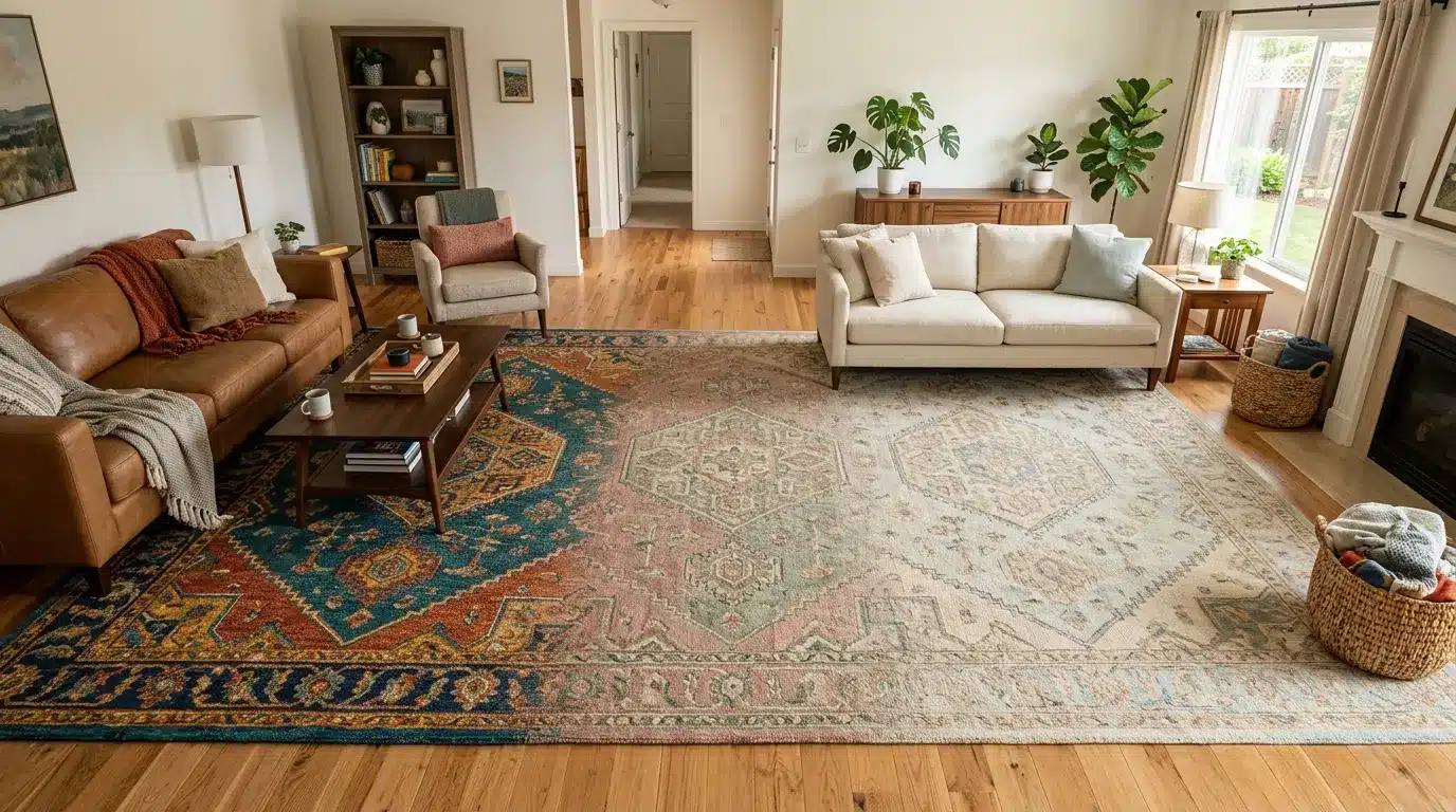
Choose runner rugs in a shared color family, moving from bold in a hallway to muted in a bedroom.
This creates gradation across an entire floor plan, not just one room.
It also signals a shift in mood as someone moves from active to restful spaces. Matching rug texture across rooms keeps the transition feeling deliberate rather than mismatched.
9. Grade Cabinet Paint Vertically
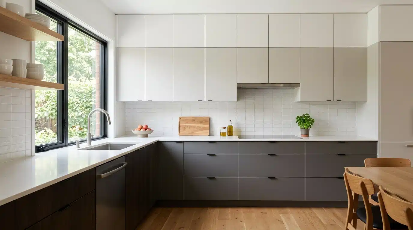
Paint upper cabinets a shade lighter than lower ones in a kitchen or built-in unit.
This vertical gradient adds height perception and softens a heavy cabinet run. It works particularly well in kitchens with limited natural light, since lighter uppers help bounce brightness around.
A satin finish on the upper cabinets can boost that light-bouncing effect even further.
How to Plan a Gradation Sequence that Looks Natural
Start with the end goal, not the starting shade. Decide where the sequence should land, then work backward.
Building a mood board first keeps the palette anchored before testing individual gradient stops.
- Choose 3 to 5 stops; fewer feels abrupt, more feels chaotic.
- Test the sequence in natural daylight, not under bulbs.
- Space the steps across different surfaces, not just one wall.
Natural light quickly changes undertones, so a swatch perfect at noon might look muddy by evening. Spread the sequence across a rug, then a cushion, then a curtain; this keeps the eye moving instead of stalling.
A sequence confined to one surface reads flat, no matter how well the shades are chosen.
How Gradation Works With Other Interior Design Principles
Gradation requires the support of other principles to be effective.
| Principle | How It Pairs With Gradation |
|---|---|
| Balance | Gradual shade shifts keep visual weight even, side to side |
| Contrast | A sharp accent color breaks the gradient, adding focus |
| Proportion | Larger objects need bigger gaps between gradient steps |
| Harmony | Related hues in the sequence keep the whole space cohesive |
| Emphasis | One bold stop in the gradient becomes the room’s focal point |
Techniques to Implement Gradation and Repetition
Turning theory into practice takes a few reliable tricks; here are a few worth trying.
1. Layer paint swatches on one wall: Paint three to four strips side by side before committing to a full wall.
This shows exactly how shades transition in real light, helping you avoid costly repainting later.
2. Use a single hardware finish throughout: Pick one metal matte black, brushed nickel, whatever suits the space and apply it to cabinet handles, faucets, and light fixtures. This builds repetition without effort.
3. Stack storage baskets by size: Arrange baskets from smallest to largest on open shelving.
This creates a clean gradient effect while staying functional and easy to maintain day-to-day.
4. Frame art in matching styles: Select a single frame material for all pieces, regardless of their artwork.
The consistent frame creates a cohesive look for the gallery wall.
5. Group planters by height: Arrange plant pots in order from shortest to tallest along a windowsill or shelf.
This creates a natural, living gradient that gradually changes as the plants grow.
Where Gradation Works Best in Interior Design
Certain areas naturally respond well to gradation.
Staircases can change shade with each step, making a simple climb more noticeable. Open shelving works too. Books or objects arranged by tone create a quiet visual pull without extra effort.
Accent walls placed behind headboards or sofas are another excellent option.
The change captures attention even without bold patterns.
Layered sheer-to-solid window treatments gradually soften the light as the day progresses.
Common Mistakes that Make Interiors Feel Unbalanced
Minor errors can disrupt an otherwise well-structured design plan.
- Using multiple metal finishes in a single room can create visual clutter.
- Overlooking scale considerations when matching furniture pieces.
- Neglecting to consider scale when matching furniture pieces.
- Cluttering a wall by using mismatched frame sizes.
- Omitting the gaps between decor groupings.
- Selecting a rug size that doesn’t complement the seating area.
- Arranging all furniture along the walls only.
- Using conflicting patterns that lack a unifying color element.
- Ignoring lighting layers other than the main fixture.
- Picking an accent color for one gradient step that never repeats anywhere else in the room.
Frequently Asked Questions (FAQ’s)
1. Is Gradation only About Color?
No, it applies to texture, scale, pattern, and even lighting intensity across a space.
2. How Many Shades Should a Gradation Sequence Include?
Three to five stops work best; fewer feels abrupt, and too many feels overwhelming.
3. Can Gradation Work in Small Rooms?
Yes, subtle gradation on one wall or shelf adds depth without overwhelming limited square footage.
4. Does Gradation Cost More to Implement?
Not necessarily; reorganizing existing items by shade or size often creates gradation for free.
Final Verdict
Gradation is a habit worth building early, and it pays off the moment you start noticing it.
It’s less a rule and more a lens; once you notice it, ordinary choices start looking different.
A stack of towels, a row of jars, a paint chip fan deck all suddenly readable as sequences waiting to happen.
That shift in perception is the real payoff here, more than any single technique covered above. Interiors built this way age well too, since a considered sequence rarely feels dated the way trend-driven choices do.
Have you tried gradation in a room at home?
Drop a comment with what worked, or what didn’t, so other readers can learn from it too.